Zocdoc is a healthcare company that helps patients discover and book with doctors online.
Overview
Patient Home is the landing experience for any user who has just booked an appointment through Zocdoc. This redesign project was part of a larger initiative to help first time users better understand Zocdoc’s value and form a stronger, longer lasting relationship with the product.
Roles and responsibilities
I served as lead designer on this project as part of Zocdoc’s Engagement team. I partnered with PM, Design and Engineering teams help define goals, ideate and test solutions, to see the project from conception to implementation. Because this project happened during the pandemic, all research, analysis and design were conducted remotely.
Time and duration
6 months - MVP
The problem:
Patient Home serves as the landing experience for all bookings on Zocdoc’s platform. It’s a particularly key moment in a first time user’s post-booking journey. Because a large percentage of first-time users originate their bookings with third party channels, we had an assumption many may not have a great understanding of what Zocdoc is or what it can do for them. With the assumption that understanding a product’s value is crucial to a user’s reengagement, we knew this post-booking experience needed to do a better job at showing, not just just telling, the value of Zocdoc. How might we provide our first time users a more complete view of how Zocdoc can help them manage their health, thus building a stronger, more engaged relationship?
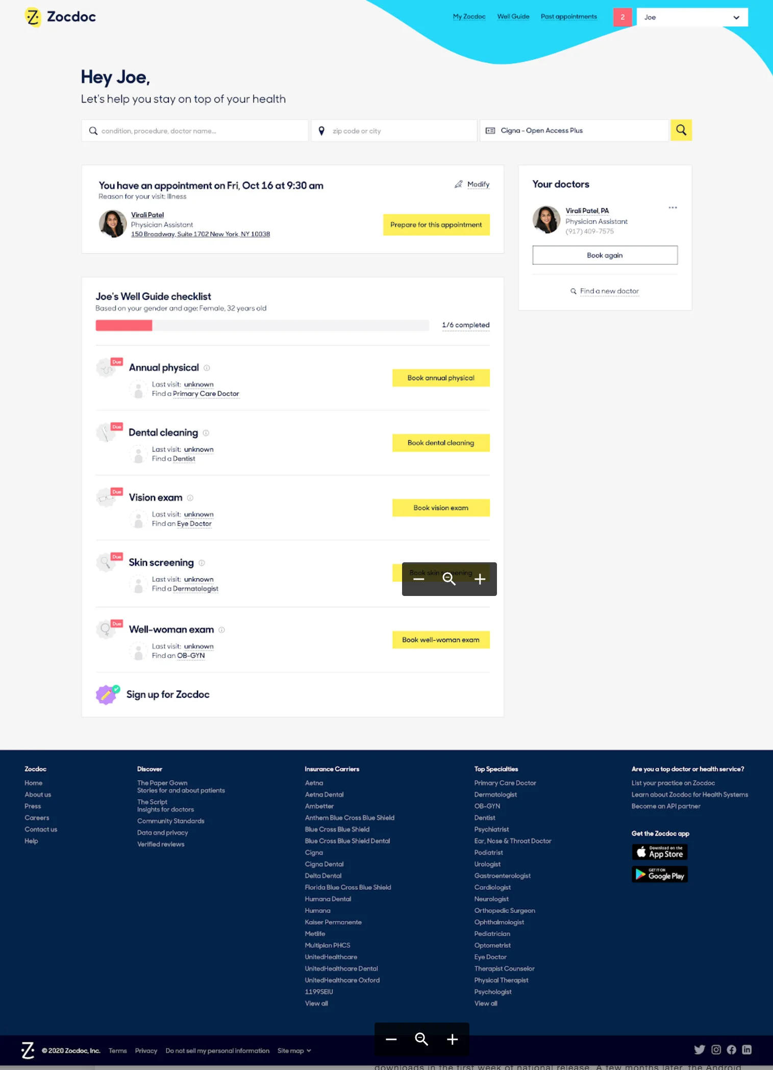
The old Patient Home
The solution:
By thoughtfully integrating Zocdoc’s core values into the Patient Home experience, we shipped a more guided, value-driven Patient Home experience for both desktop and mobile web platforms. Not only were we able to showcase the value Zocdoc brings patients in managing their health, users now had a better sense of how and why to use these features, and ultimately return back to Zocdoc in the future.
The Patient Home experience as it stood, as seen as a first-time user.
Align and analyze
Our overarching hypothesis served as an umbrella for smaller sub hypotheses. By providing our first-time bookers with a more complete view of how Zocdoc can help them manage their health, we believe they will better understand Zocdoc’s value and make them more likely to engage, return and book more appointments.
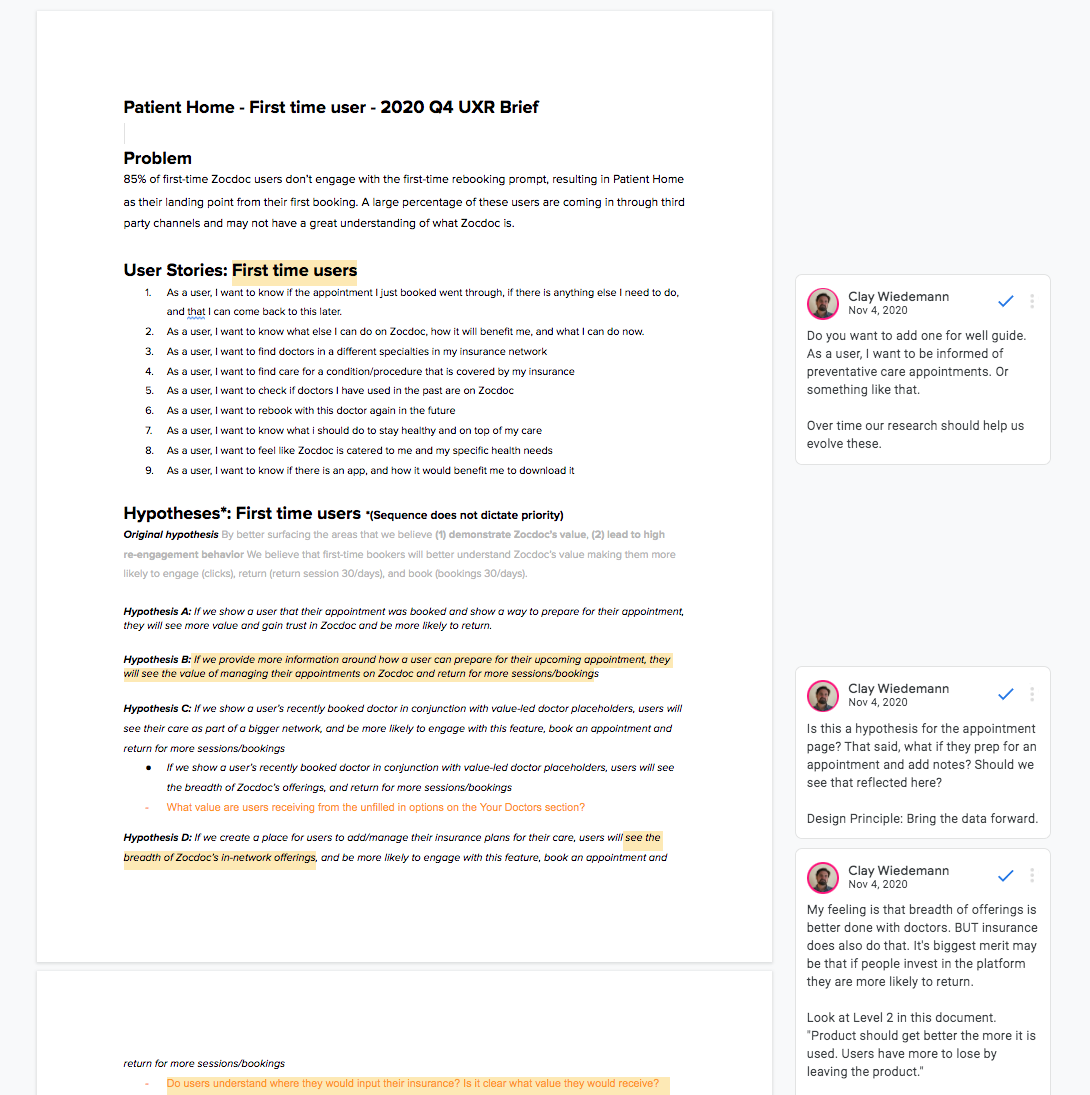
I wrote out user needs and hypotheses to make sure I wasn’t losing sight of what the user needed and expected in this critical post-booking moment.
A more complete view
Analyzing prior foundational research helped the team generate a number of assumptions. A larger previous rebooking study uncovered a trove of data as to why our users weren’t coming back to rebook with Zocdoc. Utilizing these learnings, the team aligned on a group of user-centered themes that served as a framework for our approach:
Easily find and book a doctor
Effortlessly track your preventive care
Conveniently store your insurance information
Quick and accessible (Download the app)
Manage and prepare for your upcoming appointment
I believe the design goal should encompass both the business and user goals. It was imperative that the experience felt integrated and natural - not a page of marketing slogans and empty calls to action. It was going to take the right mix of messaging, data and utility to make this page feel personal, guided and intuitive.
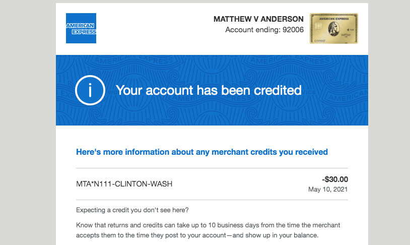
SCREENSHOTS OF COMPETITORS?
Competitive analysis
I gathered some inspiration to understand how others are currently solving for this similar space. Because the page has a multitude of offerings, I wanted to see how similar products balance competing features and message their value to their users. I was particularly focused on how others solved for upcoming visits/orders, reminders, to-do’s, as well as search and discovery.
Wireframing and iterating
Over the span of a sprint, I blocked and sketched a variety of concepts. The challenge here was exploring how far I could push the page, while engaging with engineering and product to make sure we were all aligned its on tech and product implications.
Explorations
I iterated on various concepts. Because the page needed to feel like one cohesive story rather than a collection of features for our users, I looked into ways to combine and build value onto existing features. I looked at how could we build awareness, trust and guidance through the page’s structure at different moments in the user’s journey. I wanted this new experience tailored to the user’s needs right when they needed it. How could I make our value and product feel intertwined?
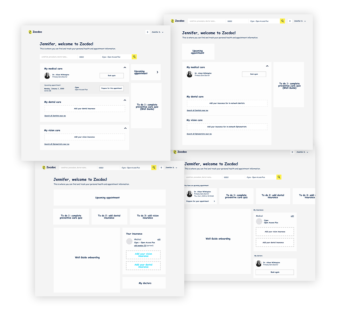
This stage was also critical in how far we pushed the current feature structure and scope. I met with engineering and product wanted a low-as-possible-cost solution, and as the designer, I naturally wanted to see how far I could explore. In the end, we struck a compromise: test a closer version to our IA against a “bigger bet” in transforming the page with a couple of users, and see what we learn.
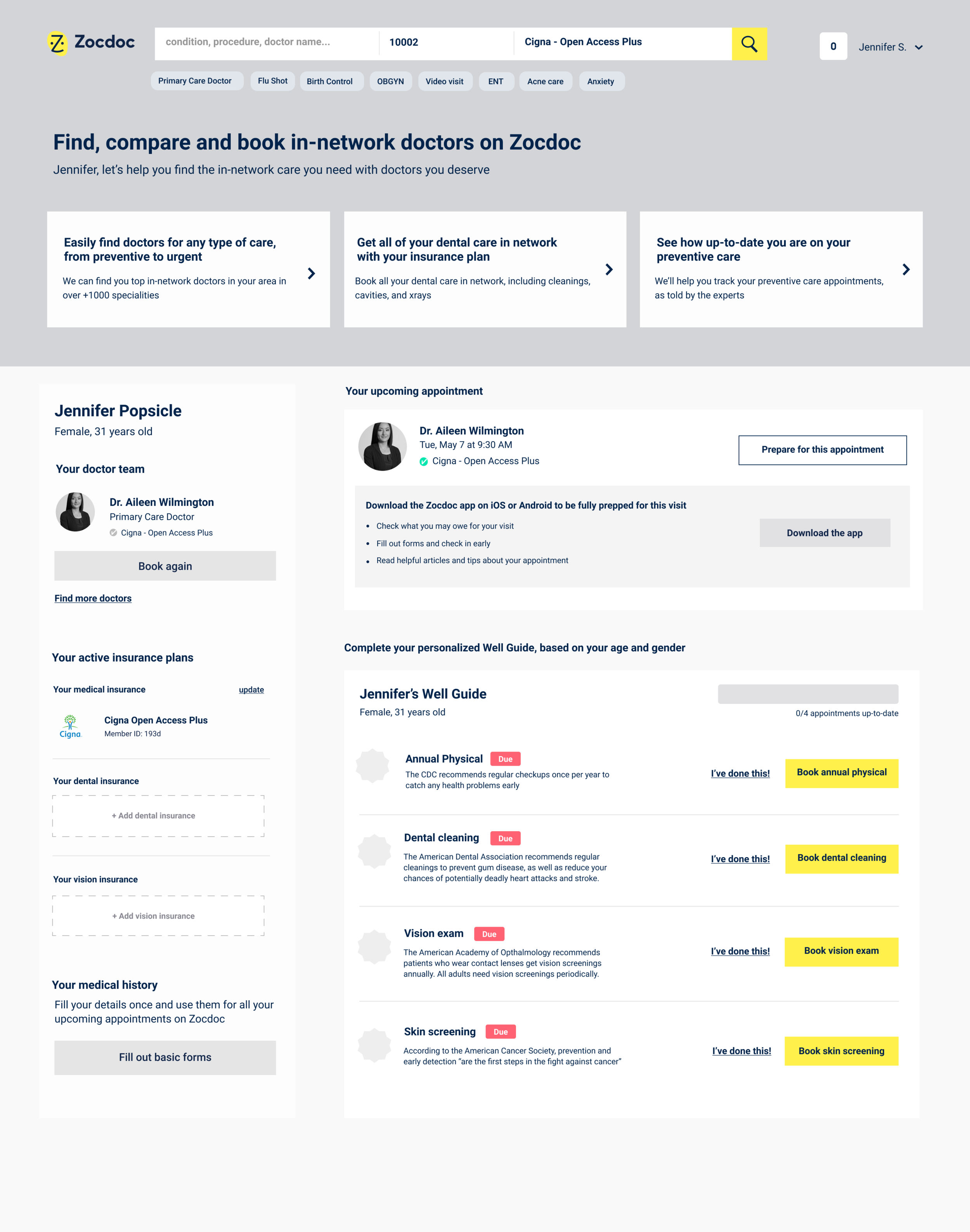
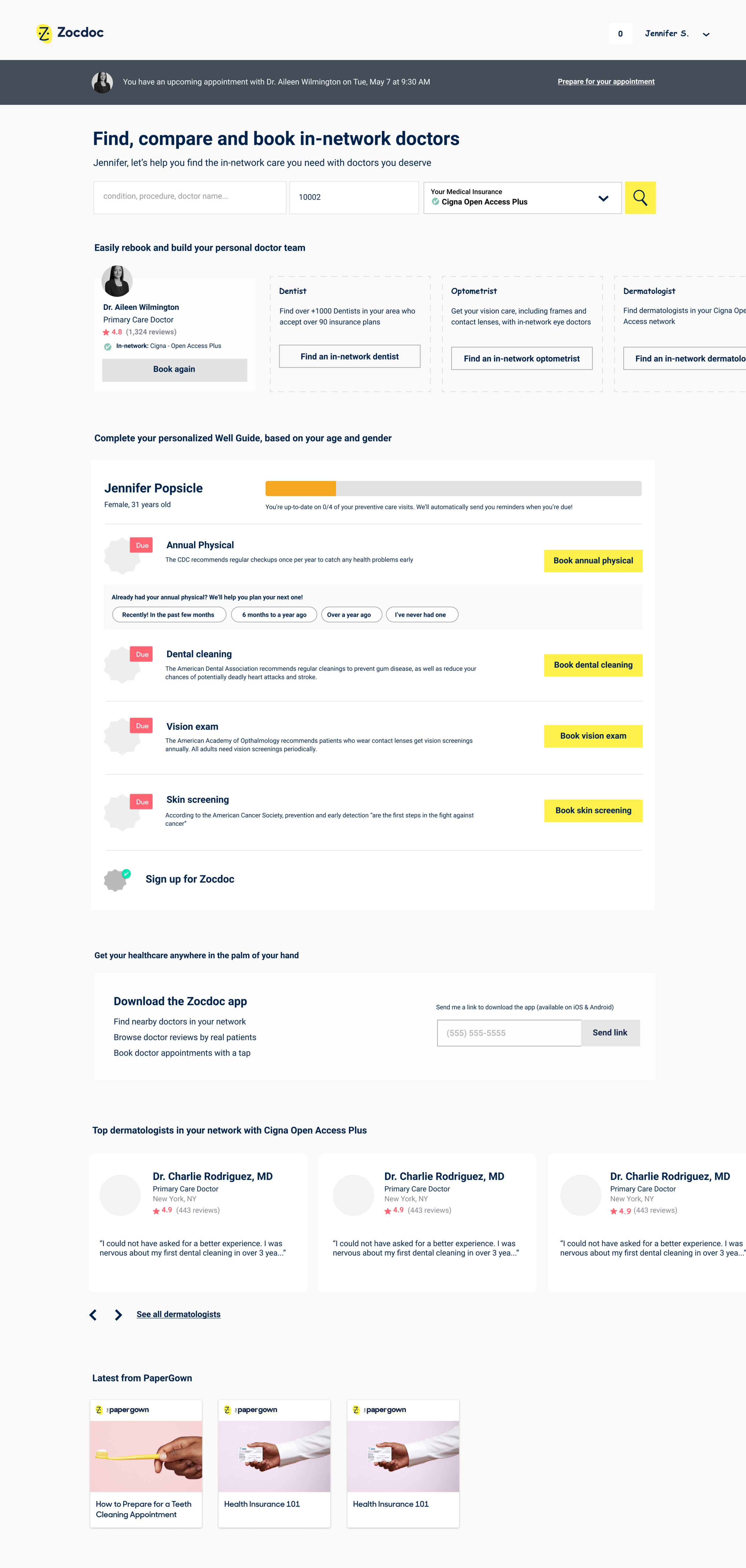
Prototypes, usability & insights
After narrowing down what we felt were the most promising directions, I wrote a research brief that outlined what we hoped to learn from each design. It was important to not only get a sense of the page’s usability, but how the messaging and frameworks helped to showcase the values we were trying to promote.
I created three prototypes (including the page’s current design) to test in front of users. Because these were unmoderated, we needed to remove any unnecessary distraction.
Going in, we had a number of open questions we hoped to uncover, including:
How much information do our users need at this moment?
What role does personalization play in driving engagement?
What types of information do they find most valuable?
Do elements like prompts and progress indicators encourage engagement and provide guidance? Do users understand it?
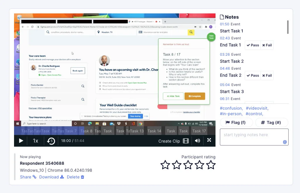
I notetook and transcribed each session and presented key relevant findings to the team.
Key insights
We took away several key findings that both helped validate and re-chart a few of our assumptions.
Users want simplicity and clarity in this moment - not to be overwhelmed with information.
I had the assumption the old patient home felt simple, but also bare. What users really want is the information they need, but it needs to be essential and not distracting or stressful.
Users want to feel the information is personalized to them and delivered in a helpful, conversational way.
Users were attracted to moments of personalization and personable messaging. Little details like name and age as well as the messaging around their upcoming appointment made users feel as though this experience was tailored for them, adding a sense of trust.
Users want cues, “shortcuts” and overall convenience in grouping, adding and referencing their information
Users liked anytime we could bring information forward, like the third-party recommendations of the Well Guide. They also liked the moments we suggested specialties they could book. This affirmed our assumption that users wanted some type of guiding hand.
Design, refine, repeat
After synthesizing these findings, it was time to bring all our learnings to bring the page to life. I knew that UI would play an important role on this page. With so many competing features and call-to-actions, I needed to be thoughtful and intentional with the page’s visual language, as well as the reality of tech and product constraints.
Patient Home
After synthesizing these findings, it was time to bring the page to life. Not only was I excited to give the page a much needed facelift, but I felt ready to apply our learnings and data to the page. I needed to be thoughtful of the page’s visual language. Primary yellow CTAs had to be intentional and important, illustrations and visual complexity needed streamlining. How could I make our value and product feel intertwined?

Working closely with our brand team, we toned down illustrations while at the same time humanizing the page. Knowing when the user more context where needed and when to pull back came from a delicate balance of our user’s and businesses’ needs.
Greeting and search
Value: Easily find and book a doctor
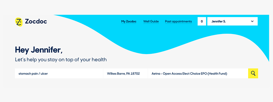
Old
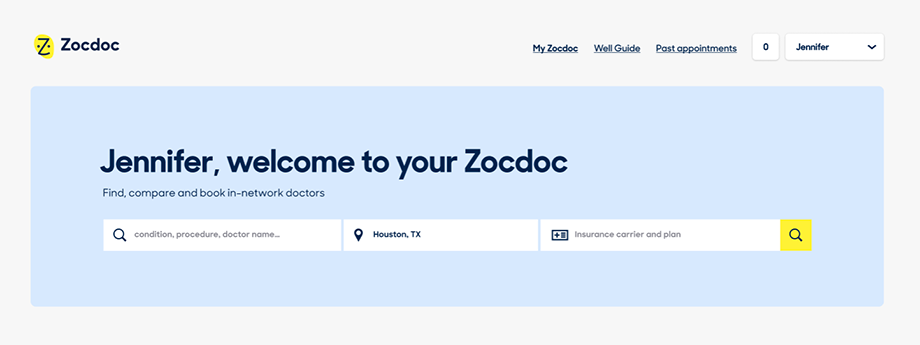
First impressions matter, and the top of Patient Home felt suboptimal in setting up the rest of the page for success. We say “Let’s help you stay on top of your health” but don’t provide a clear way of doing so. Additionally, the swirling blue shape visually draws the eye straight up to the site’s navigation and away from the important meat of the page.
New
We updated the greeting to better communicate Zocdoc’s crowning value as a product. “Find, compare and book in-network doctors” is not only less ambiguous, it ties perfectly to the search bar below. To solve for technical constraints around any visual updates to the search bar itself, I added a solid updated brand blue to make it pop and give some focused breathing space.
Upcoming appointment card
Value: Manage your upcoming appointments
Old
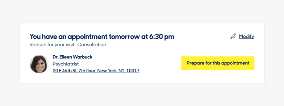
The old upcoming appointment card had a lot of useful information that users respond well to. However, it was struggling to adapt to newly minted features, like the Pre Appointment and Insurance Guides. Additionally, the number of CTAs on the card distracted from the other items on the page.
New
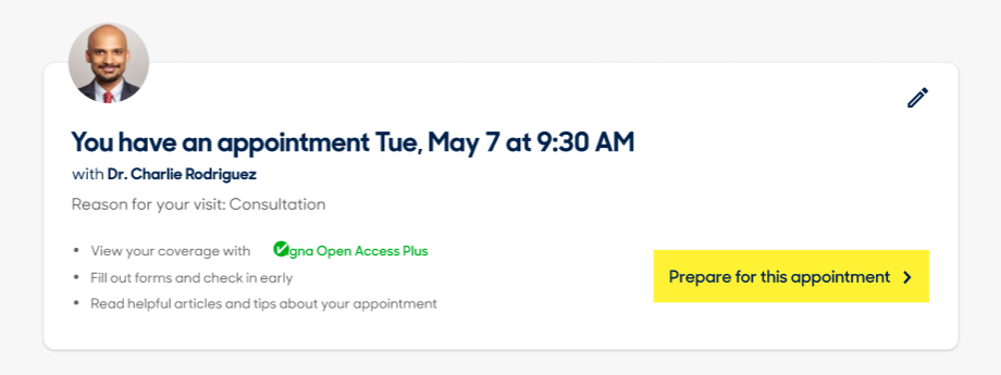
The new upcoming appointment card is a prime example of solving for both our user and business needs. This moment was not only more guided and simplified for our users, it thoughtfully nudges them to explore other parts of the product.
My Care Team
Value: Easily find and book doctors
Old
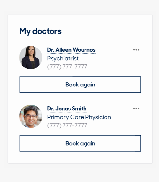
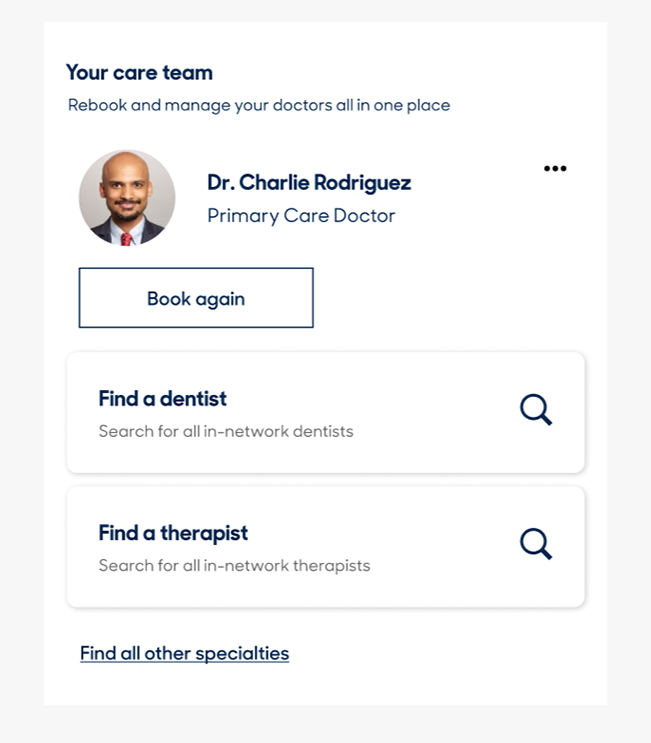
One of Zocdoc’s strongest capabilities is keeping track of all the doctors a user has booked with in one place. The old “My Doctors” feature poked at this ability, but fell short in helping users understand what other types of doctors they could find and add to their team.
New
Changing “My Doctors” to “Your Care team” + “Rebook and manage your doctors all in one place” pushed the idea that this section is meant to be a personal, curated list of care rather than just a log of past doctors seen. Adding additional dynamic speciality search cards drove our goal of suggesting to users what different types of care they could find on the site - from dentists to therapists.
Well Guide
Value: Effortlessly track your preventive care
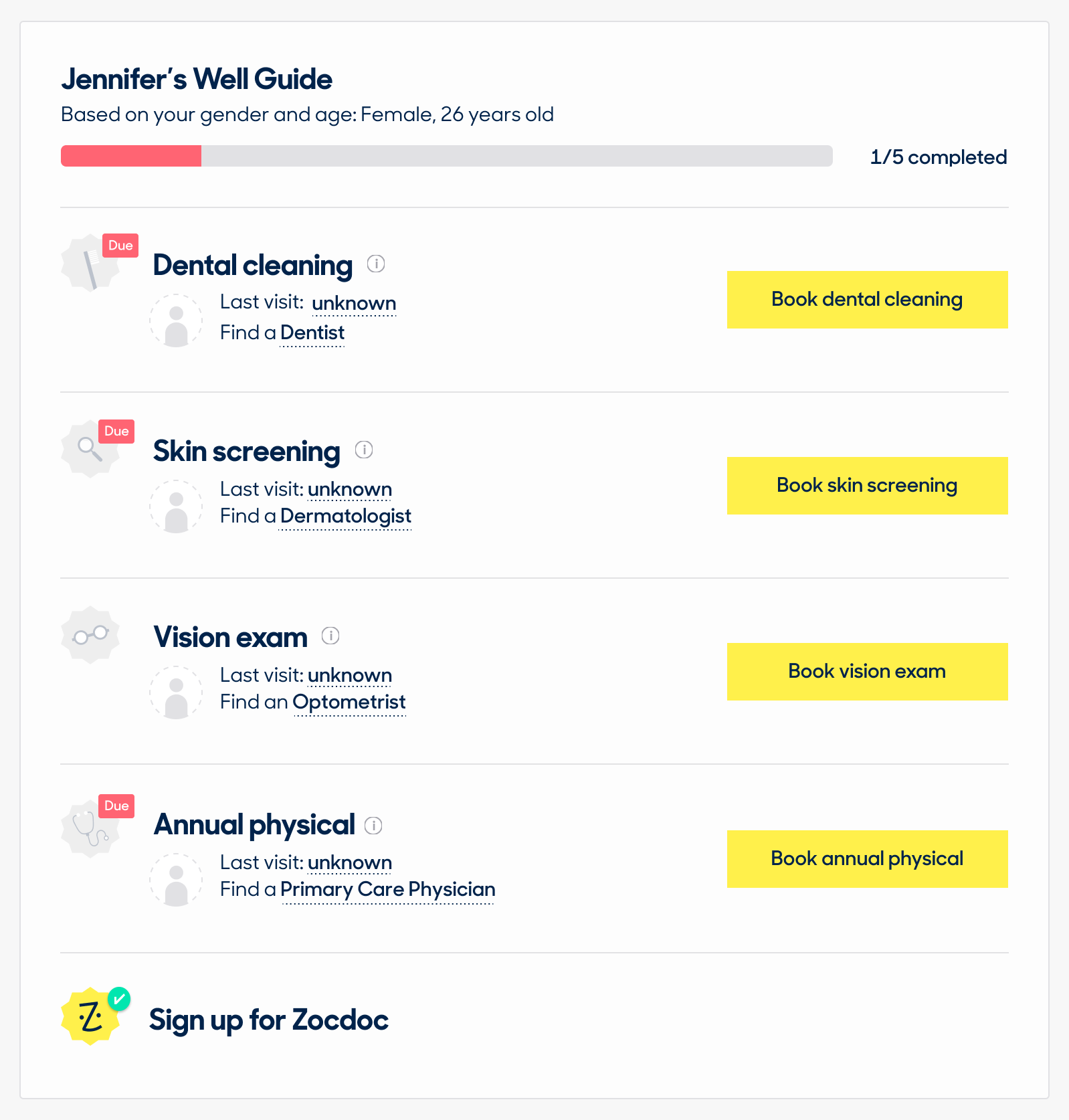
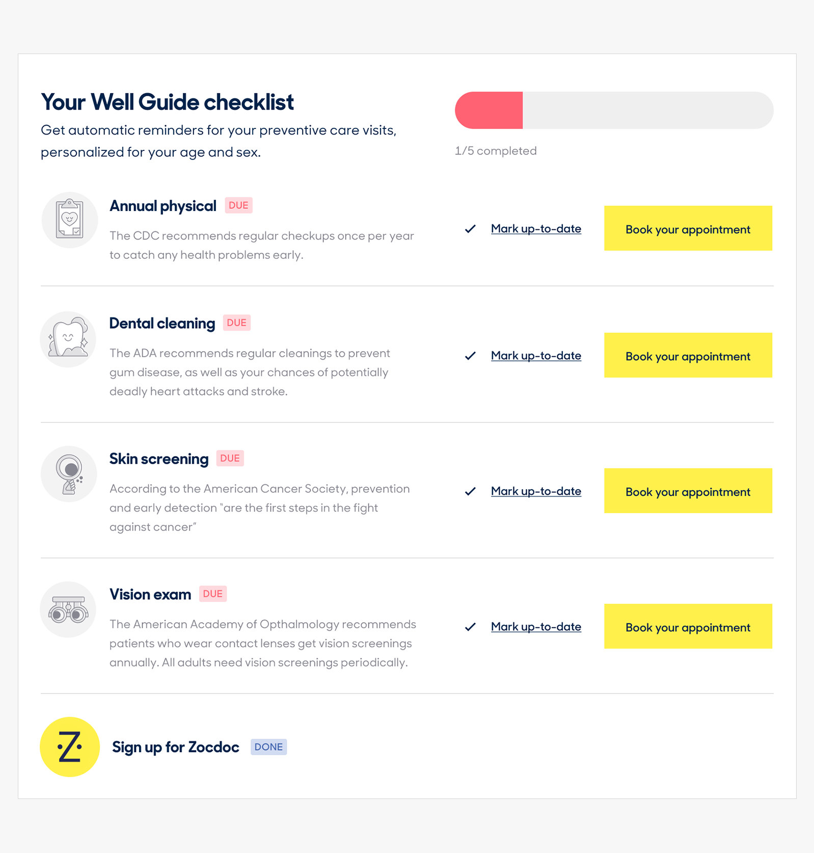
Well Guide appointments are based on recommendations by third-party sources like the CDC and American Cancer Society. Its an incredibily valuable tool to help remind users of their due preventive and personalized care appointments.
Old
While the current experience attempted at conveying a personalized experience, it lacked clarity into why these appointments were important, and why a user should track, let alone book them. Redundancy in points of entry combined with lack of guidance and color overload made this section more confusing than it needed to be.
New
By bringing forward these third-party recommendations, new users have more context around what these appointments are and why they should book them. Thoughtfully thinking about this feature’s permutations, like when an appointment is up to date, was equally important closing the loop on how this appointment and the doctor you chose to have it with create a symbiotic relationship on the platform.
Insurance
Value: Conveniently store your insurance information
Well Guide appointments are based on recommendations by third-party sources like the CDC and American Cancer Society. Its an incredibily valuable tool to help remind users of their due preventive and personalized care appointments.

Old
This feature did not have any visibility on the old Patient Home experience. As it stood, a user could only update or add their insurance information through search or deep in their settings in the top nav. Time and again we’ve found through research that finding doctors in-network is a key part in a patient’s decision-making process while getting care.

New
Introducing this feature on the new Patient Home screen not only highlighted the different types of insurances they can book with on Zocdoc, but also put users more in control in selecting and maintaining their plans.
Download the app
Value: Quick and accessible
Not all of our values needed to live as static features on the page. While we tested “Download the app” CTAs with our participants, we found we could better utilize our “Quick and accessible” value theme in more specific moments of our users’ journey. Focusing on like the Pre Appointment Guide and, As the team continues to iterate on related features and experiences, “Download the app” feature
Old
This feature did not have any visibility on the old Patient Home experience. As it stood, a user could only update or add their insurance information through search or deep in their settings in the top nav. Time and again we’ve found through research that finding doctors in-network is a key part in a patient’s decision-making process while getting care.
New
Introducing this feature on the new Patient Home screen not only highlighted the different types of insurances they can book with on Zocdoc, but also put users more in control in selecting and maintaining their plans.
Mobile Web
Because X% of our first time traffic comes from mobile web, it was important to think how the page would respond to a smaller screen size, and what information was essential to both experiences. Luckily I was able to craft the designs in a way that offers a seamless cross-platform experience.
SHOW LONG MOBILE WEB AND POINT TO IT LIKE A CHART?
Old
This feature did not have any visibility on the old Patient Home experience. As it stood, a user could only update or add their insurance information through search or deep in their settings in the top nav. Time and again we’ve found through research that finding doctors in-network is a key part in a patient’s decision-making process while getting care.
New
Introducing this feature on the new Patient Home screen not only highlighted the different types of insurances they can book with on Zocdoc, but also put users more in control in selecting and maintaining their plans.
Implement and ship
Working directly with engineers, I set up weekly check-ins to review their progress on the page’s different components, as well as answer any open usability/edge case questions. Of course, working remotely, my Slack “office” was always open in case these questions arose sporadically.
By keeping a regular design QA cadence, the team able to address issues and concerns early and often.
Outcomes & lessons learned
Looking back on the project, I think one thing I would have done differently is push harder for moderated, rather than unmoderated user research. Due to resourcing constraints, unmoderated studies gave us the biggest “bang for our buck”, but the tradeoff of not being able to follow up on certain user responses, no matter how well you prepare, feels like some opportunity was lost. That said, we were comfortable enough in our participant’s responses to create final product we felt confident in. This project was also a great practice in systemic visual design. Our design team is currently underway in revamping our visual style to one consistent system, and this project served as a good candidate for testing its limits.
Next steps
While we weren’t able to add everything we tested with our users, we have plans to follow up on these additional features based on Zocdoc’s business strategy. Zocdoc’s new design system, Mezzanine, will further iterate and grow the visual language of Patient Home.