Shake Shack Kiosk
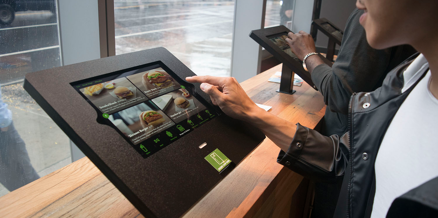
Shake Shack is a New York based fast-casual dining chain serving customers across the world. In 2017, the company launched their first self-ordering kiosk restaurant in Astor Place, New York City. I had the invaluable opportunity to collaborate with the company’s digital innovation team to design and deliver an innovative experience that improves employee and guest experiences alike.
The challenge:
Create an intuitive, savvy user experience and interface that sets itself apart from the saturated, complicated kiosk experiences emerging across the fast-casual marketspace. We also needed to create a holistic experience that married the chain’s successful order-ahead Android/iOS applications. Oh, and reduce order time and beat the conventional cashier checkout process.
My role:
I served as lead experience and visual designer for the launch of this project. Working closely with PM, Engineering and User Research teams as well as client marketing and tech leads, it was a hugely collaborative project that spanned across multiple internal and external teams.
The solution:
In 6 months, my team and I created an elegant, guided, and personable self-ordering experience that transcends a wide range of digital literacy for every type of Shake Shack customer. From concept to implementation, we delivered a product that satisfied both customer and business needs in a radical new step in the company’s promise of enlightened hospitality.
Discovery
Working with my agency’s user research team, we set out a plan to understand the Shake Shack customer better. While I had the past experience of designing the company’s successful order-ahead app, designing a kiosk experience was going to be a different challenge that required a fresh perspective.
Checking out the competition
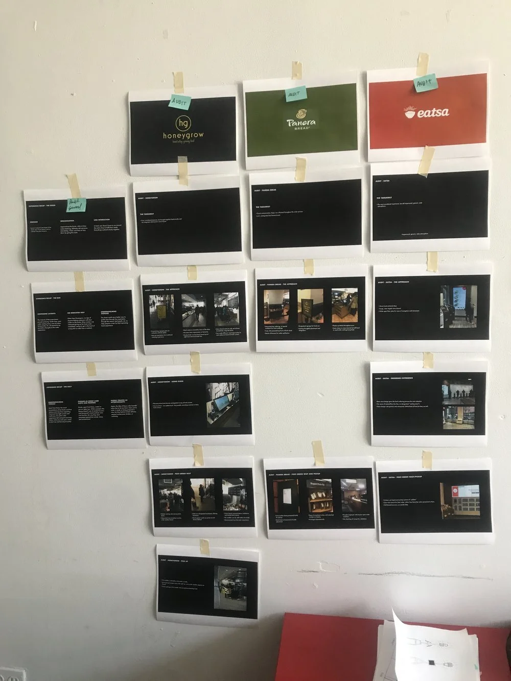
While the UXR team developed a research plan, I took it upon myself to leave our design studio and experience the physical journey of competitors and similar experiences. From McDonald’s to AMC theatres to bank ATM machines, I spent a few days visiting various restaurants and businesses that offered self-ordering services.
By notetaking on every part of the experience - from the size of the kiosk screens to where I should wait to pick up my food after ordering - every aspect of my real life user journey was considered and documented. Bringing back my findings to the team, we were able to analyze what parts of the experience weren’t working, and what could use improvement.
Understanding the customer
I assisted our user research team in field interviews with real-life customers. We knew the pilot launch of this experience would be in NYC, an edge case to a typical suburban order-ahead experience, but we wanted to make sure we spoke to as many different Shake Shack customers as we could.
Visiting different locations throughout New York and New Jersey, we targeted people of all ages and backgrounds, the team gathered invaluable first-hand needs, expectations, pain points and opportunities with Shake Shack diners.
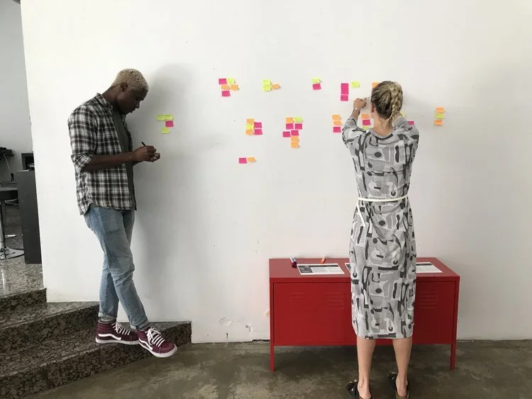
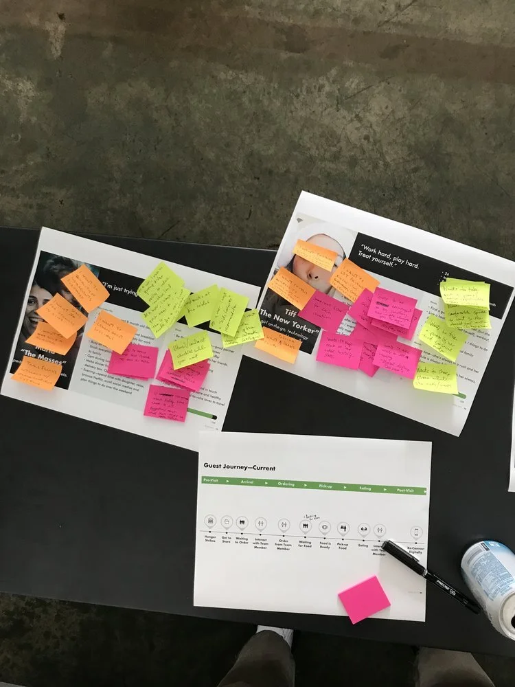
Back in the studio, I helped our UXR team note and affinity map user responses and build personas and user journeys to present to the Shake Shack leadership team. This was a key step in solidifying the needs of Shake Shack’s customers and building a foundation for the design of the experience itself.
Sketching & ideation
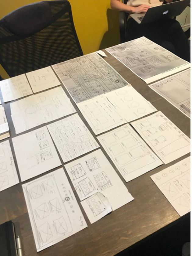
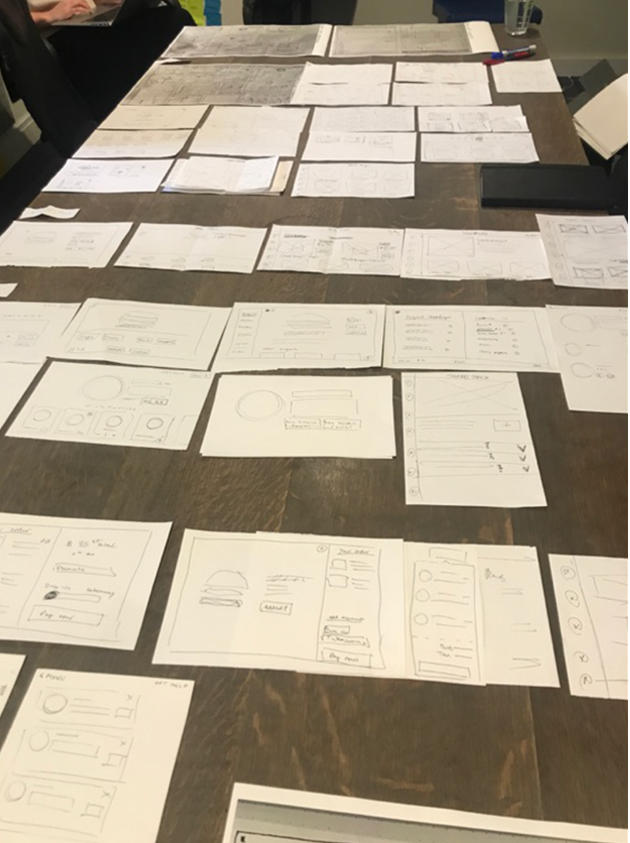
Once the team was aligned on the problems that needed to be solved, it was time to get to work and begin ideating on what this kiosk experience could be. As our research showed, ordering from a kiosk varies greatly from the experience a user has with the privacy of their phone or computer screens. The environment is hectic, crowded and loud. There might be a line of people behind you, adding to the stress of ordering off a menu that a user may or may not have familiarity with. Because of these additional challenges, there were a few things I needed to keep in mind when sketching out the experience…
Insights for ideation
Keep the experience and visual language refined and simple to meet the needs of those with all levels of “digital comfort”
Make use of large, tappable areas and clear next steps that intuitively guide the user throughout the order experience.
Always present the user with an SOS in case they get confused, lost, or stuck within the experience.
Allow a flexible system that accounts for ever-changing menu items, and solves for discoverability with minimal user effort.
Account for a variety personalized user needs like allergies, food preferences and alcoholic beverage purchasing.
Environmental design
In addition to the kiosk interface itself, I took it upon myself to consider the environmental design, and how that might impact the overall experience. From my own competitive audit, I quickly realized you could have a well designed interface and kiosk experience, but if you don’t know where to wait for your food, where to get help, or move about the physical space, the experience will greatly suffer. While none of these designs ever left the sketch pad, Shake Shack’s internal team did a great job at delivering a seamless in-shop experience.
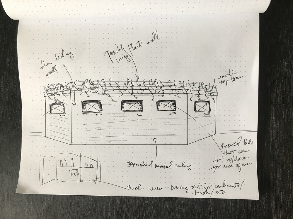
Every physical Shake Shack location prides itself on integrating into its neighborhood environment. Creating mood boards and sketches, I examined challenges like wait-lines, kiosk casing, digital wall boards that could exist in the new location’s physical space.
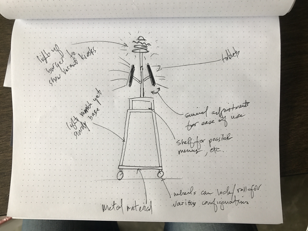
To solve for ever-changing restaurant capacity and customer limitations, I brainstormed how the experience could be modularized for those with ADA needs and crowd surges, all the while celebrating the inclusivity and integration of the Shake Shack brand.
Construction begins
As construction on the new restaurant began to take shape in Astor Place, so did the digital interface in Brooklyn. Borrowing and expanding on the visual system of the order ahead applications, I explored the more nuanced considerations and interactions in hi-fidelity format.
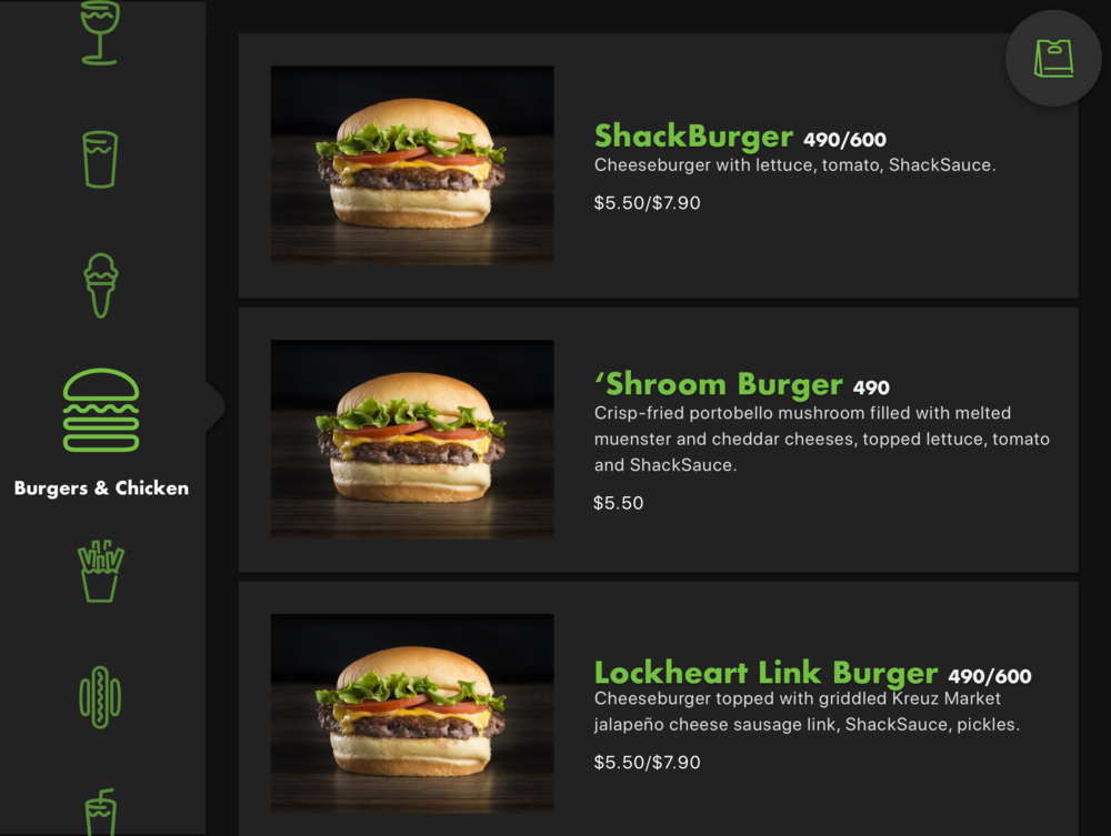
Because the team landed on iPads as the instrument of use for the kiosk - both a time and tech sensitive decision. Where McDonalds had the size of a flat screen TV, I only had a small iPad display size to reflect the chain’s broad menu and customizable configurations.
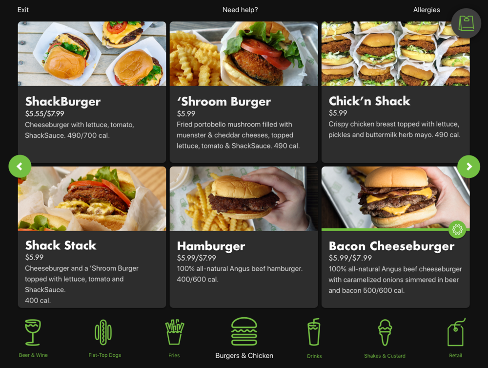
Working with a smaller screen size than most of our competitor’s applications meant the risk of fewer options at a first glance - hence more “scrolling” to find a selection. While I wanted to minimize as much of this as I could through the UI, it became clear that the vast amount of information on one screen became hectic and overwhelming. In addition, each menu category could hold anywhere from 3-12 items at a time depending on location, so it was key to make the interface flexible and modular for edge cases.
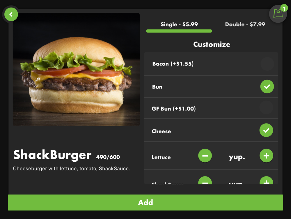
A key learning from the order-ahead app’s challenges was how customization affects kitchen productivity. There needed to be the right balance on how “inviting” to make customization options for user’s orders, particularly for allergies, while at the same time being sensitive to the kitchen’s speediness and productivity.
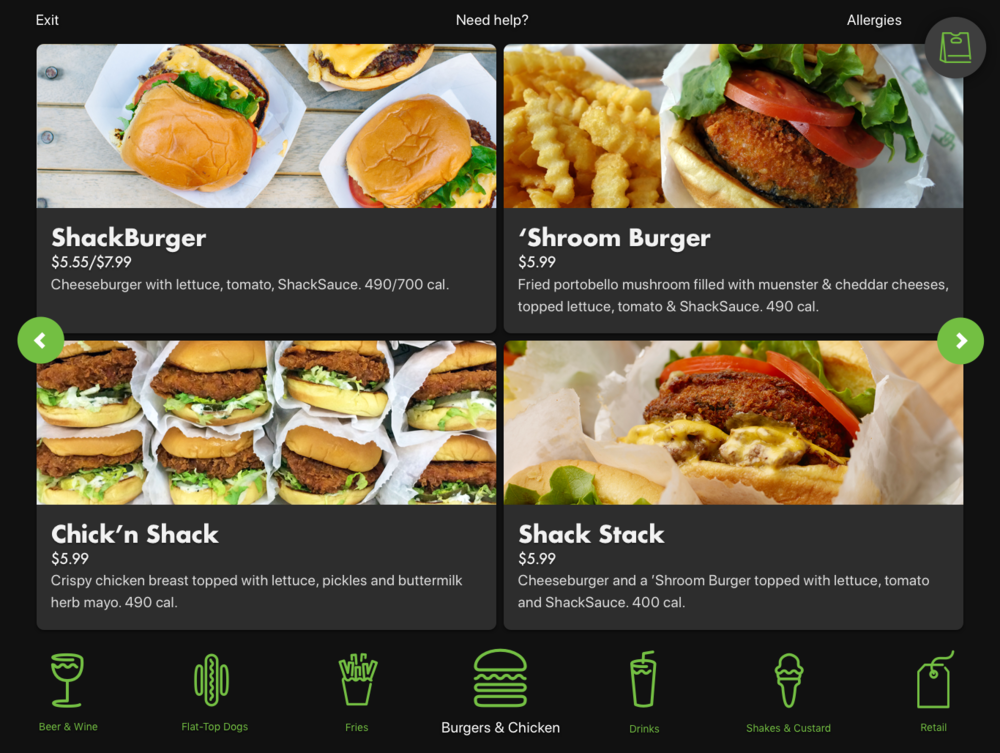
Close inspection of the menu structure, card styles and type legibility was slowly bringing the designs to the right place. However, something still wasn’t right. The text clearly described the menu items, but the company’s product shots felt hectic and unruly. I knew that part of the success of this UI was to overhaul the way Shake Shack presented its menu items visually. I made a concerted case to the client as to how a more uniform, simplified product photography set would not only help the interface design, but the user’s ordering journey as well.
Product photography
Because Shake Shack’s online and in-store menu structure never involved product photography, there had been no initiative at the company to create a holistic set of images that accurately depicted the items on the menu. One of Shake Shack’s differentiators as a fast-casual chain is showing real food - often from real customers. No hairspray, no plastic cheese. Just straight from the kitchen and onto the tray. This endearing quality is key to the brand, but manifested some unruly behavior.
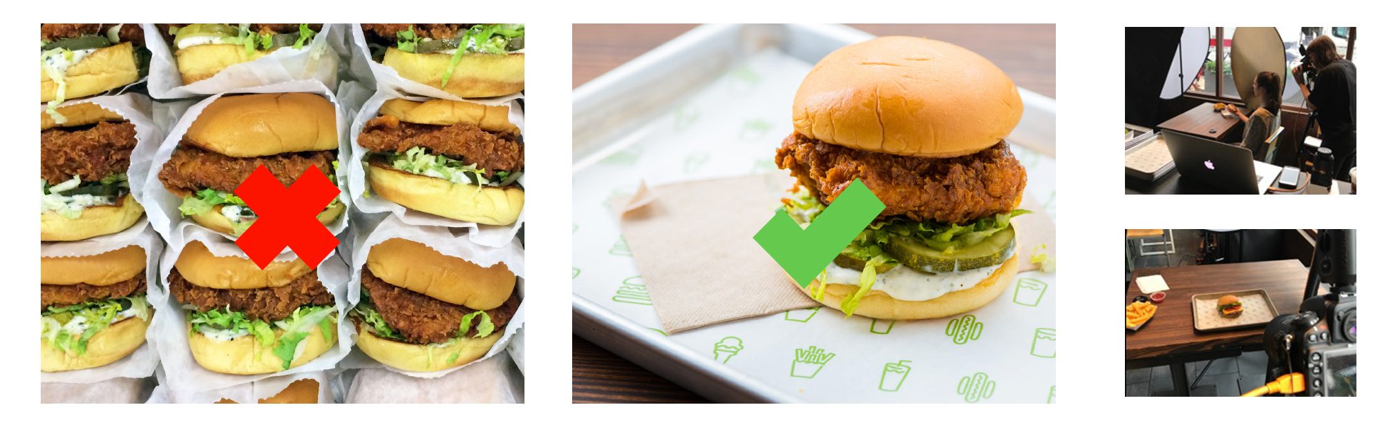
If a user is ordering a Chick’n Shack Burger, having an image of 9+ stacked Chick’n Shack Burgers not only adds to the visual overload, it also places more cognitive load on the user - am I ordering 1 or 9 Chick’n Shack Burgers with this selection? Do fries really come with this order?
As a result, I spent a week in a real Shake Shack location assisting the art direction for hundreds of combinations of food images. By quickly implementing the test shots into my designs, I was able to work with the brand’s creative team and photographer to create a holistic, simplified view of the brand’s full arsenal of products.
Final designs
With the new product shots fresh from the digital kitchen, I was able to put the final touches on a mouthwatering, guided user experience and interface.
Main menu
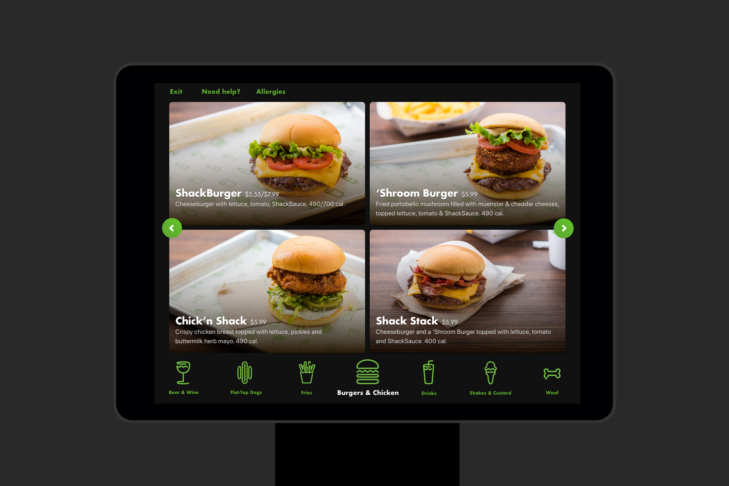
Full-bleed, large tappable cards and scrollable navigation presents users with even the fattest finger taps a clear picture of the vastness of the Shake Shack menu, while not overwhelming them with options and directions.
Bag view
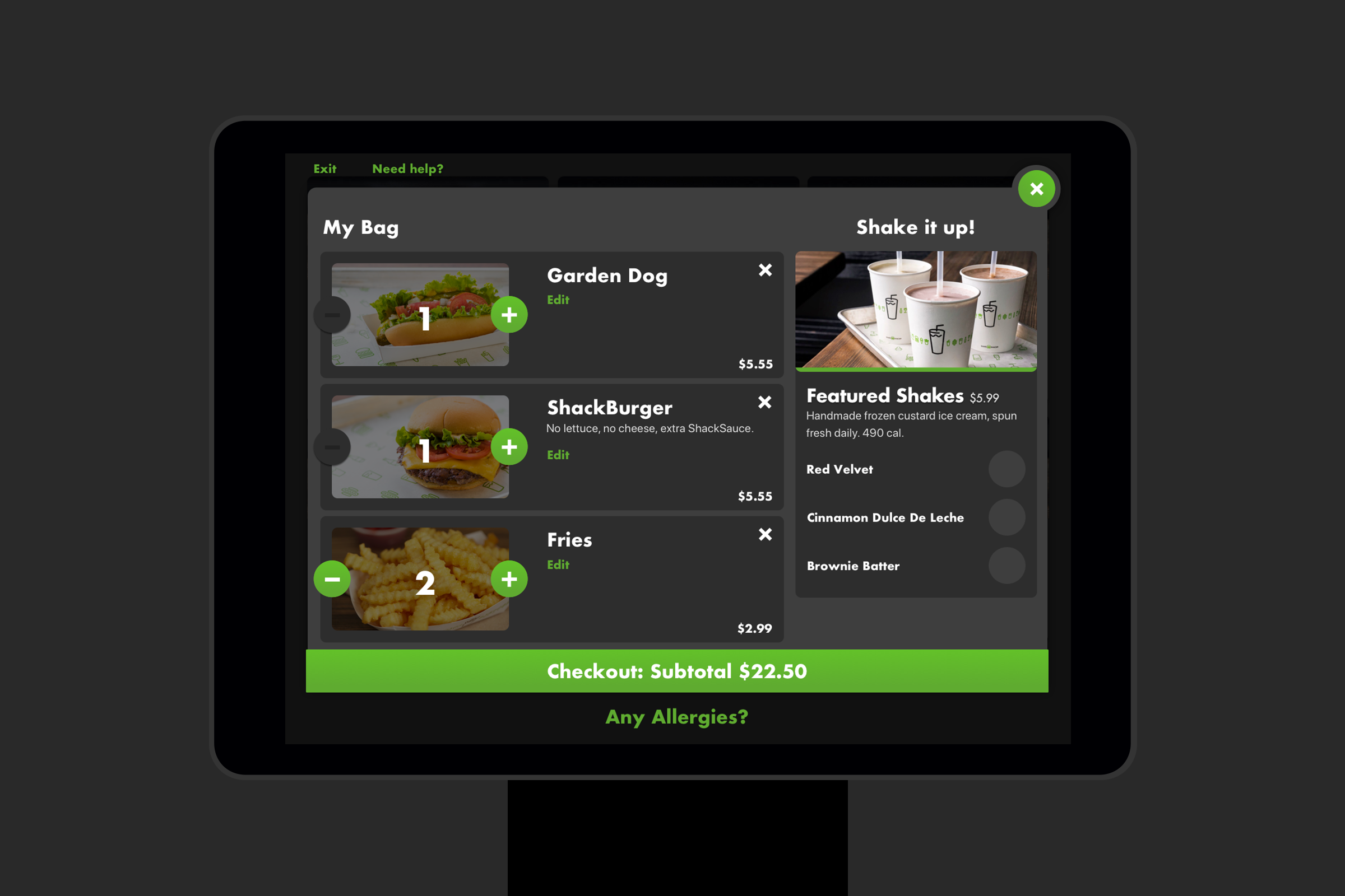
Using a standard bag/checkout interaction puts users’ minds at ease. Always keeping the user in control of their order through adding, removing and editing their order at this stage of the flow was just as important as clearly conveying price transparency. For Shake Shack, utilizing space for enticing product upsells created a moment of added revenue that a traditional checkout experience didn’t offer.
Item view
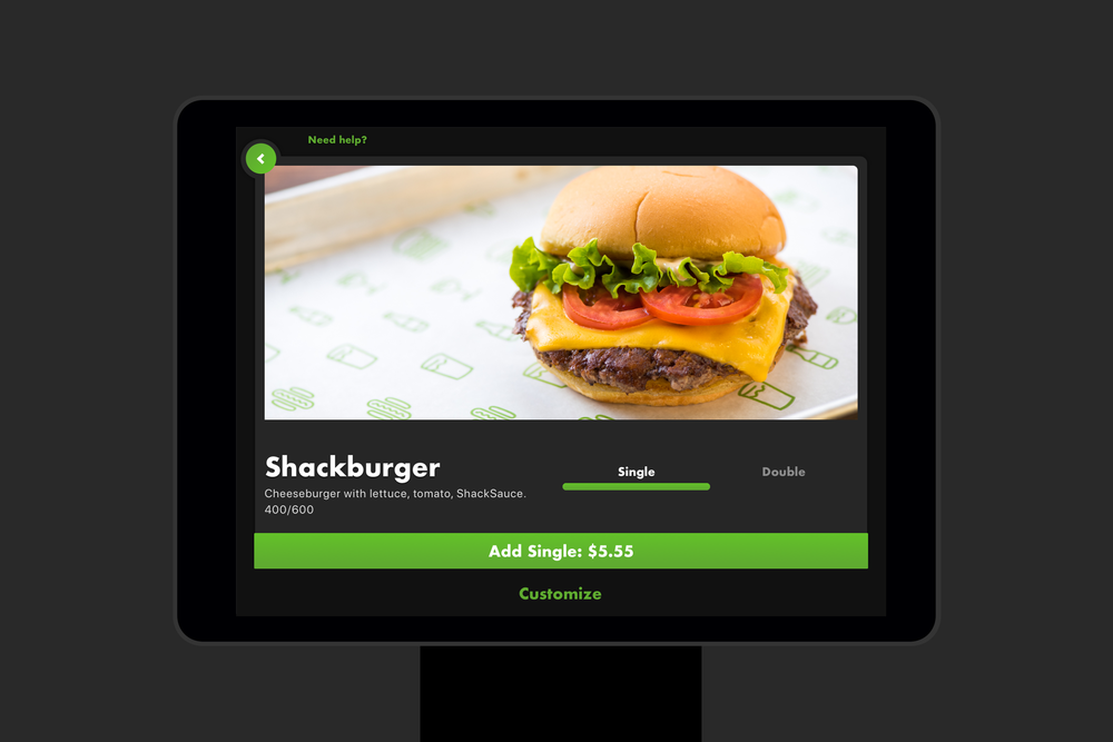
Tapping on any of the various menu cards opens up a detailed item view, where a user can quickly add their selection, choose between high-level sizing options, and easily customize their item.
Customization
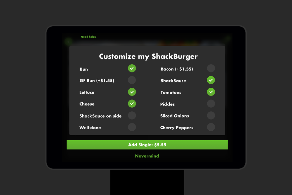
Tapping the customize button seamlessly opens a full screen modal view, where a user can choose from a variety of pre-populated customizable options. No cheese? No problem. Just uncheck. Want to add bacon? You’ll know exactly what the extra charge will be by a real-time price update within the “Add Item” button before submitting your selection.
Micro interactions
I wanted the personality of the UI to match Shake Shack’s identity, provide clear feedback, as well as create a delightful experience for users.

The sliders stretch

The buttons bloat
The system
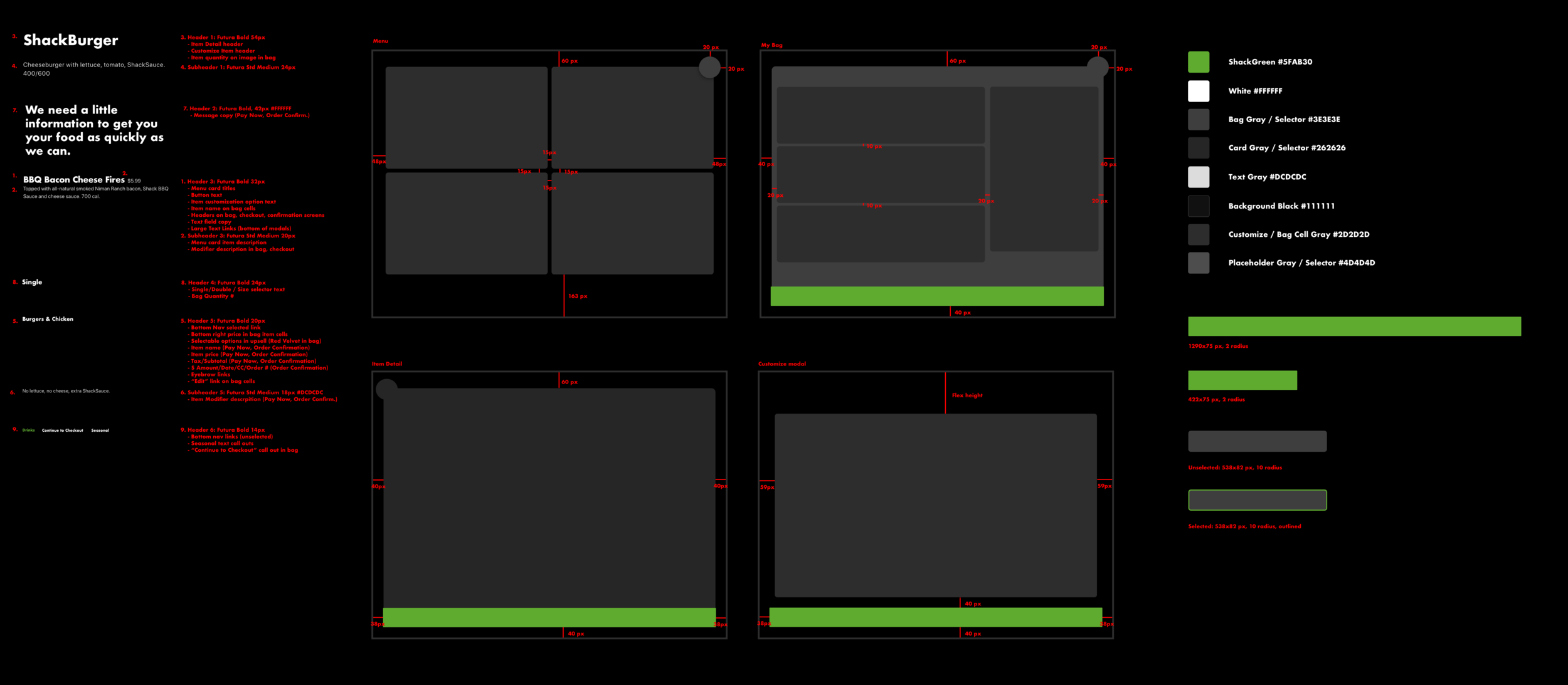
Just because this product had to be robust in its efforts doesn’t mean it can’t be simple. By creating a highly-refined user flow and visual language, the entirety of the kiosk experience broke down to four core screens. Shake Shack green was reserved for main action items, and type hierarchy was kept minimal to add to the simplicity of the experience.
Admin support
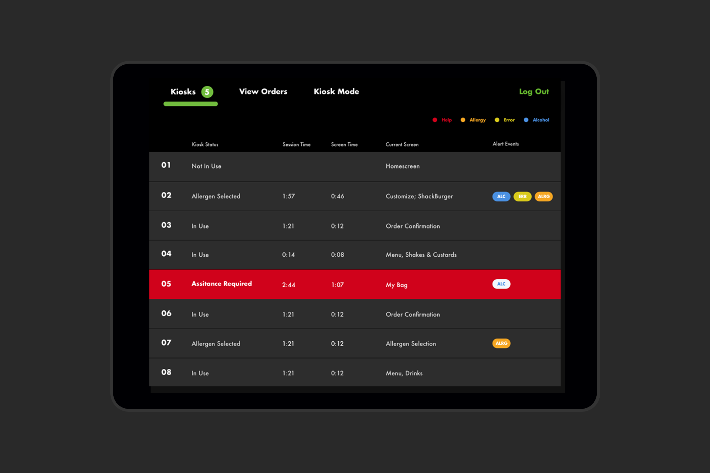
The backend admin support was one of the final stages of this project. From bug reporting to ID-ing for alcohol purchases, Shake Shacks’ employees deserve just as intuitive an experience as their customer. Each equipped with their own iPads, these “hospitality champs” are on the floor every day with Shake Shack customers, adding a human touch to the kiosk experience. Through them and the admin support, customers can easily and more comfortable with this new world of food ordering where a friendly face is replaced with an interactive screen.
The outcome
The Shake Shack kiosk pilot went extremely well.The time-to-order metric decreased significantly, and resulted in a 15% higher average check size, opening up new revenue channels for the business. The scalable architecture and ease-of-use now allows Shake Shack to create a storefront anywhere–from a bar in New York to a tent at Coachella. The kiosk experience has expanded to Shake Shacks across the country, and together provide a trifecta of heightened ordering experience that marries with its order ahead application.