Rethinking ordering for the in-store experienceShake Shack Kiosk
Project overview
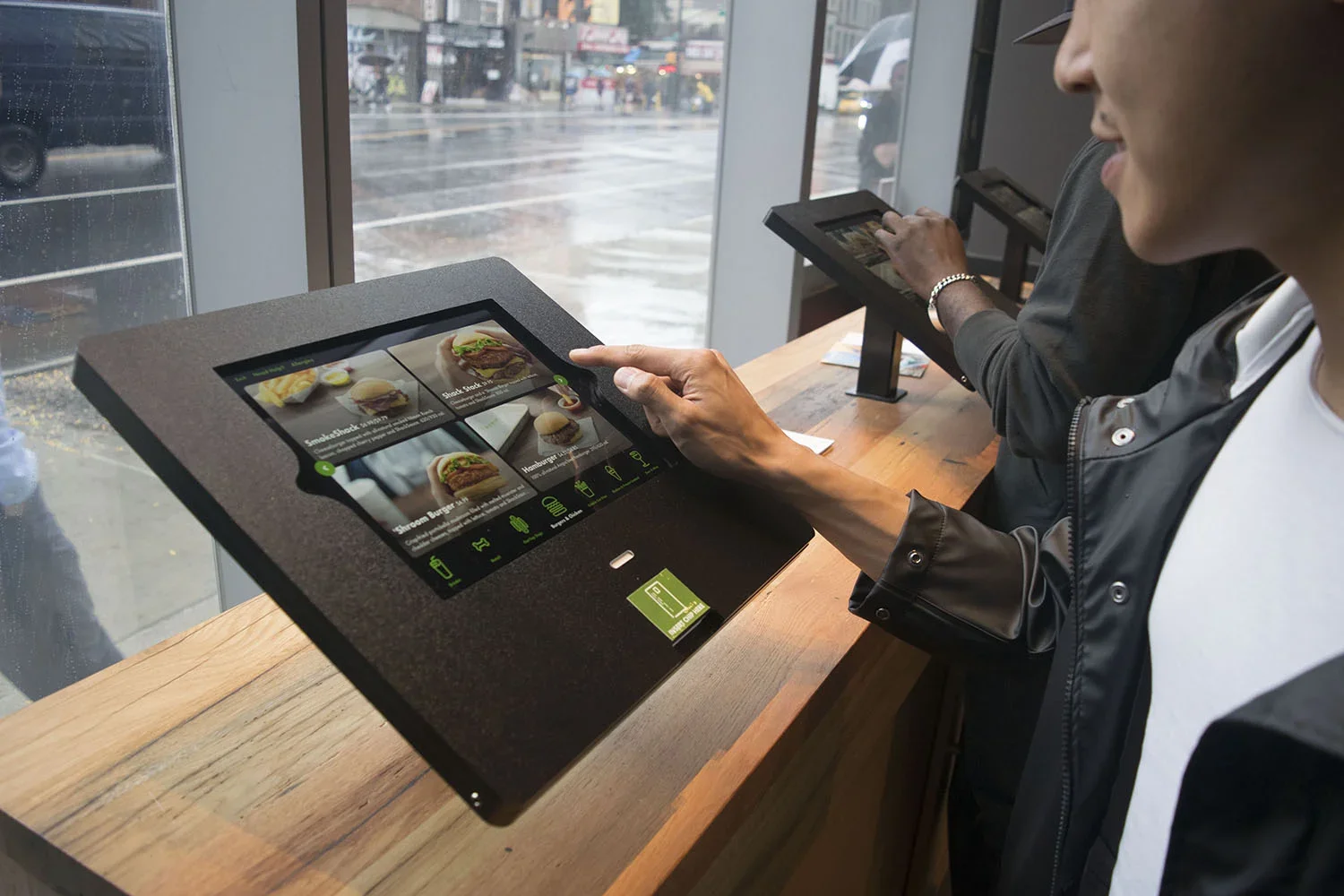
In 2018, Shake Shack opened its first self-ordering kiosk location in Astor Place, New York City.
Building on my work across Shake Shack’s order-ahead apps, I brought that understanding of the brand and ordering ecosystem into the kiosk experience. Working with a small team, I considered both the on-screen flow and the physical experience around it.
Role
Product Designer
Scope
Product design, interaction design, visual design, environmental exploration
Platform
In-store kiosk/ Apple tablet
Date
2018
The challenge
Shake Shack’s first kiosk had to do more than move the cashier flow onto a screen. It needed to make ordering faster and easier for a wide range of customers, handle a highly customizable menu, and still feel unmistakably like Shake Shack inside a busy restaurant.
The solution
A simple, highly visual ordering flow built around a small number of core screens, with large touch targets and customization revealed only when customers needed it. I also designed beyond the screen itself, considering kiosk placement, queue flow, photography, kitchen operations, hardware, and staff tools as part of the same experience.
Understanding a new way of ordering
Ordering from a phone or computer in your living room and ordering from a kiosk in a busy restaurant are very different experiences.
Through interviews, personas, and competitive audits, we looked at what customers expected from self-service ordering and studied experiences ranging from restaurant kiosks to ATMs and ticketing machines. We also considered physical factors such as kiosk size, line flow, and how the product would live inside the restaurant.
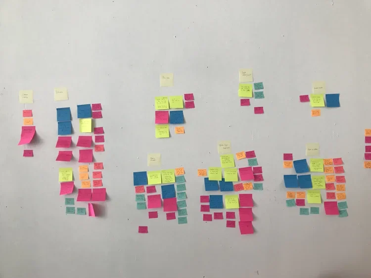
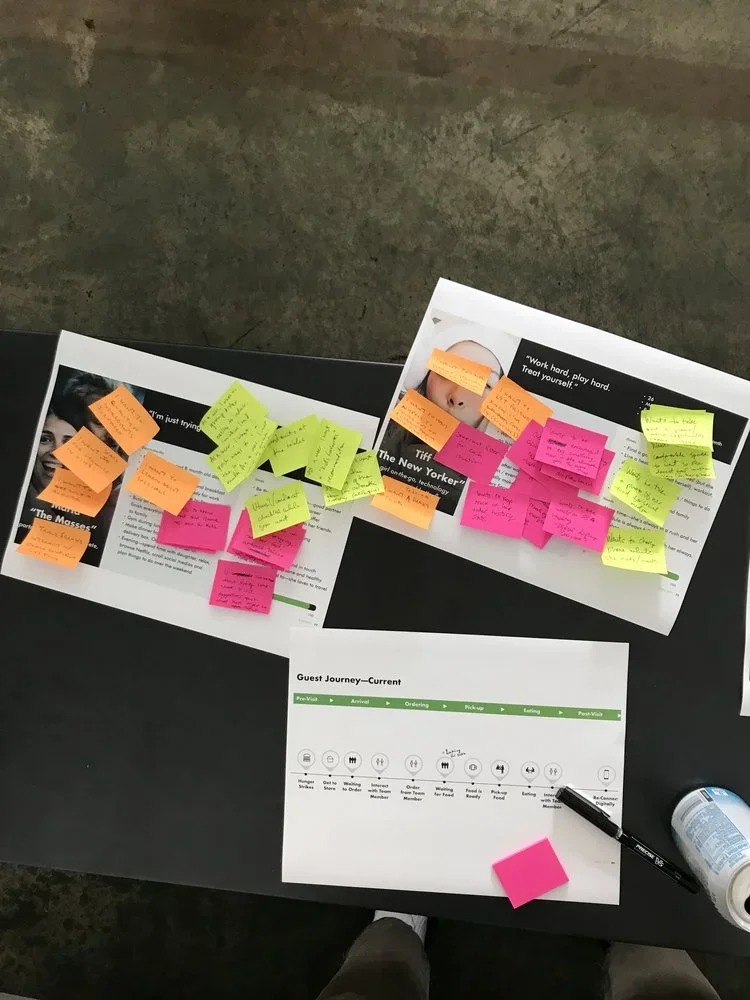
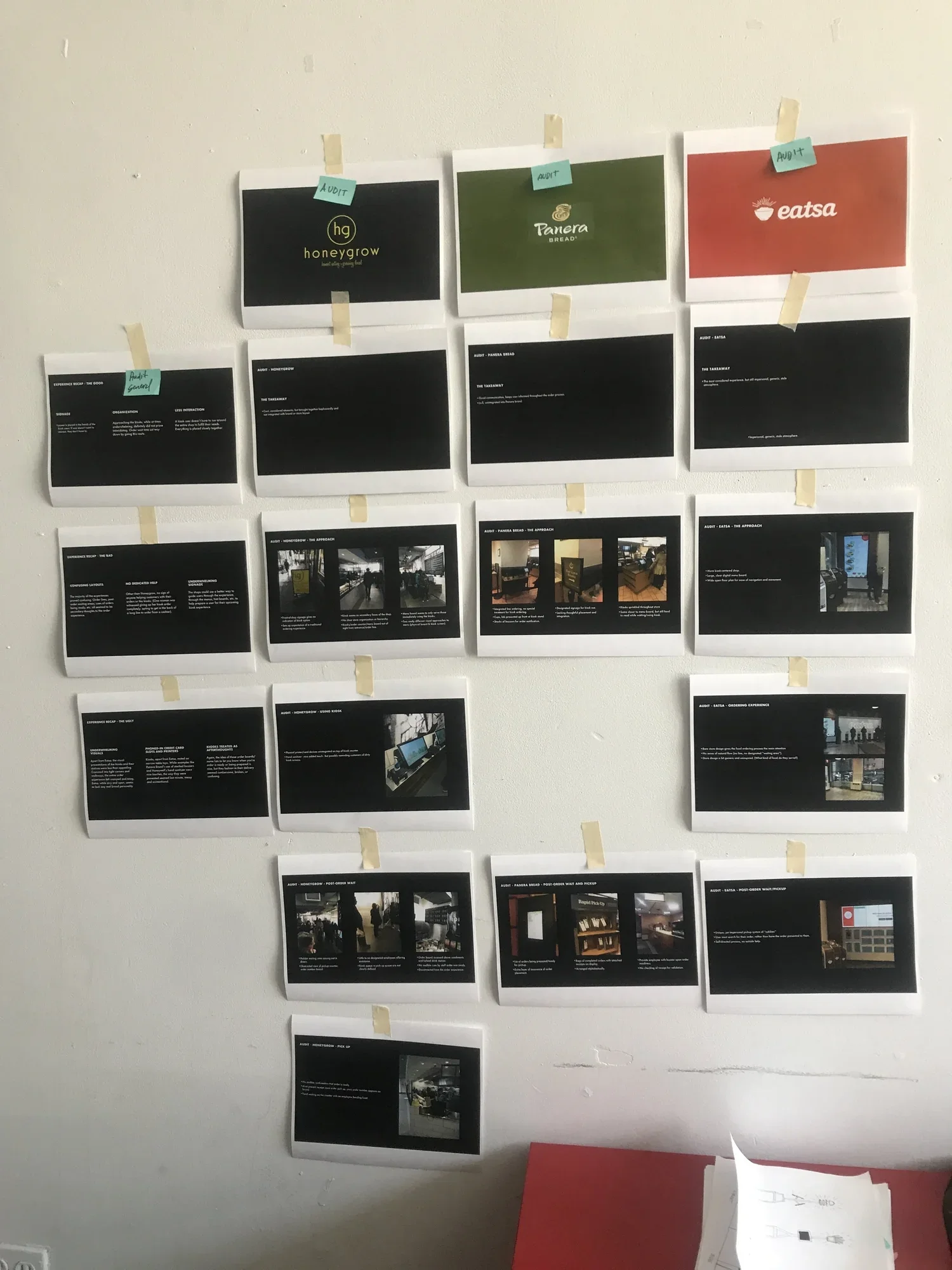
Working with our research team, we spoke with customers in-store and looked at kiosk experiences across different products. The research helped define the main user types and use cases I needed to design for.
Simplifying the interaction and visual system
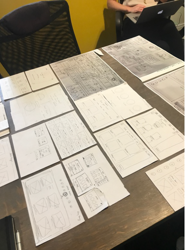
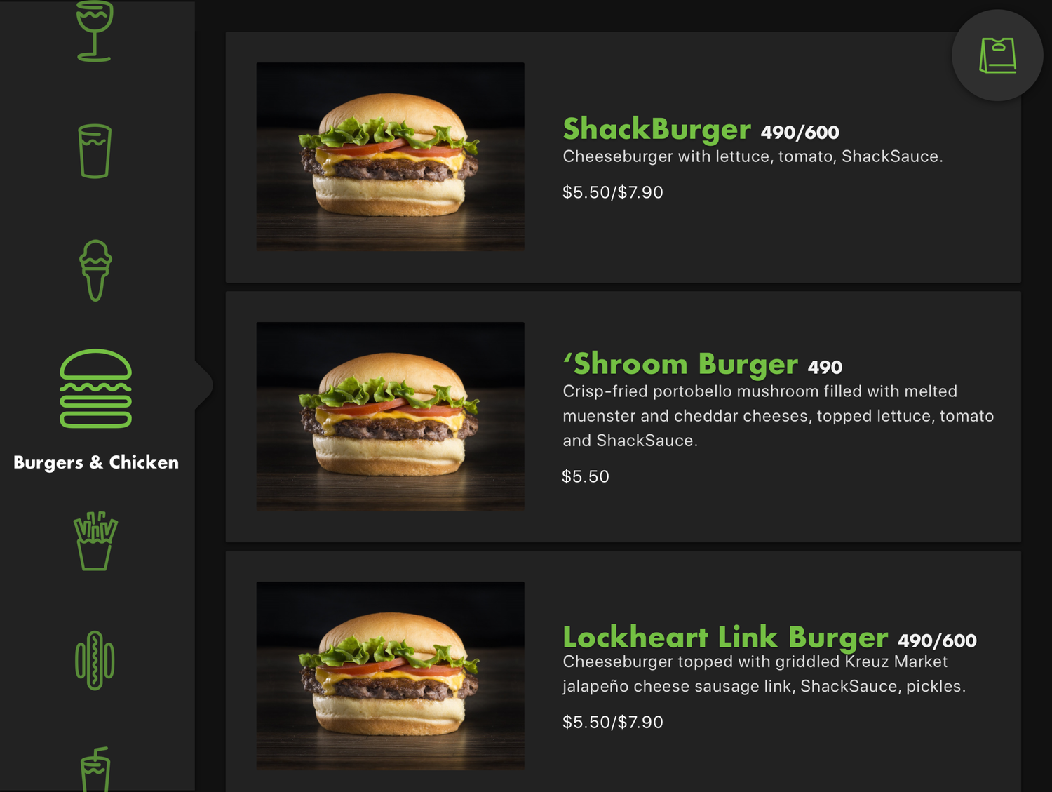
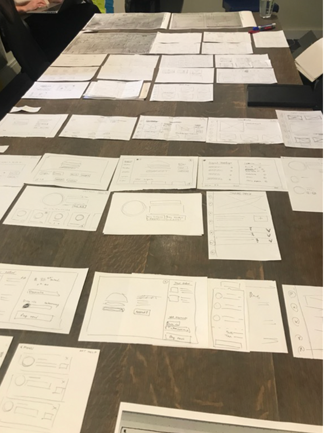
I explored navigation, menu grids, touch targets, and screen progression with the goal of making the experience usable across a wide range of customers.
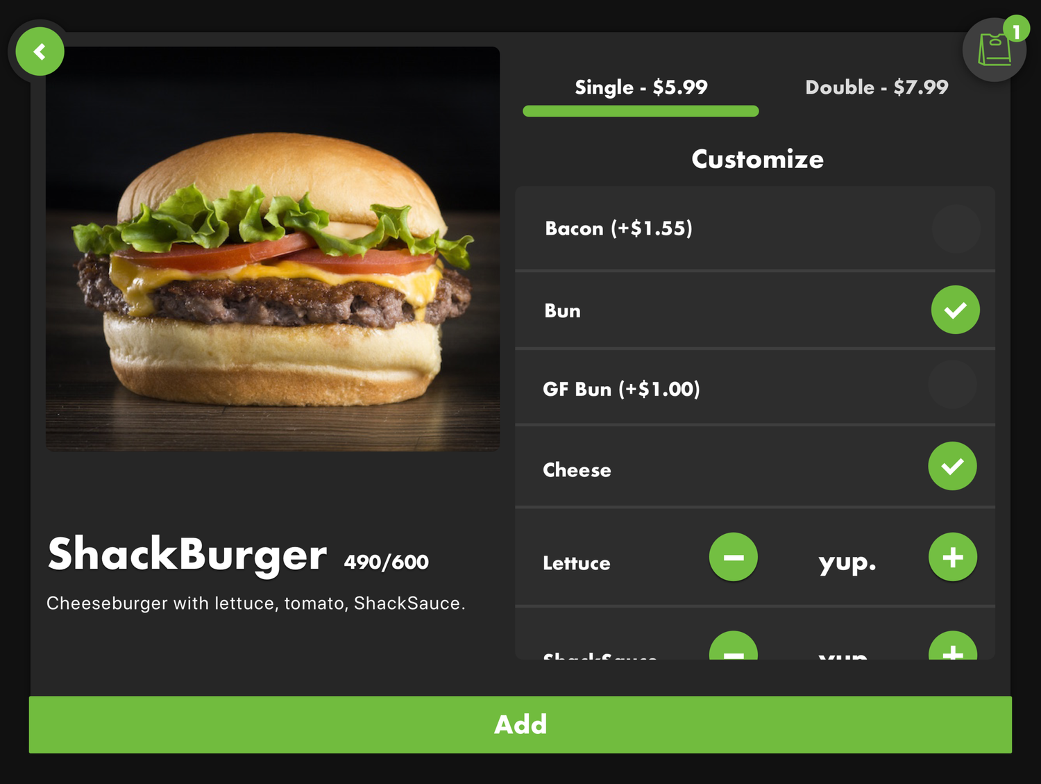
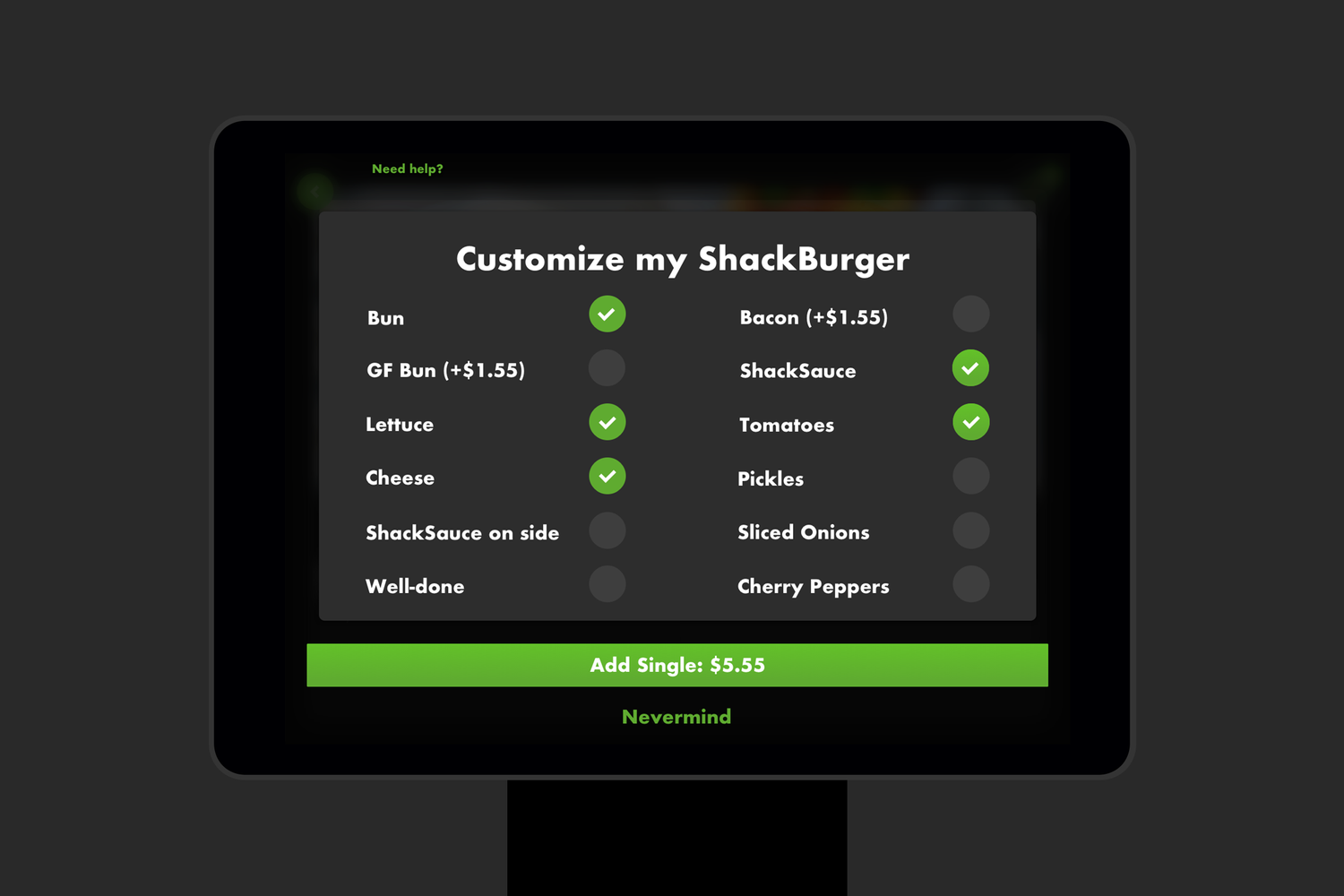
One recurring question was how much choice to expose. We had already learned from the mobile apps that making customization too prominent could encourage more complex orders and affect kitchen production. The kiosk needed to make those options available without suggesting that every customer needed to use them.
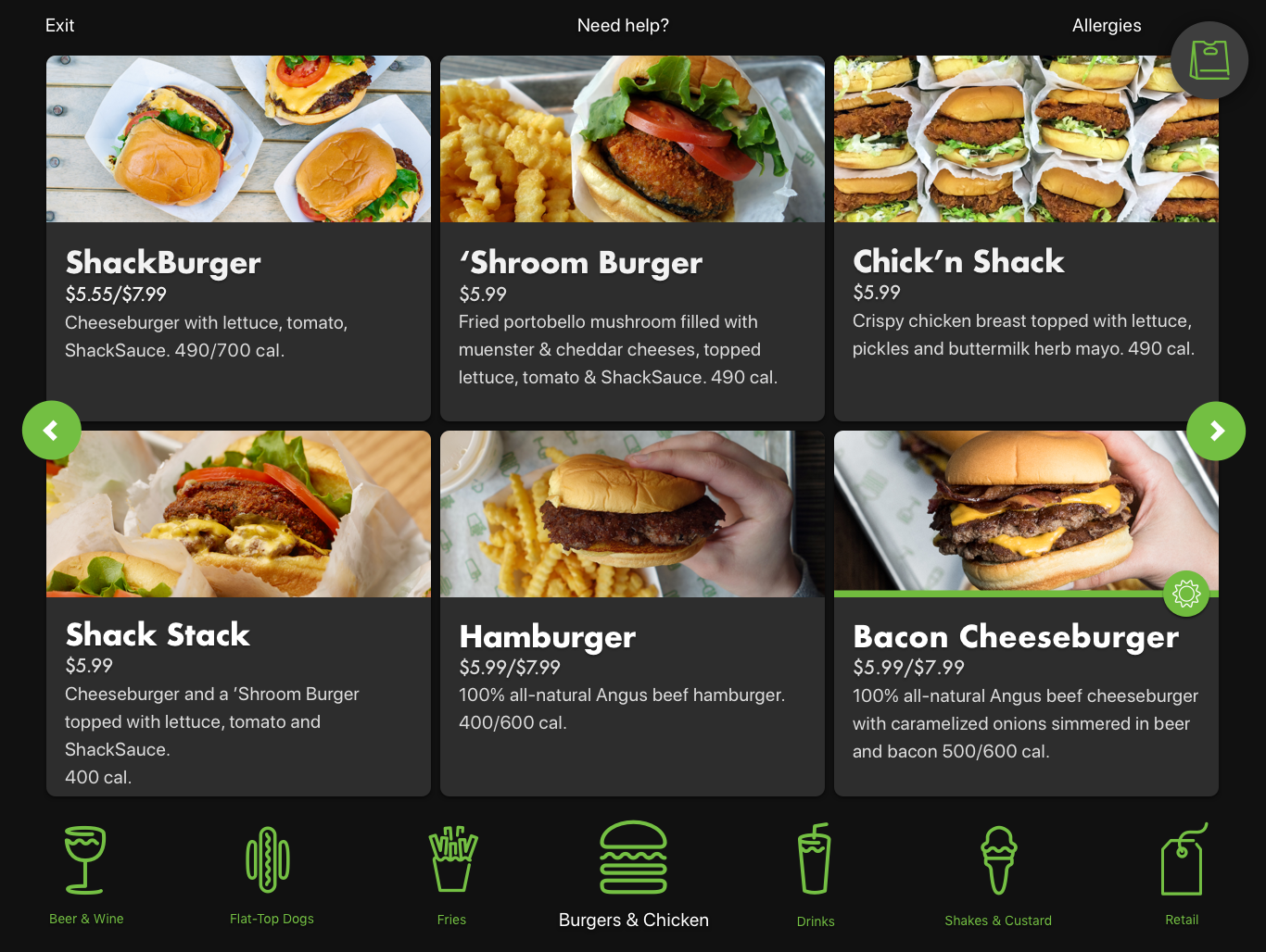
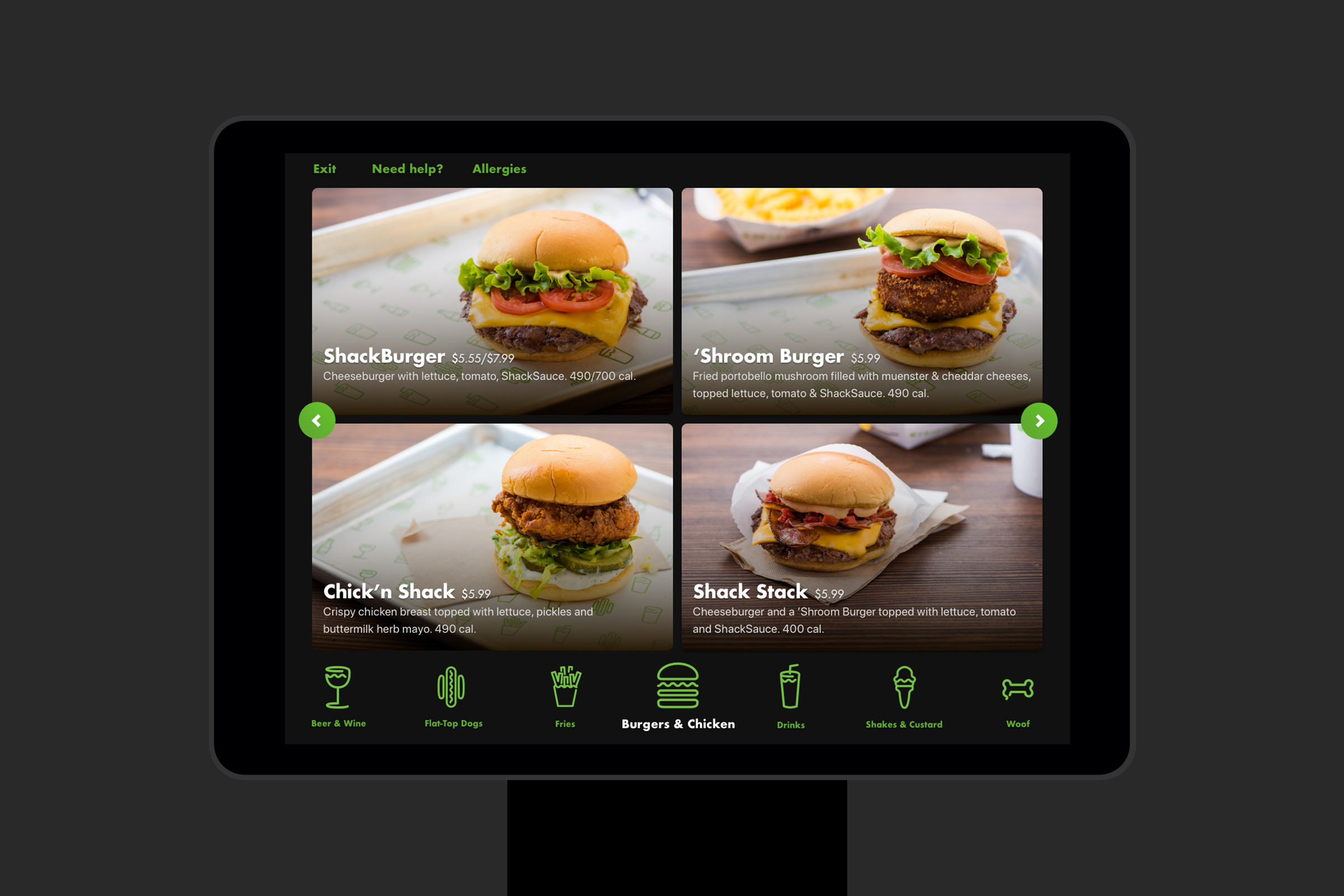
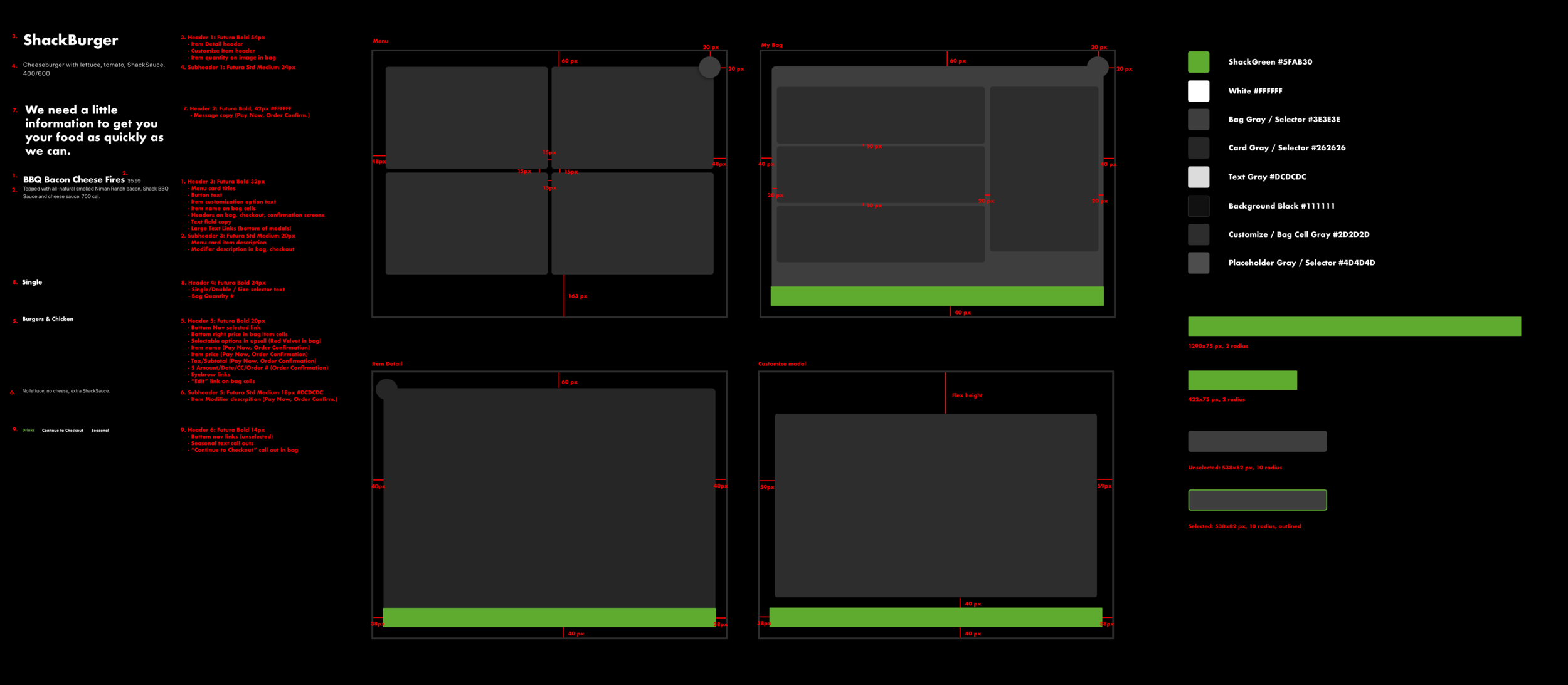
I also tested different menu densities before settling on larger, more tappable cards that reduced visual load and made the food itself more prominent.
Simplifying the interaction and visual syste
Simplifying the interaction and visual syste
Working with our research team, we spoke with customers in-store and looked at kiosk experiences across different products. The research helped define the main user types and use cases I needed to design for.
Simplifying the interaction and visual syste
Designing the core kiosk experience
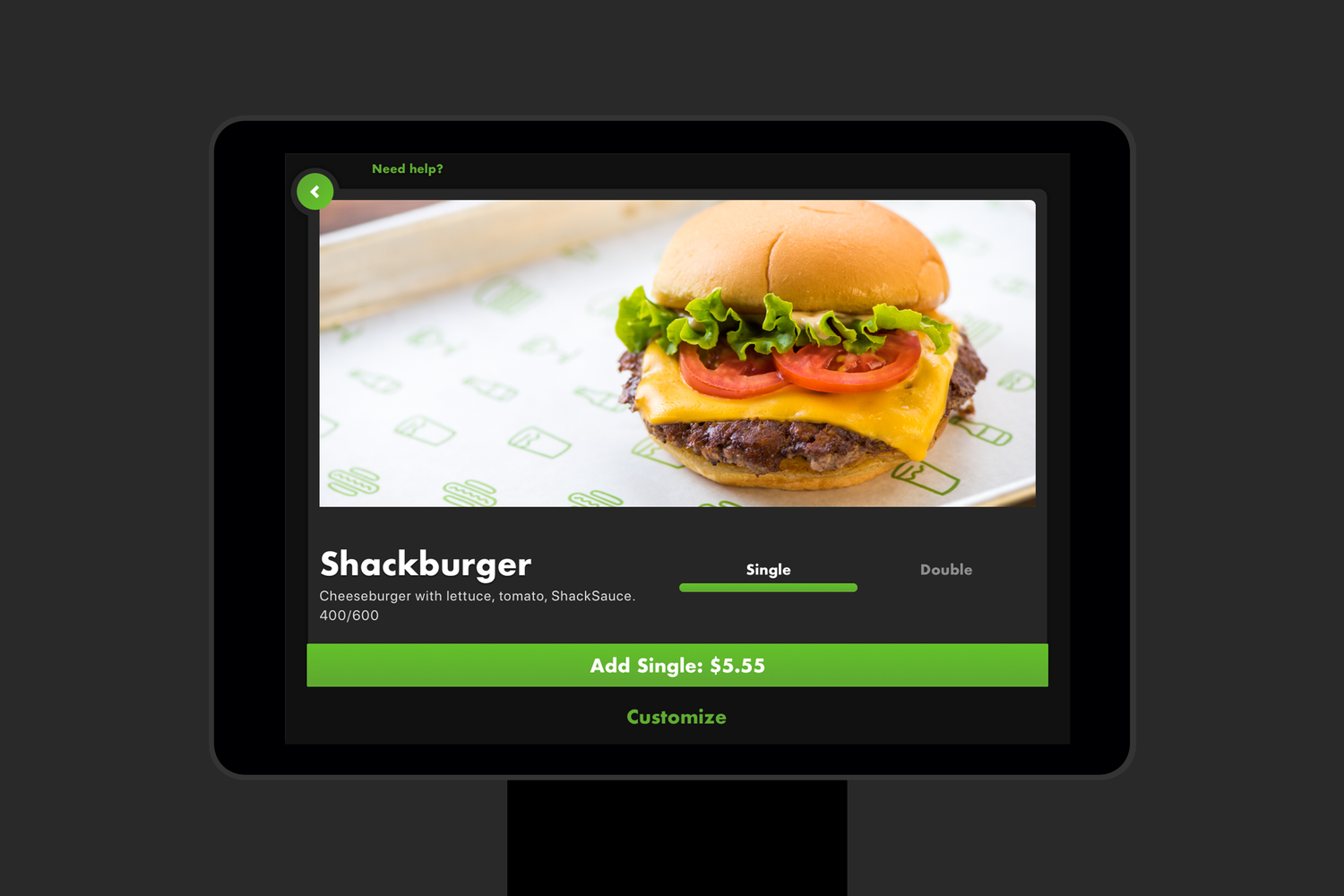
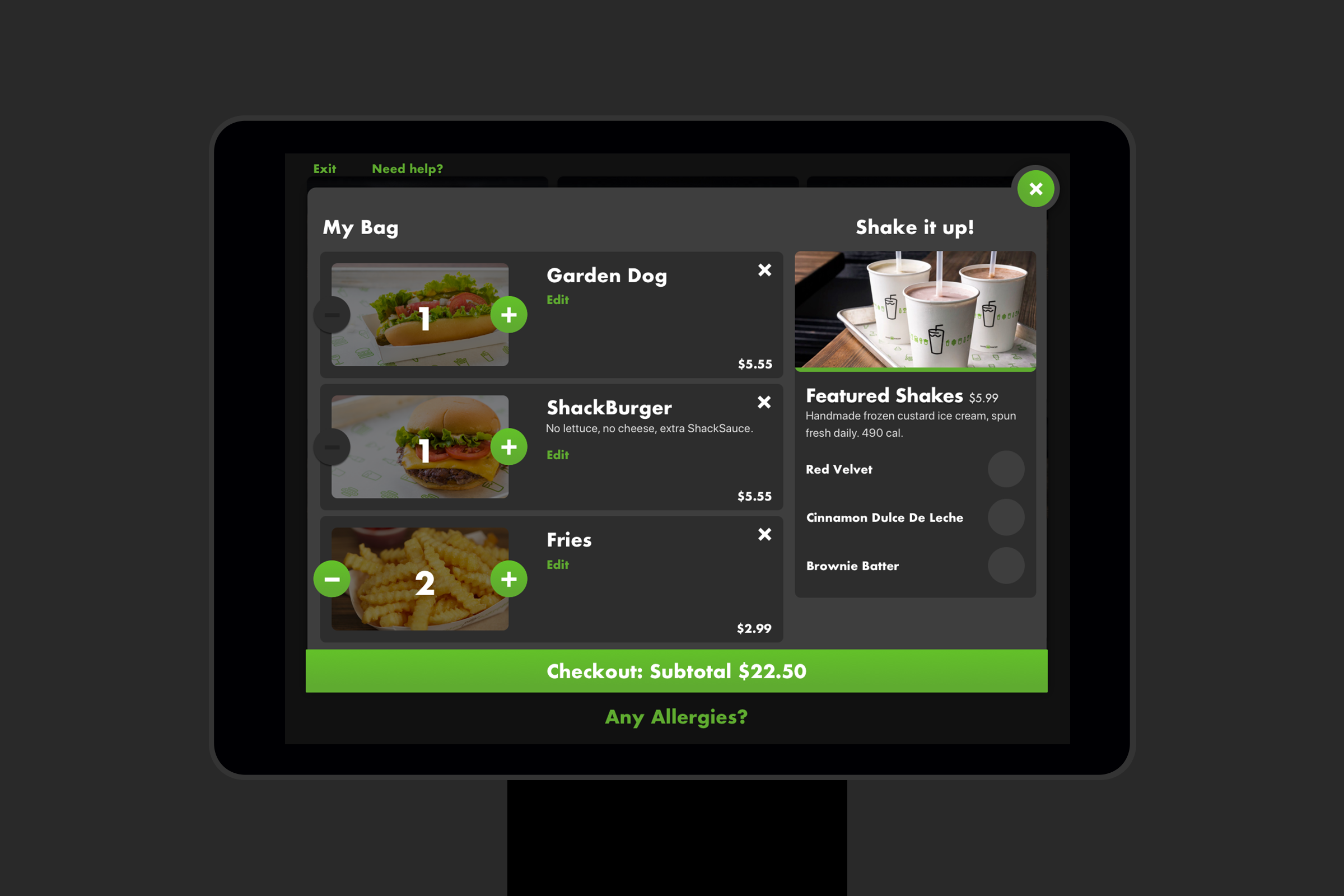
The final system reduced the ordering journey to four core screens, using large food imagery, clear touch targets, and a layered visual hierarchy built from blacks and greys.
Customers could quickly select an item, choose high-level options, or open a dedicated customization view when needed. Real-time pricing made the consequences of additions clear, while familiar cart patterns carried over from the existing ordering products.


Designing beyond the screen
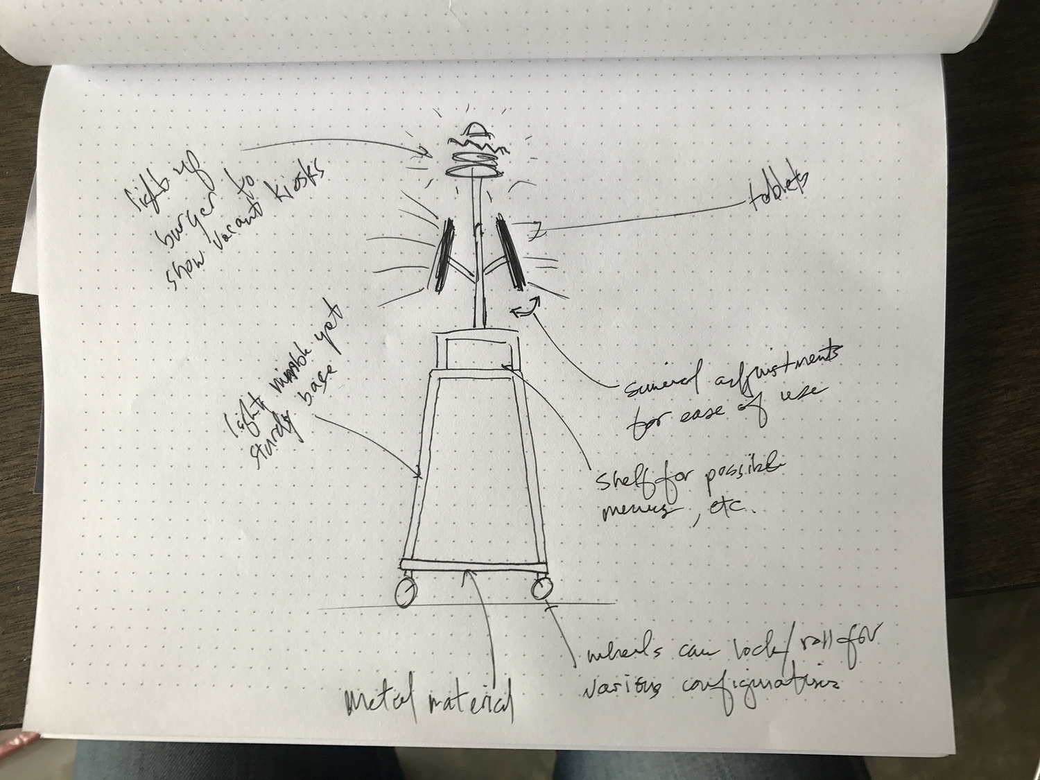
The project also extended into the physical environment. I explored kiosk casings, queue flow, digital menu boards, and how the hardware could feel integrated with Shake Shack’s Astor Place location rather than simply placed inside it.
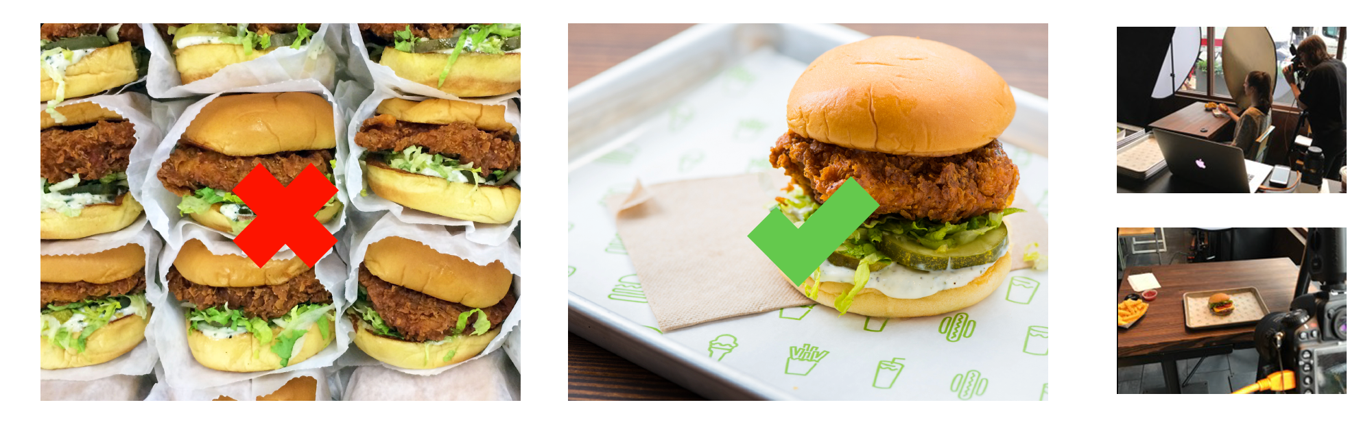
I also helped support a new food-photography direction so the menu imagery would feel consistent and work effectively at kiosk scale.
Supporting the people behind the kiosk
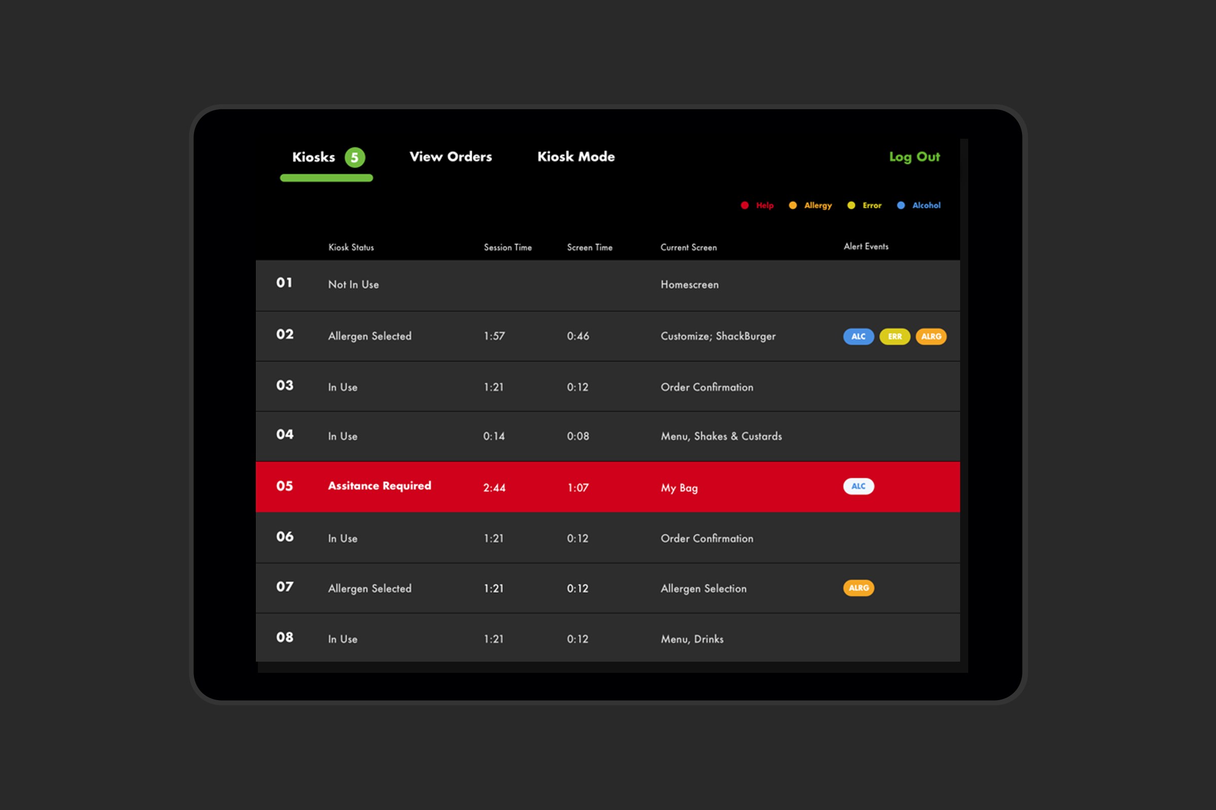
The customer experience was only one side of the system. I also worked on admin experiences for Shake Shack staff, including bug reporting and workflows such as verifying identification for alcohol purchases, while accounting for integrations with third-party systems including Square, Olo, and NCR.
Takeaway
The kiosk pushed me to think beyond the interface itself. The quality of the experience depended on the customer, the kitchen, restaurant staff, the physical environment, and the software all working together.