Bringing Shake Shack’s first order-ahead experience to mobileShake Shack: Order Ahead
Project overview
In 2016, Shake Shack launched its first order-ahead iOS app, reaching more than 100k downloads in its first week of national release. Android followed as the product continued to evolve.
I helped translate Shake Shack’s brand into a native digital experience and designing a clear path from choosing a location through checkout.
Role
UI/UX Designer
Scope
Ordering UX, interaction design, visual design, Android iteration
Platforms
iOS + Android
Date
2017
The challenge
Shake Shack’s popularity meant long lines at many locations. Order Ahead was designed to give customers another way to get their food while creating a mobile experience that still felt distinctly Shake Shack.
The flow also had to make a series of decisions feel simple: choosing a location, selecting an available pickup time, navigating the menu, customizing food, and completing checkout within the ordering window.
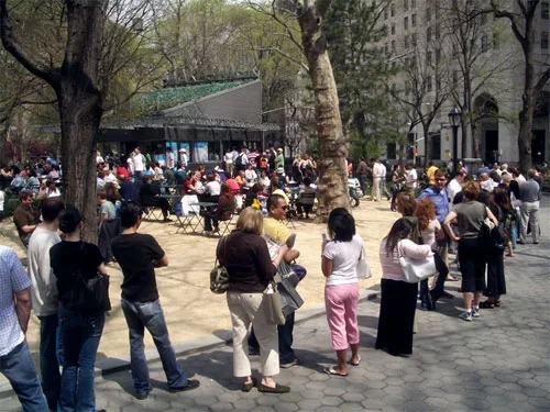
Before Seamless entered the chat, picking up food at Shake Shack meant waiting in line. In New York, those lines were legendary.
Designing a clear path through ordering
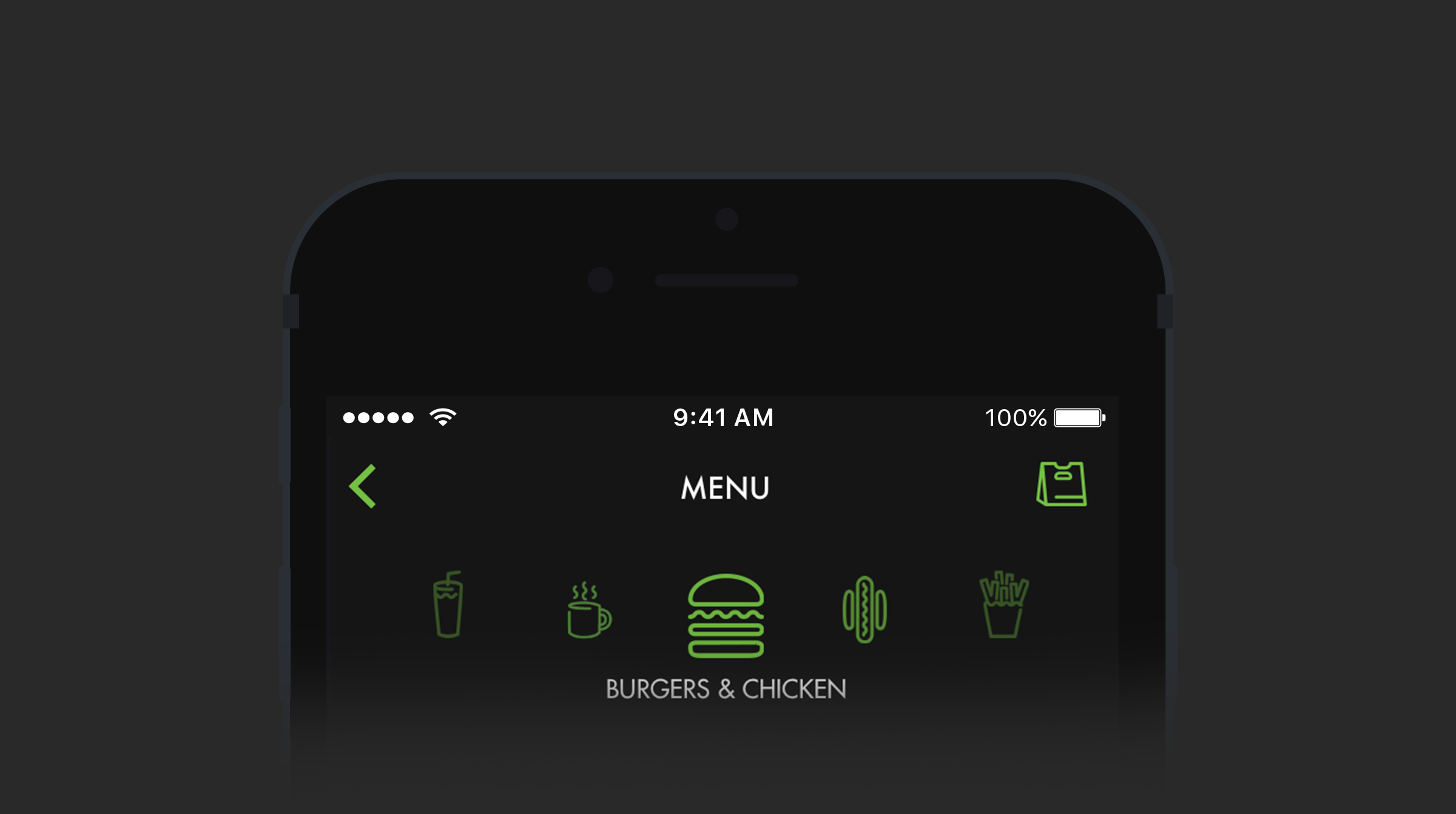
I explored different list, cell, and navigation patterns to make the ordering journey feel clear and efficient. In parallel, I worked through the app’s visual treatment—using a dark palette, layered greys and blacks, Shake Shack’s green, and existing brand iconography to create a richer, more distinctive native experience.
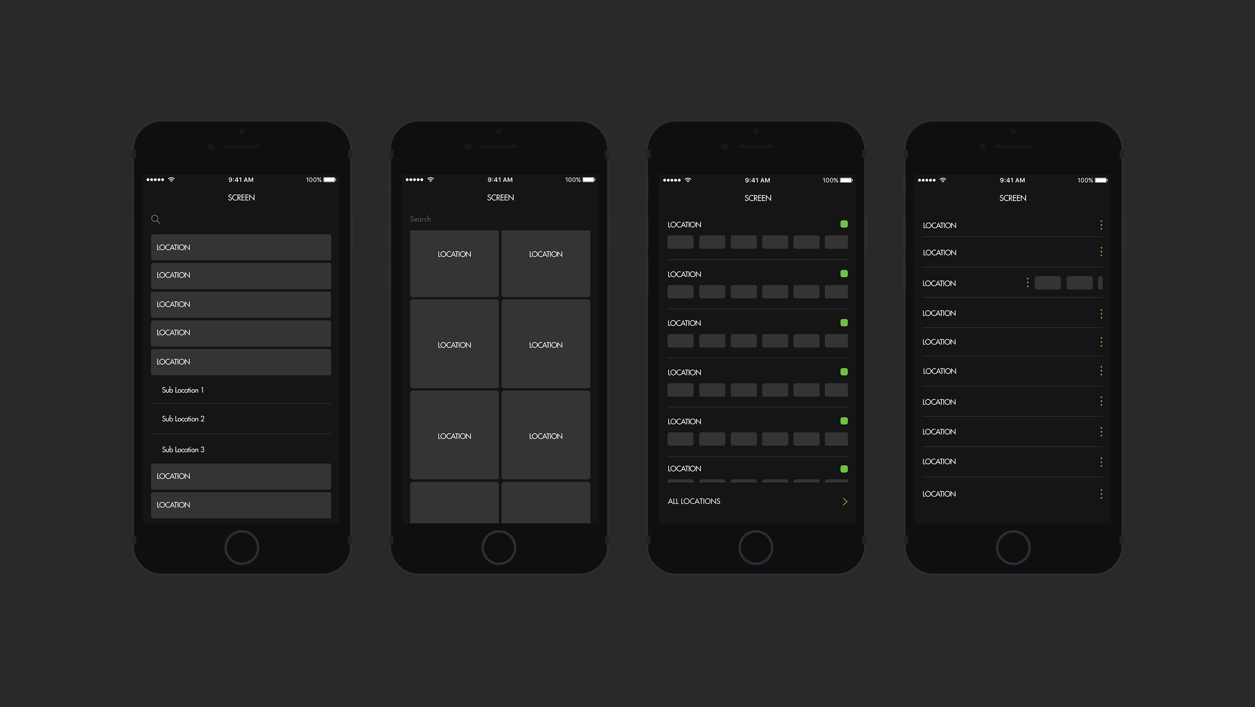
Clear content blocks made nuanced interaction possibilities easier to see and helped the design system take shape over time.
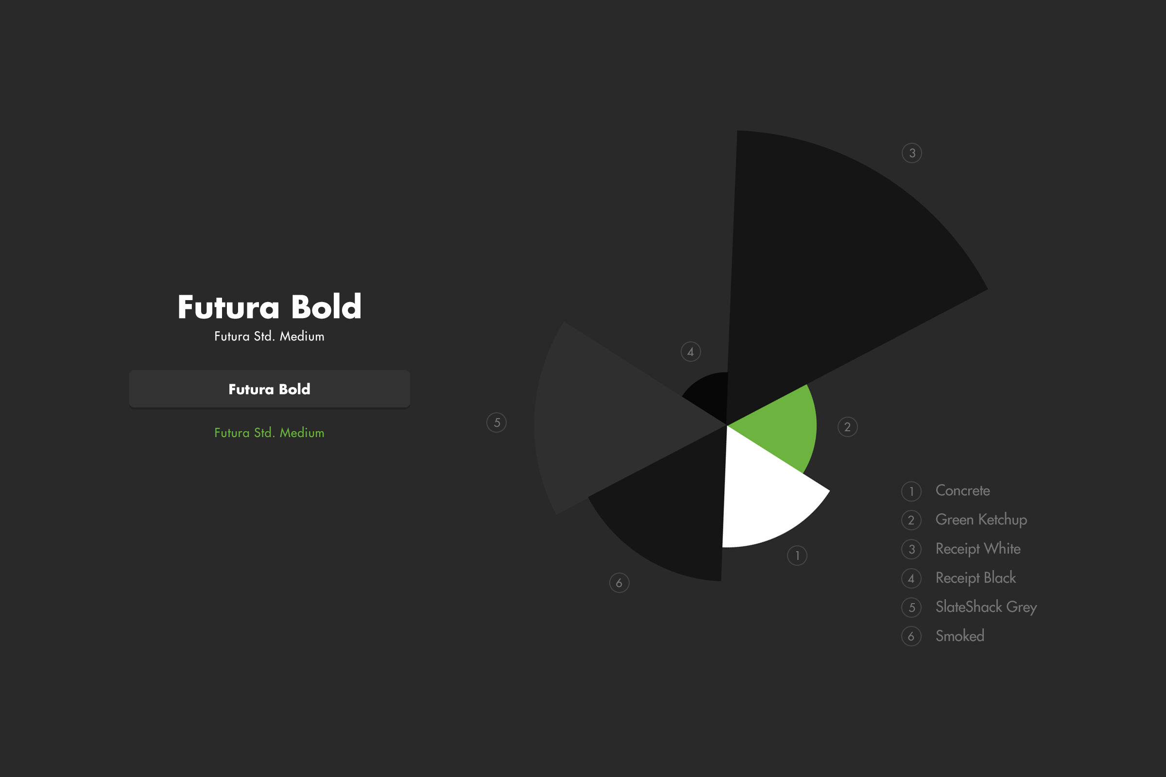
At the time, Shake Shack had very little digital presence. With their team’s approval, I took the print-first brand and reimagined how it could work in a digital world.
Phase 1: iOS MVP
Those explorations came together in the MVP flow, guiding customers from location and pickup-time selection through menu browsing, customization, cart, and checkout. Large food imagery, familiar icons, and prominent actions helped keep the experience focused while still feeling unmistakably Shake Shack.
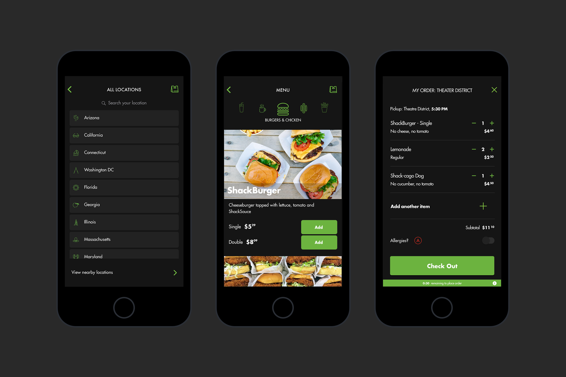
The MVP launch for iOS showed a massive response, hitting more than 100k downloads in the fist week.
Phase 2: Android
The secondary Android release gave us an opportunity to improve the product based on what we learned from the iOS launch, including feedback from customers and kitchen staff. We revisited flows and screens to reduce unnecessary steps and make common decisions easier.
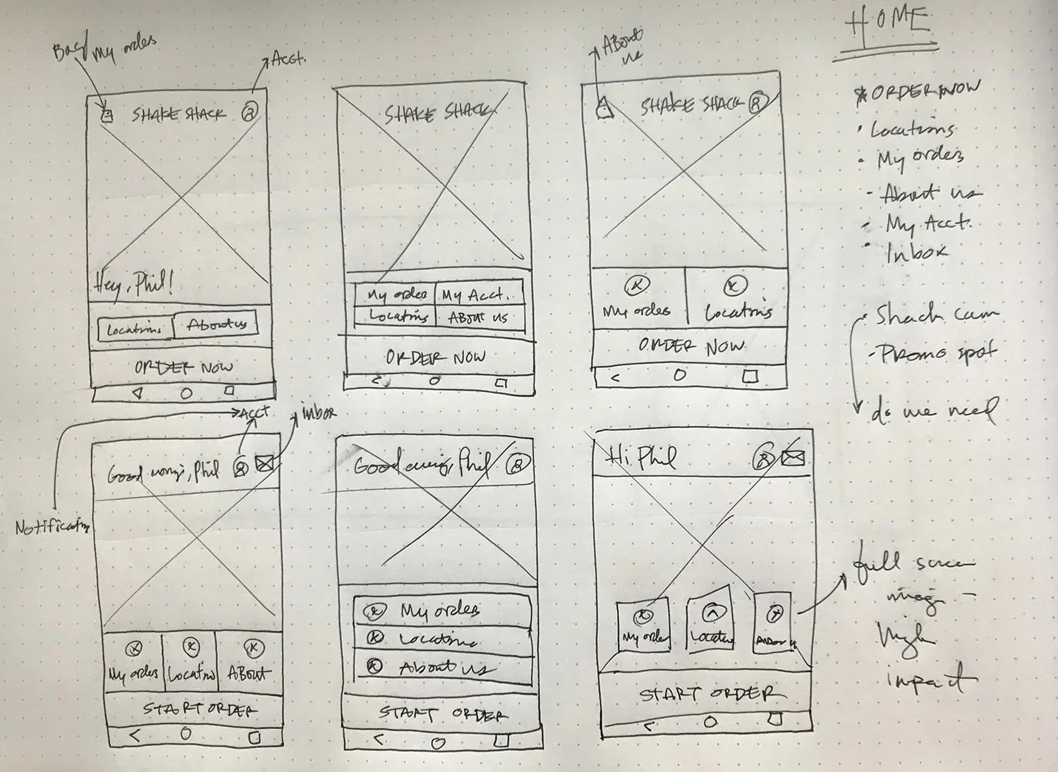
Android gave me an opportunity to make the experience feel more useful from the start. I explored a homepage that could welcome users back, surface what they needed quickly, and give them more reasons to return.
Iteration: Simplifying location selection
The original experience displayed many locations and pickup times together. While that demonstrated the breadth of Order Ahead, we learned the list could feel overwhelming and lack context for unfamiliar users.
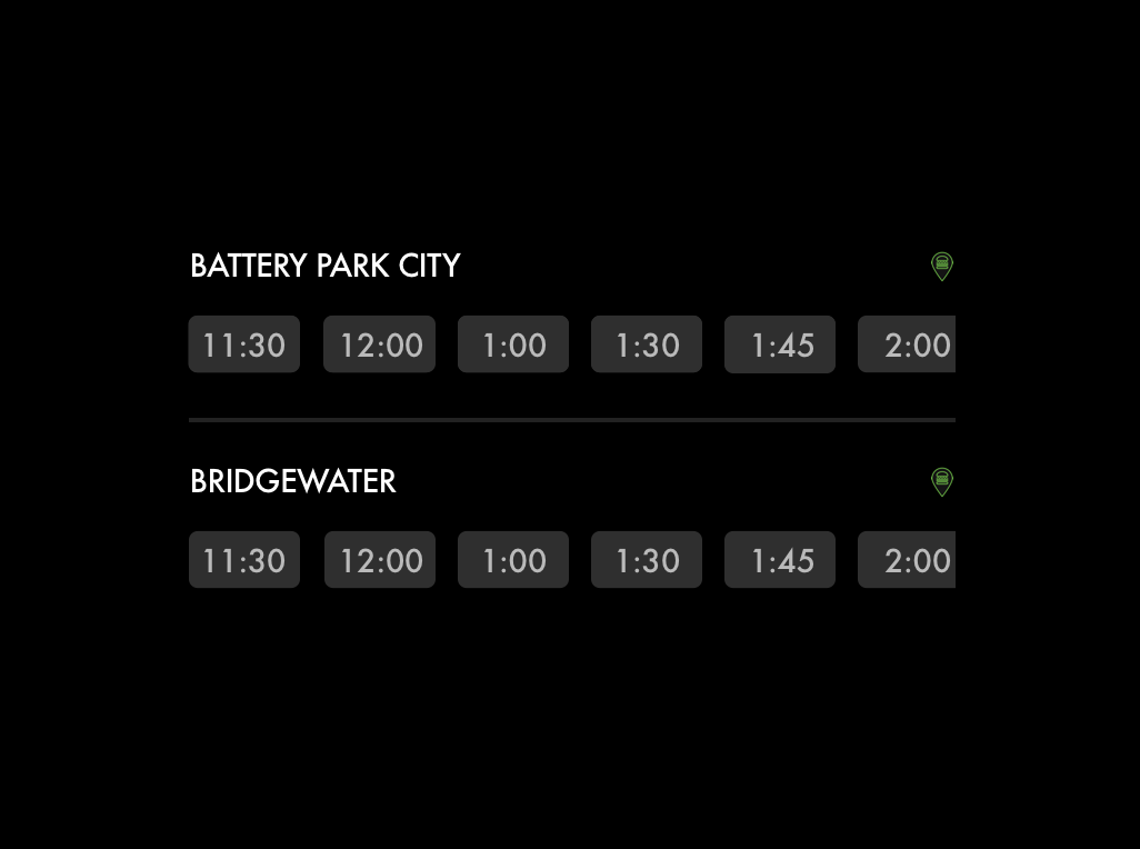
In the MVP, appointment times were easy to see and select, but each location lacked the context users needed to choose between them.
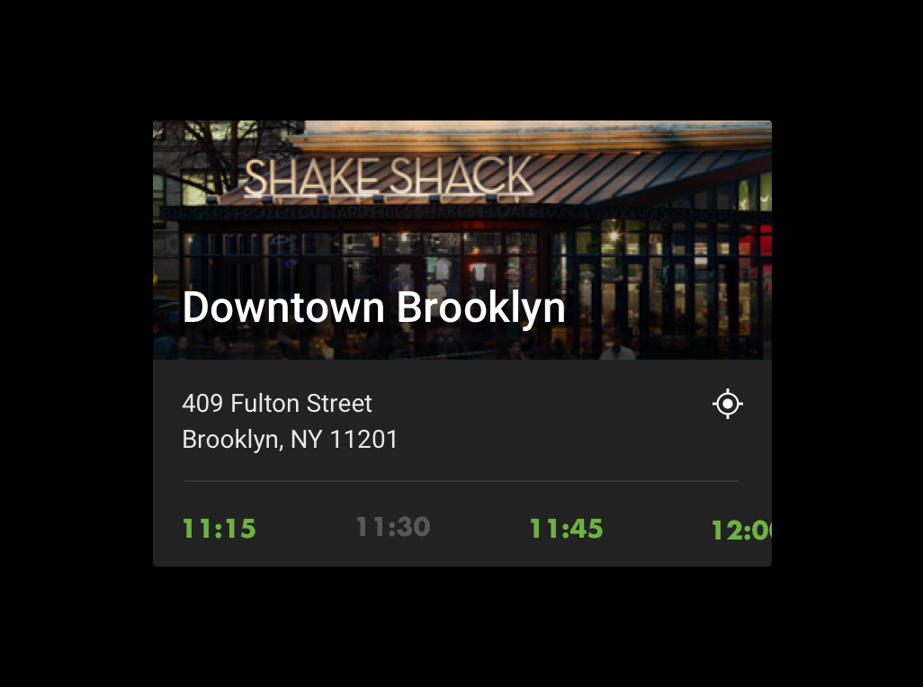
Our iteration made each location card much more useful, adding the full address, pickup availability, a map, and even a photo of the Shack itself.
Rethinking customization
The original experience made customization options highly visible. We learned that customers were using them enough to contribute to kitchen slowdowns
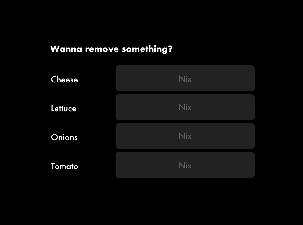
The MVP gave users a lot of control, but too much flexibility up front created problems downstream, overwhelming kitchen staff with increasingly complicated orders.
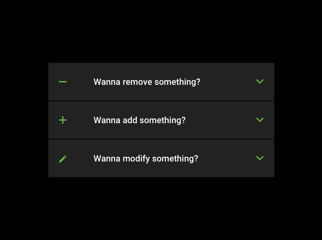
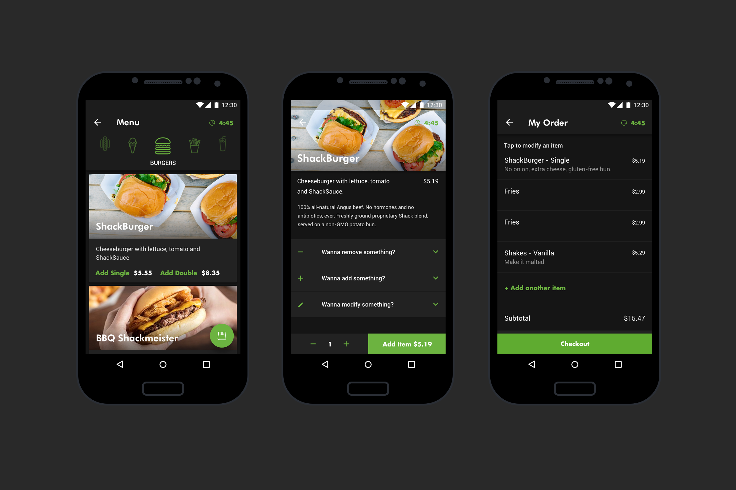
For the next iteration, we pulled customization back. It was still easy to find for users who wanted it, but it no longer invited everyone to over-customize a quick order.
Evolving the system for Android
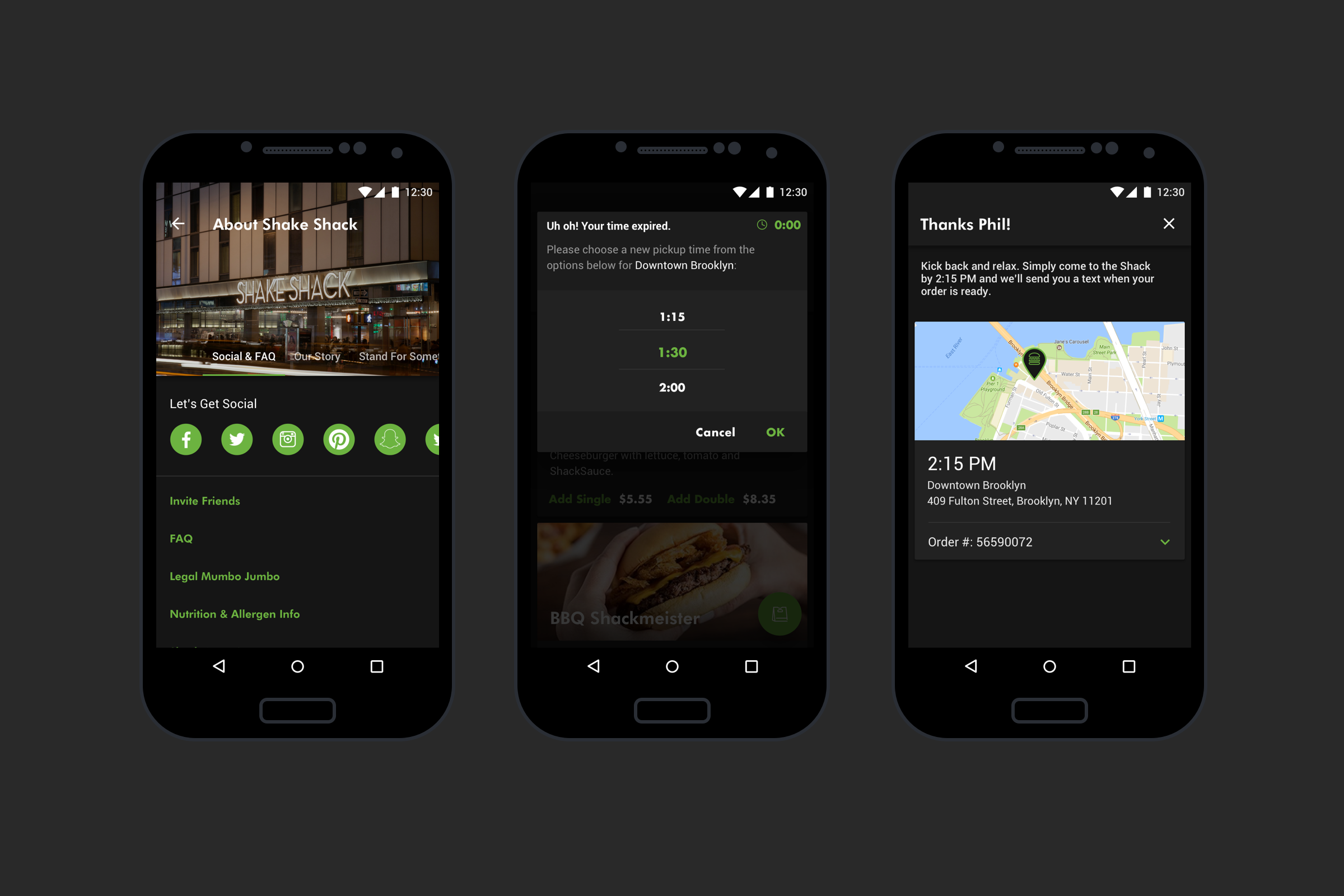
Rather than simply recreate the iOS app, I adapted the experience around Android and Material Design patterns. Cards, revised interaction patterns, and a reorganized feature hierarchy helped create a more concise experience, while new functionality such as Inbox and Account settings expanded the product.
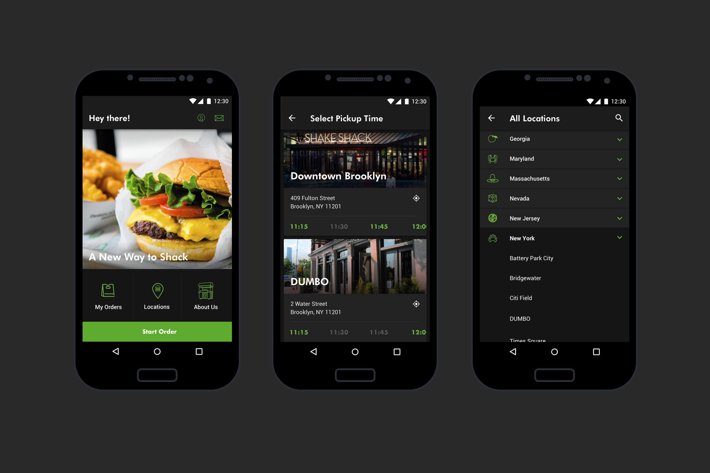
Android meant mirroring the iOS experience, but through a Material lens. New features were eventually brought to the iOS product
Recognition & awards
Appy Award for Best Restaurant/Food/Beverage App - 2017
x2 W3 Silver Awards - 2017.