Designing a paid-search landing experience around what patients actually neededSEM 2.0
Project overview
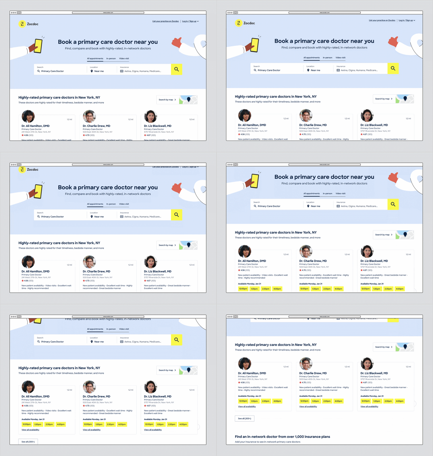
Zocdoc’s organic- and paid-search traffic historically landed on the same provider-listing pages, which had been shaped around SEO (Search Engine Optimization) requirements. As investment in paid search grew, the Growth team saw an opportunity to create a dedicated SEM (Search Engine Marketing) experience with more freedom to optimize around patient behavior and conversion.
I led the research and design to determine what that new experience should prioritize.
Date
2021-2022
Role
Senior Product Designer
Team
Product, Engineering, Research, Analytics, Product Marketing, Brand, Design Systems
Scope
Desktop/ mobile web
Why SEM posed a new opportunity
Because SEM pages didn’t depend on the same organic-search ranking requirements, we had more freedom to rethink the content and structure around patients.
That raised a new question: What should an experience designed specifically for paid-search patients do differently?
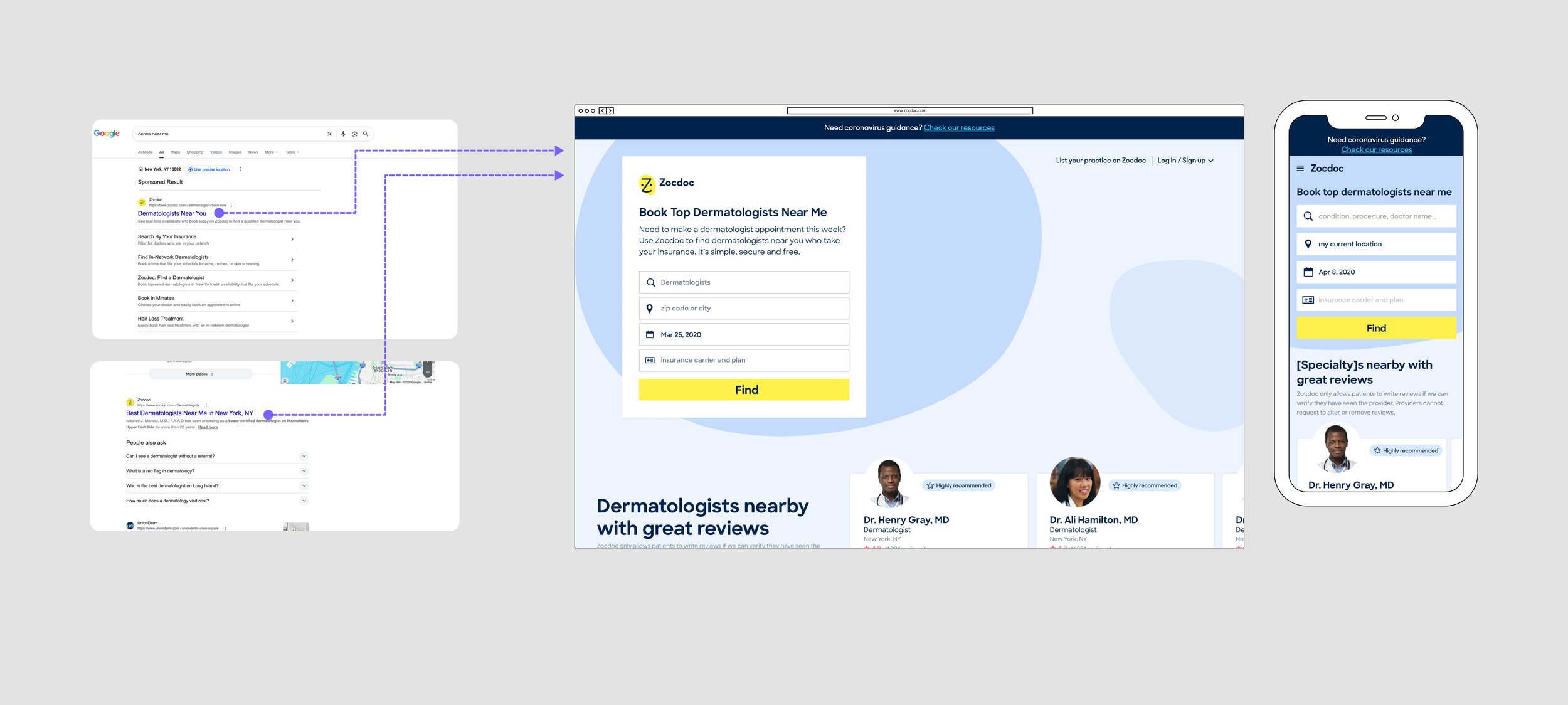
SEO pages had to balance patient needs with requirements that helped them rank in search—things like page content, structure, and the amount of provider inventory shown. SEM traffic didn’t depend on those same rules, giving us more freedom to simplify the page and test more interactive, patient-focused ideas
The behavior suggested there was something to investigate
SEM visitors were not using the page in quite the same way as organic-search visitors. That gave us a reason to explore a dedicated experience, but not enough to know what it should be.
We entered discovery considering a few possible directions without assuming which approach was right.
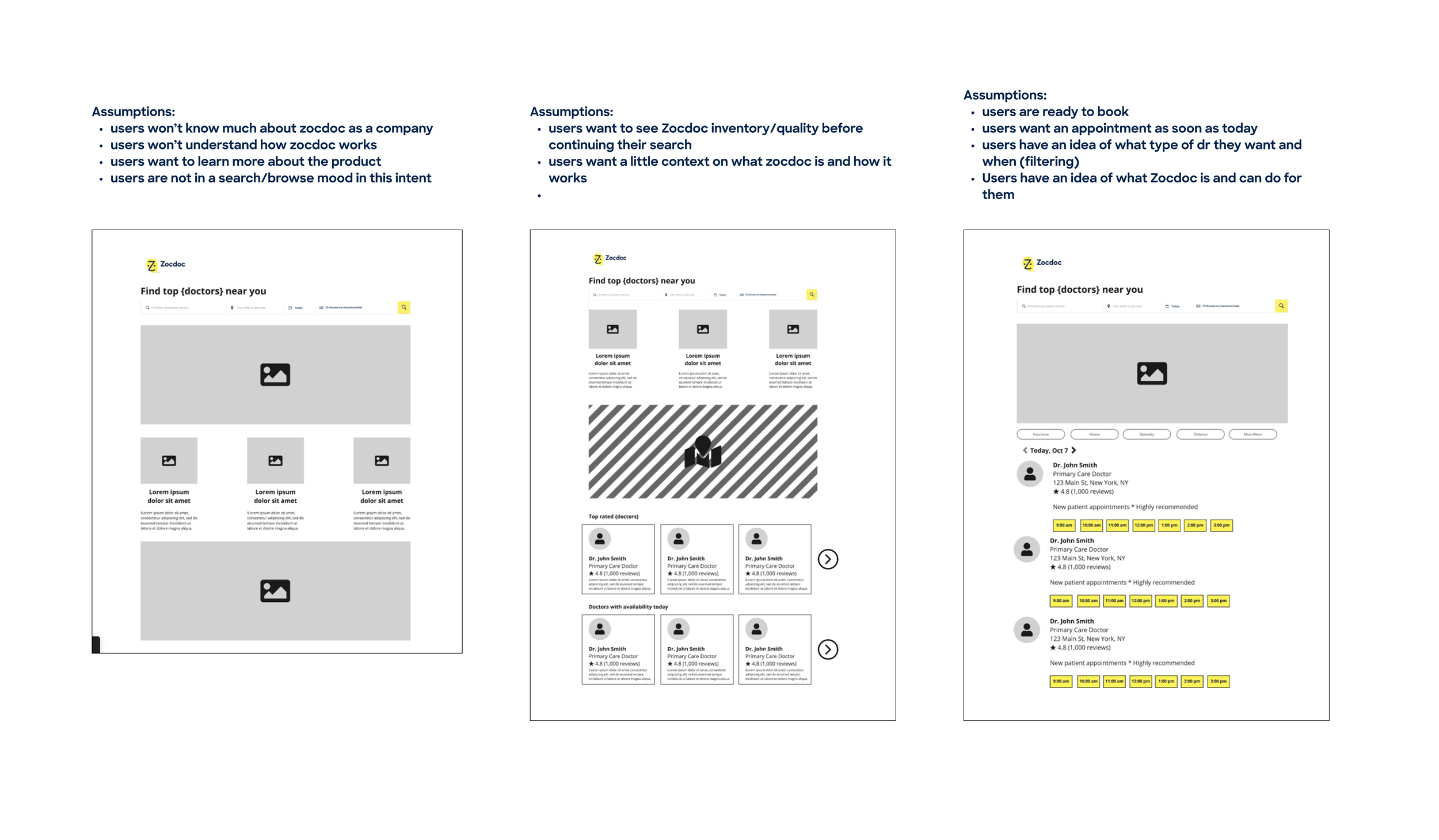
SEM visitors showed a different interaction pattern across search criteria, insurance, map use, and provider cards. Early concepts ranged from a more brand and value-focused page, to a utility-heavy experience, to a hybrid of the two. The behavioral data gave us a reason to explore, but research still needed to tell us what patients actually needed.
Understanding what patients actually needed
I led eight moderated sessions with people who had recently searched for care online. Most were still browsing, not ready to book. They needed to trust Zocdoc, understand things like insurance, availability, location, and reviews, and have better ways to narrow their options.
That gave me a clear design direction: build confidence, surface the right information, and support browsing before booking.
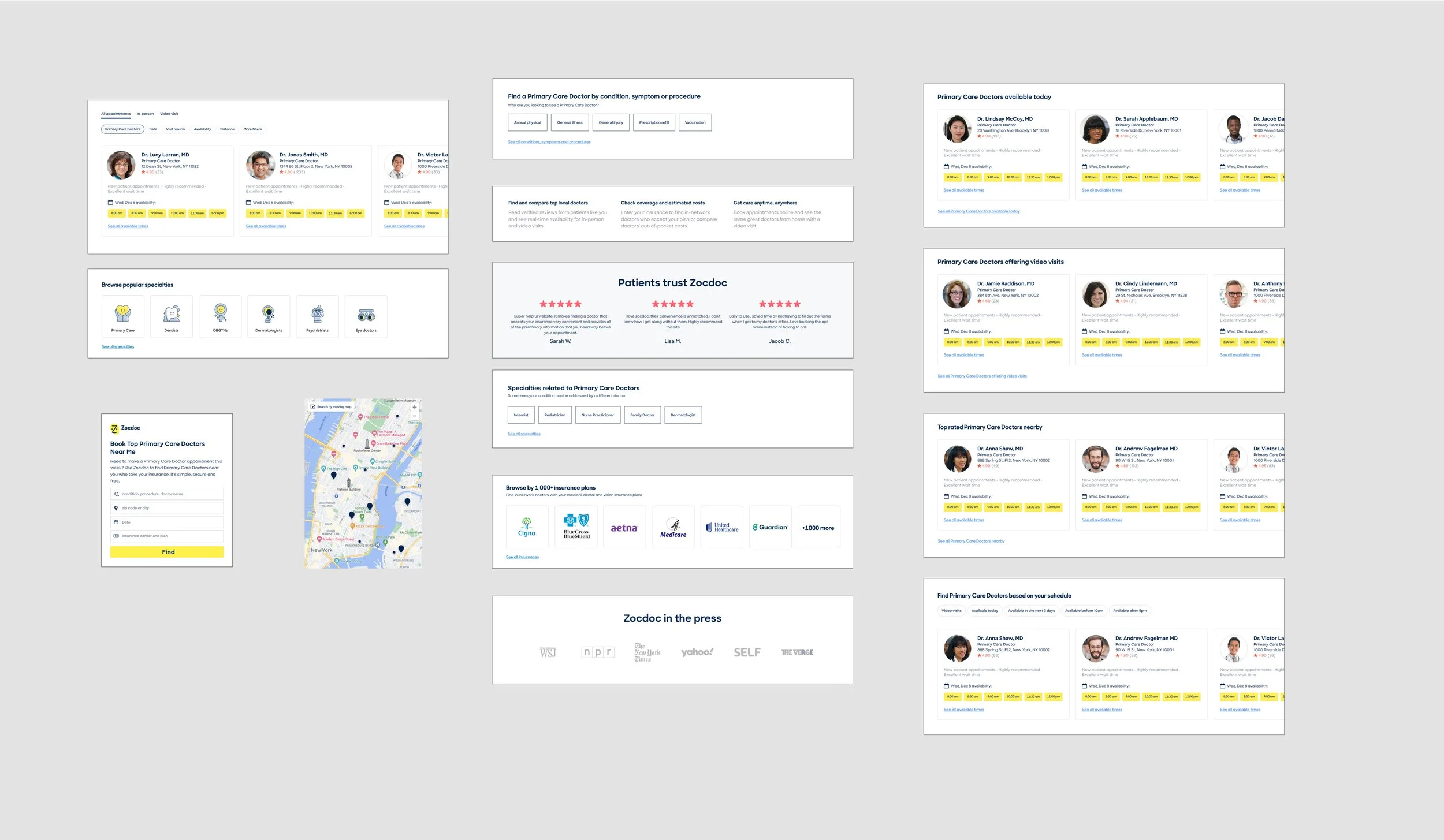
I broke the experience into individual pieces like provider results, search, maps, trust signals, and other content, then used them to co-design the page with participants.
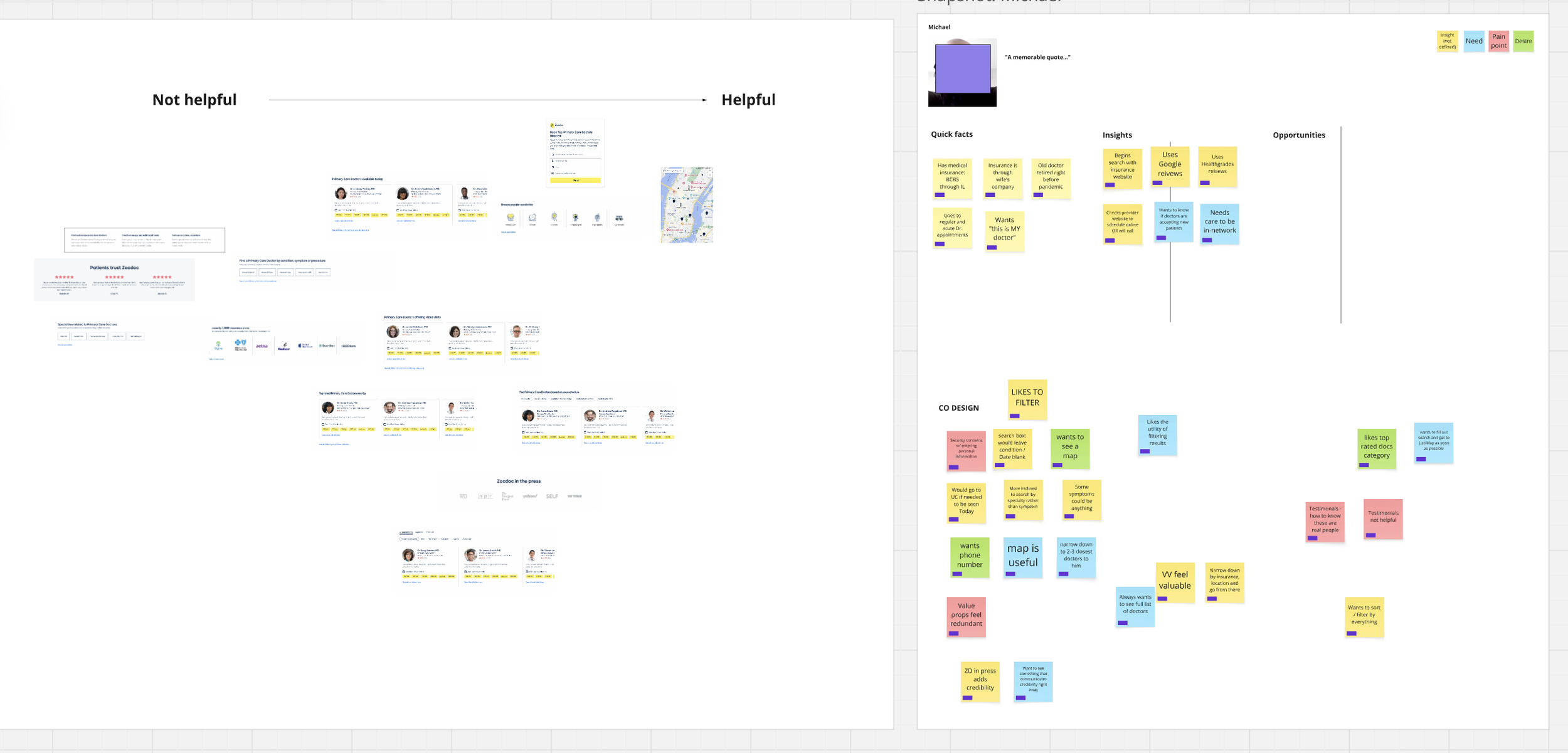
Participants showed us what they would prioritize, remove, or use to keep narrowing their search. They were skeptical of self-promotional trust signals and consistently wanted more help finding the right care.
Patient identity obscured.
Exploring the right balance
Rather than designing the page as one fixed layout, I worked through it as a set of modules. I explored different versions of search, provider results, trust signals, filters, and supporting content, then brought the strongest pieces together into one experience.
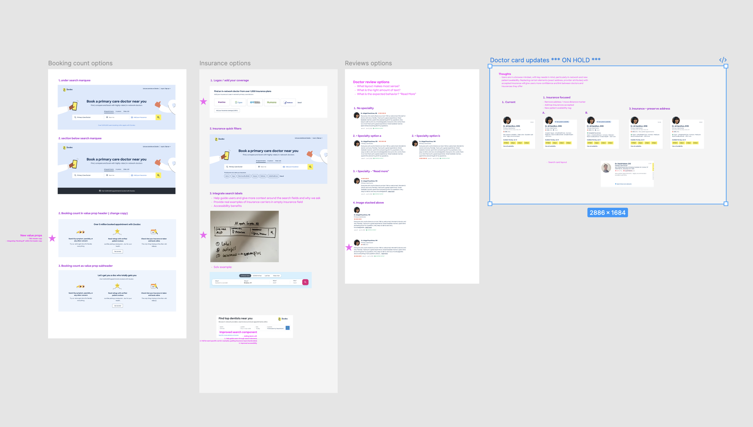
Most of the iteration happened within individual sections of the page. I explored different ways each module could support browsing, build trust, or help patients narrow their options. I kept in mind
The final cut
Rather than designing the page as one fixed layout, I worked through it as a set of modules. I explored different versions of search, provider results, trust signals, filters, and supporting content, then brought the strongest pieces together into one experience.
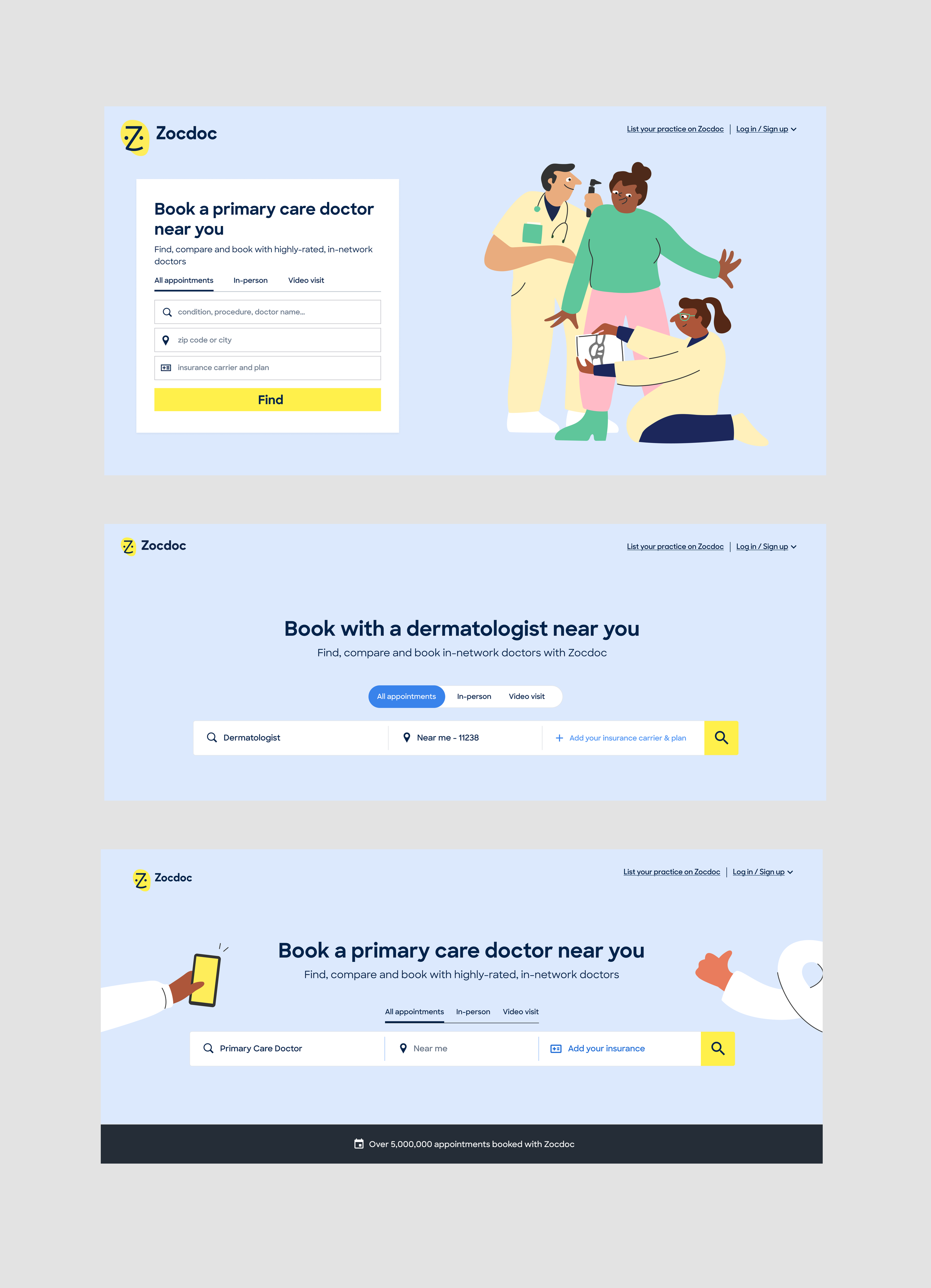
[VISUAL: Search / marquee before and after]
I explored different ways to simplify search. Because the date picker in the current one was not used im portant added complexity wanted to see if could educate users with the appt toggle at hte top horizontal search bar vs veritcal to gain more vertical height
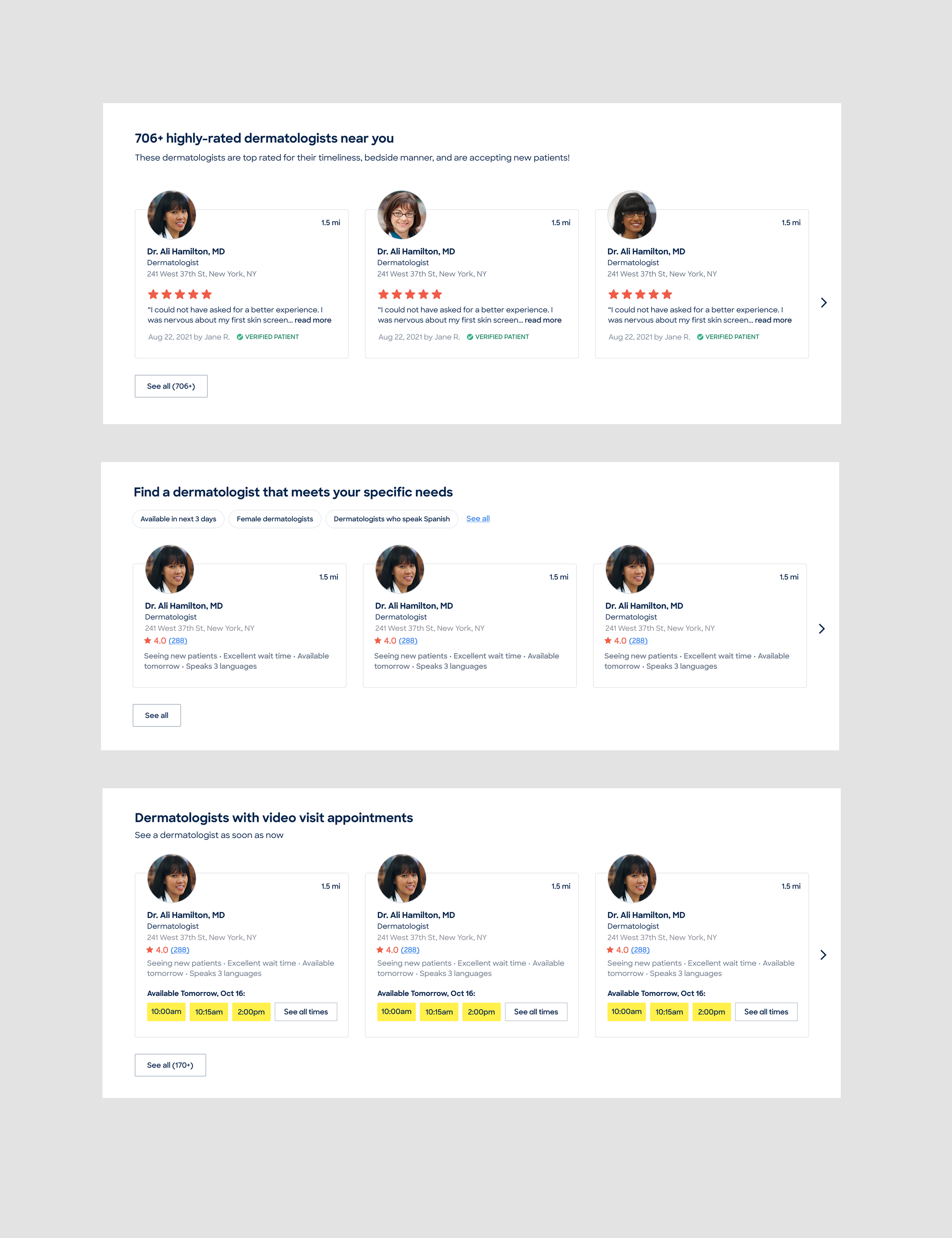
I looked at different ways to group and ‘merchandise’ providers so patients could browse more easily and understand what made each option useful. EExpose times grids vs reviews vs matching tags all in
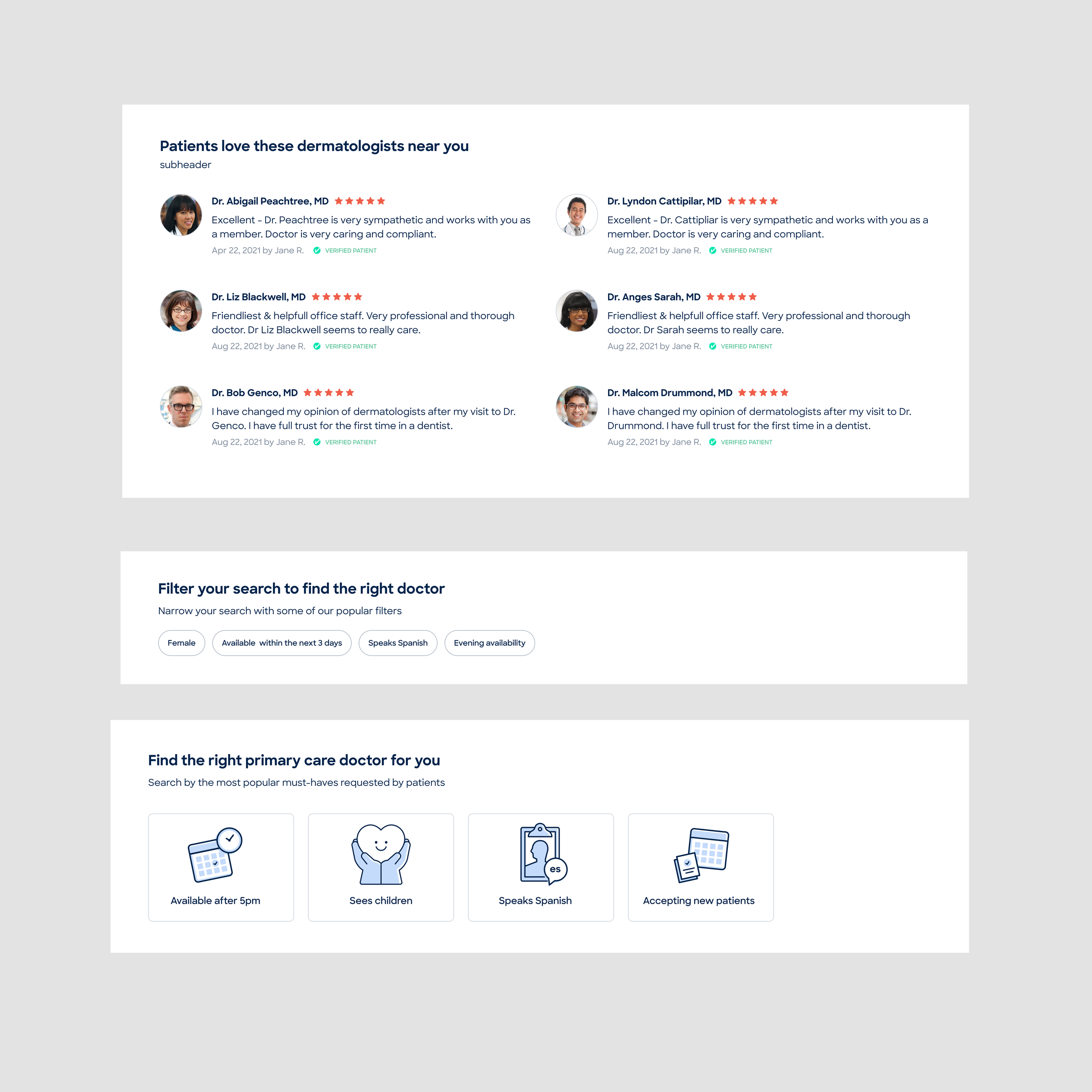
I explored different ways to build trust and explain Zocdoc’s value without relying on self-promotional messaging which users found distrustful - making more provider-centterd, bringing in filter optinos to get users to proper searches quicker, personalization to build trust
Getting the MVP into build
Once our direction was set, I worked with Product and Engineering to separate what was essential to the experiment from what could wait, cutting 7 sprints of work to 4.
We kept the core experience around browsing, trust, provider information, and narrowing options, while deferring lower-priority work to fast follows and reworking parts of the implementation.
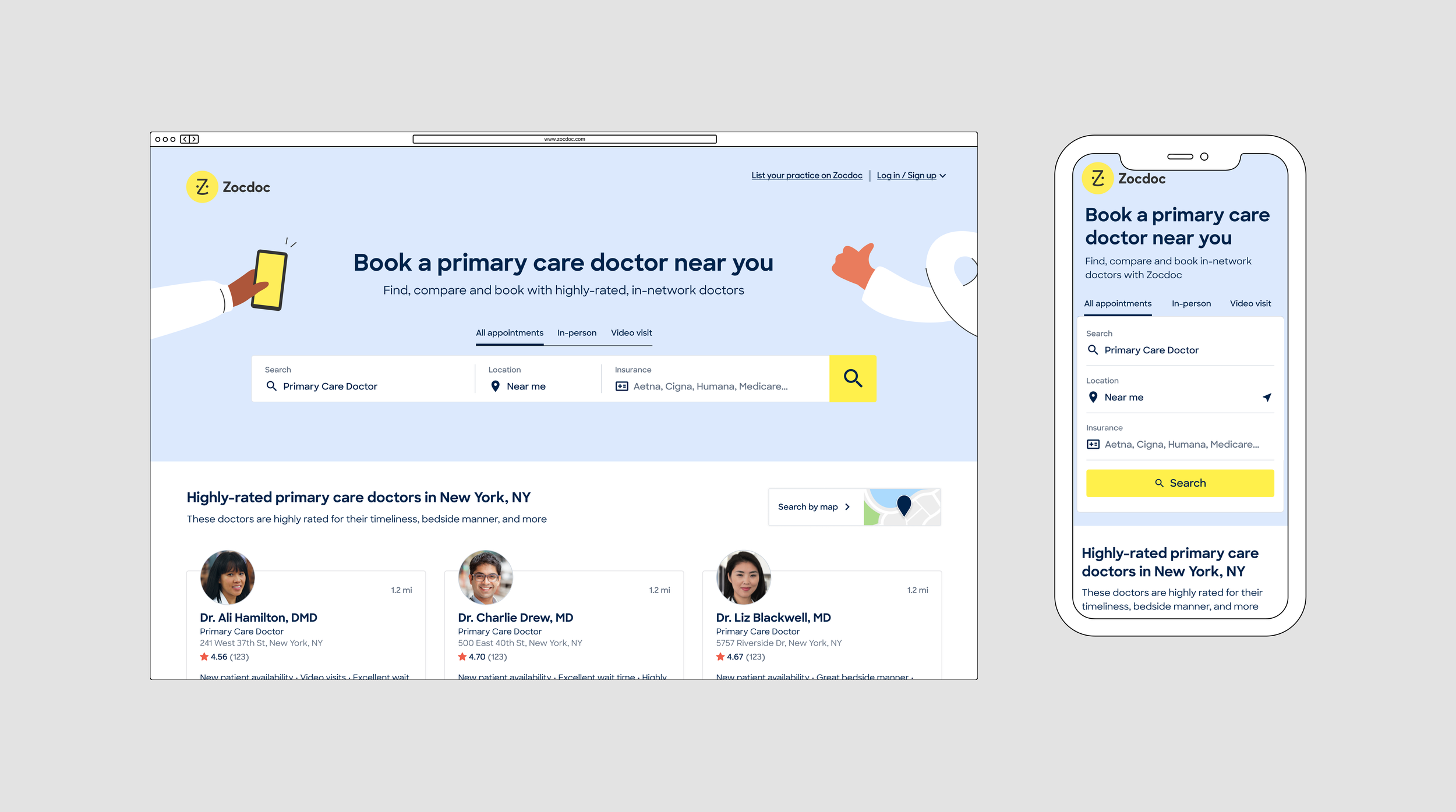
The MVP still addressed the main research findings, and set us up for learnings on future hypotheses. I stayed involved through development and design QA to make sure the shipped experience held together as implementation tradeoffs were made.
Launch and results
The new specialty SEM page launched as an A/B test against the existing listing-page experience.
The experiment ran for roughly eight weeks and produced a statistically significant +4% lift in the primary down-funnel metric, while overall conversion remained flat. The original business target had been +15%, so the MVP improved movement into the funnel but did not reach the larger goal.