Rethinking how complex provider inventory appears in searchRolled up availability
Project overview
Zocdoc was already looking at a growing set of challenges around how provider inventory appeared in Search. When our roadmap shifted and capacity opened up, I proposed using that time for a focused design sprint to explore those questions together, alongside the near-term inventory work already on the roadmap.
I helped structure and co-lead the exploration while owning Search Results Organization. I then carried Rolled-Up Availability through detailed interaction design, implementation, and experimentation.
Date
2024-2025
Role
Senior Product Designer
Team
Product, Engineering, UXR, Data, Product Design
Scope
Desktop/mobile web, Inventory in search exploration, search Results Organization, Rolled-Up Availability, implementation and experimentation
Outcome
A follow-up experiment measured a statistically significant +1.3% overall conversion lift and was recommended for launch.
Creating space to explore the broader problem
Search was already struggling to represent increasingly complex provider inventory. Because results were organized around individual provider locations, the same provider could appear multiple times for different locations or visit types, with their availability fragmented across separate results.
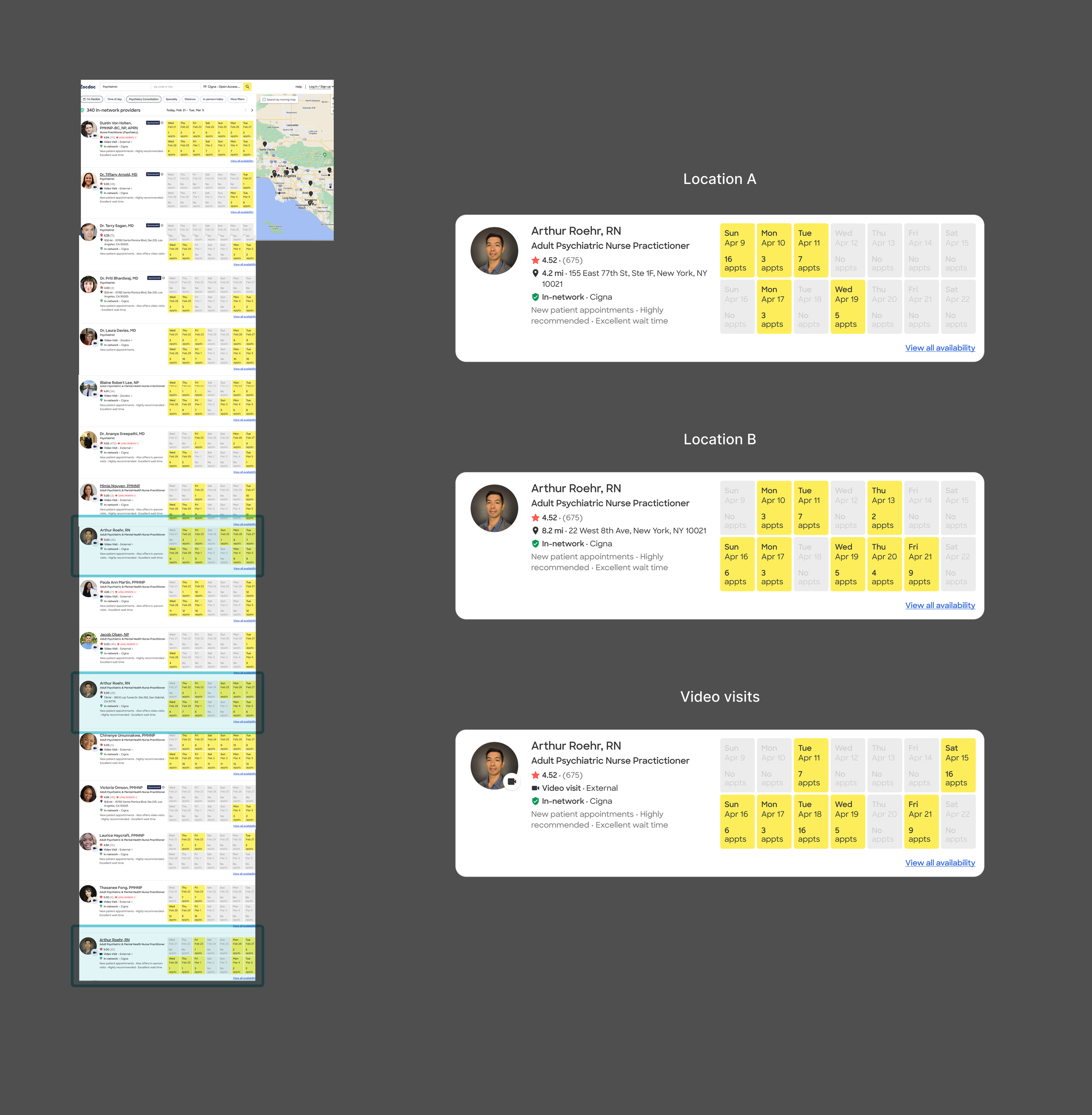
Patients could encounter the same provider more than once, while each result showed only one slice of their available inventory.
Product was already considering a broader set of Inventory in Search problems, from multiple locations and virtual care to practices and how results should be organized.
When another initiative was put on hold and our team unexpectedly had capacity, I proposed using that time for a focused Search design sprint. Rather than treating each problem separately, the sprint would give us space to explore them together while still addressing the near-term inventory work ahead.
Going broader
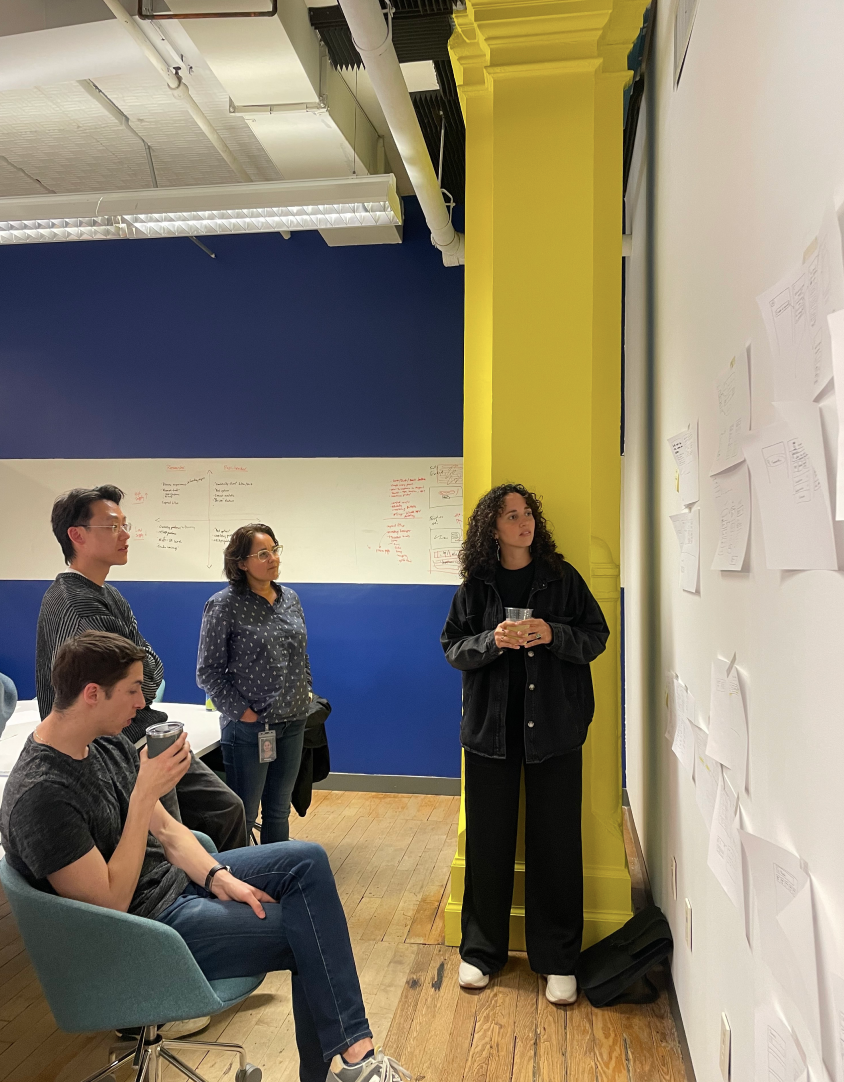
I helped organize and co-lead a cross-functional “Inventory in Search” sprint with more than 14 stakeholders across Design, Product, Research, Engineering, and the broader Search team.
We started with a shared kickoff, then moved into iterative weekly design-and-test cycles, with multiple designers exploring different parts of the Search journey in parallel. I owned Search Results Organization and helped keep the work connected through agendas, check-ins, and a shared Miro synthesis.
We eventually synthesized the exploration into a broader prototype and narrative for leadership. That gave people something concrete to react to rather than a collection of research findings and disconnected concepts. Leadership responded strongly, including feedback that the work was helping push the team beyond incremental improvements and should inform future planning.
About the way we broke out the responsibilities
About the way we broke out the responsibilities
About the way the sprint worked
Finding the right level of refinement
The core interaction question became where patients should manage location and visit type. I explored three models: editing directly inside each result, handling controls at the page level, or keeping detailed editing inside the availability experience.
The availability modal was already the step between Search and booking where patients could review more detailed appointment options, which made it a natural place to consider handling that complexity.
Result-level editing
Appointment-type toggle and location dropdown inside each provider card.
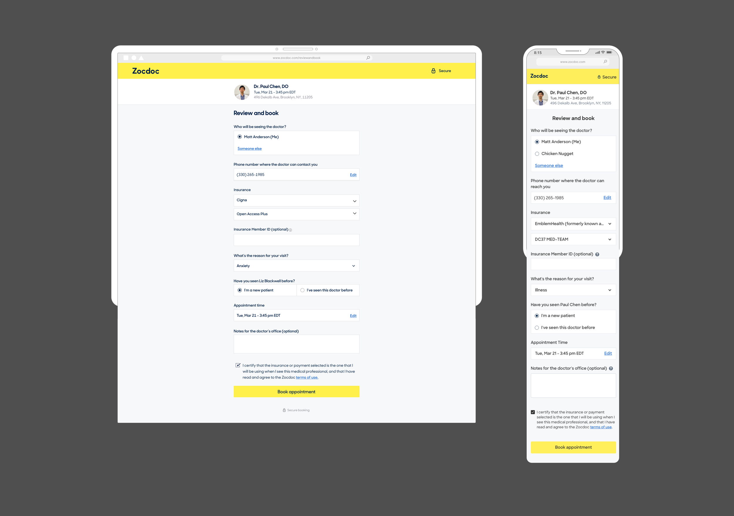
The interface looked relatively simple, but its appointment, patient, and insurance sections sat on top of a much more complicated set of booking rules and dependencies.
Page-level editing
Controls moved out of individual cards and handled more centrally on Search.
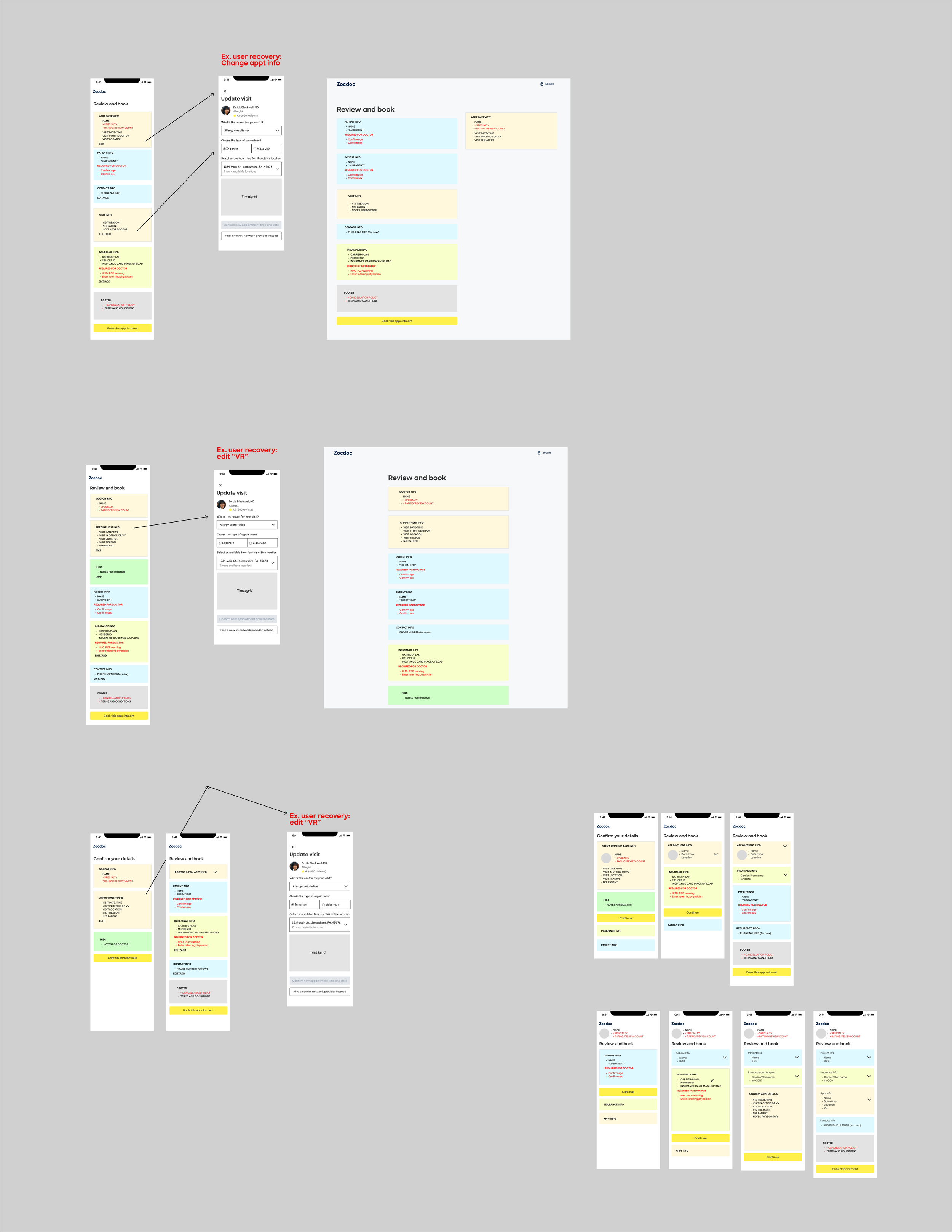
Availability modal editing
Search communicates the available options, while detailed selection happens once a patient opens availability.
Each model traded immediate control against the amount of complexity added to an already dense comparison page
As the work progressed, the question became less about whether we could expose all of that control in Search and more about how much information patients actually needed while comparing providers.
I explored a more generalized card against a higher-detail version. The lighter direction reduced the burden on Search, but risked making additional locations and inventory less obvious. The richer direction made supply more visible, but introduced more information and controls into each result.
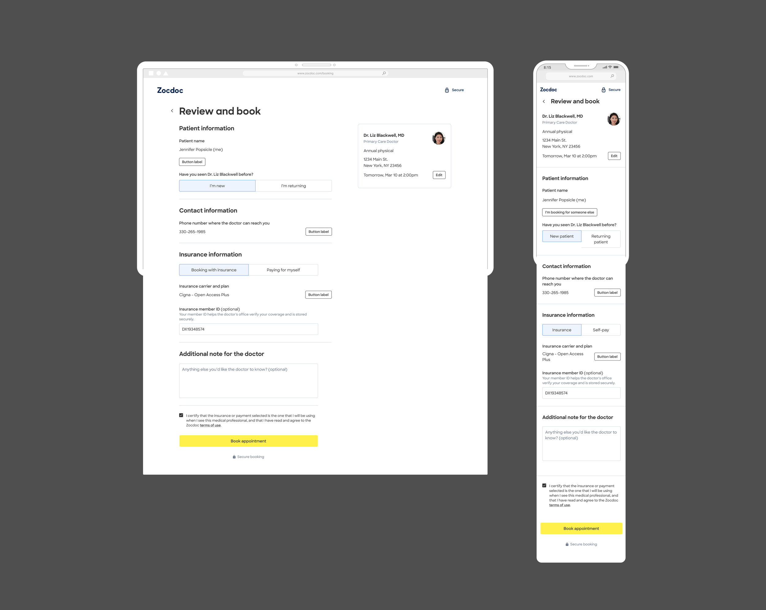
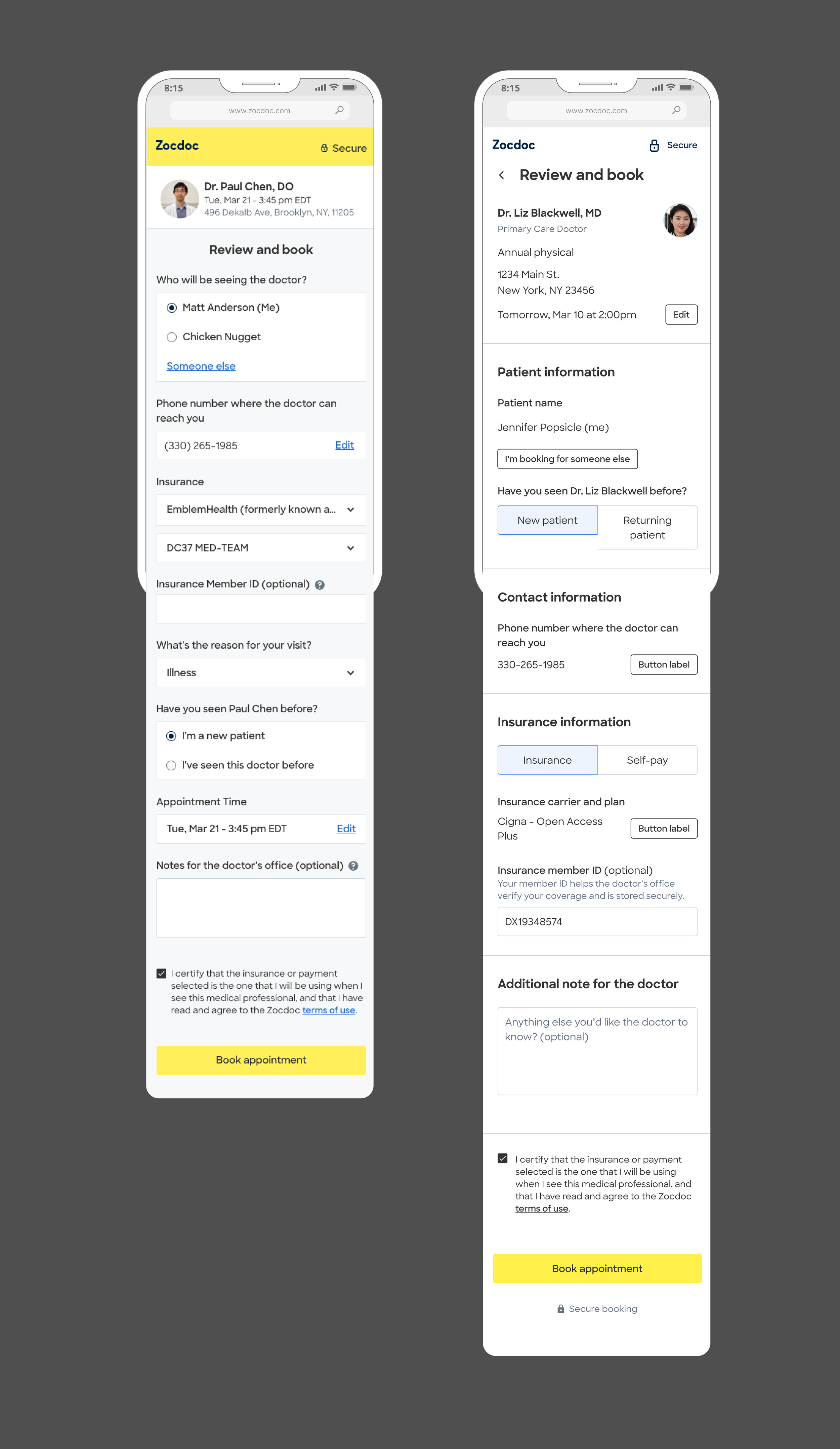
Phase 1 established the new Review & Book structure for the core booking path, creating the visual and interaction foundation the broader migration would build on.
Phase 1 established the new Review & Book structure for the core booking path, creating the visual and interaction foundation the broader migration would build on.
Testing helped us pressure-test those tradeoffs, including whether patients noticed additional locations, how much location detail mattered while browsing, and how much availability context they needed before going deeper.
That work moved us toward a model where Search surfaces the information needed to compare providers, while the availability experience handles more detailed appointment selection.
[VISUAL 3: Search card → availability modal, if you have a clean frame for it]
The direction kept important signals visible in Search without turning every result into a full appointment-management interface.
Rolling up the real system
By the time Rolled-Up Availability became formal product work, the overall direction was clearer: one provider should appear as one result, even when their availability came from multiple locations or visit types. But the underlying system still treated those as separate provider-location records. RUA simplified what patients saw without changing that underlying model.
My job was to turn that direction into a complete interaction model. I worked through which location appeared by default, how In-person and Video availability were distinguished, how additional locations were surfaced, what availability appeared on the card, and what information waited until the patient opened the availability experience.
The design then had to hold up across real inventory combinations. I refined the amount of address and availability detail shown in Search, the treatment of additional locations, visit-type controls, card hierarchy, and states like long names, limited availability, and responsive layouts.
[VISUAL 1: Before → RUA]
Show multiple cards for one provider becoming a single provider-level result.
Annotation:
The system still contained multiple provider-location records. The patient-facing experience presented them as one provider.
The system saw several inventory records. The patient needed to see one coherent provider.
Phase 1 established the new Review & Book structure for the core booking path, creating the visual and interaction foundation the broader migration would build on.
Rolling out the rolled up experience
The first company-wide experiment was mixed. Overall conversion was essentially flat, although downstream appointment quality improved. A separate issue with the Sponsored treatment also prevented the team from moving forward with that version.
The design then had to hold up across real inventory combinations. I refined the amount of address and availability detail shown in Search, the treatment of additional locations, visit-type controls, card hierarchy, and states like long names, limited availability, and responsive layouts.
[VISUAL 1: Before → RUA]
Show multiple cards for one provider becoming a single provider-level result.
Annotation:
The system still contained multiple provider-location records. The patient-facing experience presented them as one provider.