Rebuilding a critical booking step and recovering from an underperforming launchReview & Book
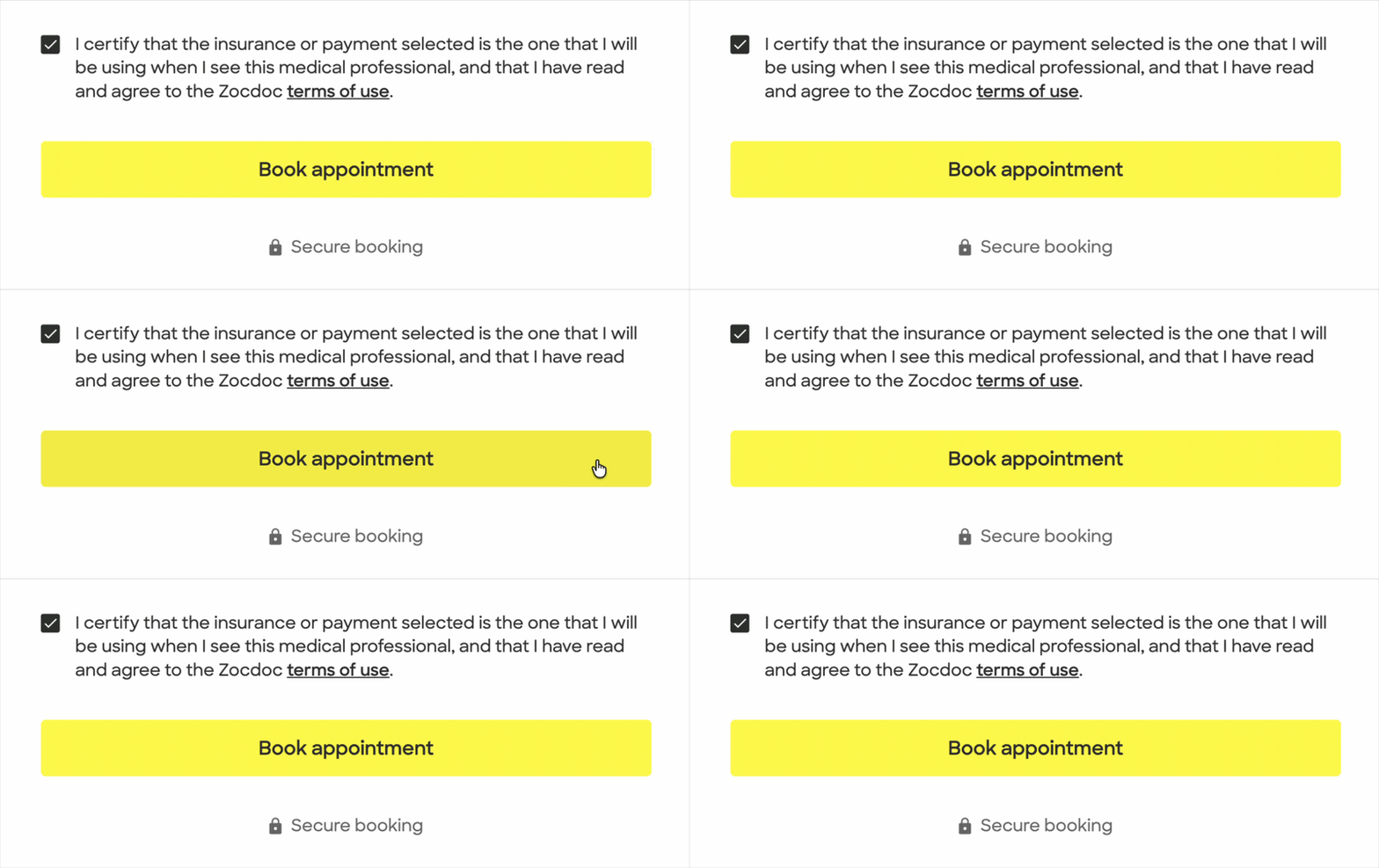
Project overview
I was the primary design owner for rebuilding Review & Book, the final step of Zocdoc’s booking flow, as the team moved it off a difficult legacy system.
The work evolved from a broader effort to improve booking conversion into a major redesign of a high-intent surface where roughly 30% of patients who arrived were not completing their booking. The first release underperformed in production, leading to a cross-functional diagnosis and a substantial redesign that ultimately improved conversion.
Date
2022-2023
Role
Senior Product Designer
Team
Product, Engineering, Analytics, UXR, Design Systems
Scope
Desktop/ mobile web, Booking-flow strategy, Review & Book redesign and migration, MVP definition, usability validation, experimentation, diagnosis, and redesign
Outcome
+2.7% booking conversion on desktop and +1.9% on Mobile Web, representing roughly 2,700 projected additional bookings per month.
The Booking team was formed to improve conversion across the booking flow. Review & Book represented a clear, but daunting opportunity: only about 70% of patients who reached this final step were completing their booking.
Despite being the last step in the booking flow, too many users still encountered errors, confusing edits, and weak recovery states just as they were trying to book. But those problems did not necessarily begin on Review & Book itself. The first step for this newly minted team was to understand how the broader booking journey was contributing to what patients encountered at the end.
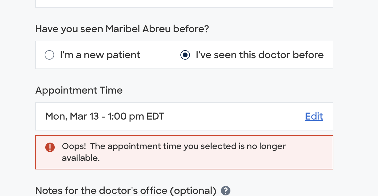
Review & Book was supposed to be a final confirmation step, but patients could still encounter disruptive errors after selecting an appointment, including cases where the appointment was no longer available.
Mapping the booking journey
I mapped the journey across desktop and mobile web surfaces, as well as both app platforms. I wanted to understand how the inputs and collection of information worked together and where the gaps were. This 30,000 ft view of our booking flow had never been recorded, and became a useful artifact for other teams.
Quality control
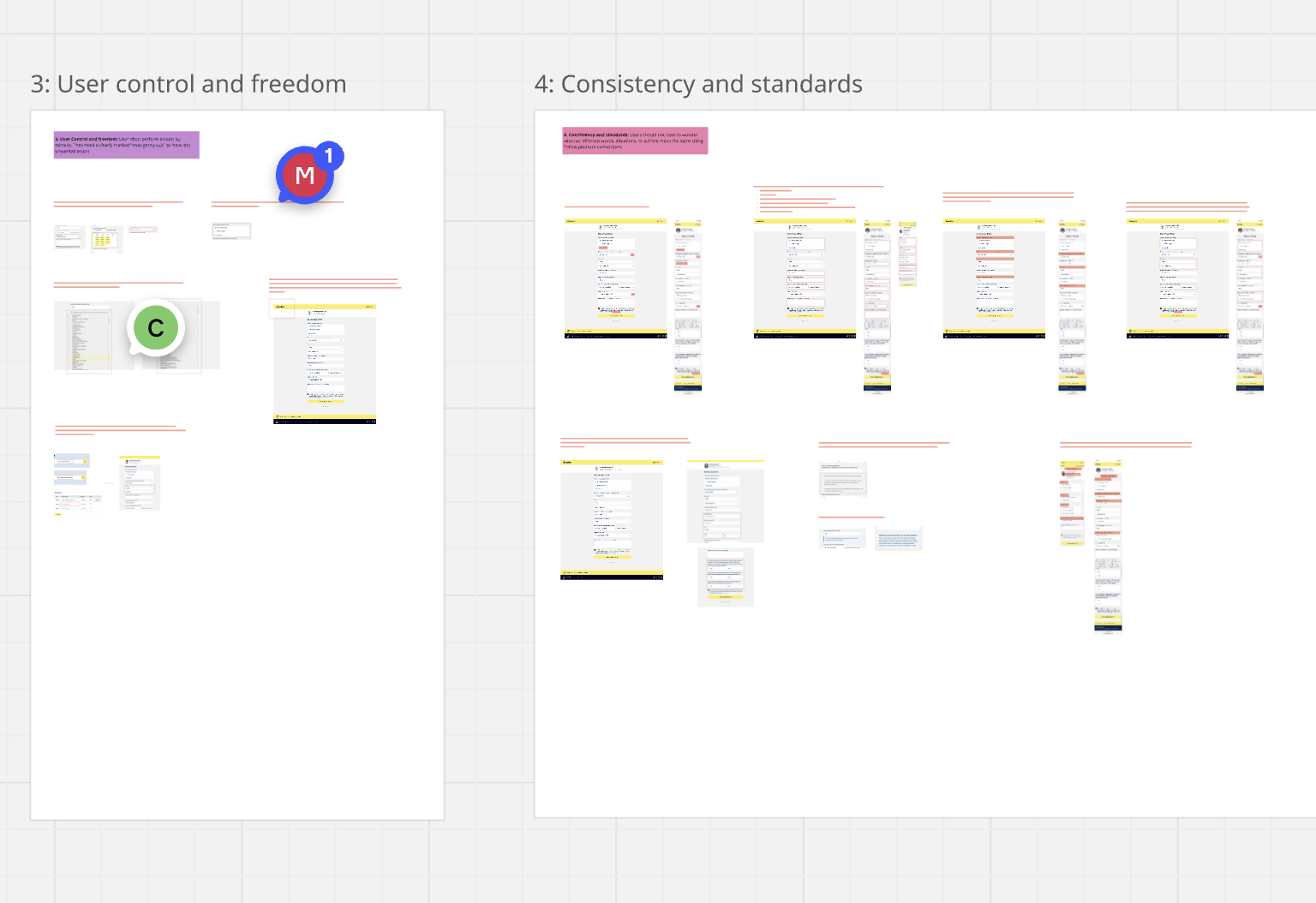
I also audited the Review & Book page itself using Nielsen’s 10 usability heuristics, identifying more than 30 issues across hierarchy, editing, errors, and recovery.
There was no single inventory connecting backend error states to what patients actually saw, so I worked with Product to manually map error tags to their corresponding UI states. I also designed a set of quick-win improvements while the broader strategy continued.
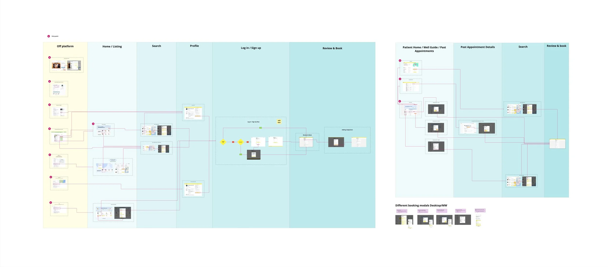
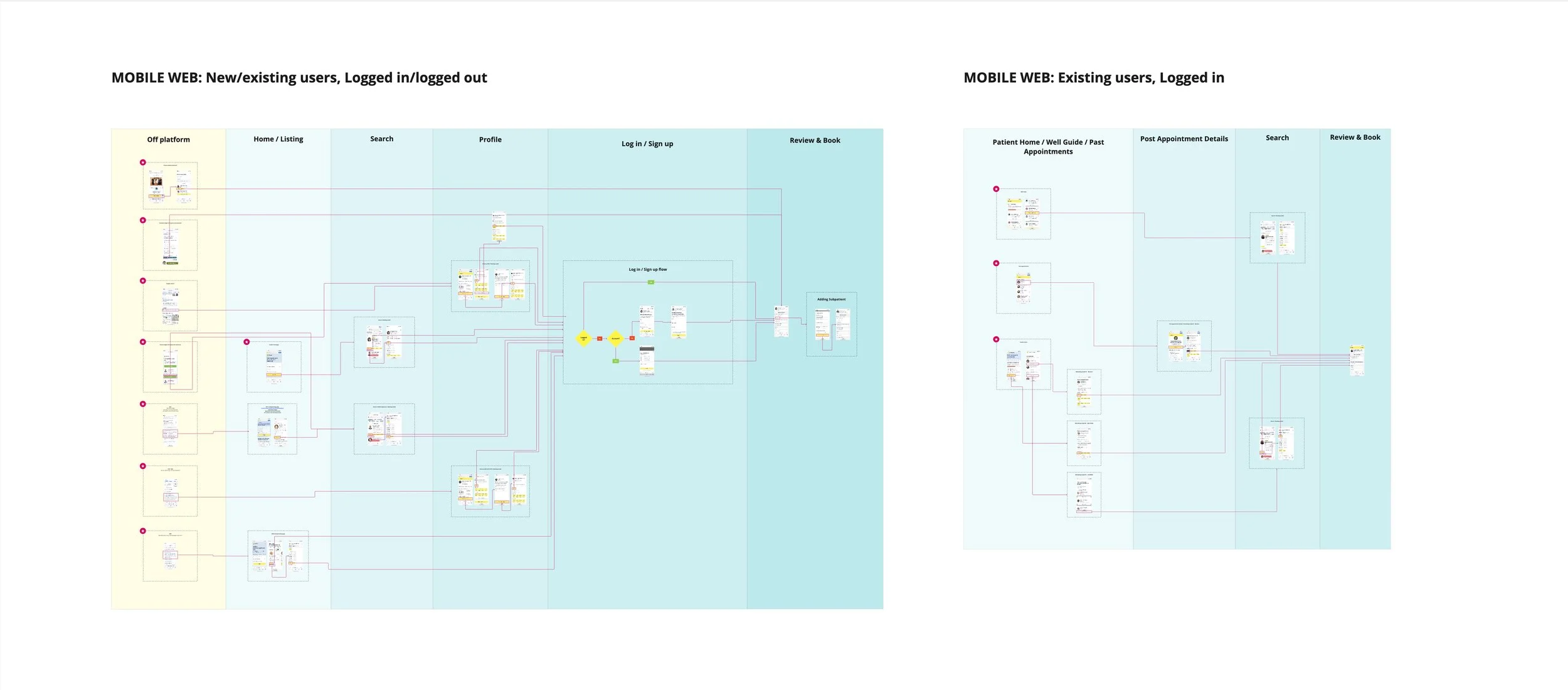
Mapping the existing journey helped make the dependencies between qualification, availability, and Review & Book visible.
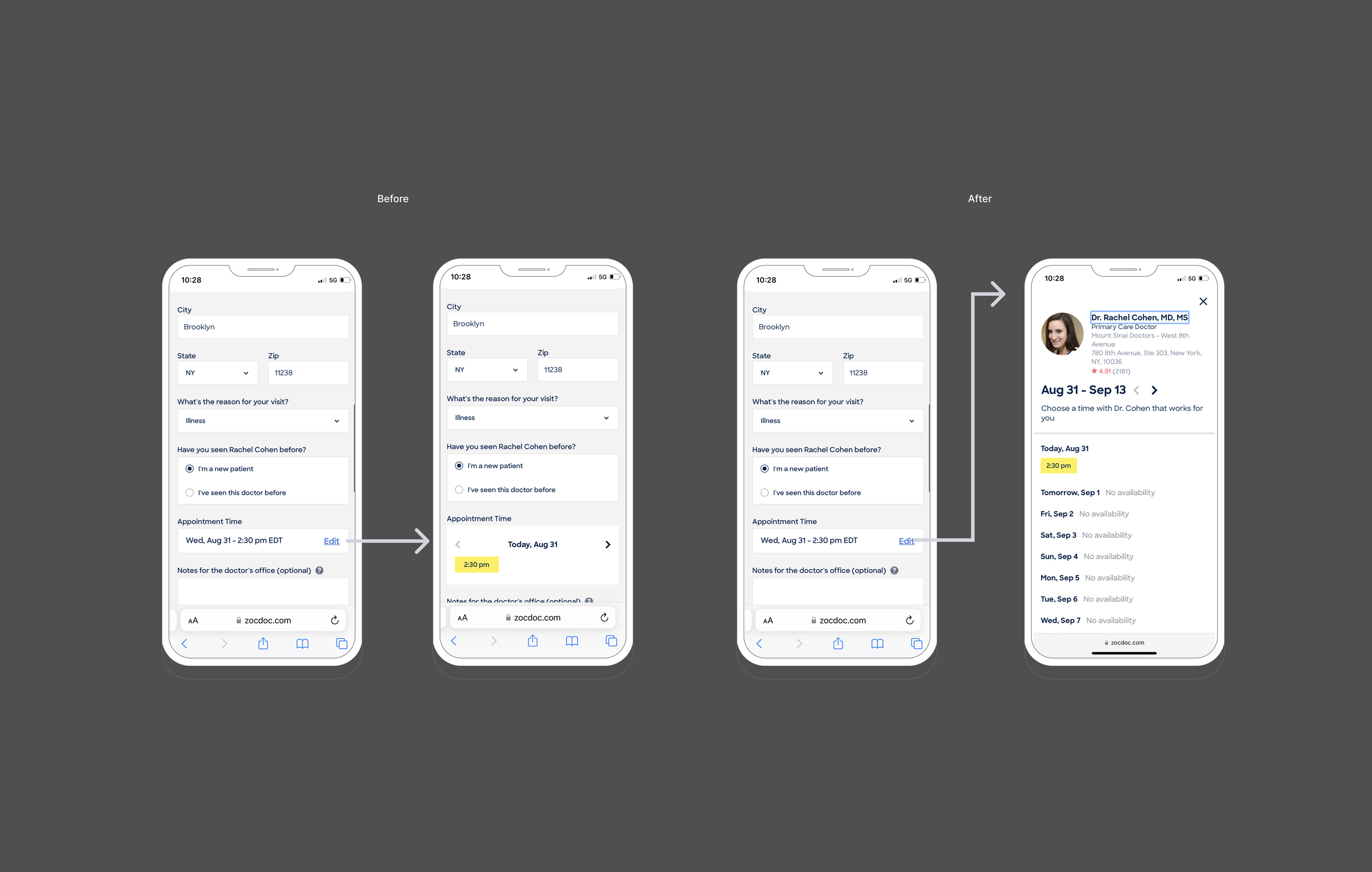
One of the low hanging fruit improvements we immediately implemented included replacing a constrained inline timeslot editor with a focused availability modal that gave patients more context and a clear way to exit without disrupting their original appointment.
The question of qualification
The work surfaced a broader problem: patients could select an appointment before Zocdoc had all the information needed to know whether that appointment was actually valid.
Insurance, visit reason, patient status, and provider requirements could still affect availability later in the journey, creating conflicts that surfaced on Review & Book.
Rather than treating those conflicts only as an end-of-funnel problem, we explored whether more qualification could happen earlier.
I designed three Booking Vision concepts that tested different ways of sequencing qualification and availability.
Testing the upstream approach
The team moved forward with a Step-by-Step direction, and I designed an Insurance Stepper to test whether collecting insurance before timeslot selection could reduce qualification conflicts later in the booking flow.
The experiment did not produce the conversion improvement we needed, so the team re-sequenced the work toward Review & Book itself.
Mapping the existing journey helped make the dependencies between qualification, availability, and Review & Book visible.
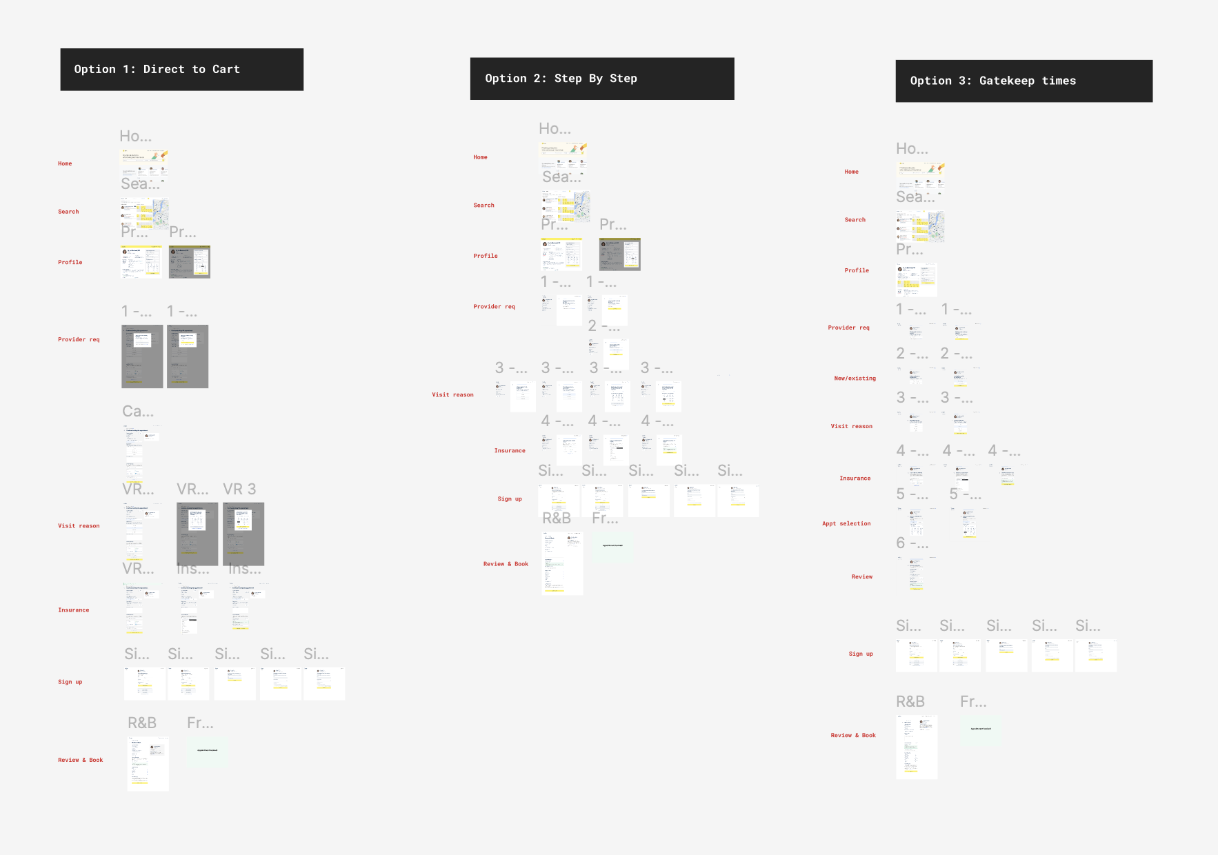
The concepts explored different tradeoffs between showing availability early and qualifying patients before they selected a time.
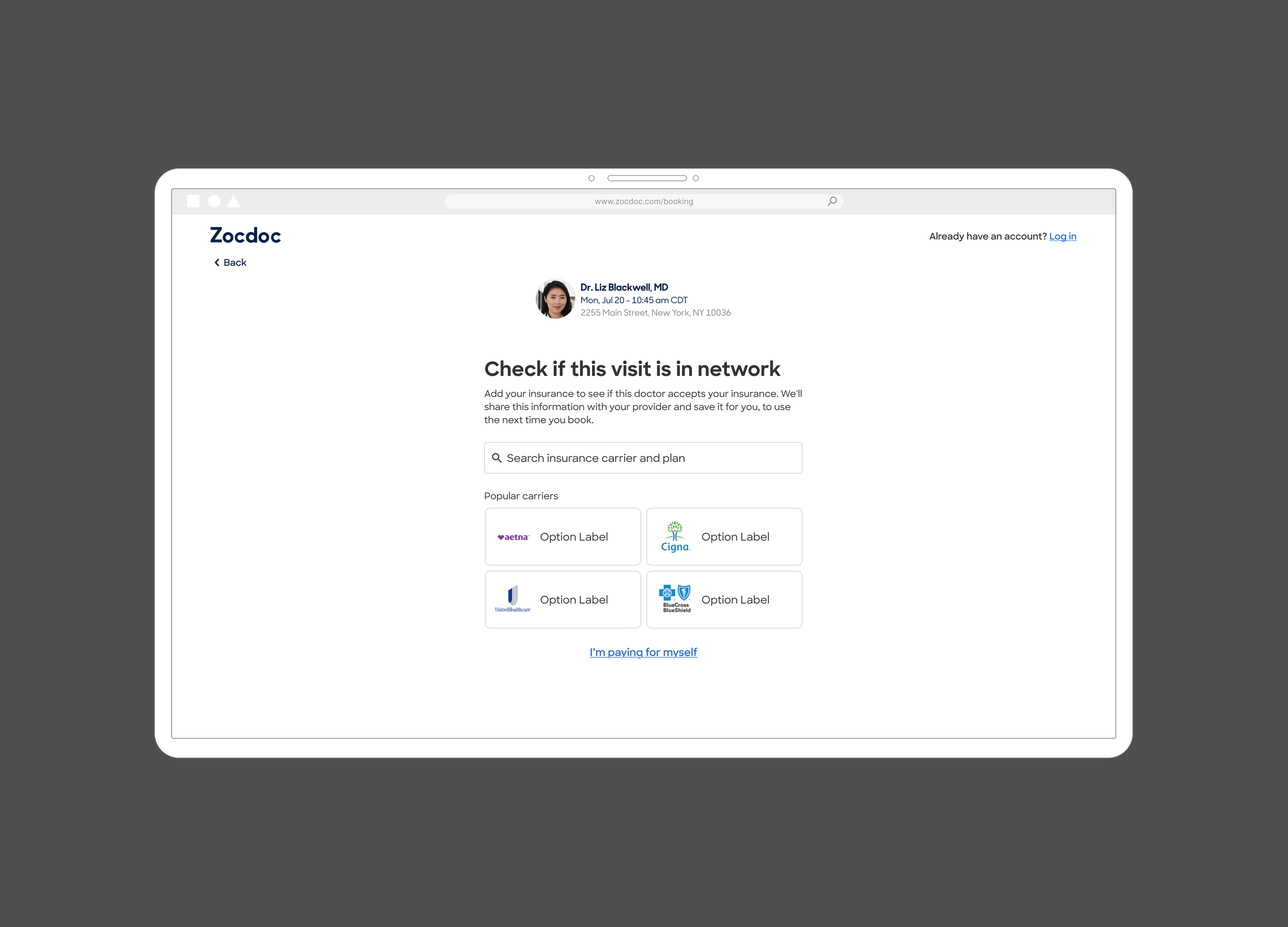
The Insurance Stepper moved insurance earlier in the journey, testing one part of the broader Step-by-Step vision.
Rebuilding Review & book
With the work re-sequenced toward the end of the funnel, I took design ownership of rebuilding Review & Book on Zocdoc’s newer product architecture.
This was more than a visual redesign. The existing page had accumulated years of booking rules, exceptions, editing behavior, and recovery logic, all on one of the last major surfaces still running on the legacy system.
Reshaping the experience
I approached the redesign mobile first. Rather than reproduce the legacy page screen for screen, I broke it into its underlying content and interaction blocks and explored how they should be grouped, ordered, and prioritized.
The rebuild also brought Review & Book into Zocdoc’s Mezzanine design system, creating a more flexible foundation for the immediate redesign and the more complex booking scenarios that would follow.
Reshaping the experience
I approached the redesign mobile first. Rather than reproduce the legacy page screen for screen, I broke it into its underlying content and interaction blocks and explored how they should be grouped, ordered, and prioritized.
The rebuild also brought Review & Book into Zocdoc’s Mezzanine design system, creating a more flexible foundation for the immediate redesign and the more complex booking scenarios that would follow.
Making the final step easier to review
The legacy page gave appointment, patient, and insurance information similar visual weight. I reorganized the experience around what patients needed to confirm before booking, making the page easier to scan while keeping editing available where the MVP supported it.
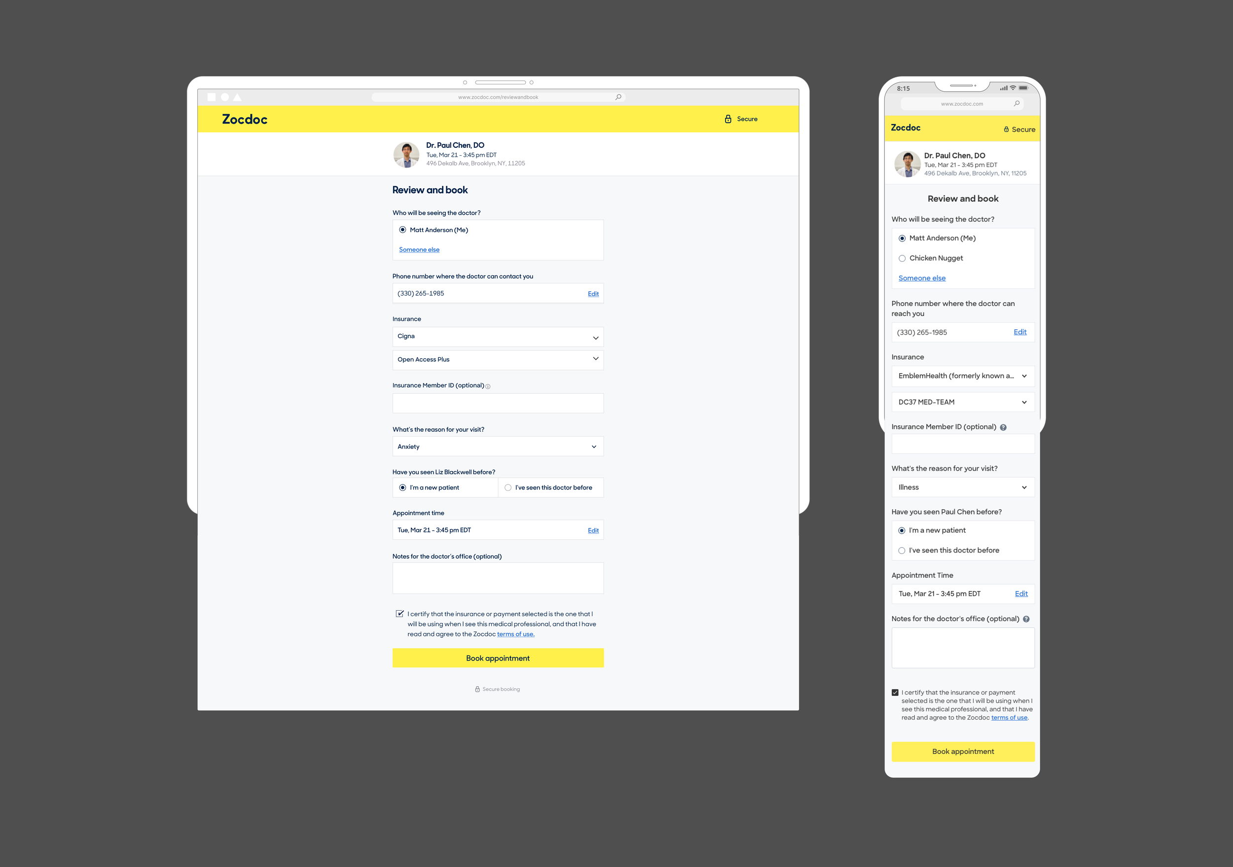
The interface looked relatively simple, but its appointment, patient, and insurance sections sat on top of a much more complicated set of booking rules and dependencies.
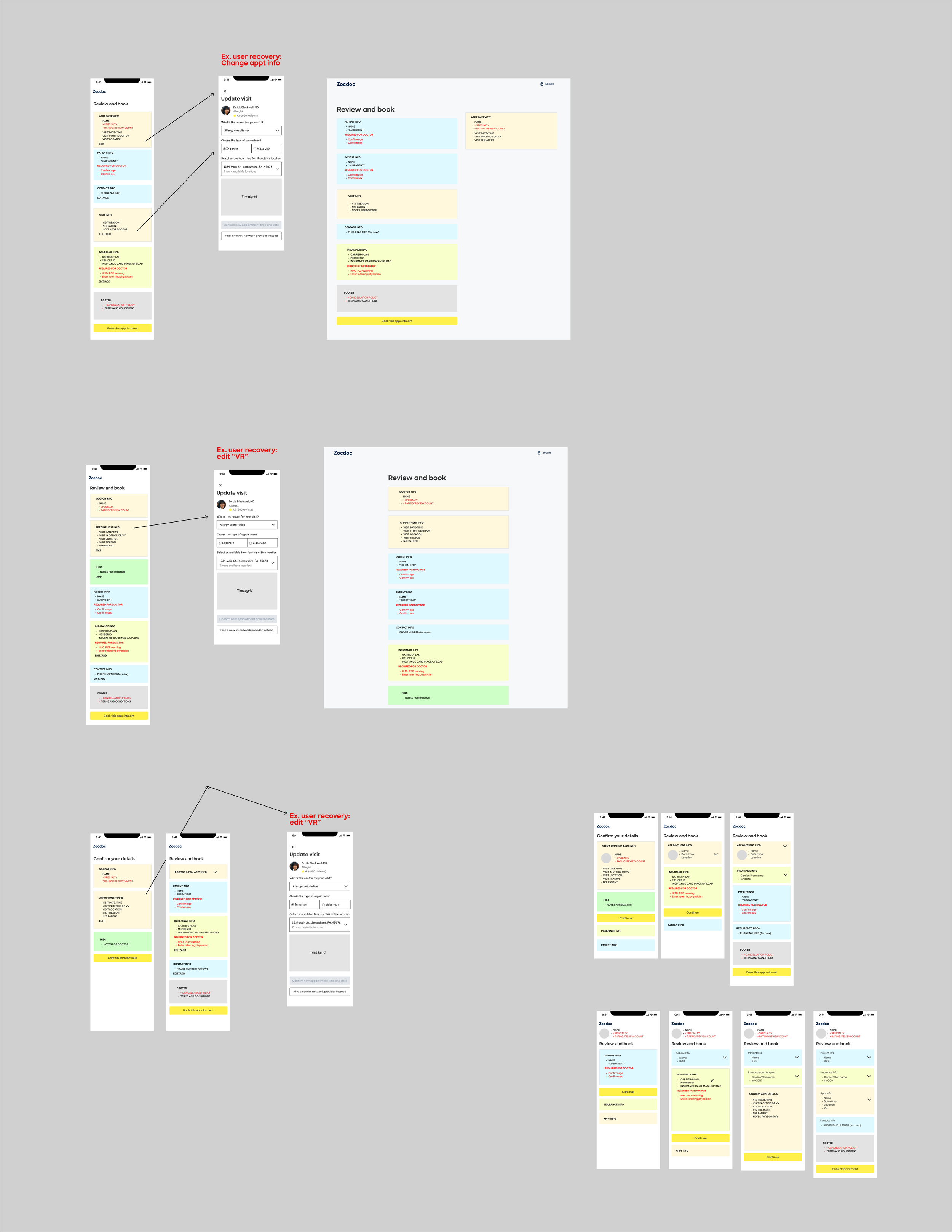
I used low-fidelity content blocks to test different hierarchies before moving into detailed UI.
Phase 1 MVP
We could not migrate every legacy scenario at once, so I worked with Product and Engineering to define a narrower first release.
The MVP moved the core booking path onto the new Review & Book, while most edits and unsupported scenarios temporarily returned patients to the legacy experience. This let us establish the new foundation without waiting to rebuild every rule and exception at once.
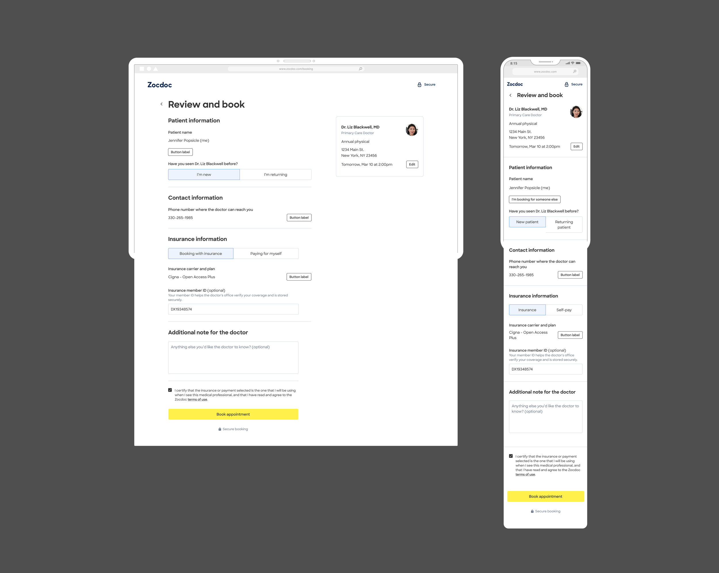
Phase 1 established the new Review & Book structure for the core booking path, creating the visual and interaction foundation the broader migration would build on.
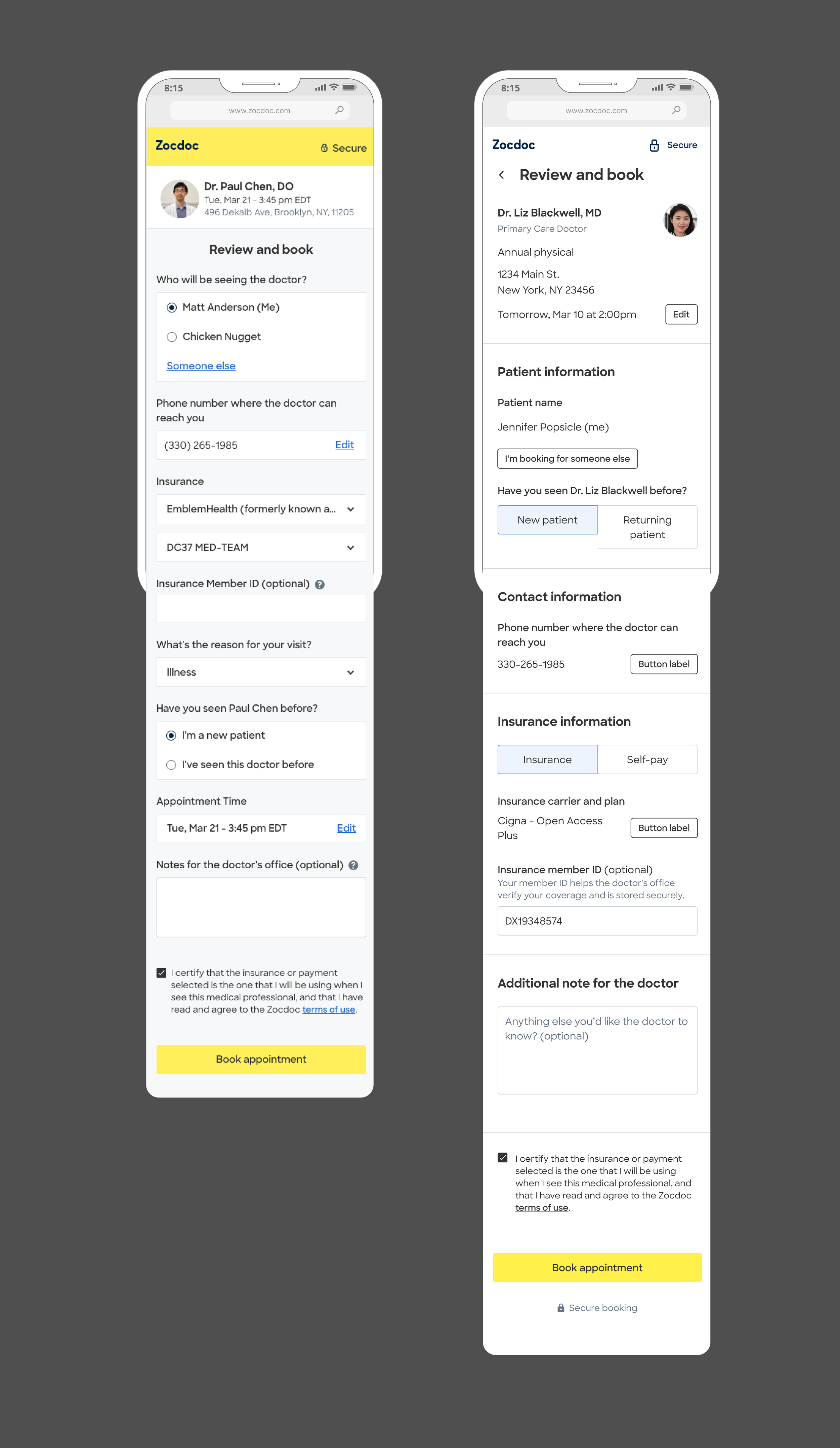
[IMAGE: Annotated Phase 1 Review & Book]
The new hierarchy prioritized booking-critical information while reducing the visual weight of secondary content and controls.
Designing beyond the MVP
Phase 1 was intentionally narrow, but the design work extended well beyond the initial release. While the MVP was being prepared, I was already working through how more of the booking experience could move off the legacy system.
Recovery paths
A major next step was keeping common edits inside the rebuilt experience instead of sending patients back to legacy Review & Book.
I designed recovery paths for changing appointment time, New/Existing patient status, and insurance, including cases where a change meant the patient’s original timeslot was no longer valid.
More complex booking scenarios
The new Review & Book also had to support scenarios that did not fit the core path.
I worked through cases like video visits, mental health appointments, required addresses, subpatients, and referring-physician information. Each introduced different requirements, but the goal was to extend the same underlying Review & Book framework rather than create a collection of one-off solutions.
The recovery work explored how edits could stay within the new Review & Book, connecting a change to its effect on availability and helping patients select a valid appointment when needed.
These explorations tested how the new framework could accommodate increasingly complex patient, provider, and appointment requirements as more of the booking experience moved off the legacy system.
Validating and releasing the MVP
Before launch, I wrote the research brief and ran usability testing on the interactions I was most concerned about. The core experience held up without major usability issues.
We launched the Phase 1 MVP in May 2023. The first production read looked roughly flat, but as we dug deeper, it became clear that the new experience was underperforming.
By then, substantial recovery and expansion work had already been designed around the new foundation. Before we could keep building on it, we needed to understand why that foundation was not performing.
Redesigning the experience
The negative result did not point to a single cause. Some issues were technical, while others were hypotheses about the design itself.
I worked with Product, Engineering, and Analytics to separate what we knew from what we suspected, looking at defects, legacy redirects, instrumentation, platform differences, CTA visibility, error states, and how patients were moving through the page.
Once the known implementation issues were addressed, I focused the next design iteration on simplifying the experience itself. I redesigned Review & Book around a simpler idea: make the final step feel like a review, not another form to work through.
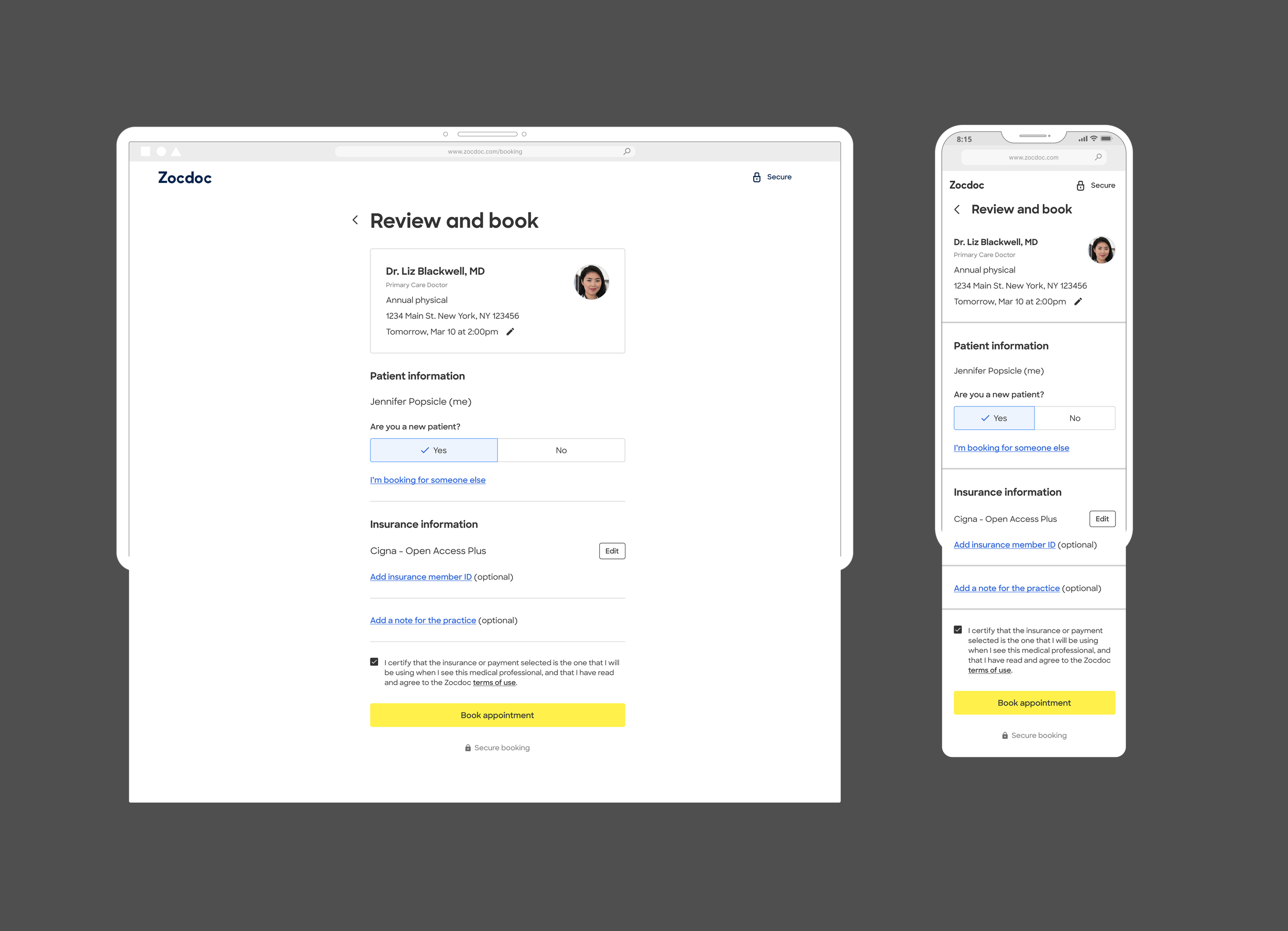
The Phase 2 redesign simplified the page into a one-column hierarchy, moved the Book action higher, removed unnecessary labels and repeated information, and deemphasized secondary fields across desktop and Mobile Web.
The redesign recovered conversion
The redesigned Review & Book improved booking conversion across both platforms.
+2.7% Desktop conversion
+1.9% Mobile Web conversion
The final experiment was projected to drive roughly 2,700 additional bookings per month.
Building on the new foundation
With the redesigned experience performing, the team continued bringing more booking scenarios onto the new Review & Book, expanding beyond the initial MVP and reducing reliance on the legacy system.
For me, the project reinforced that usability testing and production performance answer different questions. The strongest part of the work was not getting the first design right, but staying accountable when it did not perform, separating implementation problems from design hypotheses, and continuing to iterate until the experience worked for patients and the business.