Simplifying a restaurant website around the thing people came to do: order foodPotbelly Redesign
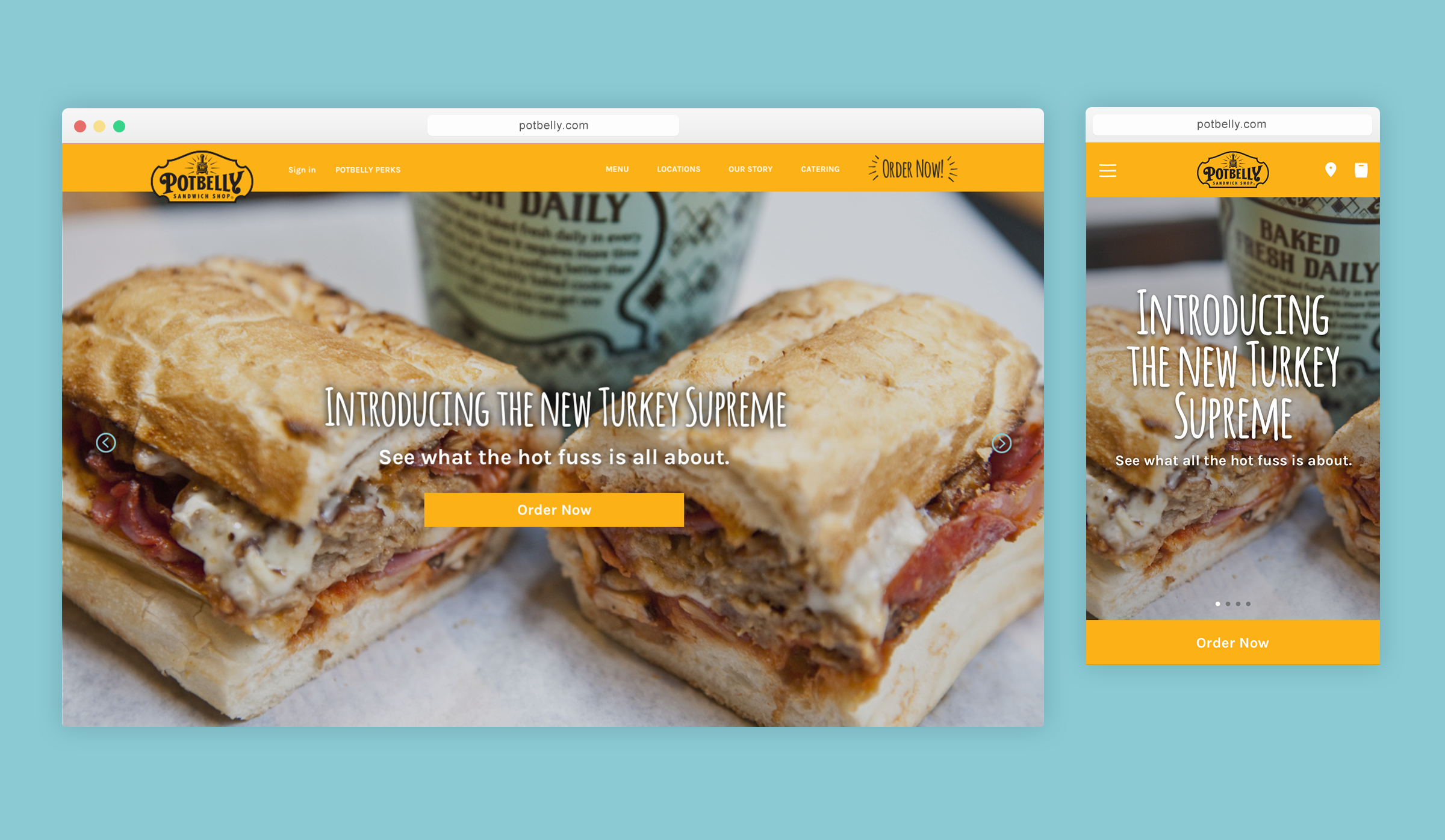
Project overview
Potbelly’s website needed to do several things at once: tell the brand story, help customers find shops and browse the menu, and support online ordering.
I worked as the designer on a small agile team, redesigning the site across desktop and mobile with a focus on simplifying navigation, improving ordering, and creating a cleaner visual expression of the Potbelly brand.
Role
Designer
Scope
Information architecture, ordering flow, responsive UX/UI, visual design
Platforms
Desktop + mobile web
Date
2017
The problem
Potbelly’s existing website had a lot of personality, but also a lot of visual and structural complexity. The redesign needed to make the experience easier to navigate, work across desktop and mobile, and give online ordering a much clearer role without losing the character of the brand.
Through user flows, site maps, competitive audits, and team workshops, we clarified the primary goal: make it as easy as possible for customers to order food. We simplified the site architecture so Potbelly’s broader content remained accessible without competing with that primary action.
Simplifying the structure and flows
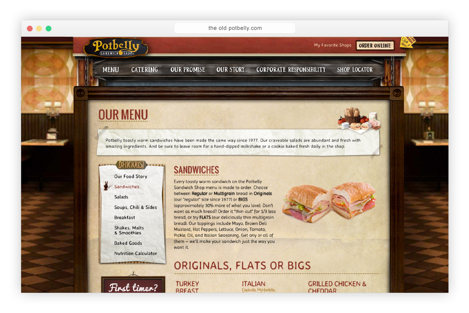
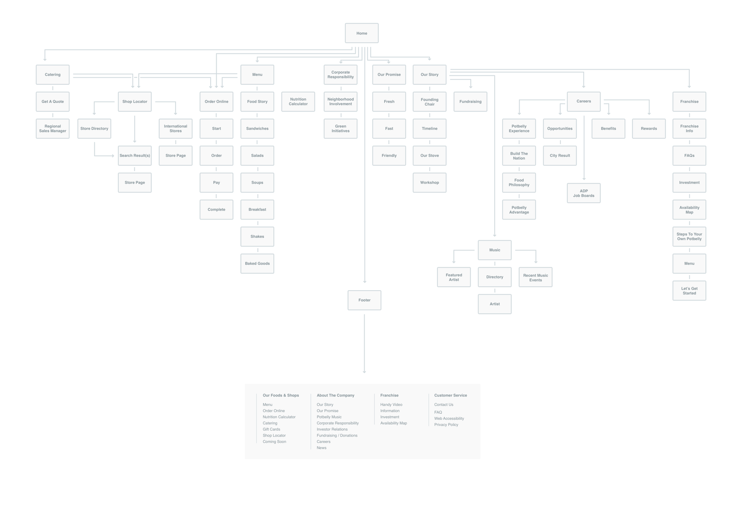
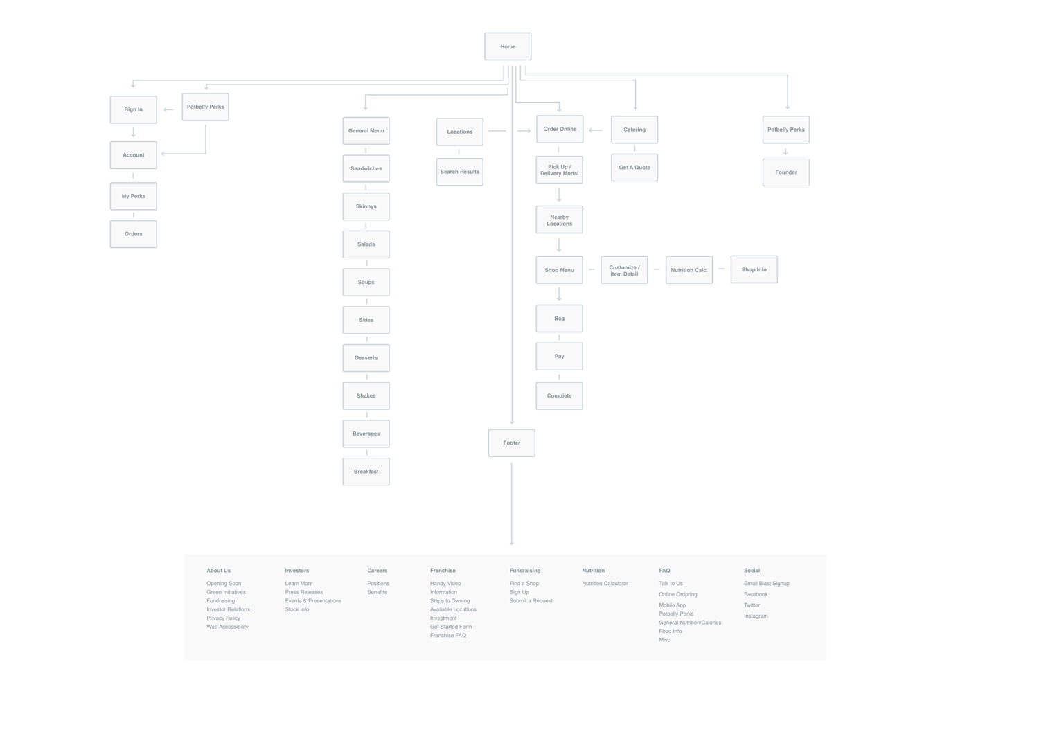
We started by reworking the site map and key user flows to make the experience easier to understand. The existing structure carried a lot of Potbelly’s content, but it made the path to ordering feel more complicated than it needed to be.
We consolidated the architecture into a simpler, more modular system and cleaned up the paths through ordering so supporting content stayed accessible without competing with the primary task.
Flow 1
Flow 1
Designing around real ordering complexity
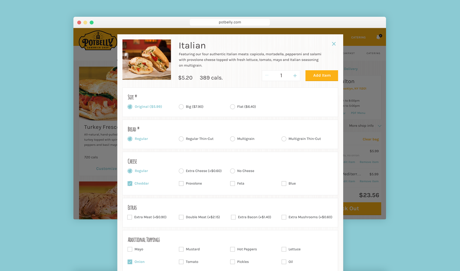
The ordering flow had to account for different pickup and delivery rules by location, as well as order size and timing. For example, orders over 20 people could be routed into catering. I used the wireframes to work through these branching paths without making the experience feel complicated.
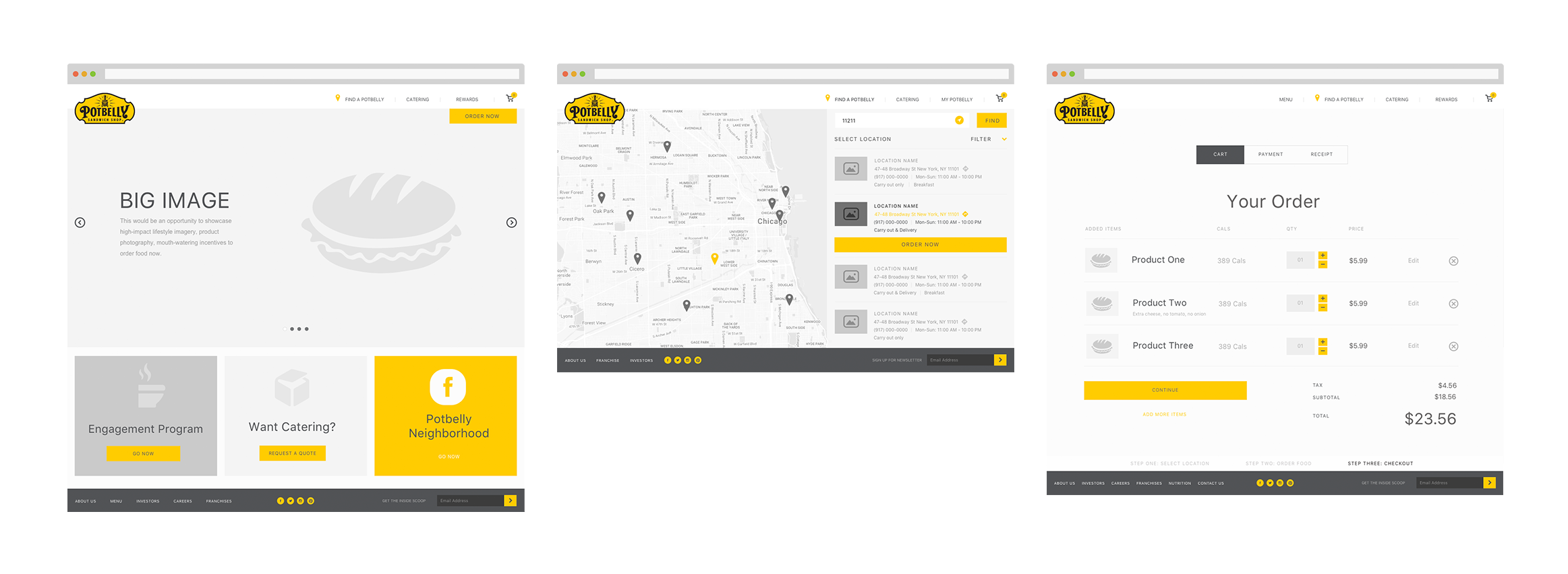
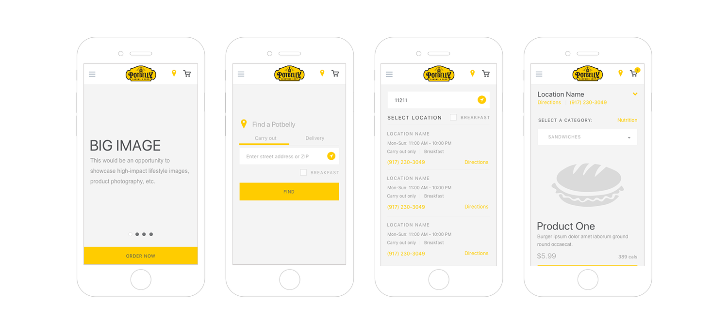
Designing one system across desktop and mobile
Responsive behavior was part of the design from the beginning rather than a desktop experience adapted at the end.
I designed mobile and desktop states together, using patterns such as collapsing content, persistent actions, responsive breakpoints, tappable directions and phone numbers, and condensed location and menu information.
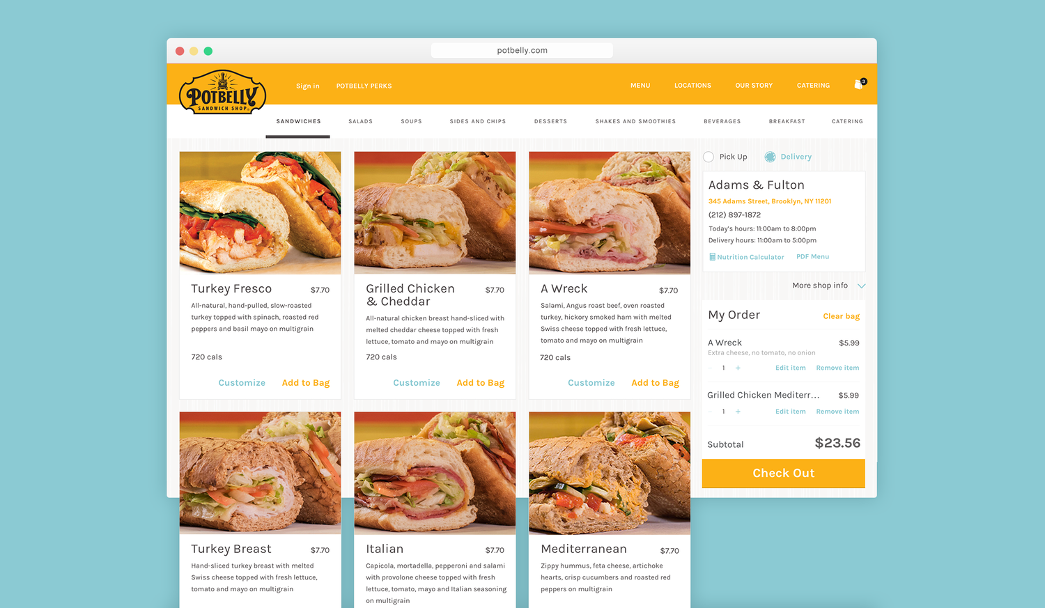
Visually, I also wanted the digital experience to feel more like Potbelly itself. The existing site leaned heavily on skeuomorphic styling, while the brand’s physical materials already had much more warmth and character.
I translated that personality into a cleaner visual language using typography, illustration, modular cards, and a simpler hierarchy, all while preserving the quirkiness of the brand without reproducing the visual noise of the old site.
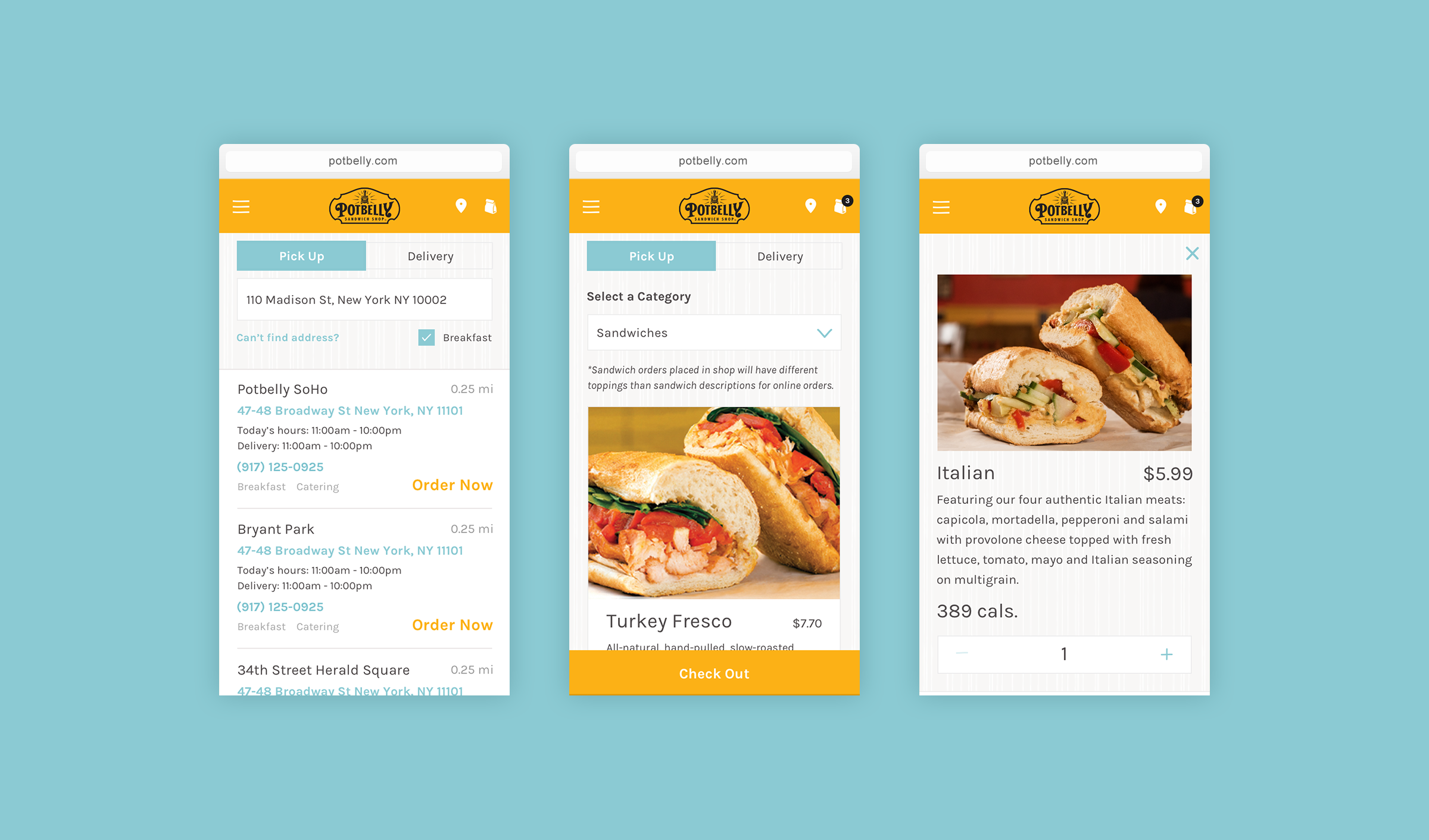
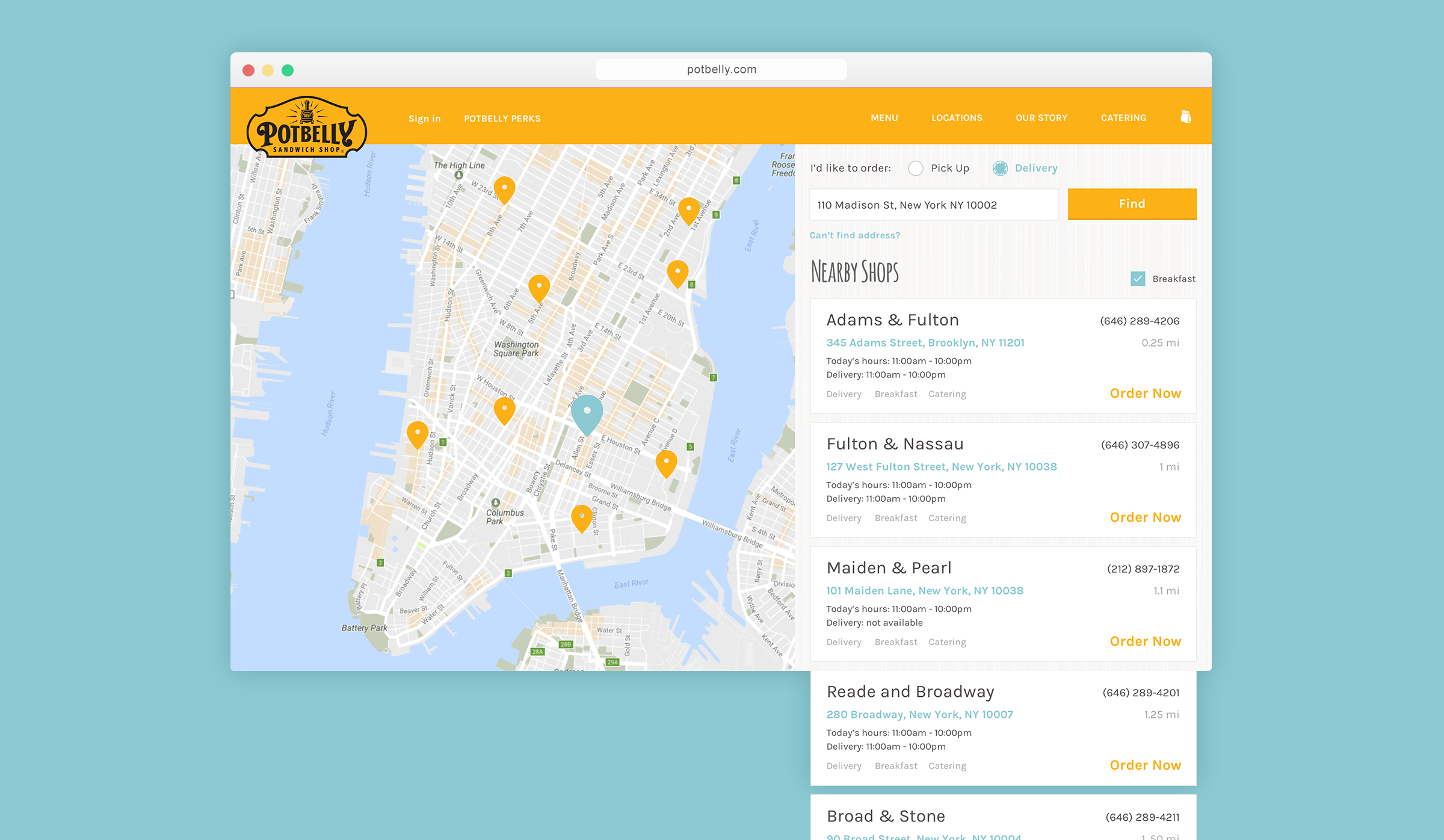
Project takeaway
Potbelly was an early lesson in something that has continued throughout my product-design work: simplifying an interface doesn’t necessarily mean simplifying the system underneath it.
The strongest experience came from deciding what deserved prominence, then designing enough flexibility into the system to handle the messy realities behind a seemingly simple action like ordering a sandwich.