Passwordless
Building a coherent identity experience across legacy systems
Project overview
Zocdoc needed to modernize its “Identity” experiences across the product. Login and Create Account, as well as its relation to recovery, verification, and booking had evolved into a fragmented system across platforms and entry points.
As the primary designer for Passwordless Login and Passwordless Create Account, I mapped how those experiences interacted and designed a staged passwordless model that could work across them without requiring the underlying identity architecture to be rebuilt all at once. Booking became an important proving ground because identity friction there directly affected conversion.
Date
2023
Role
Senior Product Designer, primary designer for Passwordless Login and Passwordless Create Account
Team
Product, Engineering, Analytics, Identity
Scope
Desktop web, Mobile Web, iOS, Android; Login, Create Account, account-state routing, phone verification, recovery, and booking dependencies
Outcome
The team's Passwordless Login experiment measured a 6.6% increase in booking conversion for eligible returning users. Passwordless Create Account later produced a statistically significant 1.1% increase in overall conversion and rolled out across web.
Why Zocdoc’s identity experience needed to change
Friction was showing up across Login and Create Account, but our leaky booking funnel made the cost especially visible.
By the time a logged-out patient reached the Patient Info page, they had already chosen a provider and appointment. Yet roughly 30% dropped before successfully logging in or signing up.
Return users
Returning patients often faced password friction because they logged in infrequently, making forgotten passwords and recovery a recurring problem.
New users
New patients faced a different version of the same issue. They had to create a password for their account even though they also needed to provide and verify a phone number to complete the booking. Roughly 10,000 patients per month abandoned at the create-password step alone.
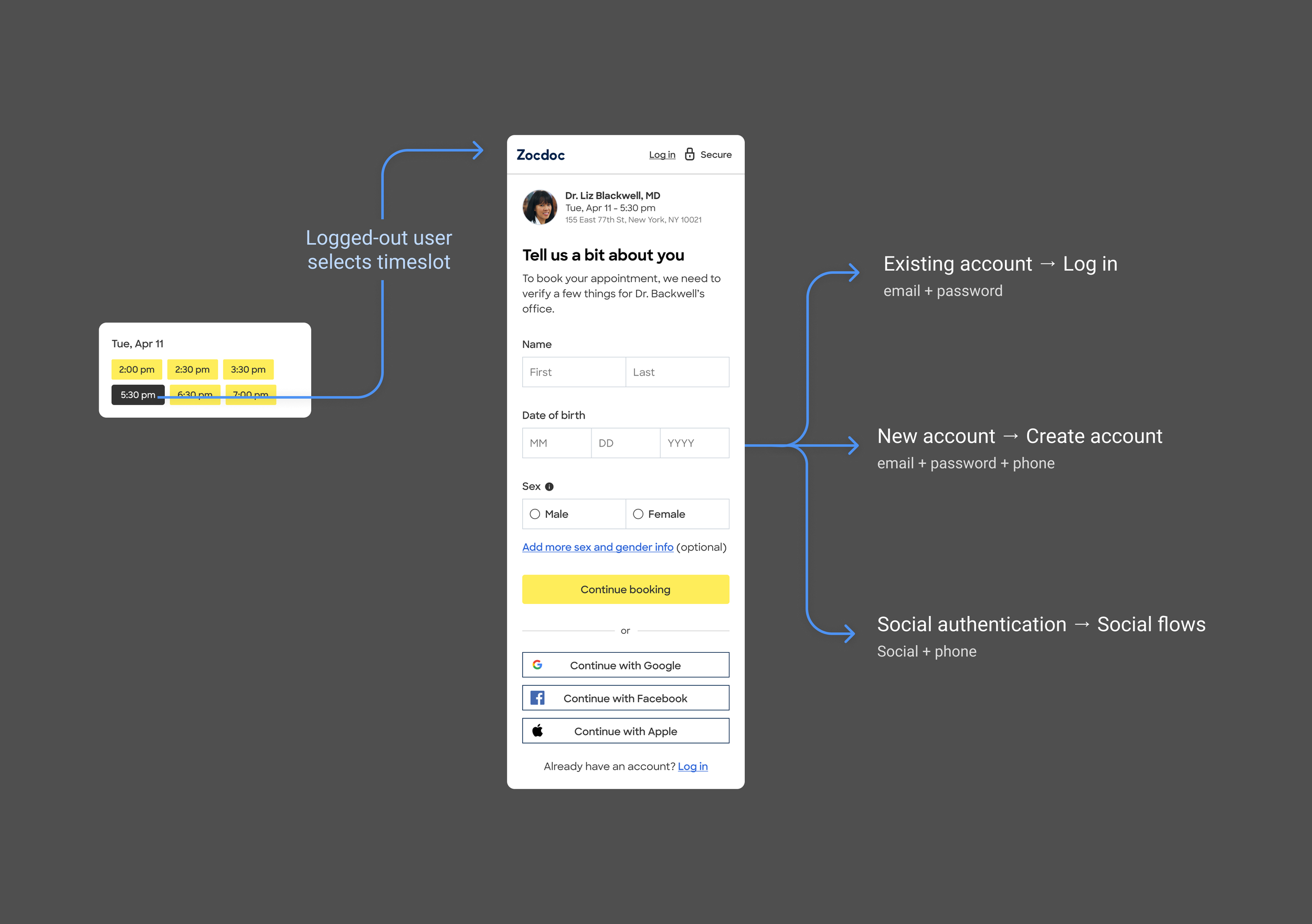
After selecting a timeslot, logged-out patients reached Patient Info, where they could continue through Login, Create Account, or Social Login. Roughly 30% abandoned before successfully logging in or signing up. The redesign focused on email-based Login and Create Account; Social Login was outside its scope.
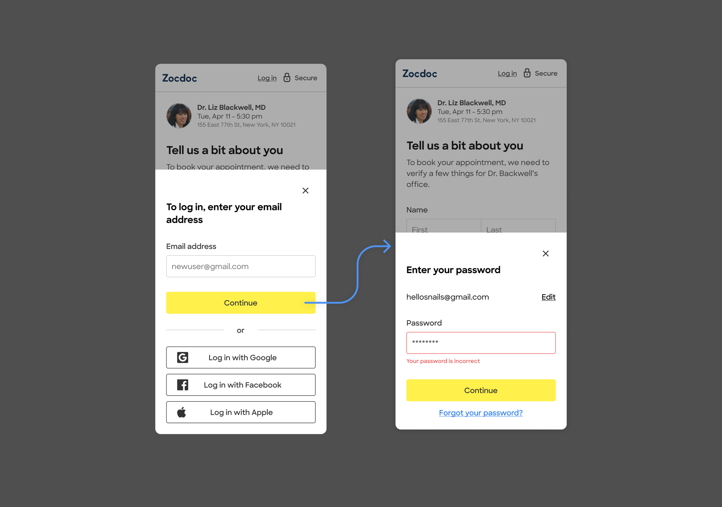
Return users blah blah blah
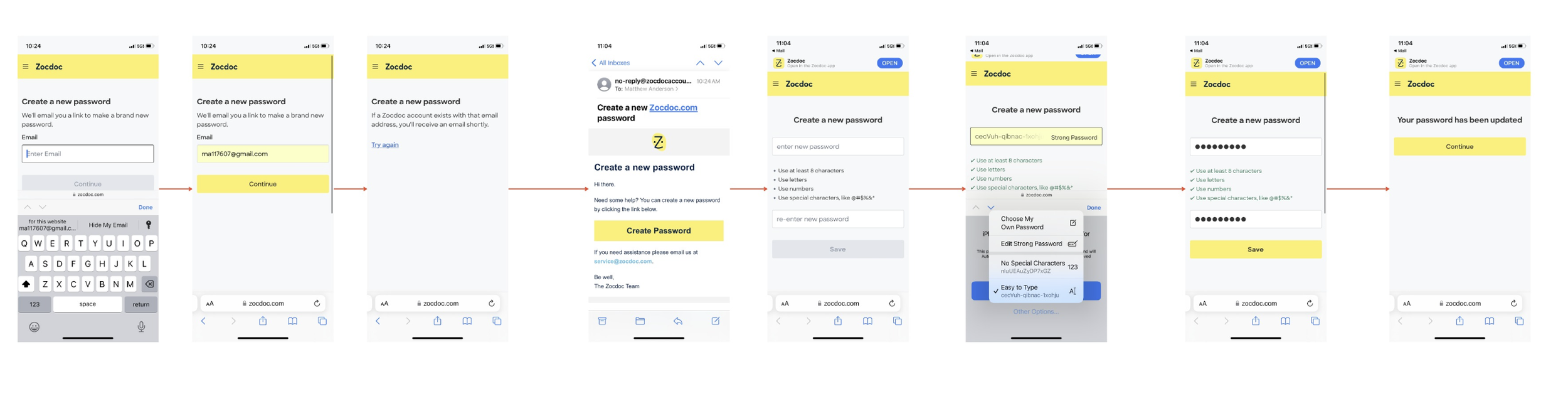
Forgot password: The reset password flow added several steps before a returning patient could get back to booking.
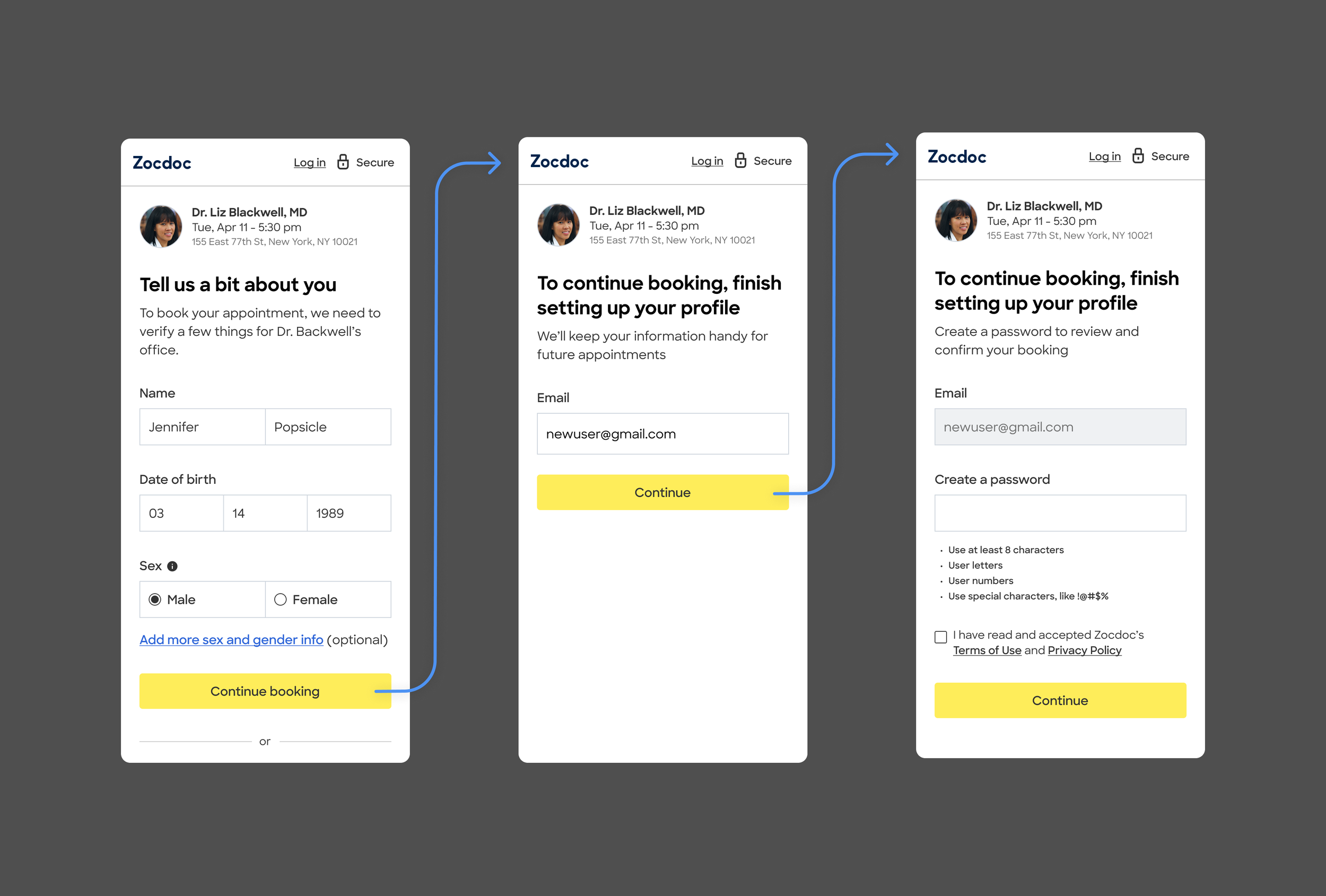
Identity sat inside a high-intent booking journey, with meaningful abandonment across both returning- and new-patient paths.
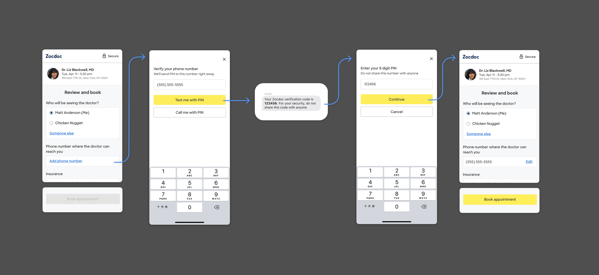
Identity sat inside a high-intent booking journey, with meaningful abandonment across both returning- and new-patient paths.
Beyond booking
The opportunity was broader than fixing one funnel. Zocdoc needed an identity experience that made it easier for returning patients to authenticate and easier for new patients to create an account, while still working across the rest of the product.
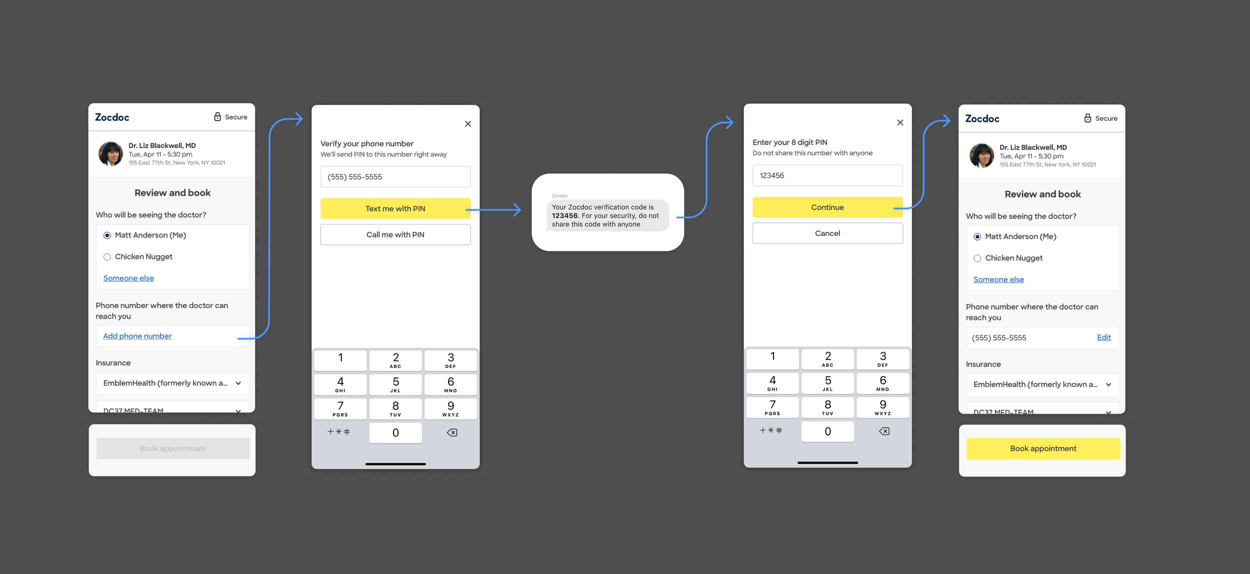
Identity sat inside a high-intent booking journey, with meaningful abandonment across both returning- and new-patient paths.
I mapped the system and found the shared logic underneath it
Passwordless was becoming technically possible, but Zocdoc’s existing account system still depended on email as the account identifier. Moving entirely to phone-based identity would have required much larger backend and account-linking changes.
Before redesigning the experience, I mapped how identity worked across Login, Create Account, password recovery, phone verification, booking and non-booking entry points, Desktop and Mobile Web, iOS and Android, and states such as SSO, MFA, and locked accounts.
The audit showed that different parts of the product were often making decisions about the same account state in different ways. An existing patient could enter Create Account and eventually hit an “email already in use” dead end. Other entry points could route the same patient through different Login or recovery experiences.
Login and Create Account still needed to remain distinct experiences. What they needed was a consistent way to determine which experience a patient belonged in.
Because email still had to remain the account identifier, I used it as the shared decision point.
That model gave us a way to progressively simplify Login and Create Account without rebuilding the underlying identity architecture all at once.
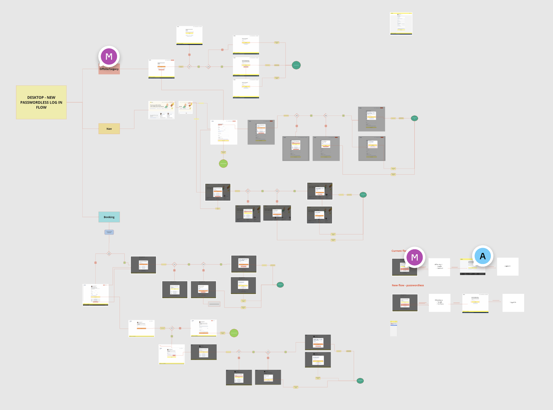
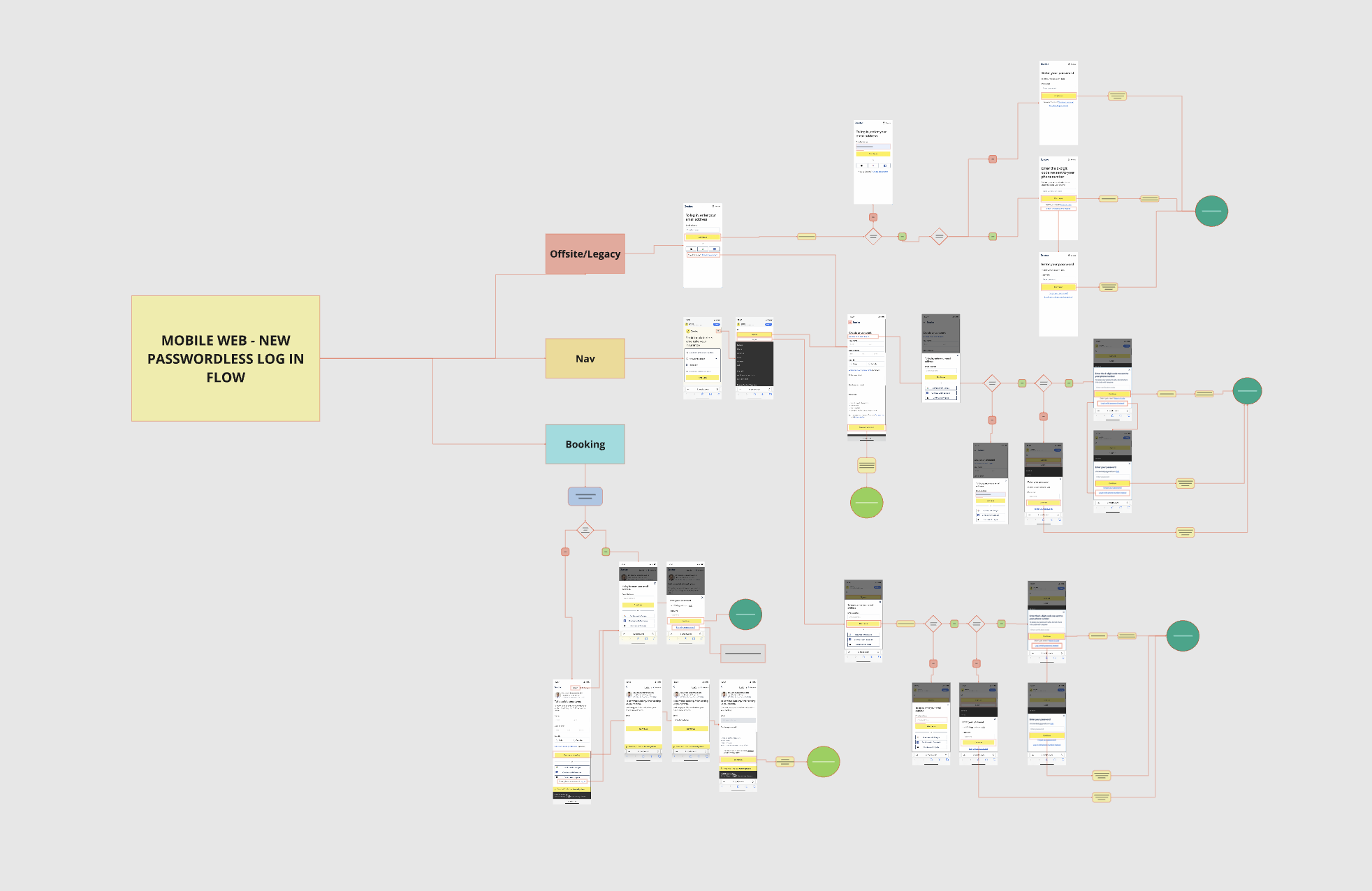
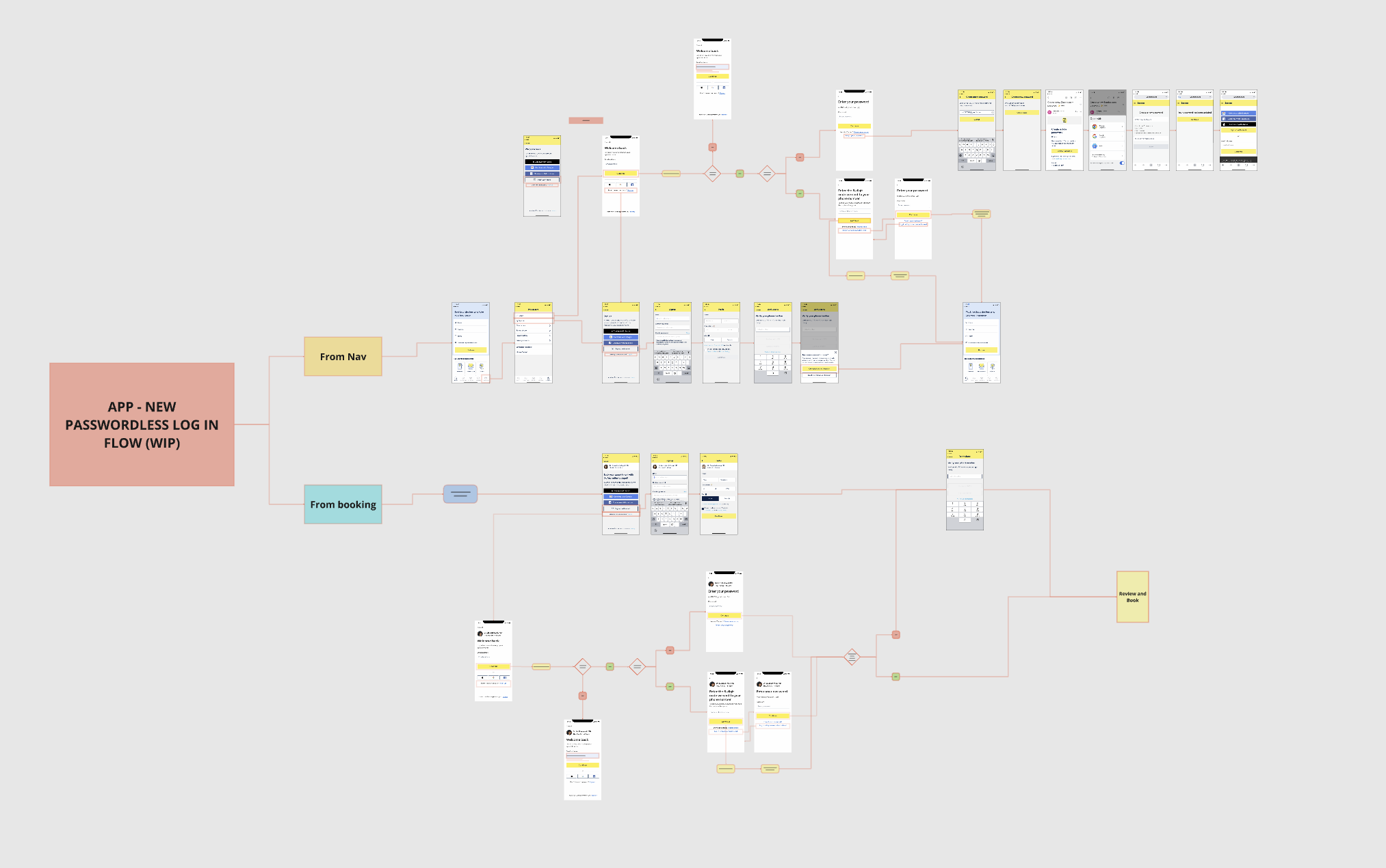
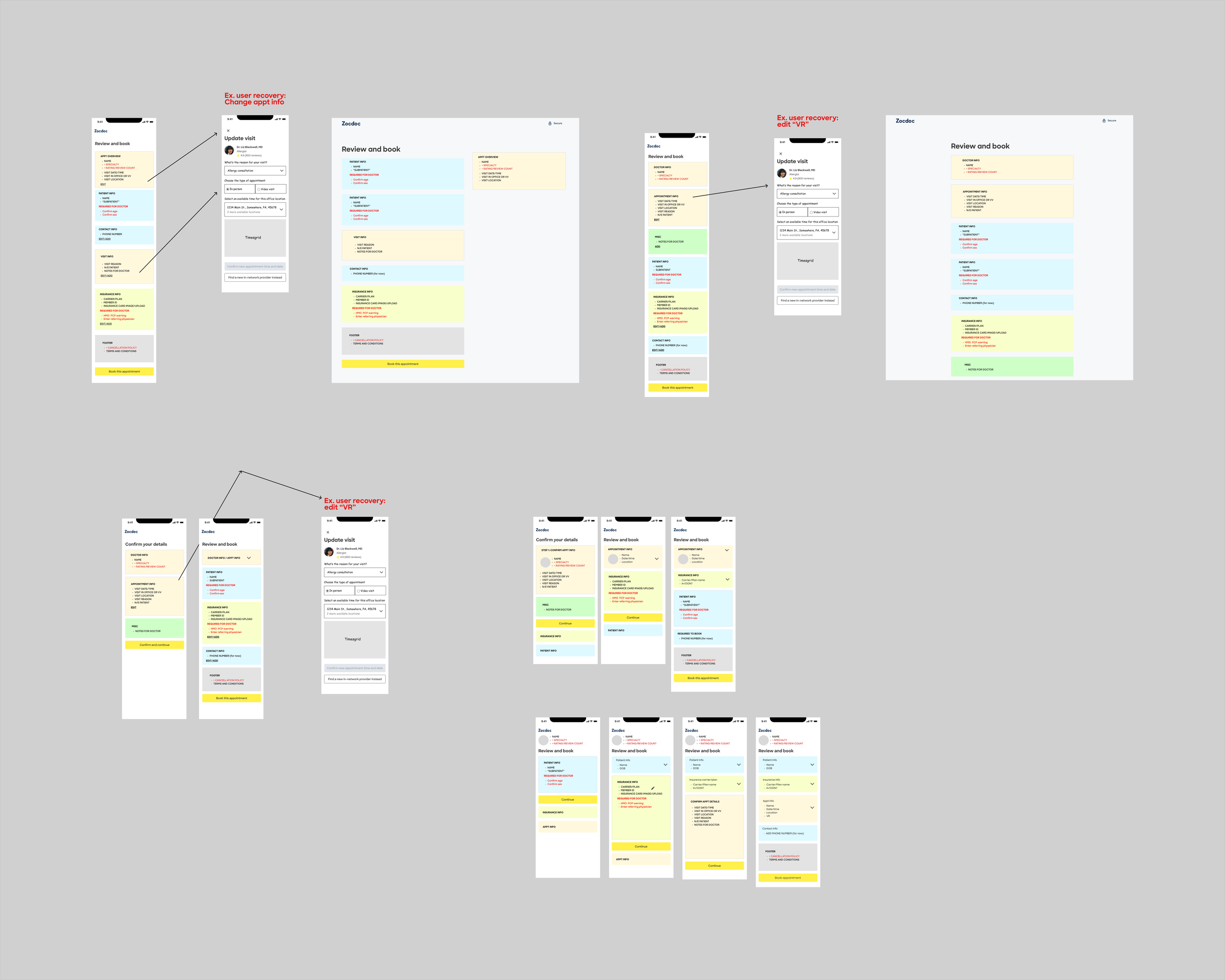
A current-state audit exposed how many identity paths, platforms, and edge cases had accumulated around the same underlying account states.
caption
A shared account-state model gave the redesign a consistent foundation across surfaces.
Changing the experience in stages
The identity system could not change all at once, so we introduced Passwordless progressively. Each phase simplified one part of the experience while preserving the rest of the system around it.
We proved Passwordless Login first
The team initially planned to start with Passwordless Create Account and address returning-user Login afterward.
But that sequence created a problem: a patient could create an account through a new phone-based experience, then return later to a Login system that still largely depended on passwords. Product re-sequenced the rollout around returning users first.
The first Passwordless Login test deliberately preserved most of the existing booking flow, including the standalone Email step. After a patient entered their email, Zocdoc could determine whether the existing account was eligible for Passwordless Login. For eligible users with a verified phone number, I designed an SMS authentication path while keeping password Login available as another option.
One model across platforms
The same identity logic had to work beyond the booking flow. Login and Create Account appeared across Desktop Web, Mobile Web, iOS, Android, and different entry points throughout the product.
I designed the experience so those surfaces could share the same underlying account-state decisions without forcing them into identical UI.
That meant working through SMS verification, password fallback, recovery and error states, responsive behavior, and when Login should appear as a modal versus a full-page experience.
Web gave us the first place to validate the model. From there, Passwordless Login expanded into the apps, and I carried the same logic into the mobile Create Account flows.
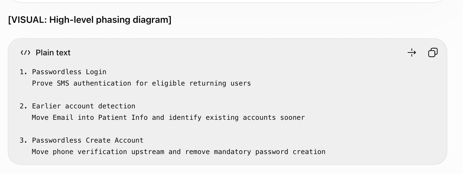
Passwordless was introduced in stages: first modernizing Login, then identifying account state earlier, then simplifying new-account creation.
The first test changed authentication without restructuring the surrounding journey: Email remained a separate step, while eligible returning users could authenticate by SMS.
The same interaction also improved a common Sign-up failure. If the email already belonged to an account, we could route that patient into Login instead of leaving them at an “email already in use” dead end.
This let the team test the core Passwordless Login experience before taking on the more complicated changes to new-user account creation.
Recognizing existing accounts sooner
The first Passwordless Login test solved authentication, but patients were still being identified too late.
Returning patients could fill out Patient Info, advance to the separate Email step, and only then learn that Zocdoc already had an account for them. An estimated 37% of users reaching that step already had an account.
I moved Email into Patient Info so we could identify those patients before they continued further down the Sign-up path.
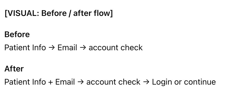
Moving Email into Patient Info let Zocdoc identify existing accounts before patients continued further into Sign-up.
For existing accounts, Login could now surface directly from Patient Info. New patients could continue into account creation without interruption.
This was more than removing a page. Moving the point of identification changed how the rest of the flow could respond to the patient.
Simplifying new-account creation with phone verification
Once Zocdoc could identify genuinely new patients earlier, the next question was what account creation actually needed to require.
New patients still had to create a password, then later provide and verify a phone number to complete their booking. That meant two separate identity steps inside the same journey.
By moving phone verification upstream into account creation, we could make that step do double duty: establish a verified account and satisfy the booking requirement that previously lived later in Review & Book.
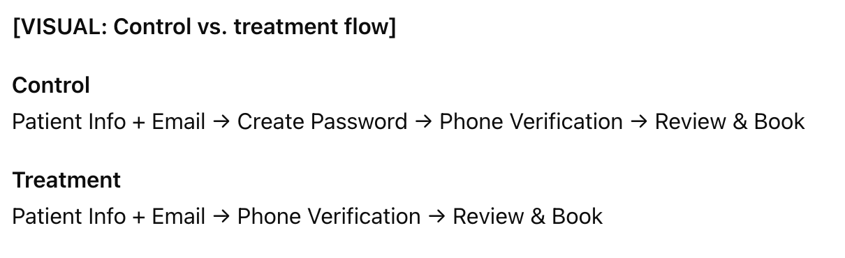
Using phone verification earlier removed mandatory password creation from the primary path and eliminated a later verification step from Review & Book.
Password was not removed from the system entirely. The treatment still offered “Continue with password instead” as a fallback.
The larger change was structural: verification moved from a downstream booking requirement into the account-creation experience itself.
When should the account actually exist?
Moving phone verification into account creation created a less visible design question: should Zocdoc create the account before or after the patient verified their phone?
The technically simpler option was to create the account first, then verify the phone. But if a patient abandoned during verification, they could return with a partially created account, an unverified phone number, and a generated password they had never chosen or seen.
Verifying the phone first required more backend work, but it kept the account state cleaner. If the patient abandoned, no incomplete account was left behind.
The team chose verify-first. Engineering owned the architecture and implementation decision; I contributed the user-state reasoning by making the abandonment and return experience explicit.
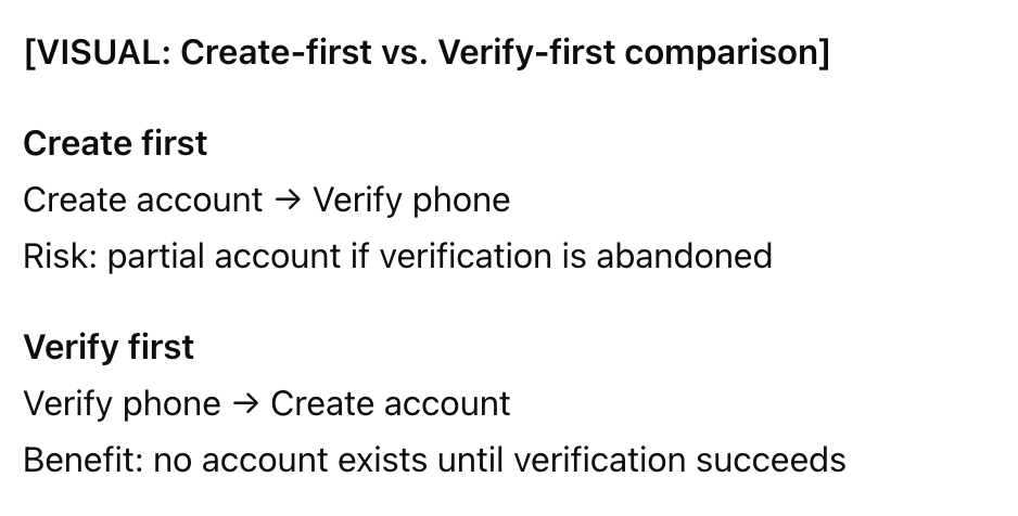
The technically easier sequence created a worse return state, so the team chose to verify the patient before creating the account.
The interaction adapted to each surface, while the underlying rules for identifying, authenticating, and creating accounts stayed consistent.
Understanding what went wrong
The negative result did not point to a single cause.
I worked with Product, Engineering, and Analytics to separate implementation and measurement problems from experience-level hypotheses. We investigated legacy redirects, insurance behavior, error states, CTA visibility, platform differences, and how patients were moving through the new experience.
We found several bugs in the build that clearly needed to be fixed, but we also needed to understand which parts of the design might be contributing to the drop in performance.
Simplifying the experience
Once the known implementation issues were addressed, I focused the next iteration on the experience itself.
I redesigned Review & Book around a simpler idea: make the final step feel like a review, not another form to work through.
The two-column layout became a single-column hierarchy. I shortened the page, moved the Book action higher, removed repeated information and unnecessary labels, pushed secondary fields behind links, and made error states more directional. I also narrowed editing and recovery so patients were less likely to trigger cascading availability errors while making changes.
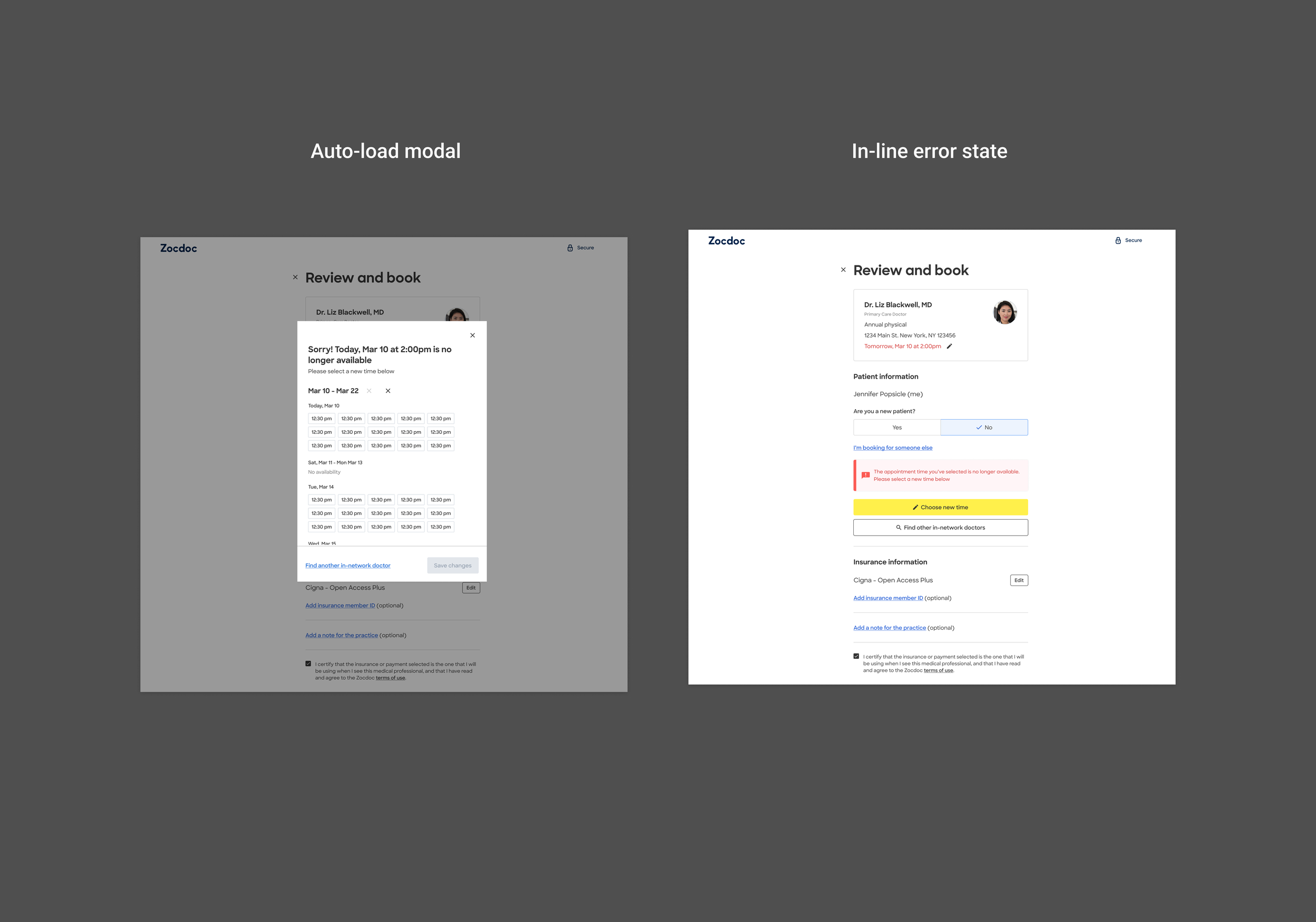
Whenever users hit an issue, we now trigger a modal that directs them to new care. They have much clearer inline options to recover from this last minute roadblock.
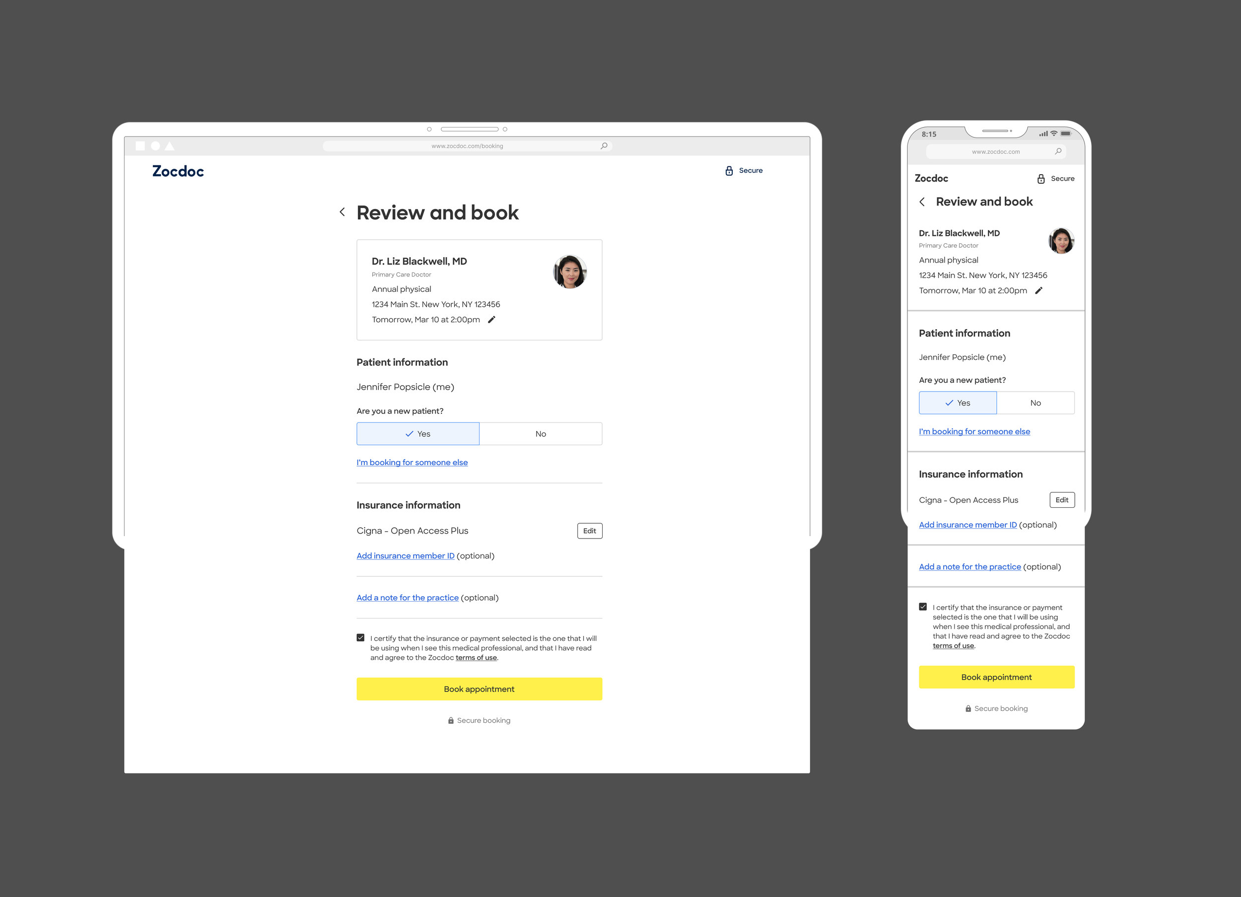
The redesign reduced form-like structure and brought the booking action into clearer focus across both platforms.
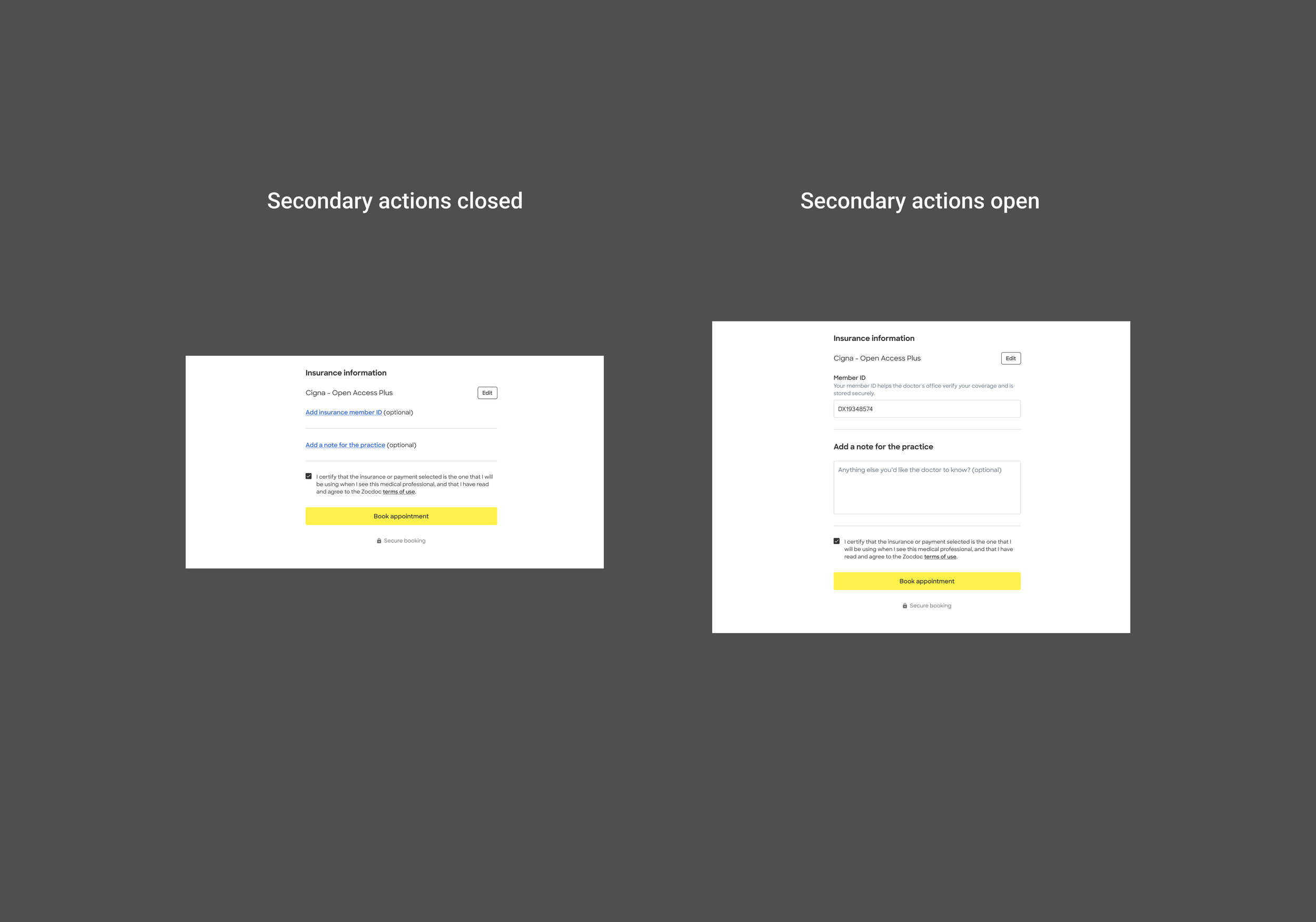
Something about condensing for a shorter page
The redesign recovered conversion
The redesigned Review & Book improved booking conversion across both platforms.
+2.7% Desktop conversion
+1.9% Mobile Web conversion
Together, the results represented roughly 2,700 projected additional bookings per month.