Insurance picker improvements
Helping patients navigate thousands of insurance options
Project overview
Insurance selection is a required part of booking on Zocdoc, but roughly 20% of patients drop off without successfully adding their insurance.
I joined the work after an earlier redesign had already failed to improve the experience. Over the next two iterations, I redesigned the picker to better support patients who didn’t always know exactly what answer the system expected from them.
Date
2021-2022
Role
Senior Product Designer
Team
Product, Engineering, Research, Analytics, Product Marketing, Brand, Design Systems
Scope
Desktop/ mobile web
Learning from an earlier launch
Before I joined, the team had already tested a V3 against the existing picker. It did not improve overall conversion, but it gave us some interesting information to work with.
My job became looking at the delta between the two experiences, and how I might improve v4 so that we could improve from both past experiences.
In the existing experience, patients had to navigate a taxonomy of roughly 855 carriers and 18,000+ plans, often without knowing the exact plan name Zocdoc expected. The result was an adruous list and drop off on one of Zocdoc’s most friction-filled moments
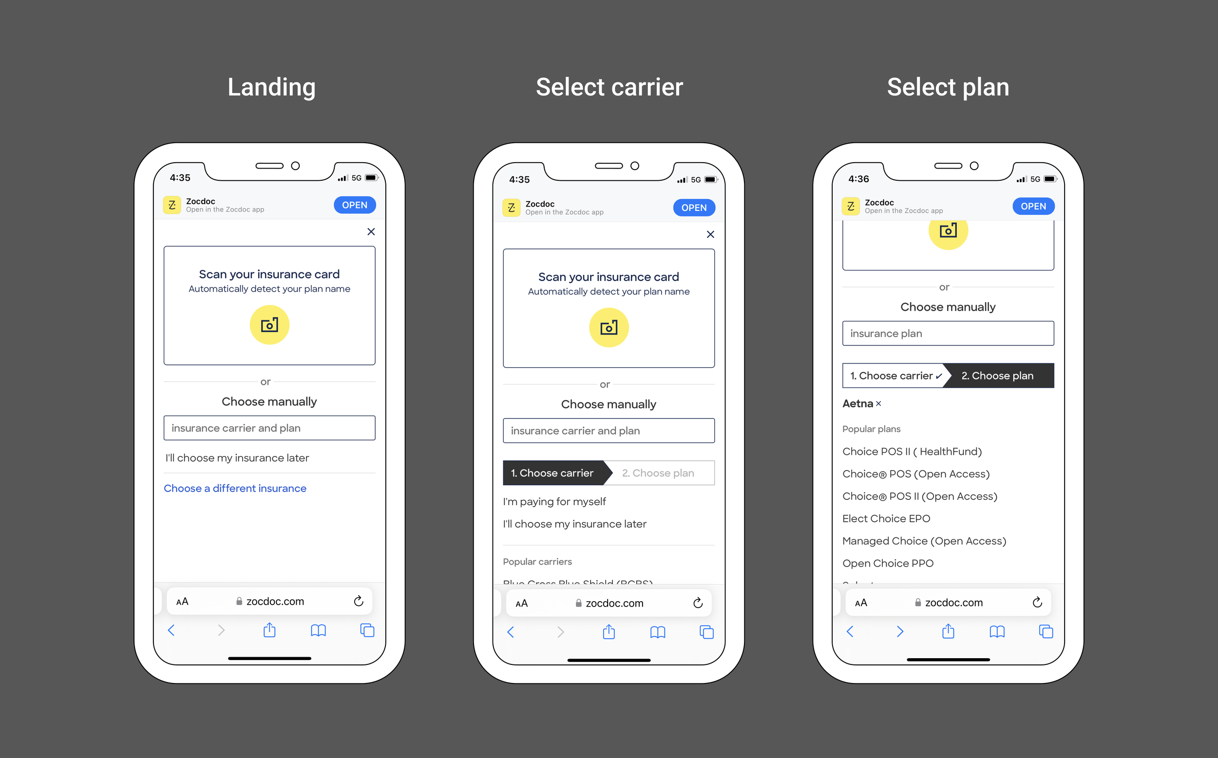
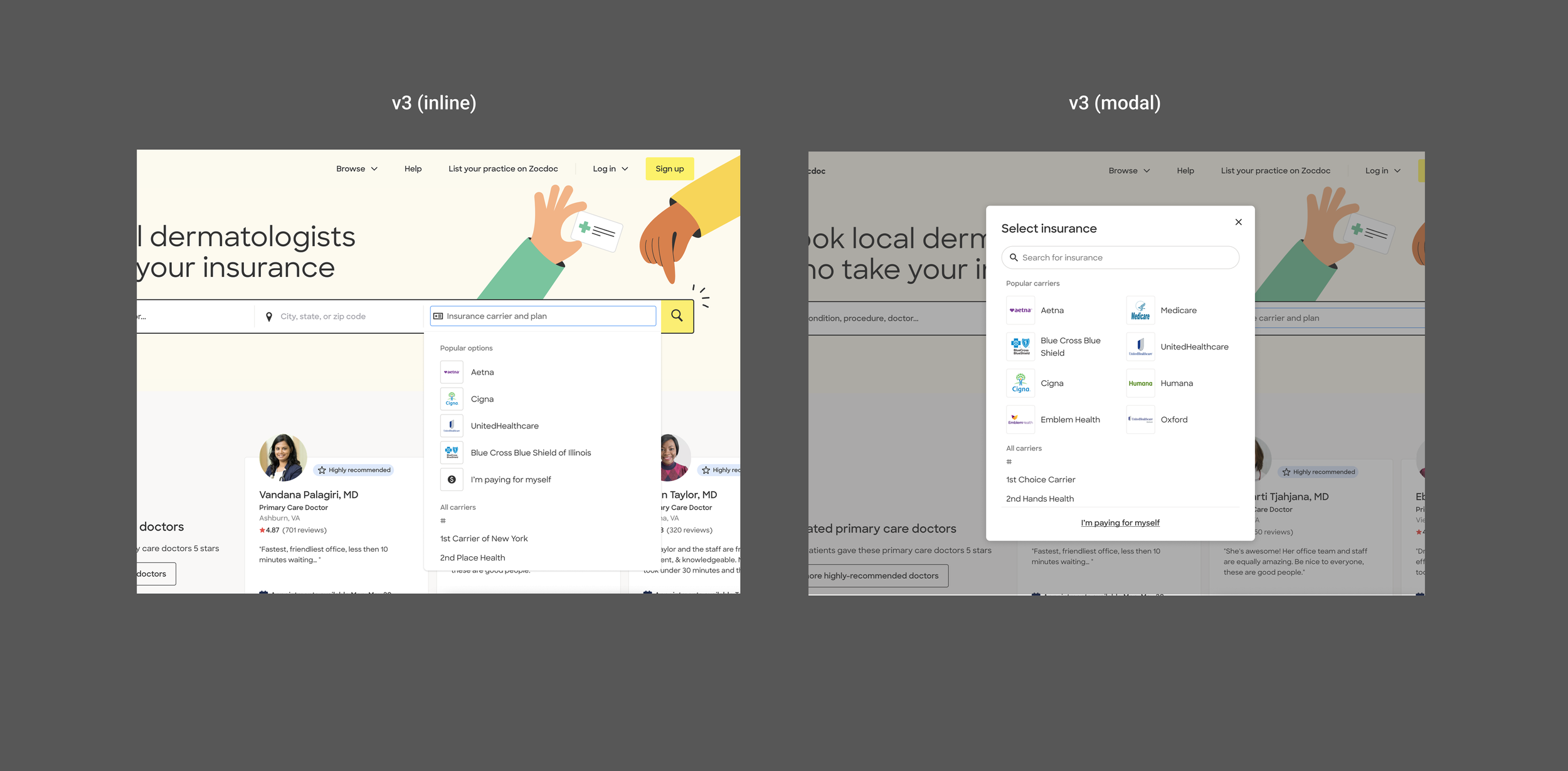
V3 emphasized popular options and search while making the full lists less prominent. Some carrier-selection behavior improved, but 48% of patients who searched for a plan returned to the full list and ~32% dropped after searching.
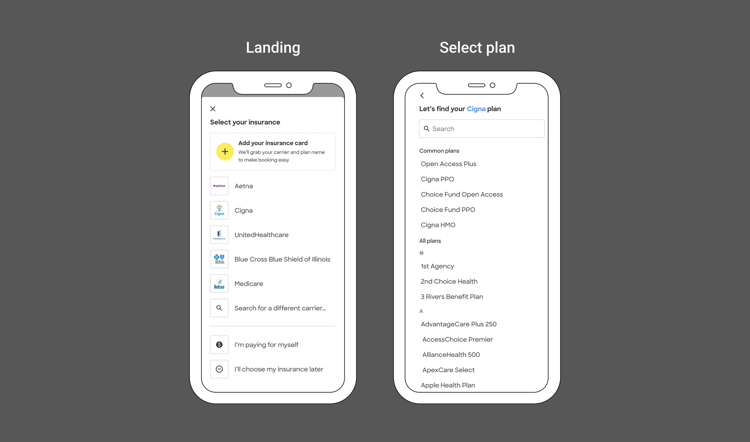
v4: Clearing the way
V3 increased engagement with popular carriers, but patients still struggled to find less-common insurance and move from carrier to the right plan.
For V4, I redesigned the picker to make those paths clearer. I explored things like improving autocomplete, expanding popular options, restoring access to the full lists, and clarifying the carrier → plan progression to find ways to better guide users through an already confusing experience.
v4: Mobile Web
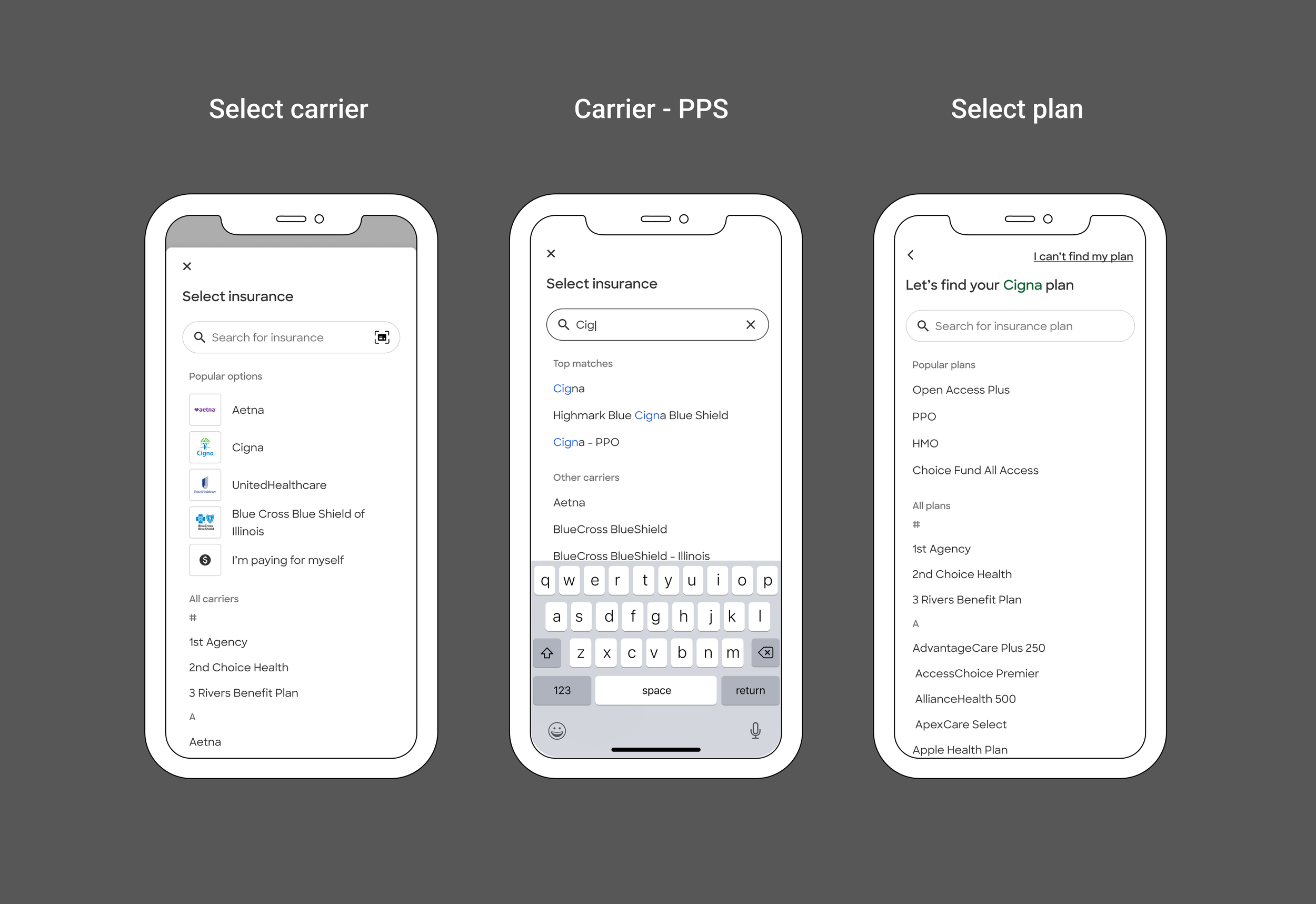
On Mobile Web, I adapted the strategy into a more immersive, full-screen flow that separated search, popular options, browsing, and the carrier → plan progression more clearly
v4: Desktop
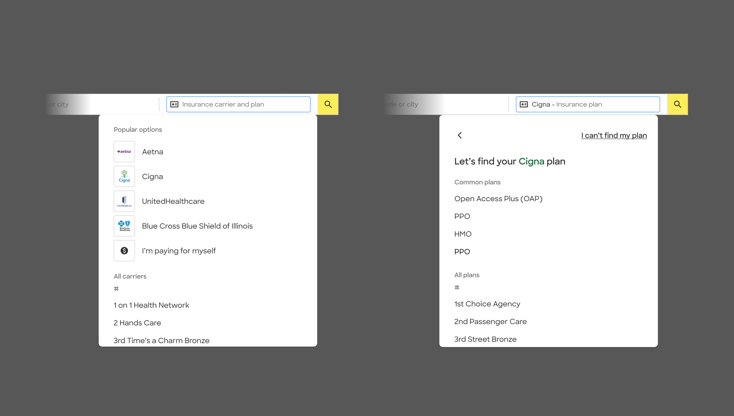
Desktop retained its inline picker, so I applied the same finding strategy within a more constrained interaction—expanding popular options, keeping the full lists accessible, and adding a fallback when patients couldn’t identify their exact plan.
v4: Giving patients a new way forward
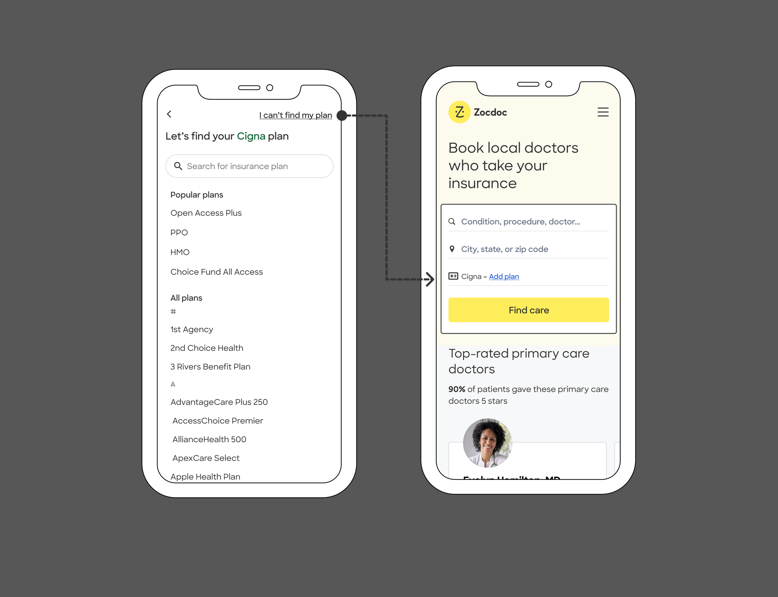
V4 introduced “I can’t find my plan” for patients who knew their carrier but couldn’t confidently identify the exact plan.
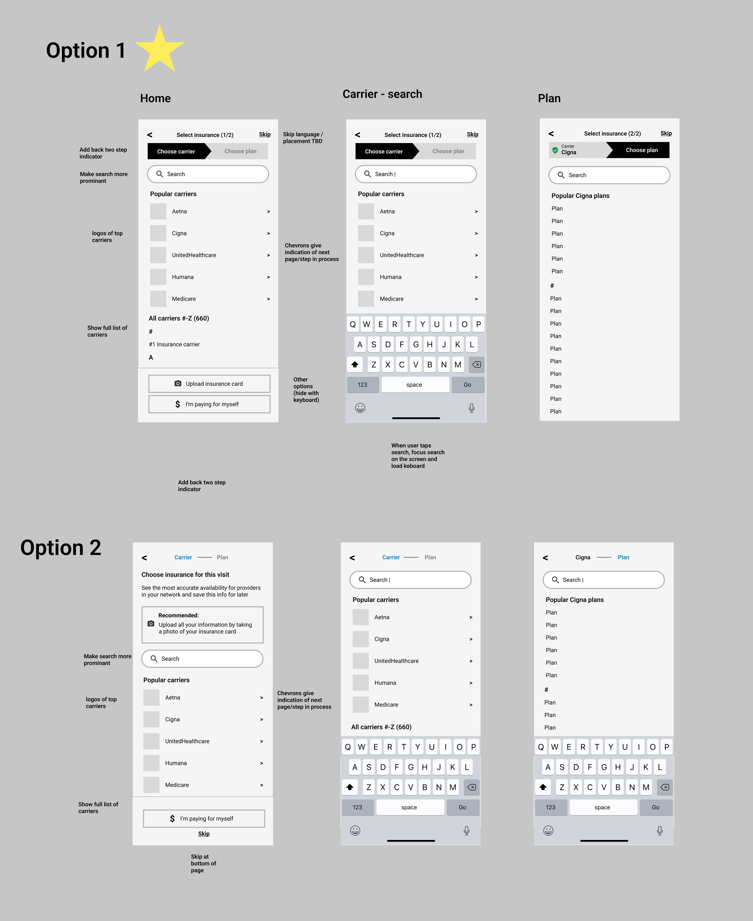
The full flow connected carrier and plan selection while preserving search, browsing, and fallback paths throughout.
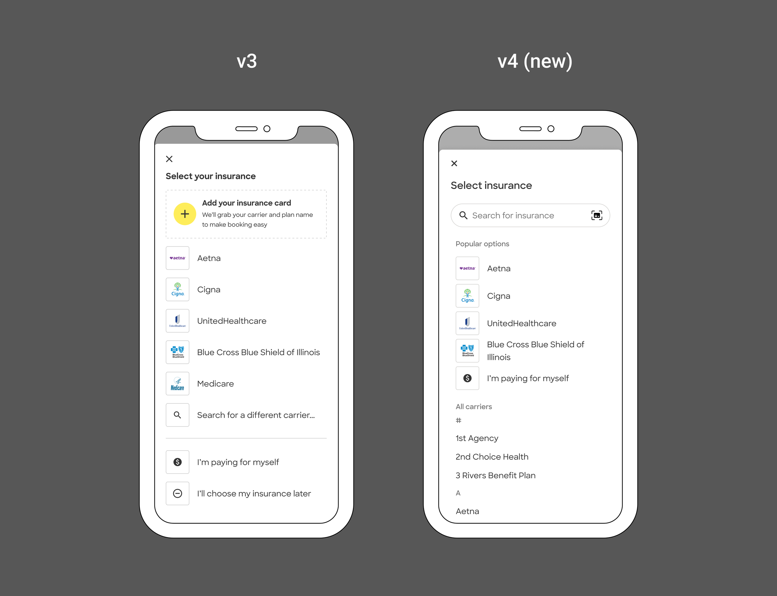
V3 → V4: Search became more visible, the insurance-card scan was de-emphasized, and the full carrier list returned—giving patients clearer ways to recognize, search for, or browse their insurance.
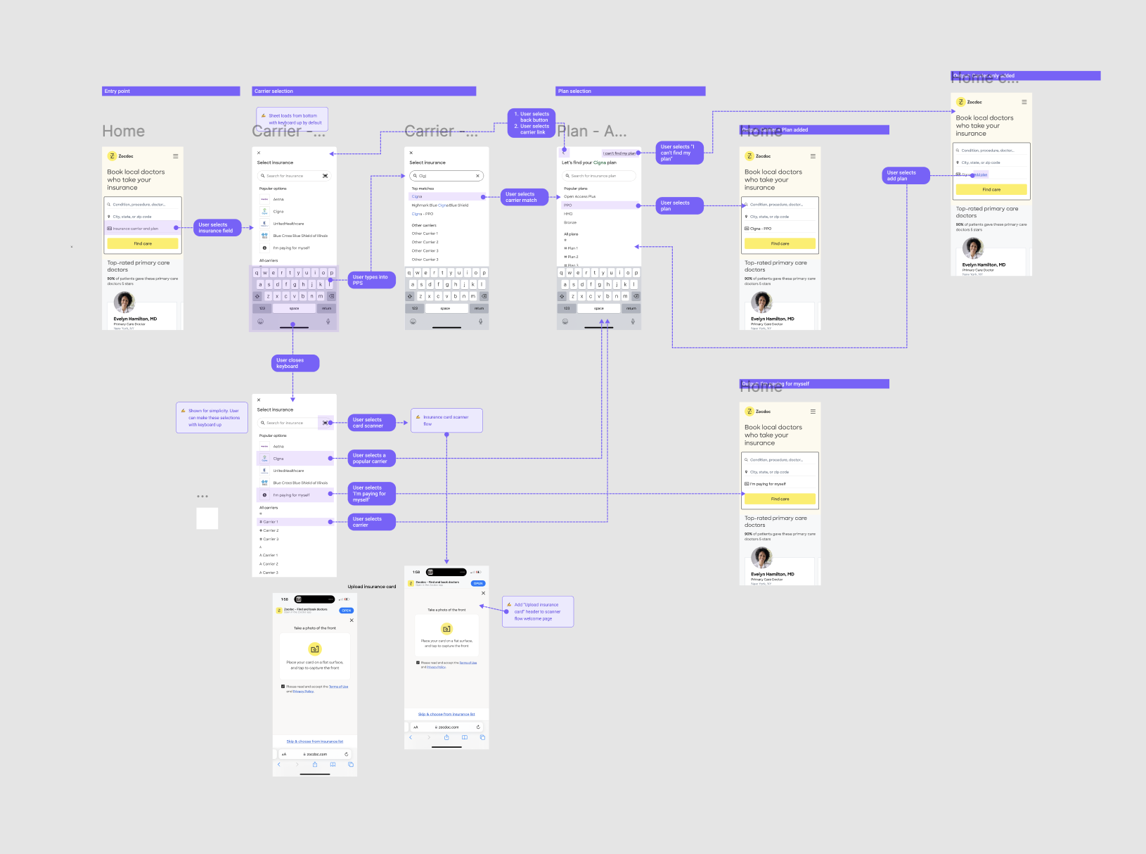
With several actions competing for attention at each step, I explored how to surface only what was most useful in the moment while keeping secondary paths available.
The desktop pattern had to work consistently across multiple entry points, including Home and Search. I mapped the interaction states and expected behavior across those contexts for implementation.
For the MVP, this primarily tested intent. The action functioned as a skip at the plan step: patients could continue with partially added insurance using the carrier’s default plan for search instead of choosing a plan they didn’t recognize.
V4 validated the new approach
The V4 experiment increased overall booking conversion +1.4%, representing roughly 1,900 projected additional bookings per month. The lift was larger for first-time patients at +3.2%.
Autocomplete use also increased, and 5–8% of patients used “I can’t find my plan”—evidence that the fallback was addressing a real need.
V4 improved conversion while showing that patients were actively using both search and the new fallback path.
V5: Making the primary paths easier
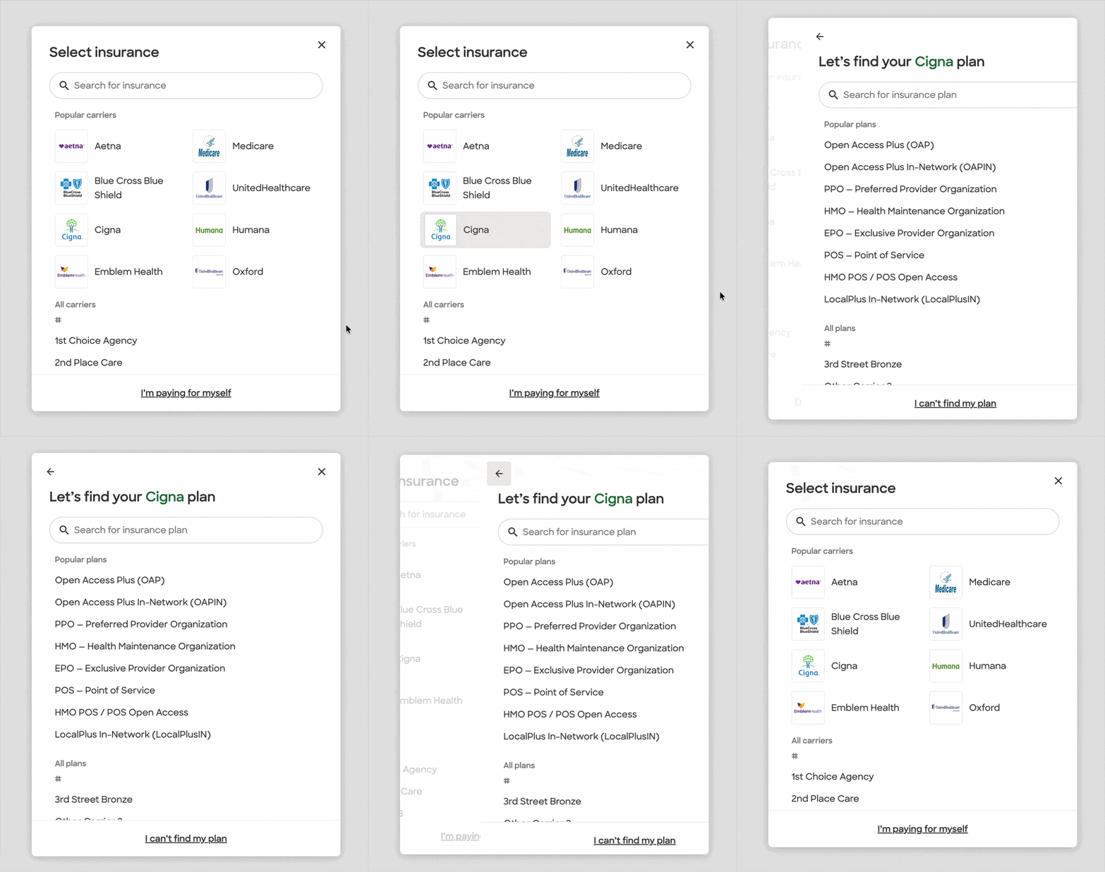
V5 focused on helping more patients find their insurance before they needed the fallback. On desktop, I moved the picker into an immersive modal to make search more prominent, while we also expanded popular options and autocomplete results. With “I can’t find my plan” already validated in V4, we moved it into a secondary position.
Mobile Web was already immersive, so its V5 changes were more incremental.
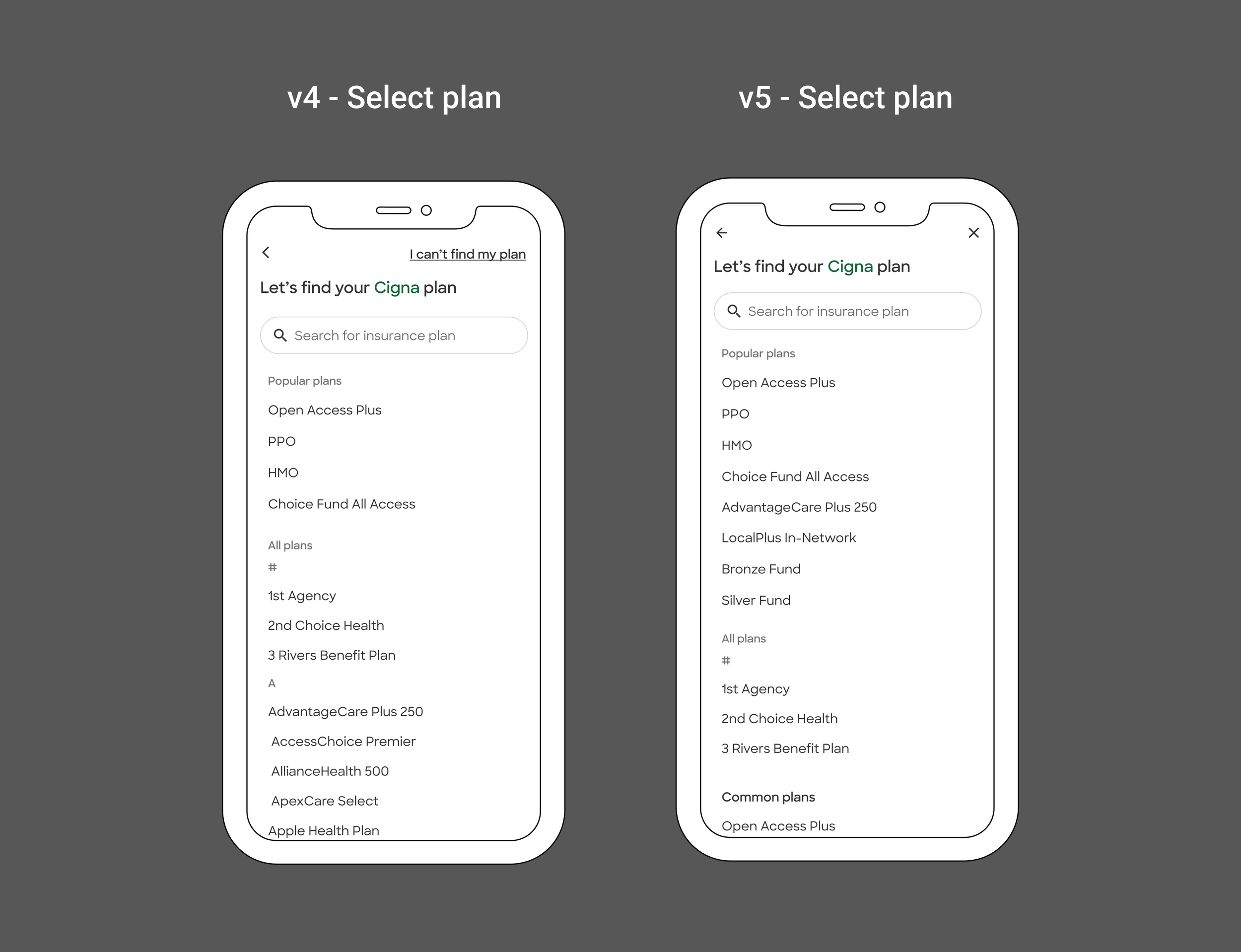
After validating the fallback in V4, we moved “I can’t find my plan” into a secondary position and returned emphasis to finding the right plan first.
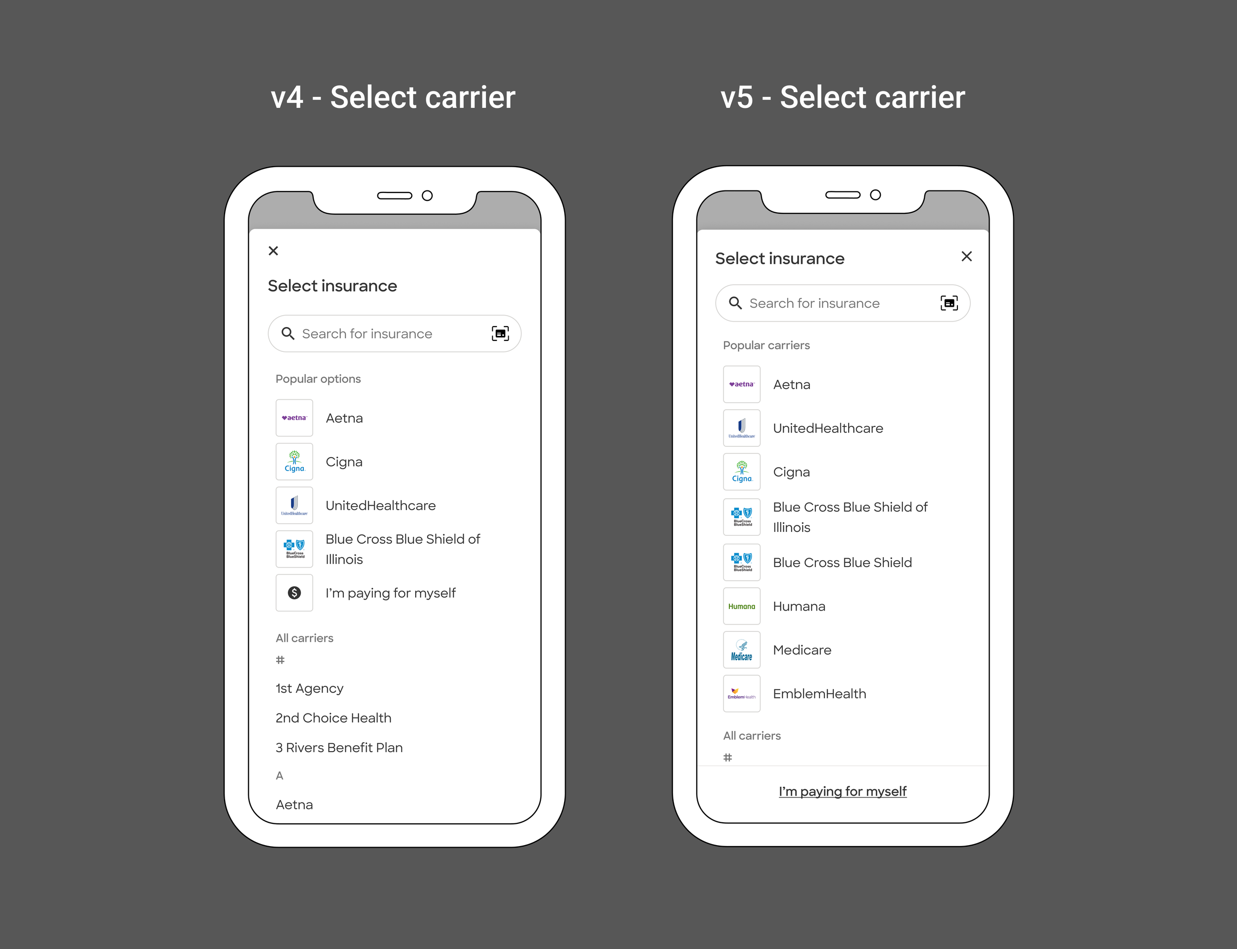
V5 expanded popular options and autocomplete results to up to 8, giving patients more chances to find the right carrier before opening the full list.
Moving the picker into a modal made search much harder to miss on desktop.
V5 changed behavior, but not conversion
Overall booking conversion was roughly flat, but behavior shifted in the intended direction: +2.3% insurance searches, +26.7% popular-carrier selection, −41.5% long-list carrier selection, and −2.1% use of “I can’t find my plan.”
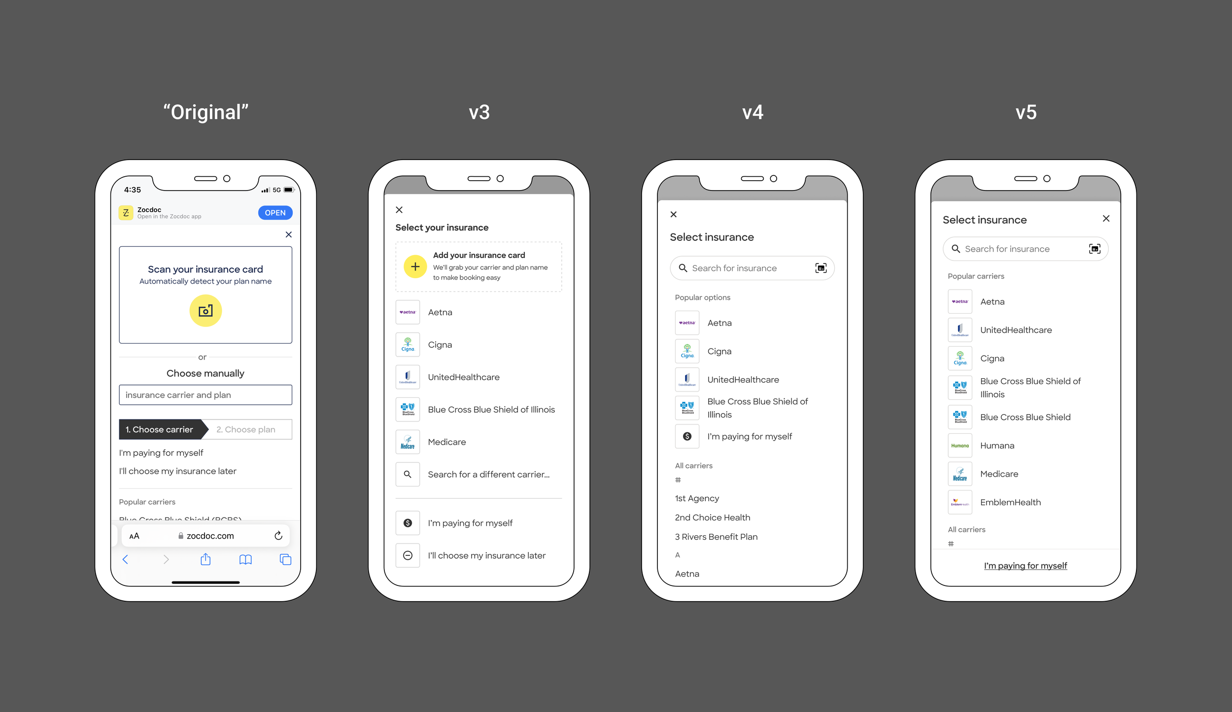
Original → V5 progression