SEM 2.0
Designing a paid-search landing experience around what patients actually needed
Project overview
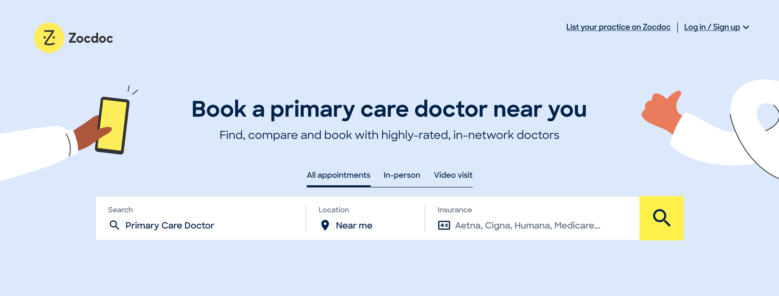
Zocdoc’s organic and paid-search traffic historically landed on the same provider-listing pages, which had been shaped around SEO (Search Engine Optimization) requirements. As investment in paid search grew, the Growth team saw an opportunity to create a dedicated SEM (Search Engine Marketing) experience without those same constraints.
I led the research and design to determine what that new experience should prioritize for patients.
Date
2021-2022
Role
Senior Product Designer
Team
Product, Engineering, Research, Analytics, Product Marketing, Brand, Design Systems
Scope
Desktop/ mobile web
TL;DR: SEM vs. SEO
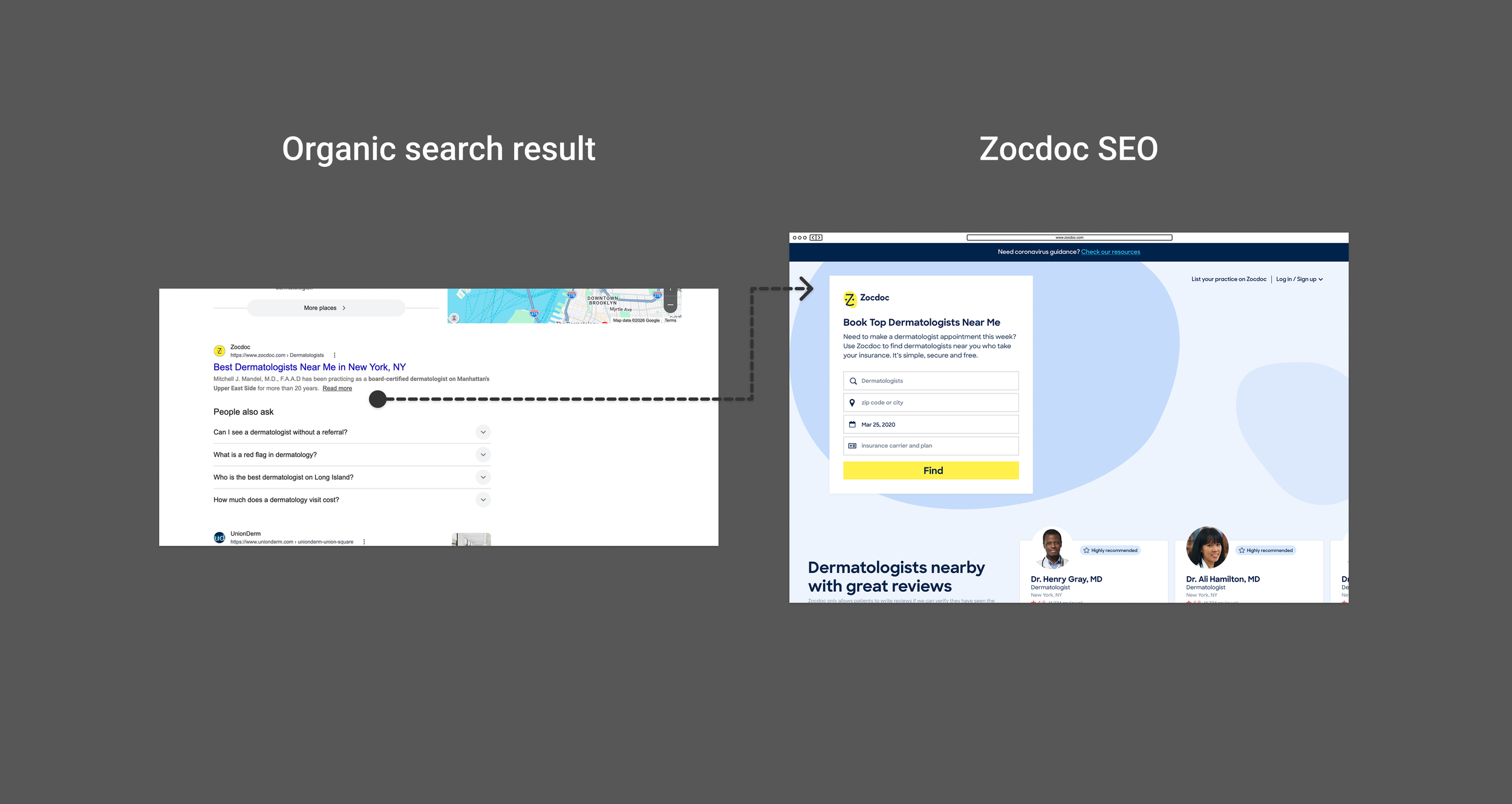
SEO: Organic search result → Zocdoc listing page
SEO pages had to balance patient needs with the content, structure, and other requirements that helped them rank in organic search.
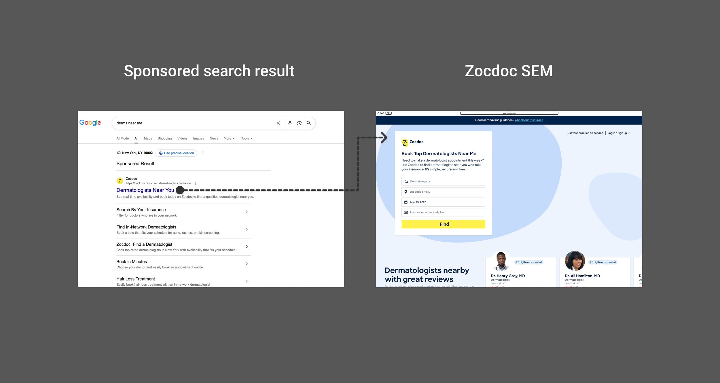
SEM: Paid search ad → Zocdoc listing page
SEM brought patients in with similar search intent, but without the same organic-ranking constraints, giving us more freedom to optimize the experience around patient behavior and conversion.
The existing page was built for a different job
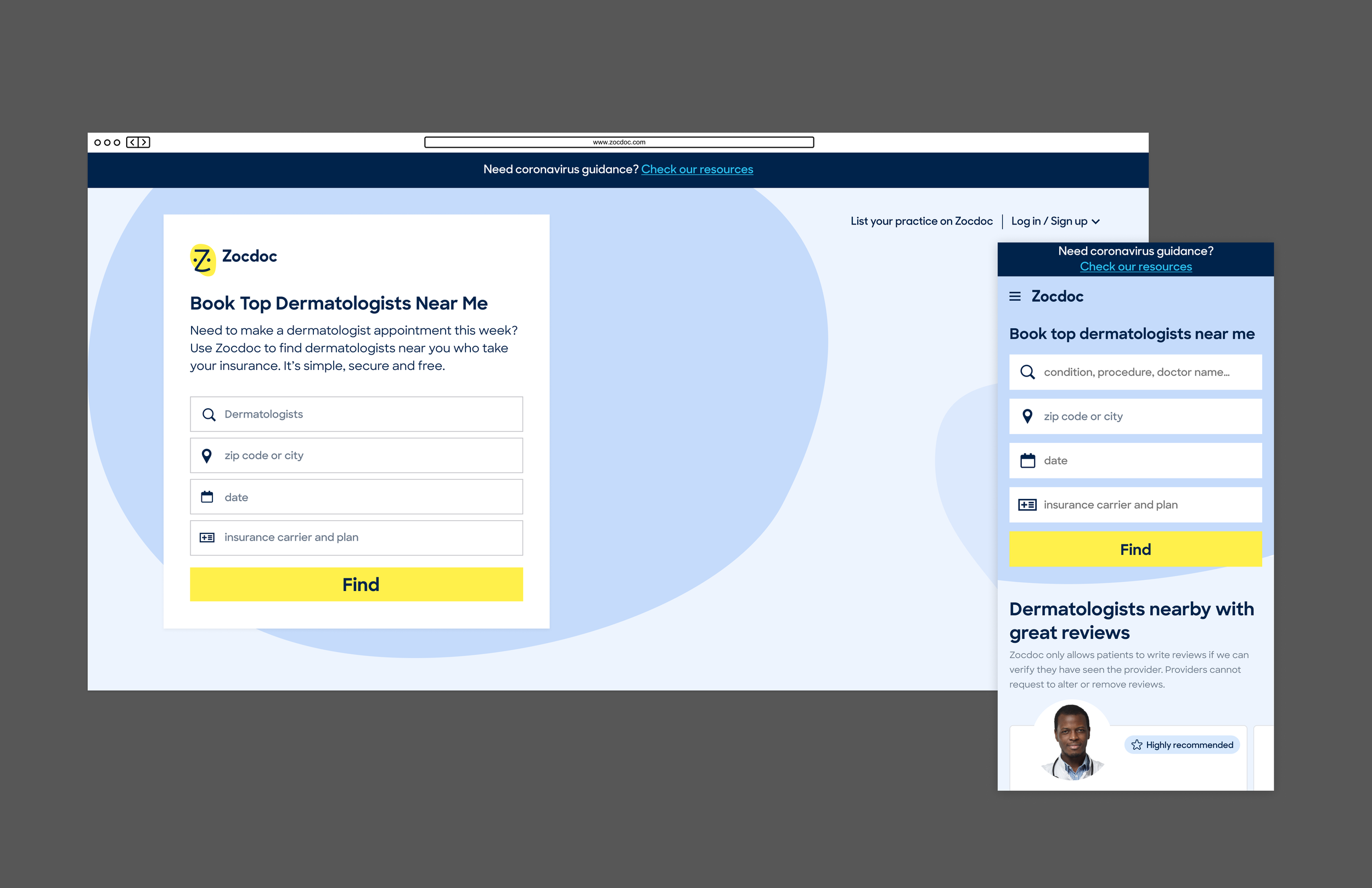
The existing listing page wasn’t necessarily broken. It had been designed to serve both SEO and conversion, which shaped the experience around a large search area and a running list of bookable providers.
That worked for the original model, but it left little room to tailor the experience to how paid-search patients were actually finding care.
The goal was ultimately more bookings, but the landing page first needed to help patients confidently take the next step.
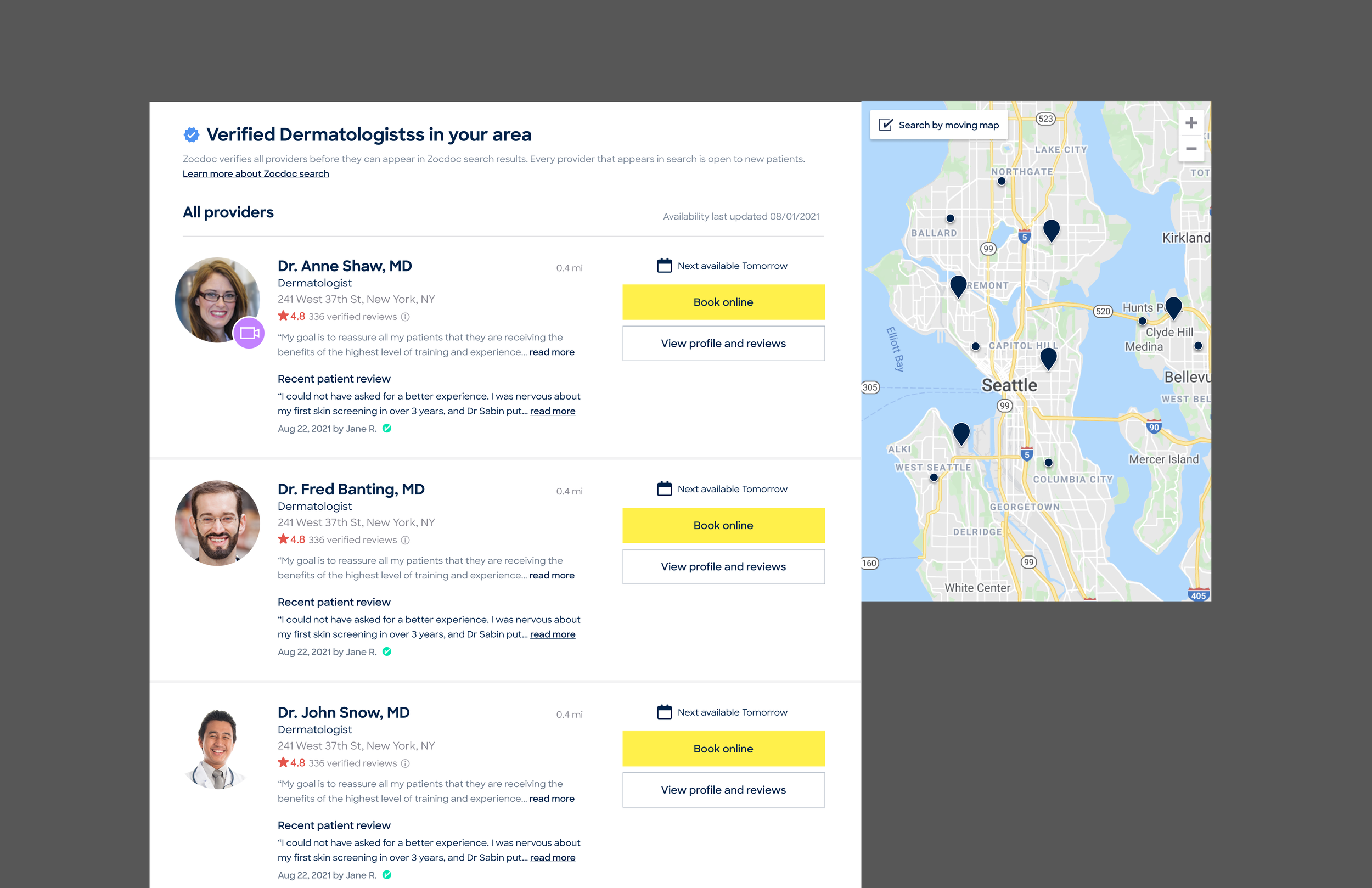
The goal was ultimately more bookings, but the landing page first needed to help patients confidently take the next step.
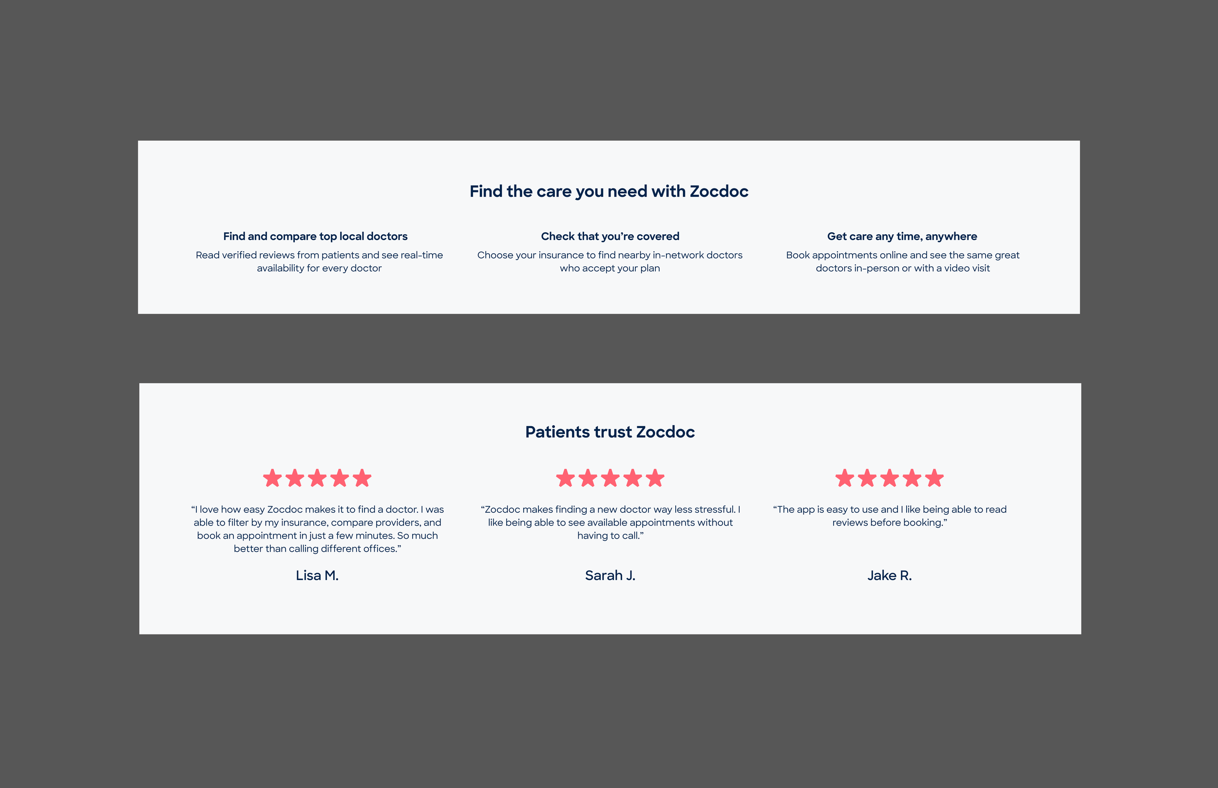
The goal was ultimately more bookings, but the landing page first needed to help patients confidently take the next step.
The opportunity
The business goal was to improve conversion from paid-search traffic, with an initial target of +15%.
But these landing pages sat at the very top of the care journey. Rather than expecting every visitor to book immediately, we focused on how we could build trust with patients and get them a step deeper into the booking funnel.
Behavioral data also showed different interaction patterns between SEM and organic-search visitors, particularly around insurance, search criteria, maps, and provider results.
That gave us a reason to rethink the experience, but it didn’t tell us what the experience should be.
The goal was ultimately more bookings, but the landing page first needed to help patients confidently take the next step.
Understanding what patients actually needed
I led eight moderated virtual research sessions to understand how patients’ needs changed based on what they were looking for, urgency, and their previous experience finding care.
Rather than testing one finished page, I broke the experience into modules both new and existing and asked participants to group and prioritize the pieces that mattered most to them.
The sessions showed me the majority of patients were still in browsing mode at this point in the funnel, not ready to book. This makes sense. They first need confidence in Zocdoc, key information like insurance and availability, and provider faces to help them begin their journey.
In short, this landing page needed a humanized approach to help patients confidently take the next step, not a wordy site that sends them straight into booking.
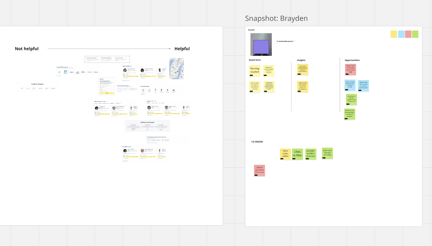
Example co-design board. Different patients prioritized the experience differently, but trust, useful provider information, and support for browsing consistently surfaced.
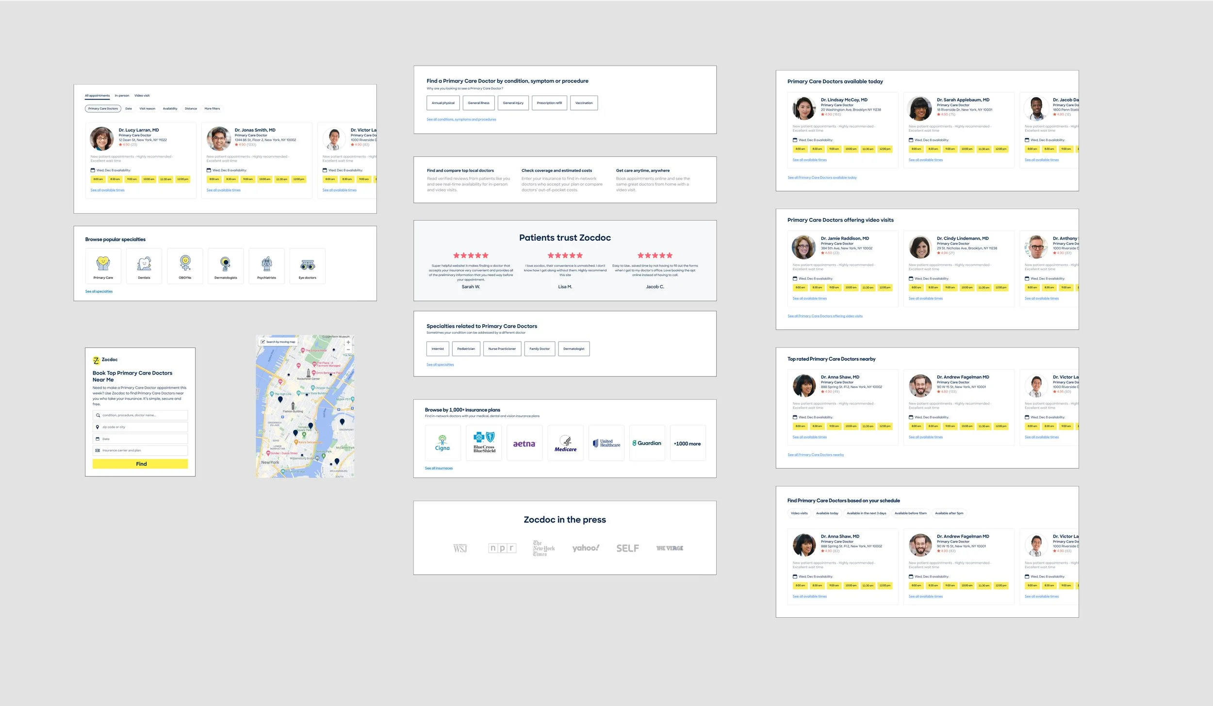
Breaking the page into pieces let participants show us what they valued without anchoring them to an existing layout.
Building off research
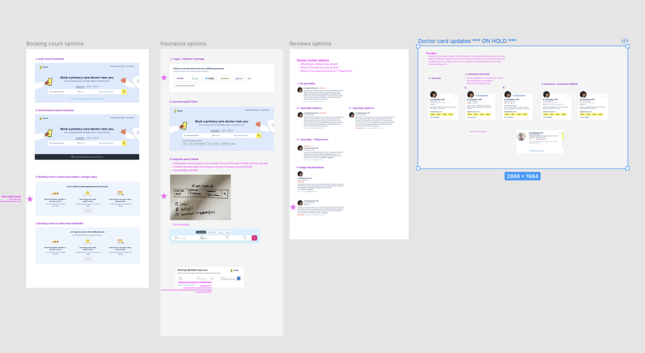
The findings gave me a set of priorities, but not one obvious layout. I worked through the page as a series of modules, exploring how search, provider results, trust, and supporting content could each help patients browse and move forward.
I shared the work regularly with Product, Engineering, and Design, narrowing the individual pieces before bringing them together into one experience.
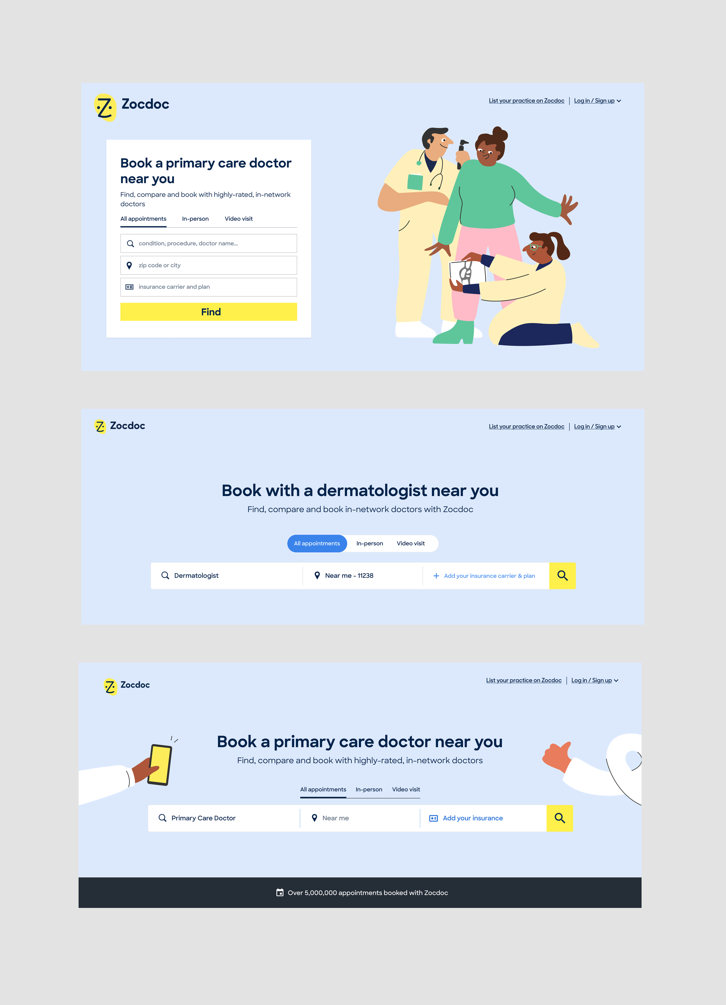
I explored ways to simplify search and make insurance easier to find without overwhelming patients at the top of the page.
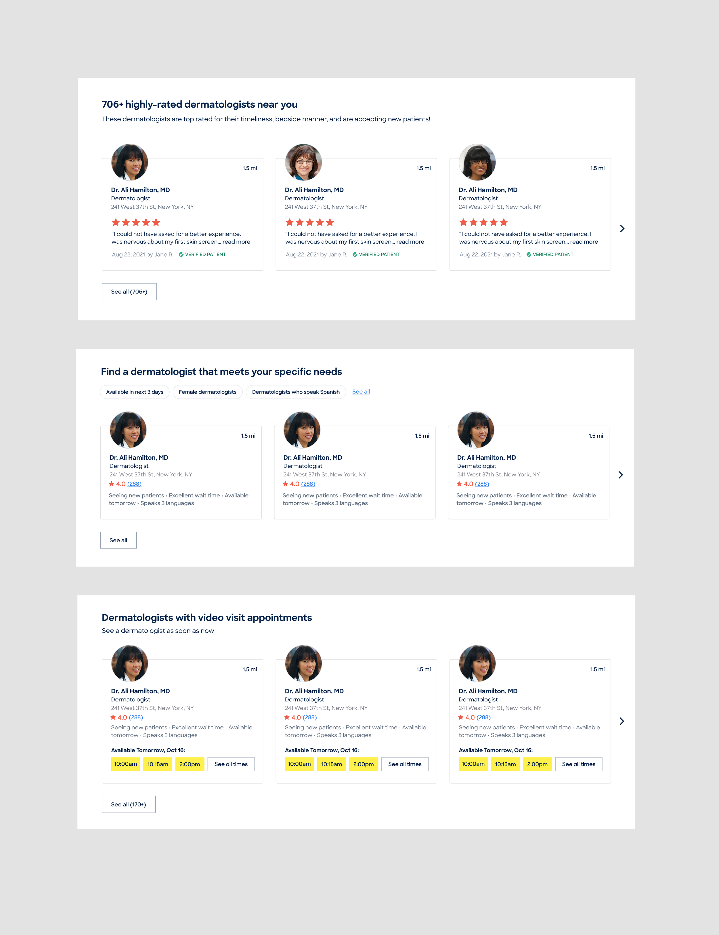
I wanted to find different ways to organize and present providers so patients could browse and compare their options more easily.
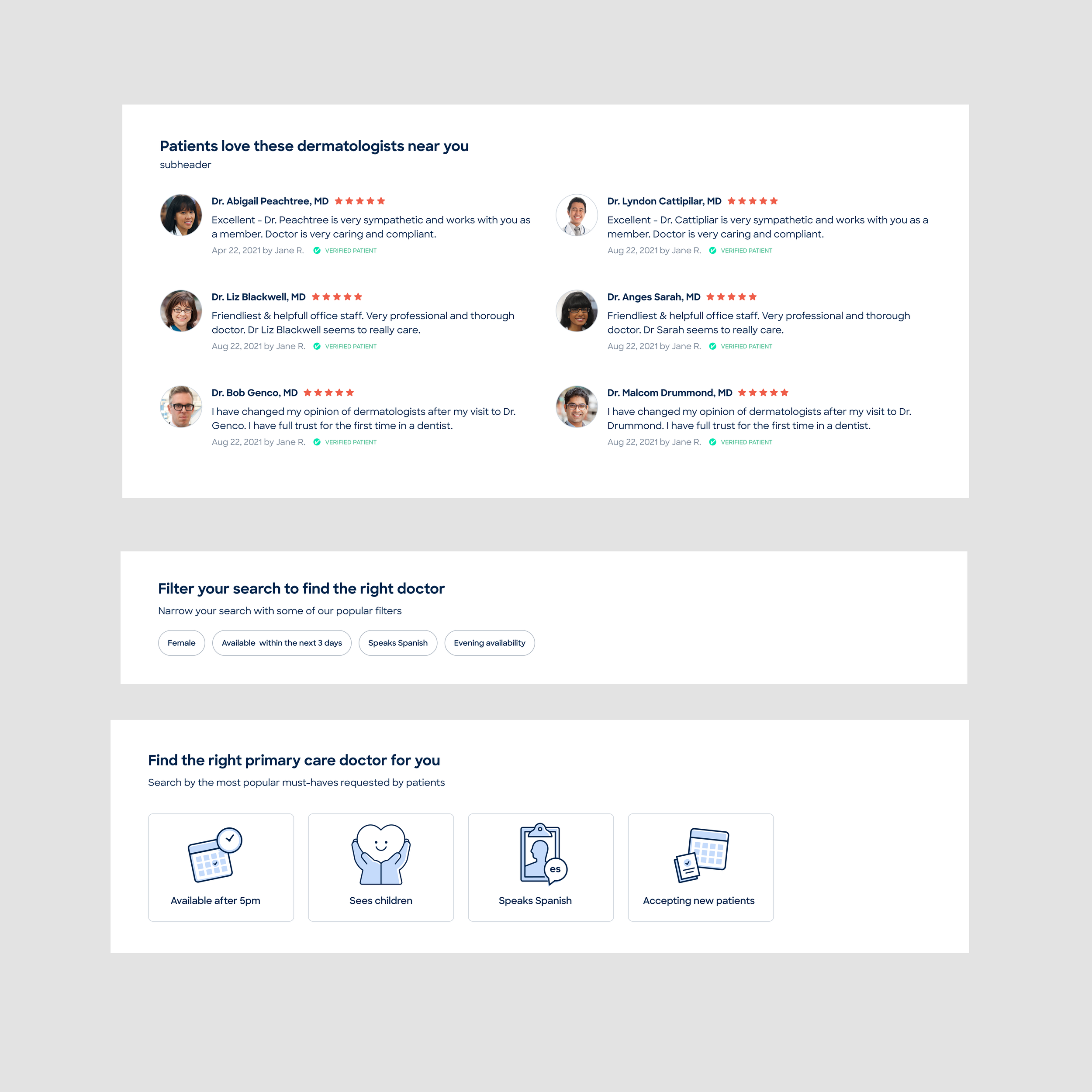
I tried to build Zocdoc credibility with new patients, without relying on self-promotional messaging.
What makes an MVP
Simplifying search
The original search marquee felt like a form, with over several inputs. Usage data showed that relatively few patients used the existing date field, and research suggested that some found it confusing or limiting. I removed it, simplified the search area, improved autofill behavior, and made insurance more of a focal point on the page
Making providers easier to browse
Instead of relying on one long list search list, I organized providers into more useful categories that could help spark patient discovery: highly rated nearby, near-term availability, and video visits were all safe bets to start to see if we could bring users to more specific searches.
The cards showed enough provider information and availability to help patients evaluate their options while still reinforcing Zocdoc’s value as a booking platform.
Building trust without eroding it
Research showed that patients were skeptical of self-promotional messaging, while outside validation increased trust. We couldn’t tell users how or why to trust us, we had ot show them.
I worked with Product Marketing and Brand to bring those signals into the page while also making sure the experience didn’t feel like an advertisement.
Removing a low-value input as well as moving to a horizontal orientation gave the search area more of a focus and created room for useful content higher on the page.
The goal was to give patients useful ways into the provider inventory without asking them to process one long list.
External validation helped establish credibility without asking patients to simply take Zocdoc’s word for it.
The final build
Once the experience was defined, engineering estimated the build at seven sprints.
I worked with Product and Engineering to separate what was essential to the experiment from what could wait. We deferred lower-priority work and reworked parts of the implementation, bringing the estimate down to four sprints without stripping out the core experience we wanted to test.
I stayed involved through development and design QA as implementation tradeoffs were made.
Launch and results
The new specialty SEM page launched as an A/B test against the existing listing-page experience.
Over roughly eight weeks, the experiment reported a statistically significant +4% lift in the primary down-funnel metric. Overall conversion remained flat, meaning we improved movement into the funnel but fell short of our original +15% conversion goal.