Map
Improving how patients discover and compare providers
Project overview
A previous experiment on Zocdoc’s desktop map experience increased engagement, but resulted in fewer bookings. I joined to simplify the experience and clarify the roles the map plays with both profiles and conversion. From there, I expanded the work beyond the initial brief, auditing the broader Map experience, uncovering more problems, and defining a phased direction for improvement.
Date
2024-2025
Role
Senior Product Designer
Team
PM, Engineering Manager, Design Manager, 2 Developers
Scope
Desktop/ mobile web
Outcome
Simplified and stabilized the immediate experience, then shipped a foundational Map improvement and defined a broader path forward.
Simplifying the immediate experience
The previous experiment had pushed substantially more booking functionality into the desktop map experience. Engagement increased almost 20%, but overall booking conversion declined, with fewer patients visiting provider profiles via the map experience.
The team already had a working hypothesis: too much of the booking experience had been pushed into Map, cannibalizing our users.
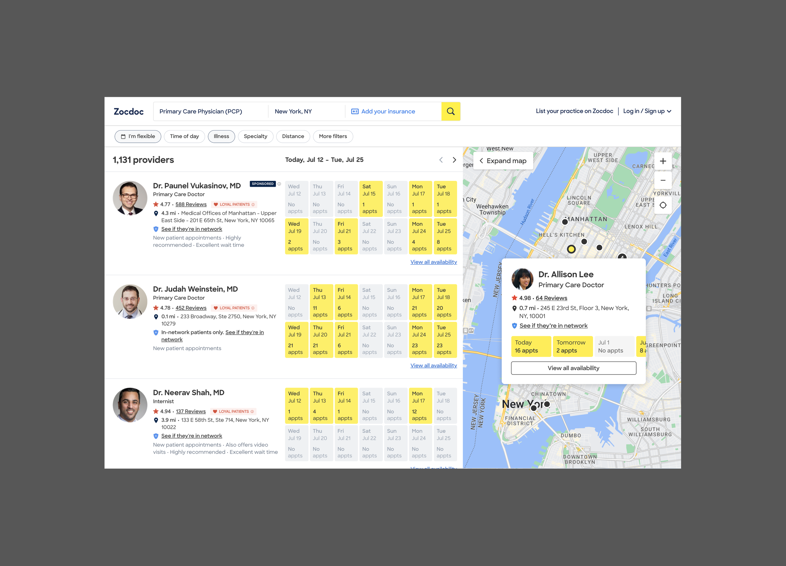
In the original map redesign, the provider card mirrored the list results to the left, displaying a row of available dates with the ability to view more availability.
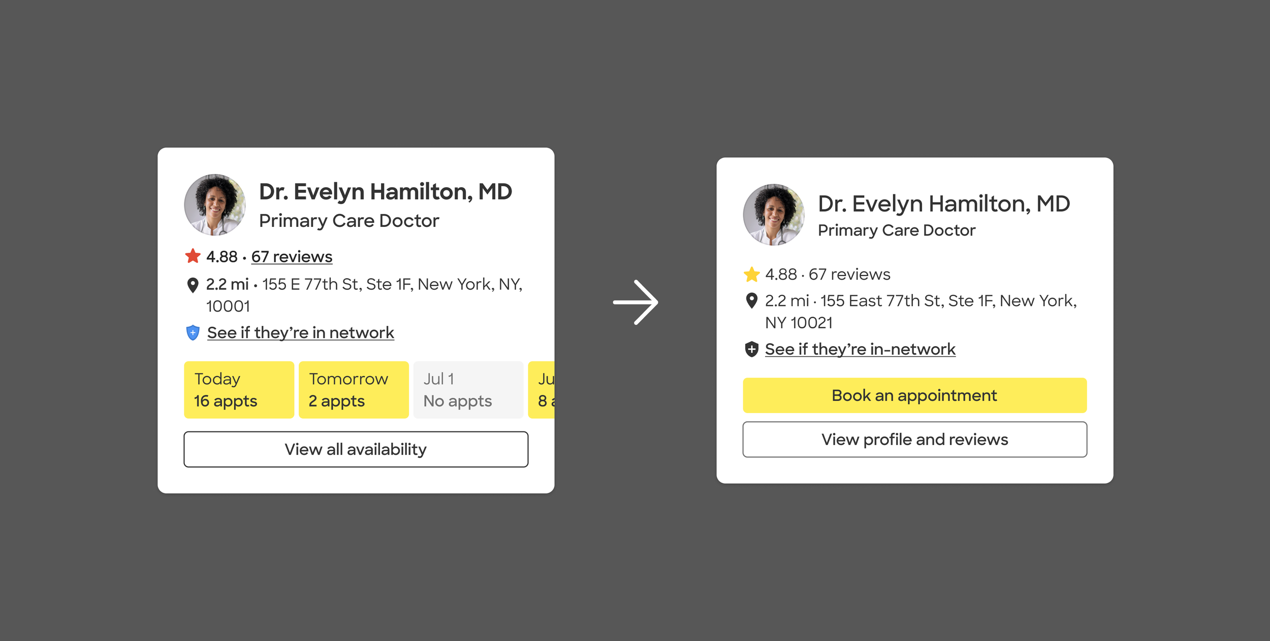
Before/After: Provider cards, Desktop Map
The previous card embedded a full appointment grid, pushing patients toward booking before they had fully evaluated the provider.
For V2, I moved detailed availability out of the card and created two clearer next steps: view the Provider Profile or book an appointment. I also updated the card to Zocdoc’s newer design system.
Before/After: A dense, booking-heavy card became a simpler comparison surface with two clear paths forward.
Platform updates: Mobile web
Previous experimentation had focused on desktop, leaving Mobile Web several iterations behind in both visual language and interaction patterns.
I brought the experience into the current design system and adapted the desktop direction for a smaller viewport—updating provider cards, Map controls, filtering, and location behavior while replacing legacy interactions with patterns better suited to mobile.
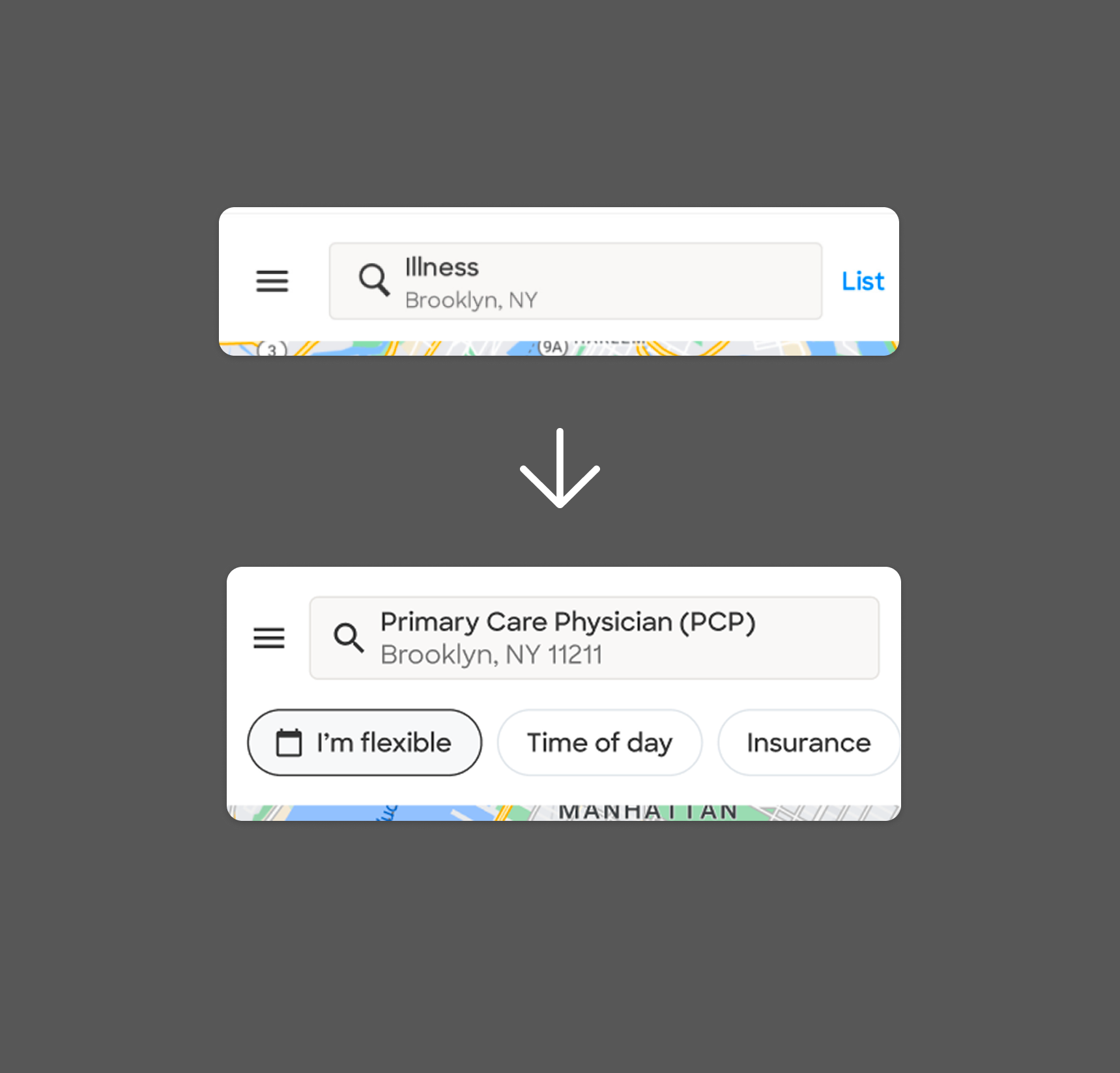
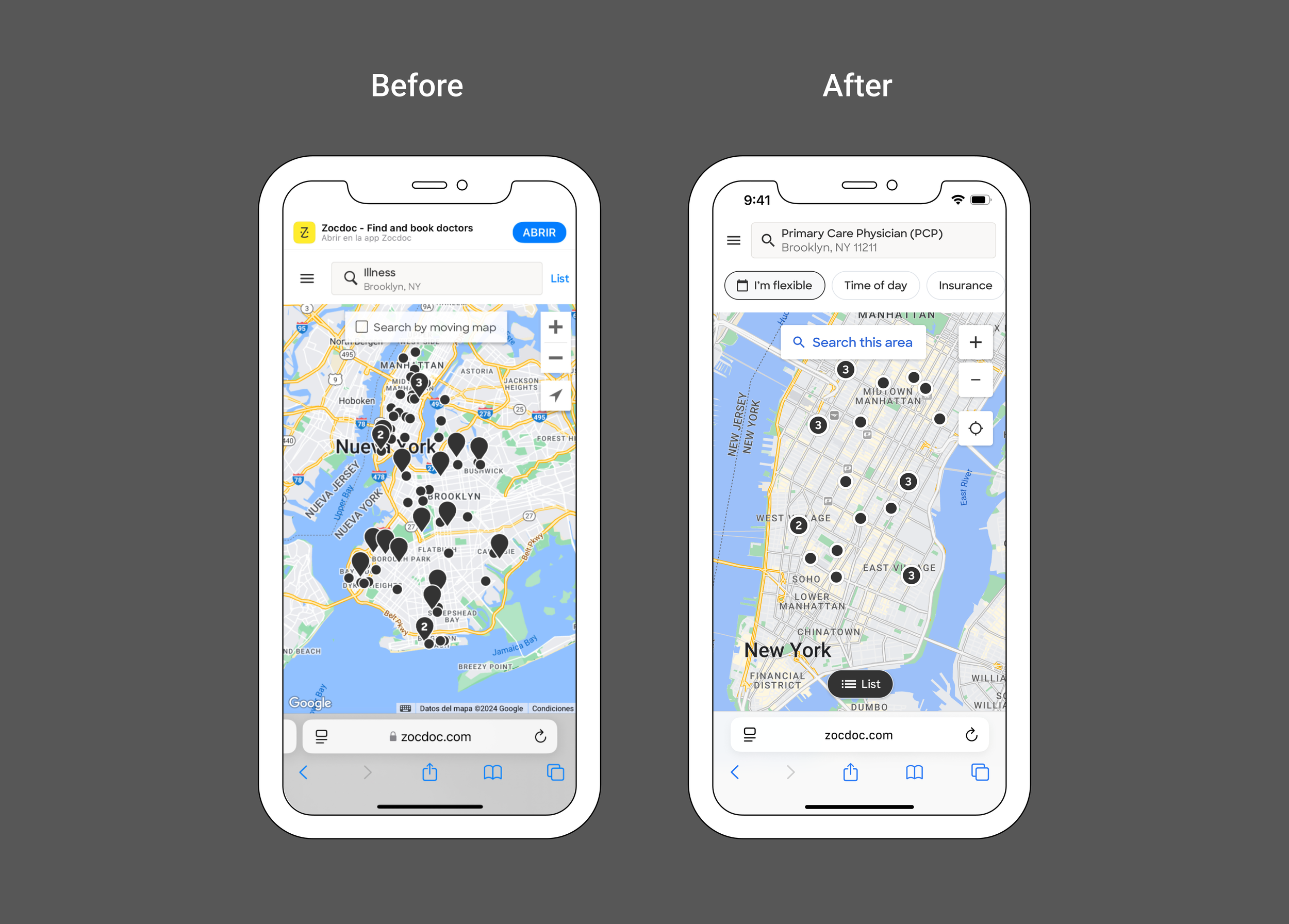
The redesign brought Mobile Web in line with desktop through updated provider cards, Map controls, filtering, and location behavior.
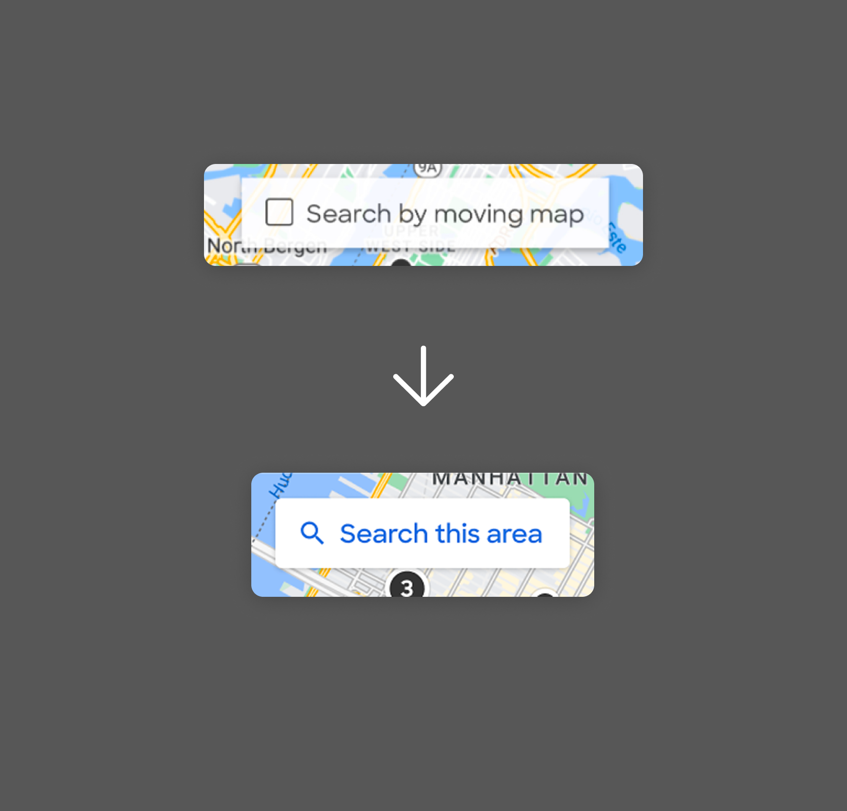
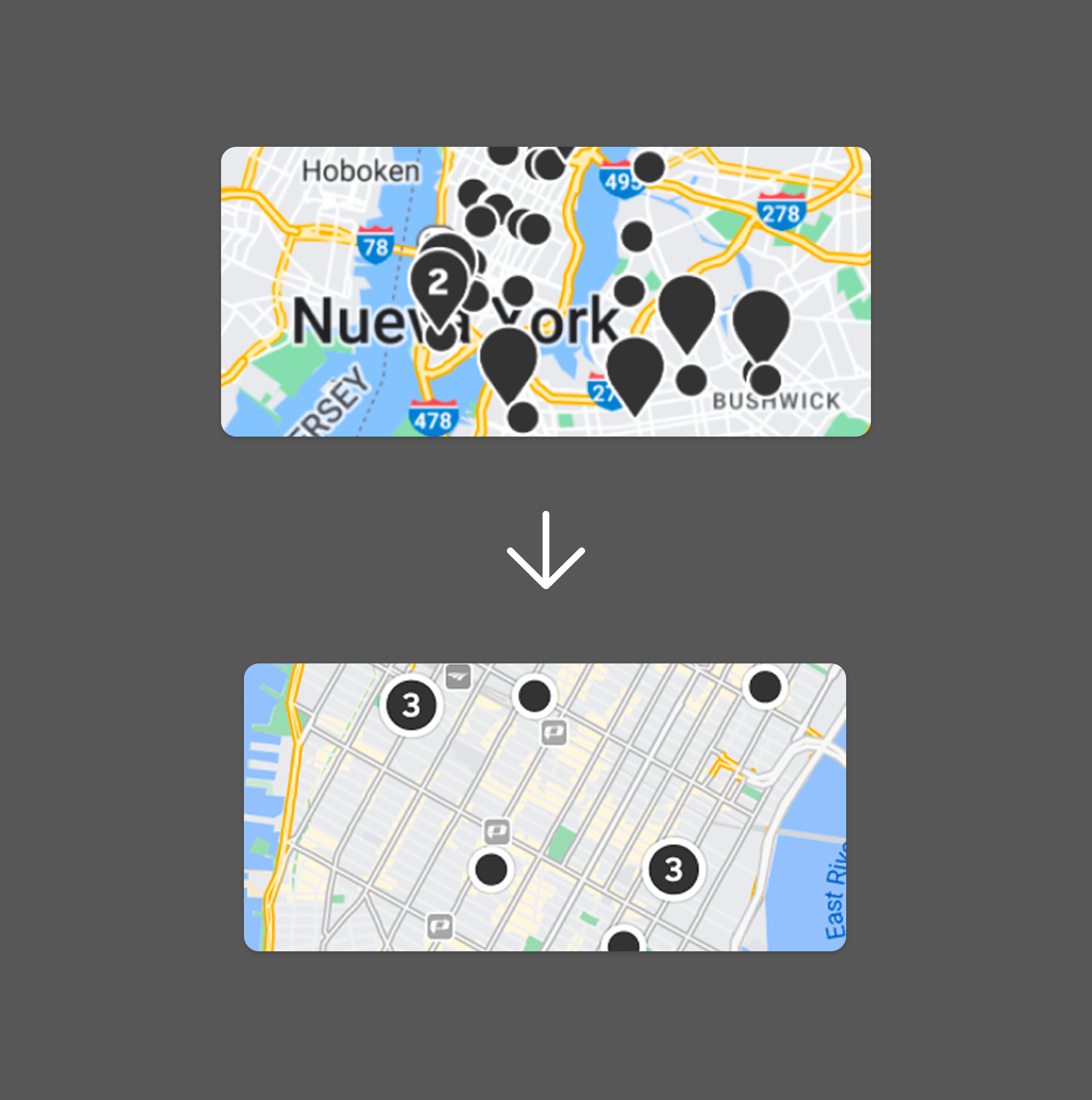
Bringing filters into the map experience helps users narrow down their choices without having to move back and forth between the list/map view. “Search by this area” gave users a better experience than the legacy “Search by moving map”. Pins and markers were brought to parity with Desktop
Testing Map discoverability
Only X% of users accessed the map on mobile web. So in addition to improving its experience, I also wanted to test to see if we could drive more users to the map and expand its benefits. I moved the entry point to a persistent pill at the bottom of the viewport, making Map more visible from Search.
While the change didn’t increase Map usage, it helped separate two questions: how good the Map experience was once opened, and how likely patients were to discover it at all.
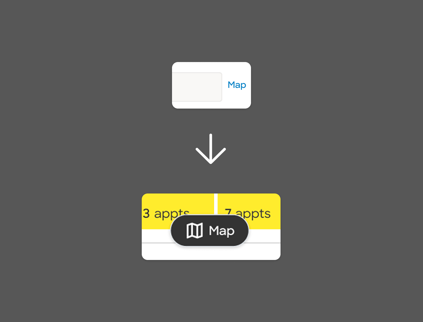
The experiment made Map more prominent from Search,. The the only indication being at the top right of the navigation, but increased visibility alone wasn’t enough to drive more patients into the experience.
Broader audit
After bringing desktop and Mobile Web into alignment, I stepped back and looked at Map across the full patient journey.
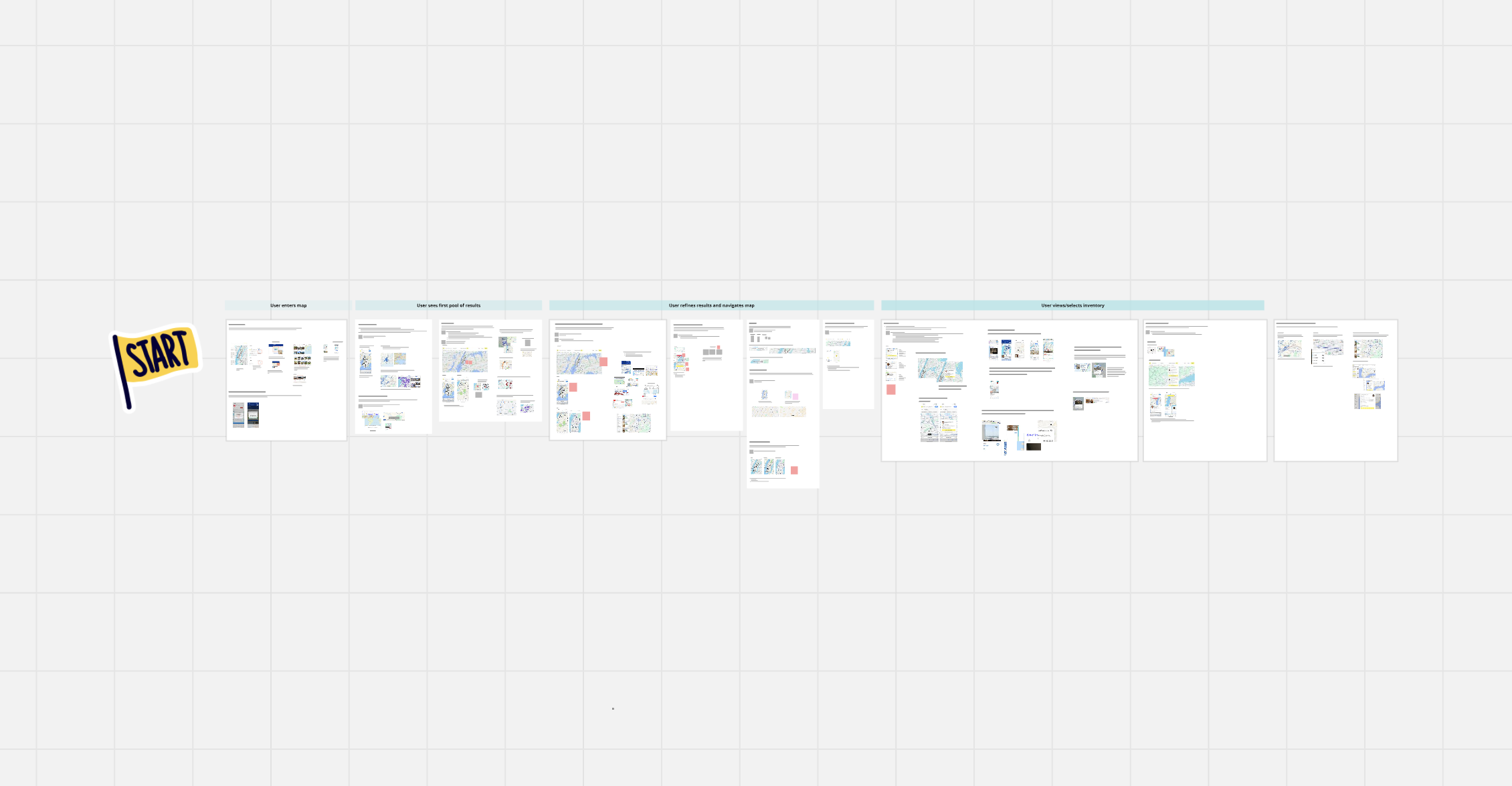
I walked through what patients were trying to understand at each stage, compared Zocdoc with how other products handled the same needs, and documented recurring gaps across entry points, controls, provider cards, pins, and the underlying map itself.
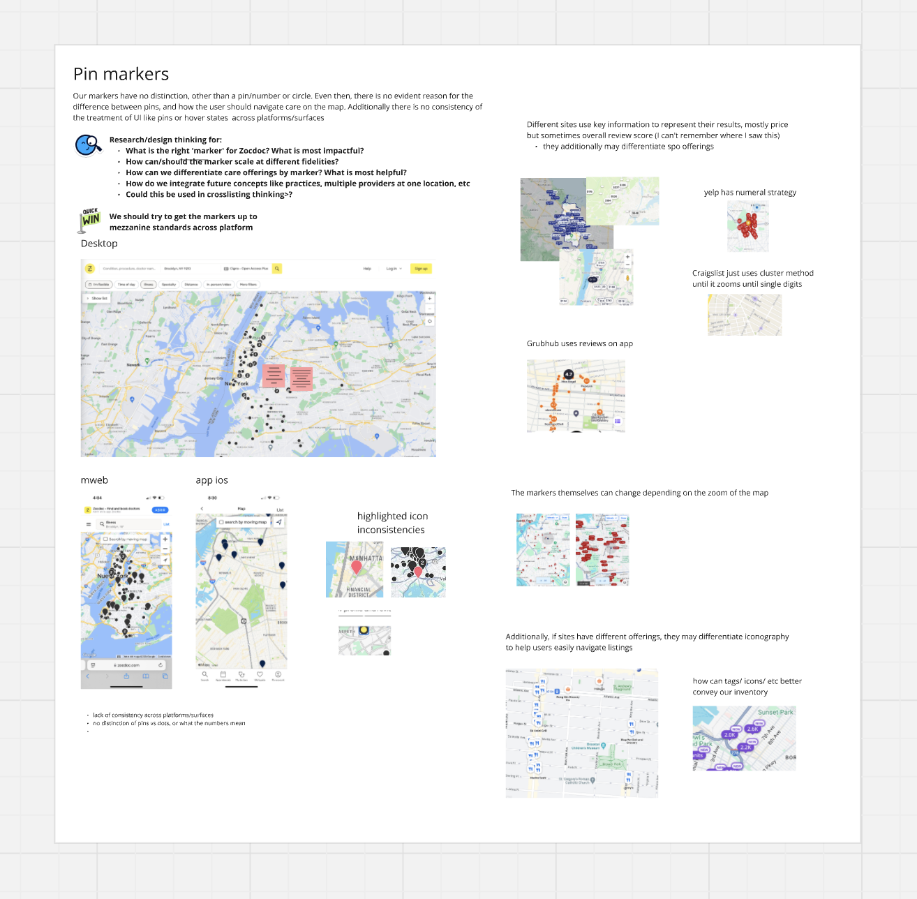
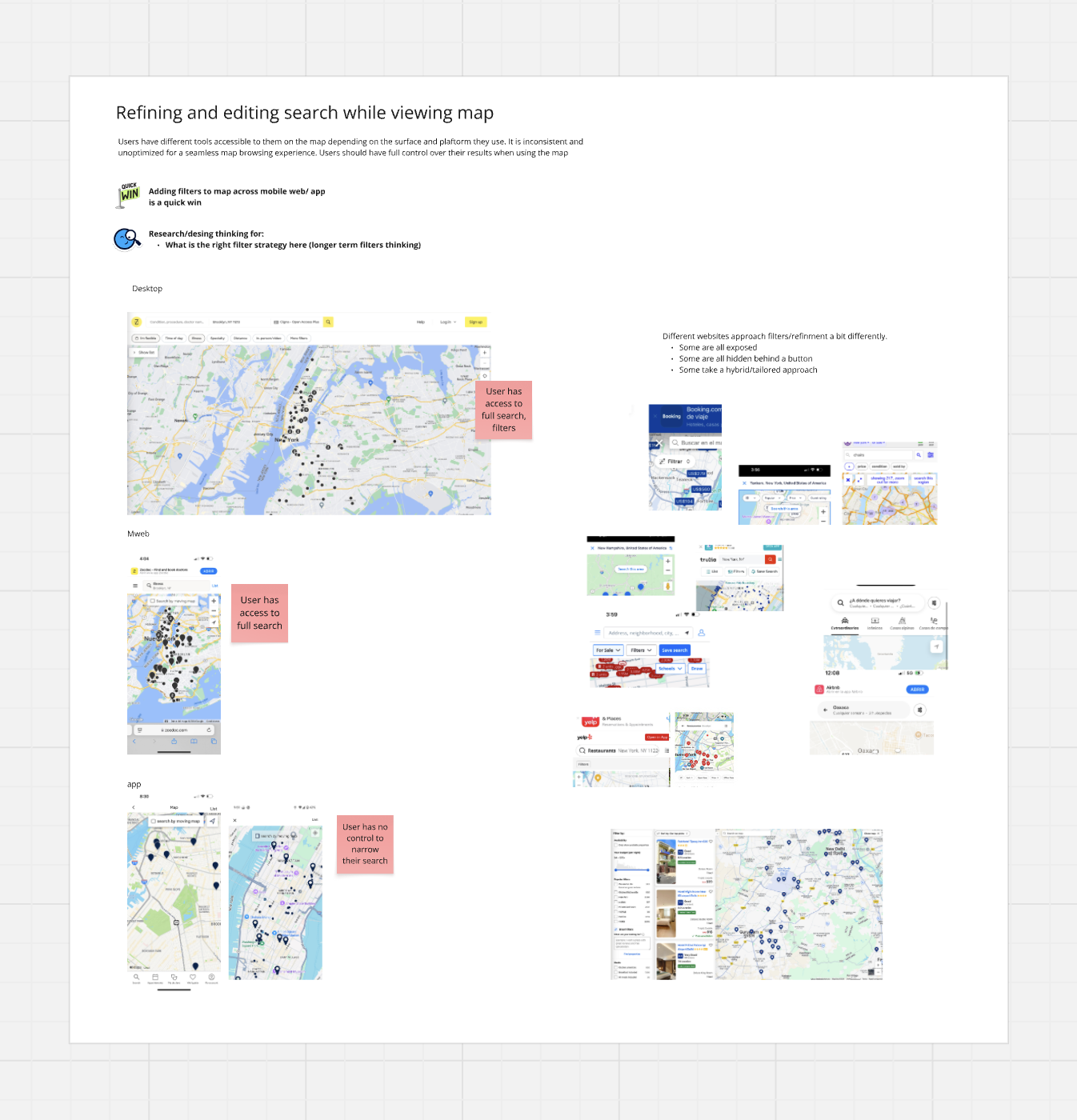
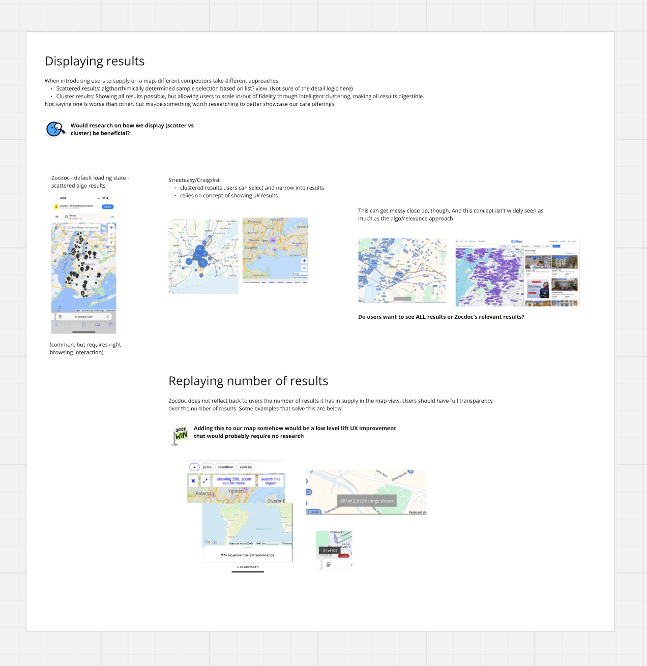
Individual sections went deeper on specific interaction problems, including pin states, provider representation, and map readability.
The full audit captured issues across the end-to-end Map journey and adjacent Search experience.
Turning the audit into a design-led roadmap
The audit surfaced more opportunities than we could address at once, so I organized the work into phases based on dependencies, effort, and what needed to come first.
The roadmap separated foundational improvements from larger interaction and discoverability work, giving the team a practical sequence for evolving Map over time.
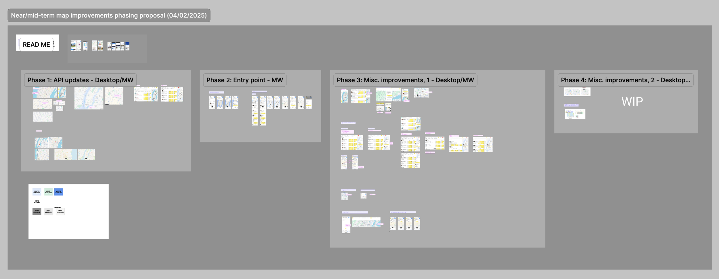
The roadmap turned a broad set of findings into a sequenced plan—from foundational Map improvements to larger interaction and discoverability changes.
Standardizing the Map foundation
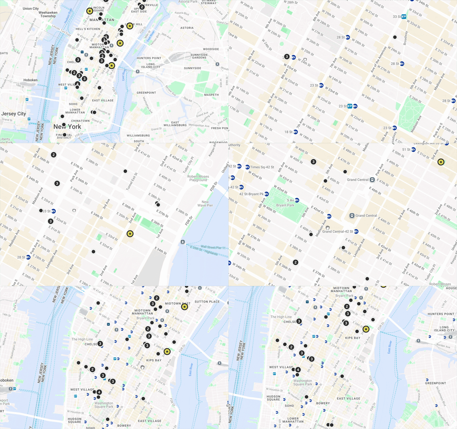
The first phase focused on the map itself. Across the Zocdoc product, our maps had accumulated inconsistent styling due to legacy experiences and platform differences. There was also unnecessary visual detail and competing information that made our provider pins harder to read.
I explored Google Maps’ customization capabilities and worked with Engineering to bring all our Google map-derived maps into a more restrained, consistent treatment. We softened the underlying colors, reduced unnecessary streets and labels at different zoom levels, and simplified the hierarchy so Zocdoc’s provider inventory stood out more clearly.
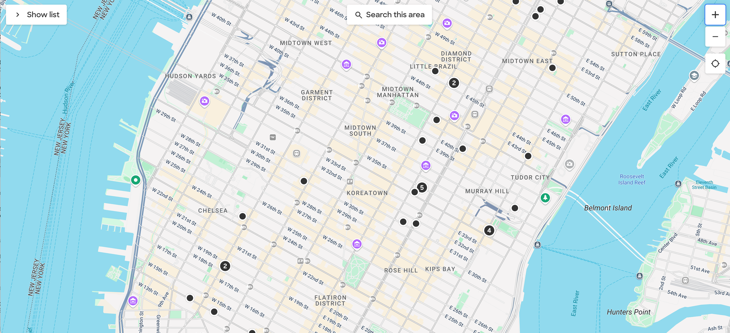
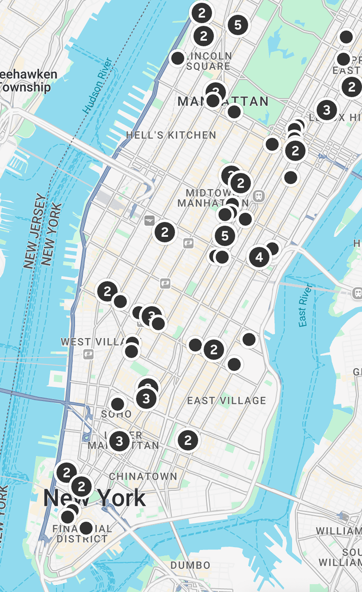
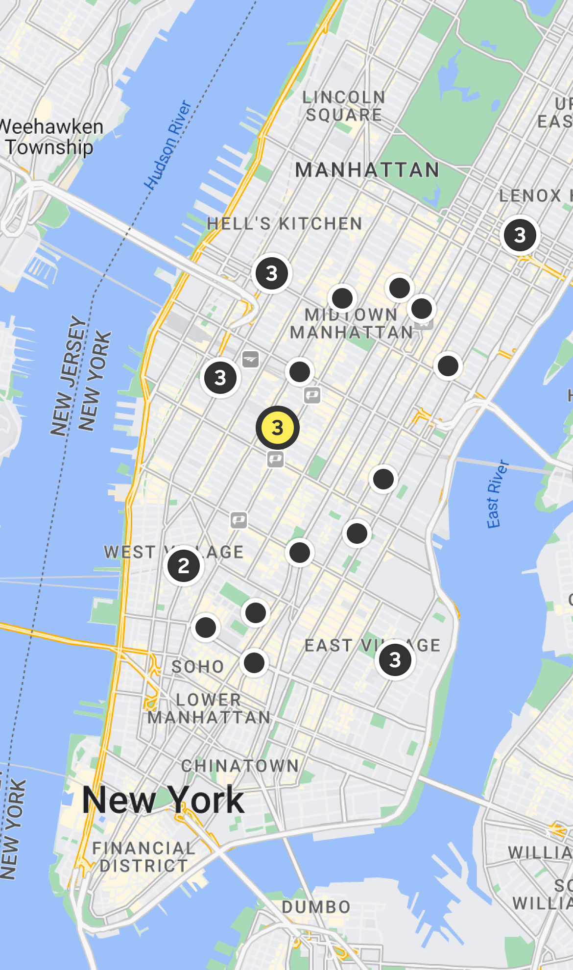
Before pulling in the a new API, our map presentation was inconsistent across platforms.
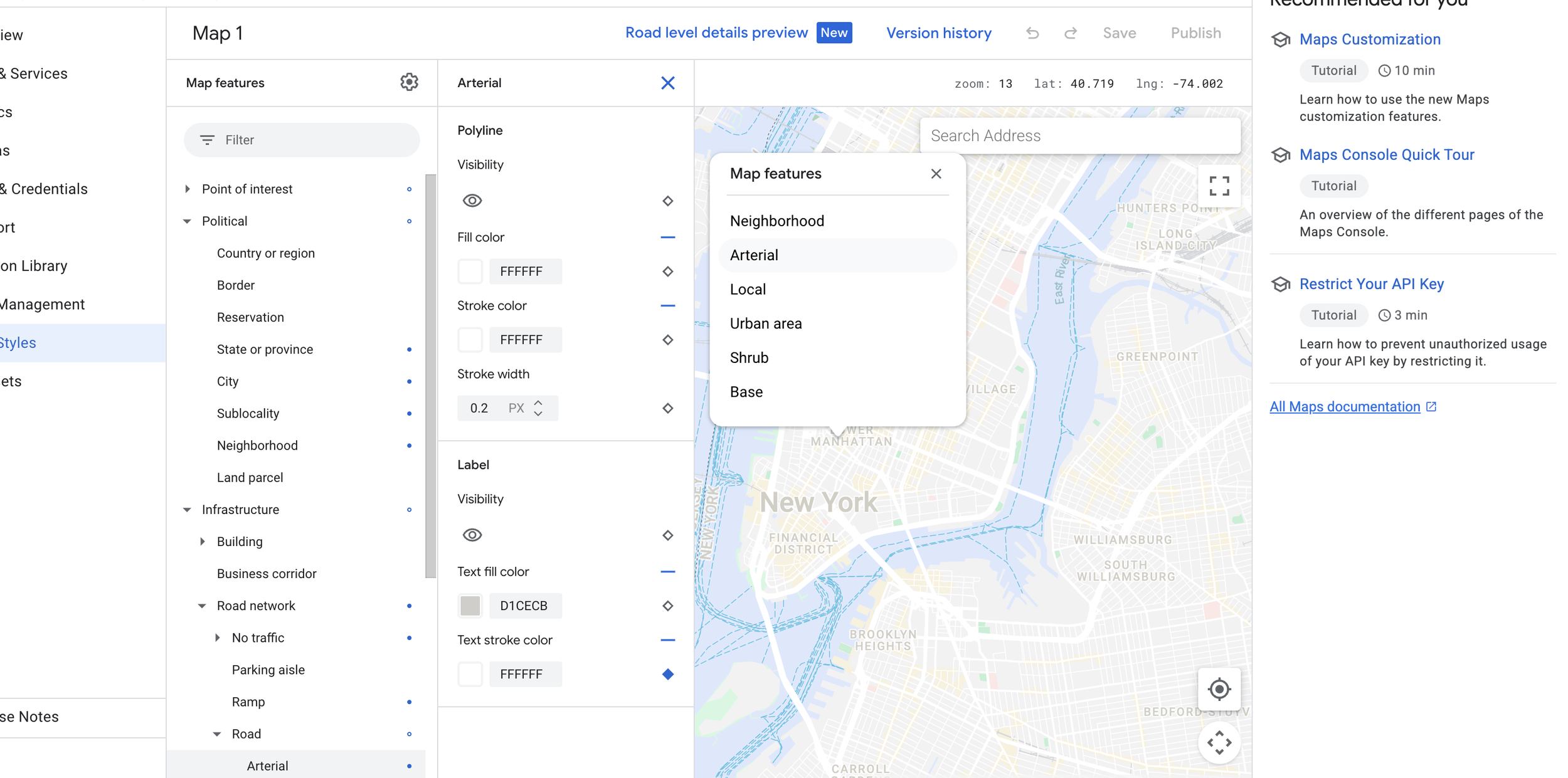
I was able to explore the tool and go down to every detail. bringing our existing styles from our design system into the map itself.
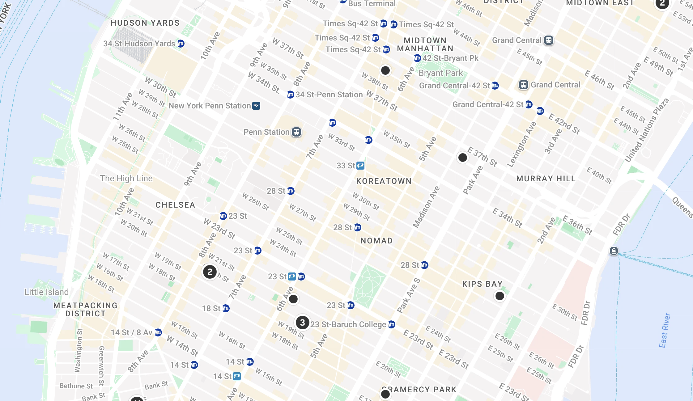
Before/After: Reducing the prominence of the underlying geography created a clearer canvas for Zocdoc’s provider inventory. By deemphasizing non critical information ,we could raise relevant information like major subway stops.
Where we landed
The standardized Map treatment shipped and became the foundation for Google-powered maps across Zocdoc. It gave the product a more consistent visual system and made our provider inventory easier to distinguish from the underlying geography.
The roadmap went further, with additional work planned around discoverability and the broader interaction model. Those phases ultimately didn’t move forward as Search priorities shifted and team scope changed.