Review & Book
Rebuilding a critical booking step and recovering from an underperforming launch
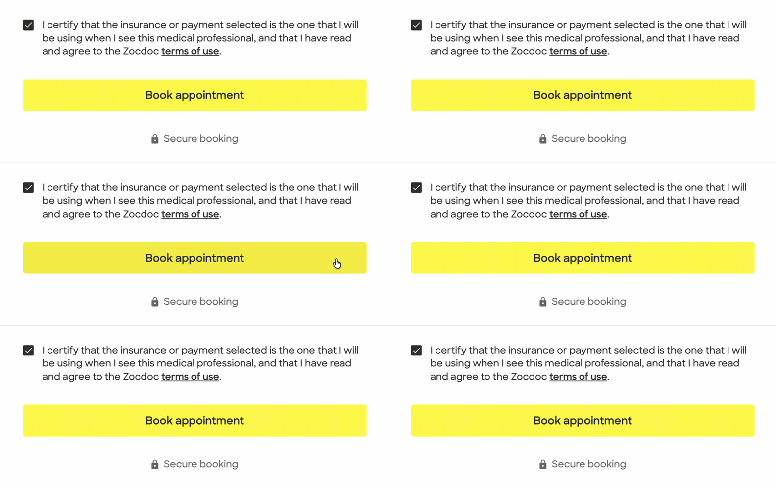
Project overview
After an initial effort to improve qualification earlier in the booking flow failed, the Conversion team re-sequenced the work toward the end of the funnel: Review & Book.
I became the primary design owner for rebuilding Review & Book, the final step of Zocdoc’s booking flow. The work included moving one of Zocdoc’s last major legacy surfaces onto newer product architecture and the updated Mezzanine design system, all while improving the 30% drop off the page experienced.
When the first MVP underperformed in production, I worked with Product, Engineering, and Analytics to understand what was happening, then redesigned the experience around a simpler model that ultimately turned conversion around.
Date
2022-2023
Role
Senior Product Designer
Team
Product, Engineering, Analytics, UXR, Design Systems
Scope
Desktop/ mobile web, Booking-flow strategy, Review & Book redesign and migration, MVP definition, usability validation, experimentation, diagnosis, and redesign
Outcome
+2.7% booking conversion on desktop and +1.9% on Mobile Web, representing roughly 2,700 projected additional bookings per month.
Understanding the conversion problem
This work began a few months earlier, when the newly formed Conversion team was tasked with improving Zocdoc’s booking flow. At the time, there wasn’t much of a flow: after selecting a timeslot, a patient either logged in or went directly to Review & Book.
But only about 70% of patients who reached that final step completed their booking. Patients could still encounter errors, confusing prerequisites, and weak recovery states just as they were trying to finish.
Those problems surfaced on Review & Book, but they did not necessarily begin there. Before redesigning the page, we needed to understand how the broader booking journey was contributing to what patients encountered at the end.
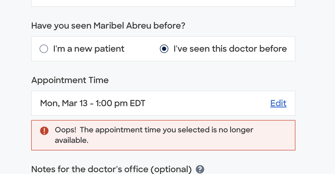
Patients could reach the final step after selecting an appointment only to learn that the appointment was no longer available, a visible symptom of qualification happening too late in the journey.
Mapping the booking journey
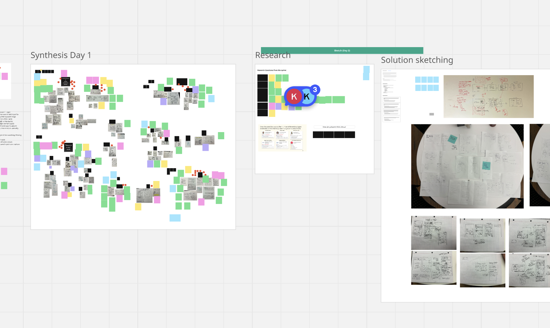
I mapped the booking journey across desktop, mobile web, iOS, and Android to understand where information entered the flow, how those inputs affected one another, and where gaps emerged.
This end-to-end view had not previously been captured in one place, and became a useful reference beyond the immediate project.
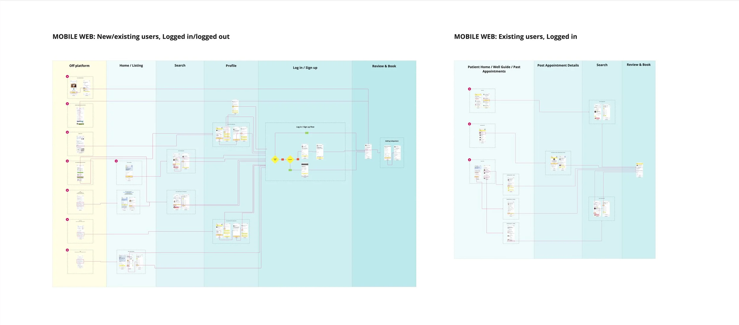
Mapping the existing journey helped make the dependencies between qualification, availability, and Review & Book visible.
Auditing Review & Book
With the broader journey mapped, I looked more closely at Review & Book itself. Using Nielsen’s 10 usability heuristics, I identified more than 30 issues across hierarchy, editing, errors, and recovery.
There was also no single inventory connecting backend error states to what patients actually saw. I worked with Product to manually map those errors back to their UI states, giving us a clearer picture of where the experience was breaking down.
Alongside the broader work, I identified smaller improvements we could address immediately.

Mapping the existing journey helped make the dependencies between qualification, availability, and Review & Book visible.
The question of qualification
The work surfaced a broader problem: patients could select an appointment before Zocdoc had all the information needed to know whether that appointment was actually valid.
Insurance, visit reason, patient status, and provider requirements could still affect availability later in the journey, creating conflicts that surfaced on Review & Book.
Rather than treating those conflicts only as an end-of-funnel problem, we explored whether more qualification could happen earlier.
I designed three Booking Vision concepts that explored different ways of sequencing qualification and availability.
Testing the upstream approach
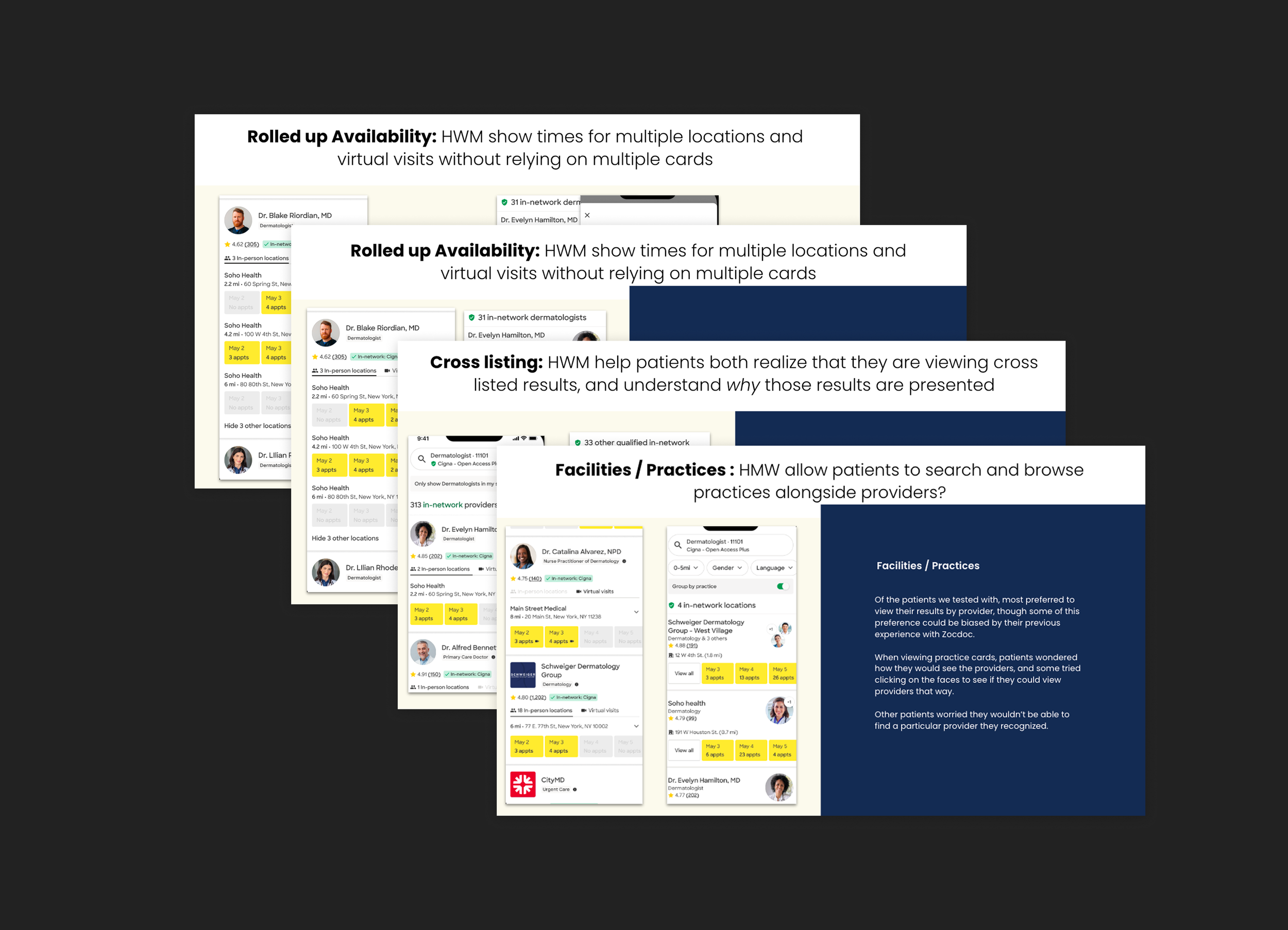
The team chose Step-by-Step as the longer-term direction, and I designed an Insurance Stepper to test one part of that model: collecting insurance before timeslot selection.
The experiment did not improve overall conversion, so the team re-sequenced the work toward Review & Book itself.
The concepts explored different tradeoffs between showing availability early and qualifying patients before they selected a time.
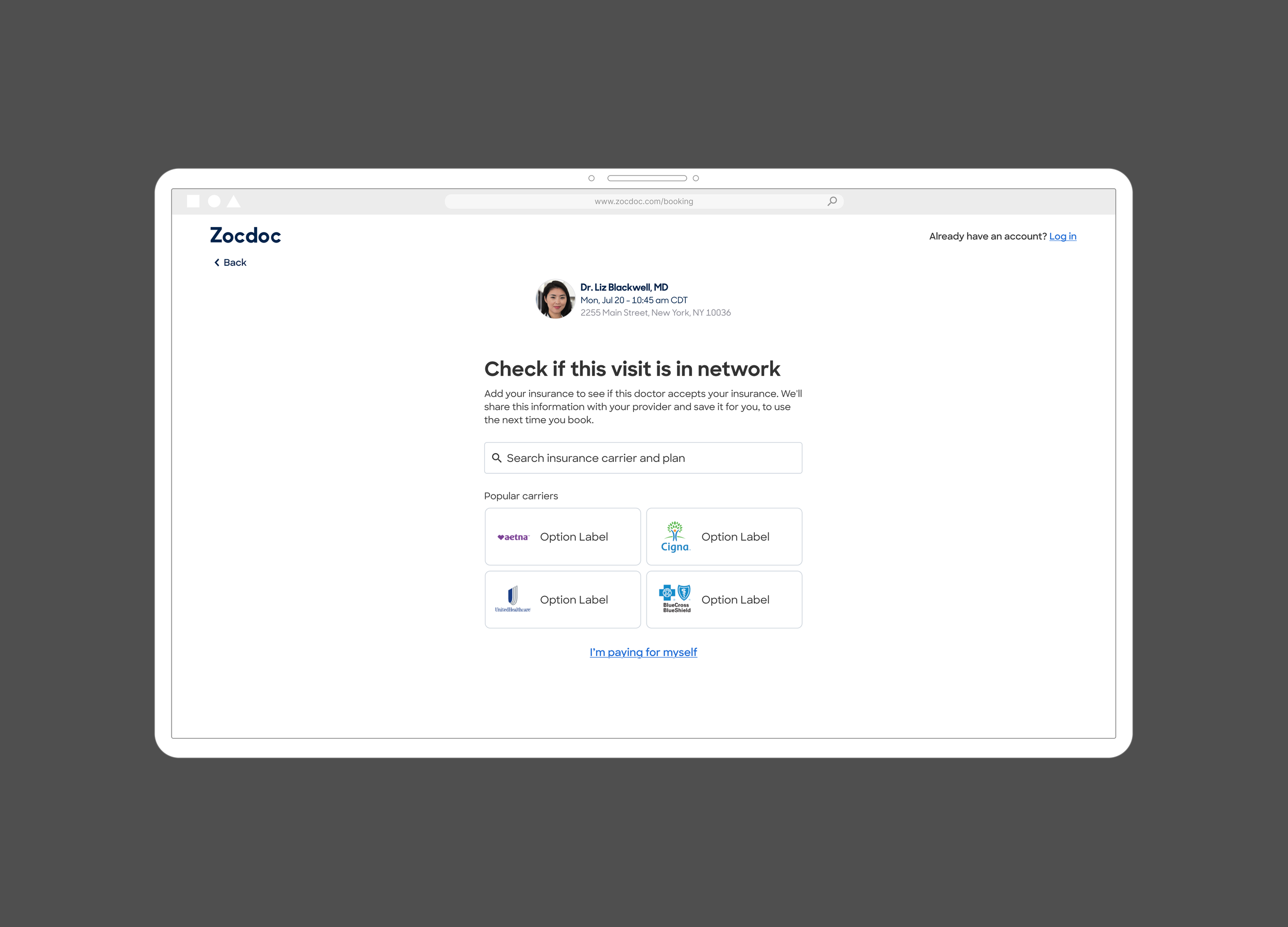
The Insurance Stepper tested whether resolving insurance earlier could prevent qualification conflicts later in the booking journey.
Rebuilding Review & Book
Taking on one of Zocdoc’s last legacy booking surfaces
With the work re-sequenced toward the end of the funnel, I took design ownership of rebuilding Review & Book.
The page sat on one of Zocdoc’s last major legacy systems, where years of qualification rules, provider requirements, editing behavior, and recovery states had accumulated. Rebuilding it meant simplifying the patient experience without pretending that underlying complexity had disappeared.
Reshaping the experience
I started mobile first and broke the existing page into its underlying content and interaction blocks rather than reproducing the legacy layout screen for screen.
That let me reconsider what patients actually needed to review, what could be deemphasized, and how the experience should be structured within Zocdoc’s newer design system.
The interface looked relatively simple, but each section sat on top of a much larger set of booking rules, dependencies, and exception states.
I used lower-fidelity content blocks to work through hierarchy and grouping before moving into detailed UI.
Phase 1 MVP
Rebuilding every legacy rule and exception at once would have made the project too large to learn from quickly. I worked with Product and Engineering to define a narrower first release that moved the core booking path onto the new Review & Book experience.
The MVP supported common booking scenarios across desktop and Mobile Web. More complex cases and many edits still redirected patients back to the legacy experience, creating an intentionally transitional system while we continued designing the broader migration.

Phase 1 established the new Review & Book foundation for the core booking path while more complex scenarios remained temporarily on the legacy experience.
Making the final step easier to review
The legacy page gave appointment, patient, and insurance information similar visual weight, which made the final step feel more like another form than a confirmation.
I reorganized the page around what patients needed to verify before booking, using clearer grouping and hierarchy while keeping editing available where the MVP supported it.
The new hierarchy made booking-critical information easier to scan while reducing the visual weight of secondary content and controls.
Designing beyond the MVP
The first release was intentionally narrow, but I was already designing how more of the booking experience could move onto the new system.
A major part of that work was recovery. Editing insurance, patient status, or appointment details could change whether a selected timeslot was still valid, so those interactions needed to do more than simply update a field.
I designed recovery paths that connected the change a patient made to its effect on availability, helping them understand what changed and choose a valid appointment when needed.
Supporting more complex booking scenarios
Beyond recovery, the new Review & Book also had to support booking scenarios that did not fit the core path.
I worked through cases like video visits, mental health appointments, required addresses, subpatients, and referring-physician information. Each introduced different requirements, but the goal was to extend the same underlying framework rather than create a collection of one-off experiences.
The recovery work explored how common edits could stay within the new experience instead of sending patients back to legacy Review & Book.
These explorations tested how the new Review & Book could scale to more complex patient, provider, and appointment requirements without fragmenting the experience.
Validating and launching the MVP
Before launch, I wrote the research brief and ran usability testing focused on the interactions I considered riskiest, including editing appointment details, completing missing information, and recovering when patient status affected availability.
The core interaction model held up. Patients understood the page and were able to complete and edit the information they needed without major usability issues.
We launched the MVP in May 2023. The first production read looked roughly flat, but as we dug further into the experiment, it became clear that the new experience was underperforming.
Recovering the launch
Understanding what went wrong
The negative result did not point to a single cause.
I worked with Product, Engineering, and Analytics to separate what we knew from what we suspected. We looked at implementation defects, legacy redirects, instrumentation, platform differences, error states, CTA visibility, and how patients were actually moving through the page.
Some issues clearly needed to be fixed before we could judge the design. Others remained experience-level hypotheses.
That gave us a more disciplined path forward: address the known problems first, then test a simpler version of the experience rather than reacting to the entire result at once.
Simplifying the experience
Once the known implementation issues were addressed, I focused the next iteration on the experience itself.
I redesigned Review & Book around a simpler idea: make the final step feel like a review, not another form to work through.
The two-column layout became a single-column hierarchy. I shortened the page, moved the Book action higher, removed unnecessary labels and repeated information, pushed secondary fields behind links, and made error states more directional.
The diagnosis distinguished implementation and measurement problems from experience hypotheses, helping us decide what to fix and what still needed to be tested.
The redesign reduced form-like structure and brought the booking action into clearer focus across both platforms.
Conversion recovered
The redesigned Review & Book improved booking conversion across both platforms.
+2.7% Desktop conversion
+1.9% Mobile Web conversion
Together, the results represented roughly 2,700 projected additional bookings per month.