Rolled-up availability
Rethinking how complex provider inventory appears in search
Project overview
When capacity opened on the Search roadmap, I proposed and co-led a cross-functional sprint around the new Improve Inventory in Search initiative, exploring the broader problem space while narrowing toward testable ideas. My design focus was how that inventory should appear in Search, specifically: how provider inventory should appear in Search, how much complexity patients should manage there, and what role Search should play in finding care.
The sprint produced several near-term experiments, including Rolled-Up Availability, which consolidated fragmented provider inventory into a clearer results experience. I became the primary designer for the MVP, carrying it through detailed interaction design, implementation, and experimentation.
Date
2024-2025
Role
Senior Product Designer
Team
Product Manager (x1), Engineering Man (x1 Manager, x4 Developers, User Researcher (x1), , Product Design
Scope
Desktop/mobile web, Inventory in search exploration, search Results Organization, Rolled-Up Availability, implementation and experimentation
Outcome
A follow-up experiment measured a statistically significant +1.3% overall conversion lift and was recommended for launch.
Improving Zocdoc inventory
The initiative started with several known problems and potential solutions. But when we looked at them together, the broader challenge became clear: Zocdoc’s inventory was becoming more complex than the way Search was designed to represent it.
Search needed to account for an increasingly varied mix of providers, locations, visit types, practices, availability, and cross-listed providers without making the experience harder for patients to understand.
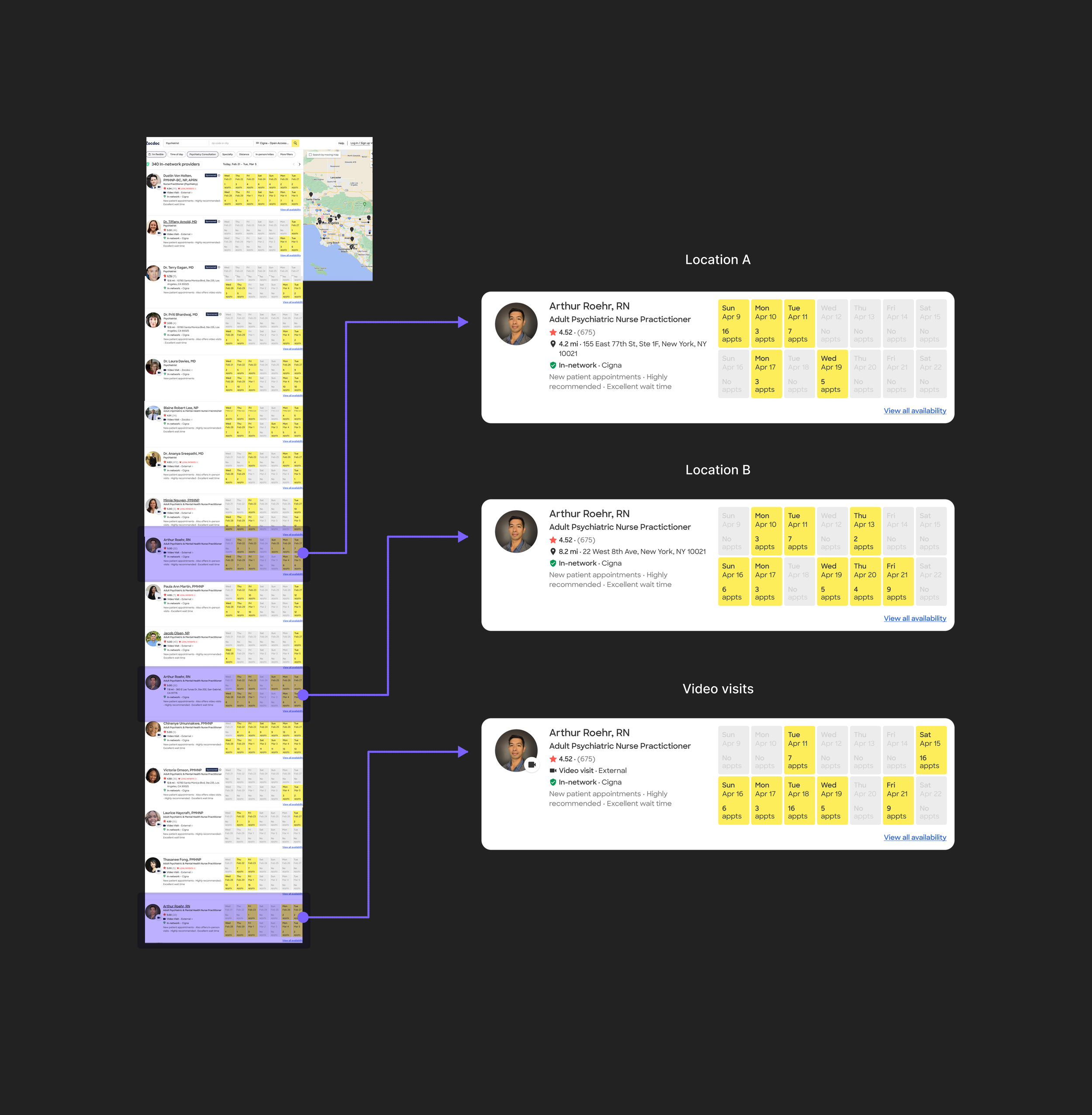
Because Search was organized around individual provider locations, the same provider could appear multiple times across locations or visit types, fragmenting their availability across separate results.
But the problem extended beyond the results themselves. What Search knew about a patient upstream affected which inventory should appear and how it should be organized downstream. Improving inventory meant looking across the Search journey, not solving each results-page issue in isolation.
Looking at the entire experience
The ‘design sprint’
I helped structure and co-lead a four-week sprint that included 14+ stakeholders across Product, Design, Research, Engineering, Leadership, and adjacent teams and audiences.
We had two goals for the sprint. First, explore the broader problem space, which would result in a directional prototype we could share with leadership, while still producing tangible improvements for the near-term MVP.
The sprint started with mapping the wider problem spaces and generating directions with the wider group, and then narrowing down to the strongest ares to begin exploring. As the work became more focused, a smaller team of 5 (PM, 2 Designers, UXR, EM) carried those questions into targeted design-and-test cycles.
Connecting input with output
The truth was, the inventory problem started before patients reached the results page. What Zocdoc knew about a patient’s needs shaped which inventory could be most useful to them, so the sprint explored both sides of the system: collecting better signals upstream and deciding how Search should respond to them.
While the other designer went deeper on the upstream collection flow, while my work mainly focused on making Search responsive to those inputs: deciding what inventory to surface, how results and filters should adapt, and how to make that added relevance clear without increasing complexity.
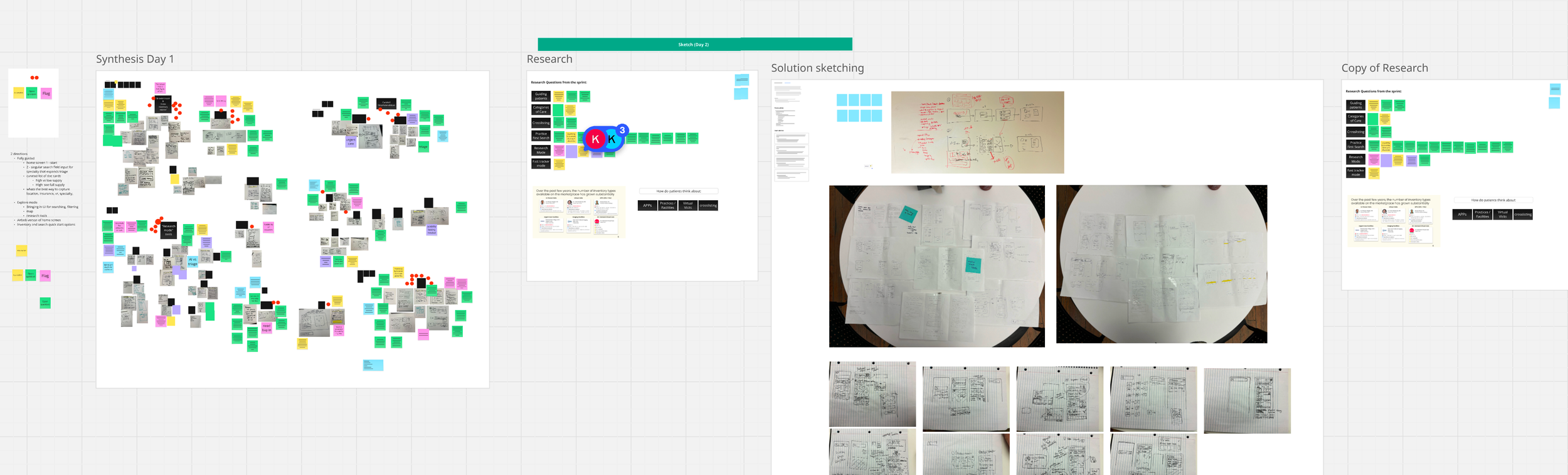
We brought together pain points from across the organization, then grouped them into a smaller set of questions to explore through design and research
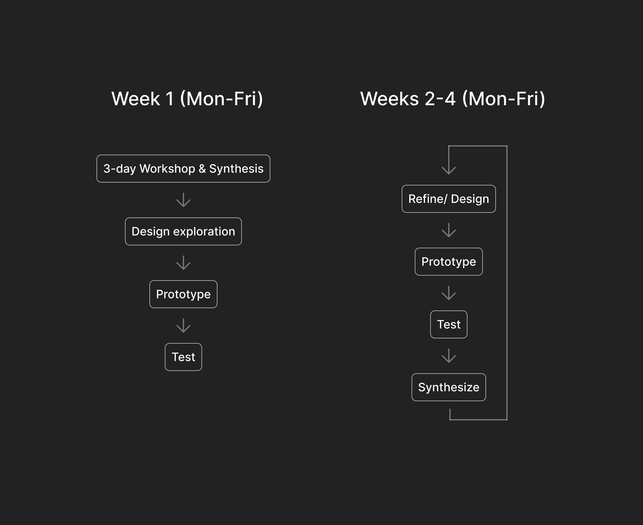
The sprint started with broad cross-functional exploration, then narrowed through successive design-and-test cycles over four weeks.
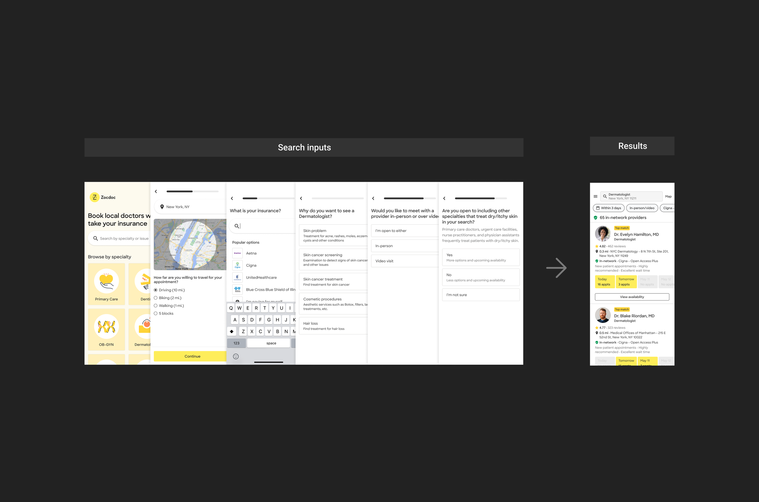
We tested the experience as one connected system: information gathered upstream changed what patients encountered in Search. My work focused on translating those signals into a results experience that felt more relevant without becoming harder to understand.
Design exploration: Zocdoc inventory display
While the first few rounds of research focused more on the upstream experience, we alread ybegan to narrow in on the correct display of core inventory. I explored different inventory problems through design, including making cross-listed providers understandable, consolidating fragmented availability, and defining how practices and facilities might appear alongside individual providers.
Cross-listed providers
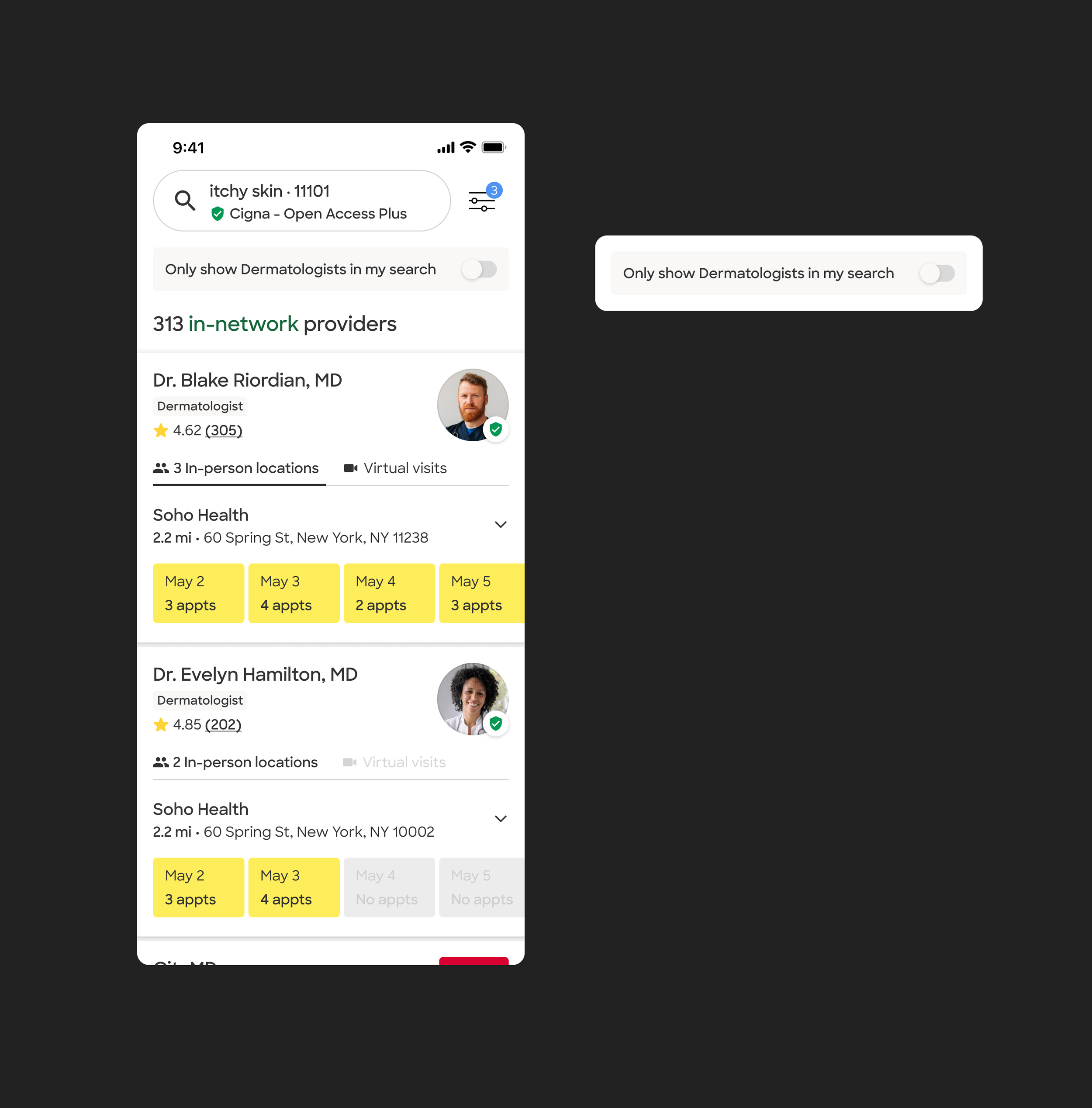
I explored ways to make cross-listed providers easier to understand by explaining why they appeared in a patient’s results, especially when the connection to their search was not immediately obvious.
Duplicate/fragmented results
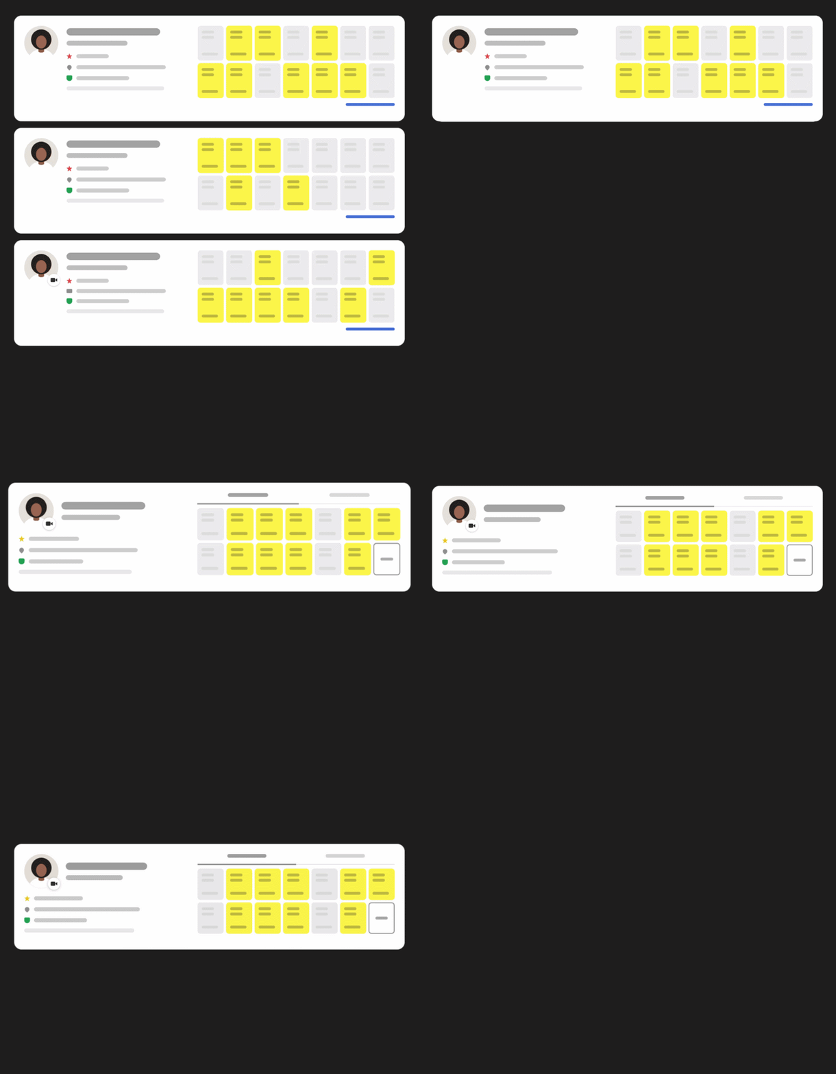
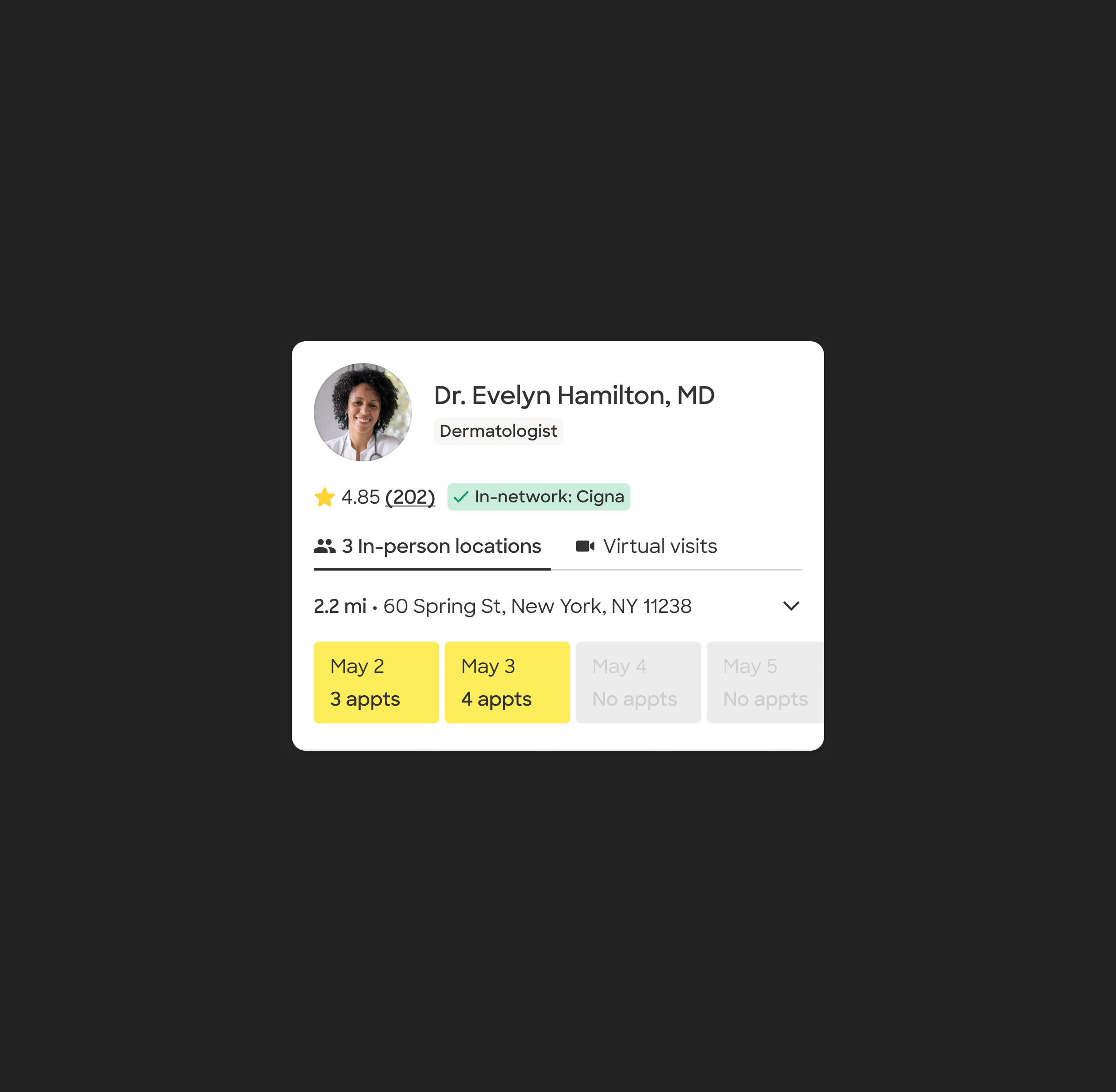
I explored how to combine multiple locations and Video availability into a single provider result without hiding the options patients needed to compare and book.
Practice/facility inventory
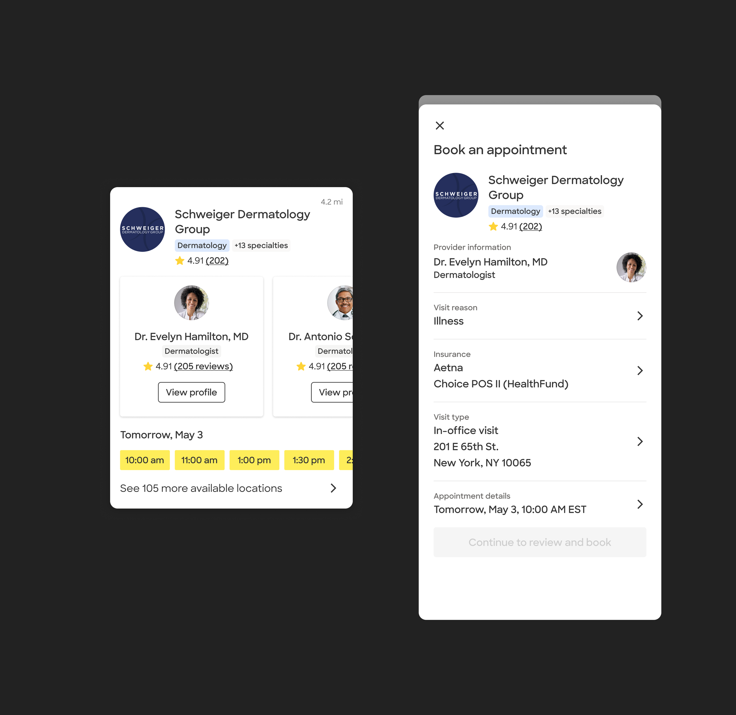
I explored how practices and facilities could appear alongside individual providers as distinct result types, and what information patients would need to understand what they were looking at.
Leaning on weekly research
I partnered with UXR throughout testing, moderating sessions and helping synthesize what we were learning as each prototype evolved. Across the research, a few themes kept resurfacing: proximity and insurance were fundamental to comparison, In-person vs. Video needed to be immediately clear, and patients wanted access to a provider’s full availability rather than a partial slice.
At the same time, exposing more information and controls directly in Search could make an already dense page harder to compare. That tension became the focus of my next exploration: what needed to stay visible in Search, and what could move deeper into the booking journey?
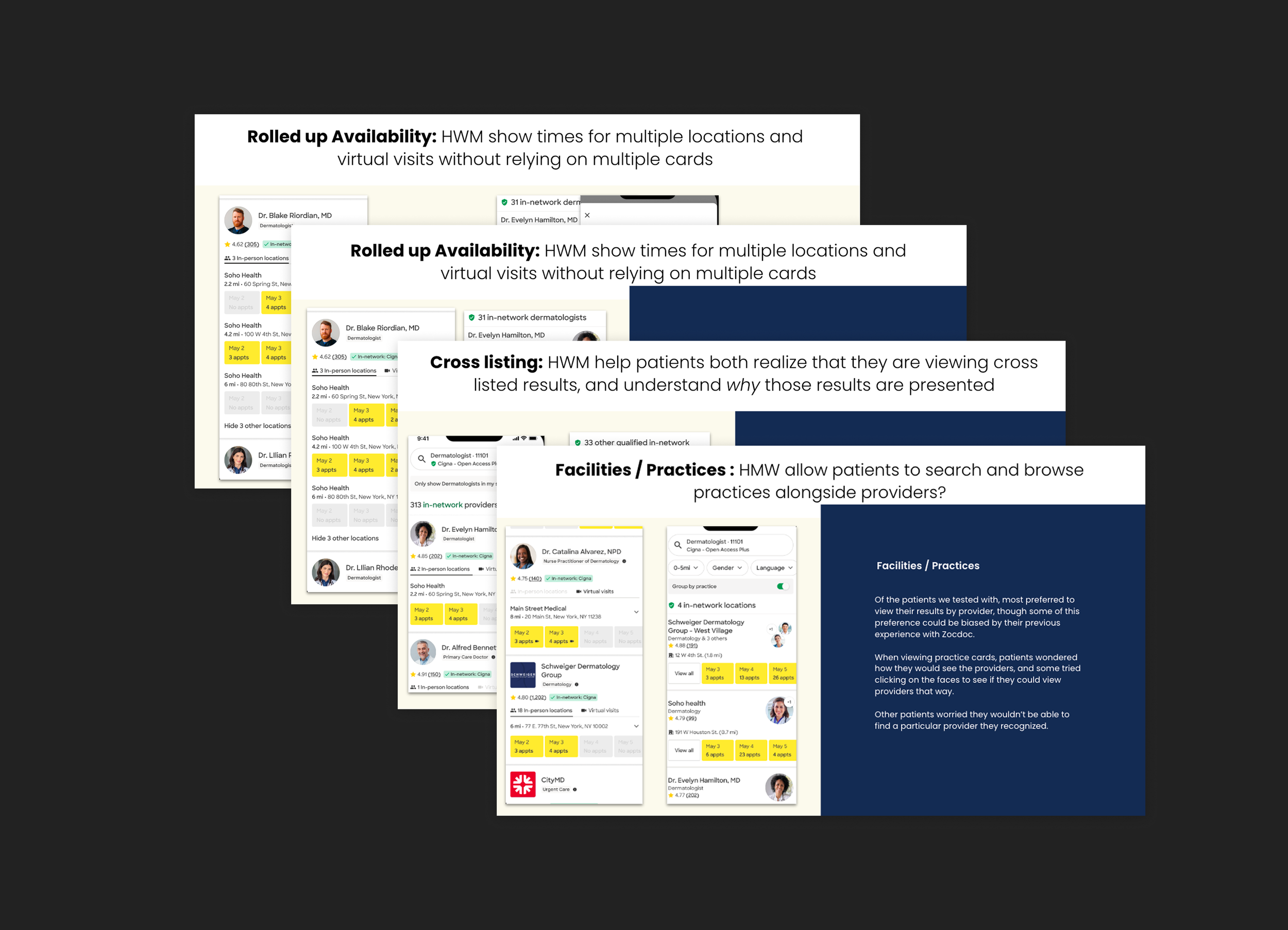
Research across the sprint helped distinguish the information patients needed for comparison from complexity that could be handled deeper in the journey.
Fragmented inventory: the clearest near-term opportunity
The sprint produced several ideas we could test incrementally, but we also needed a more substantial near-term opportunity we could turn into an MVP and validate through experimentation.
Zocdoc’s fragmented inventory emerged as the clearest near-term direction. Other areas, from cross-listing and practice representation to more exploratory future-state concepts, still needed deeper investigation before they were ready to become product work.
Defining Search’s role as a comparison tool
As the sprint narrowed toward Rolled-Up Availability, the MVP direction was clear, but the interaction model wasn’t. My results work focused on one question: how much of a provider’s location, visit-type, and availability complexity should patients manage in Search, and what should wait until they went deeper?
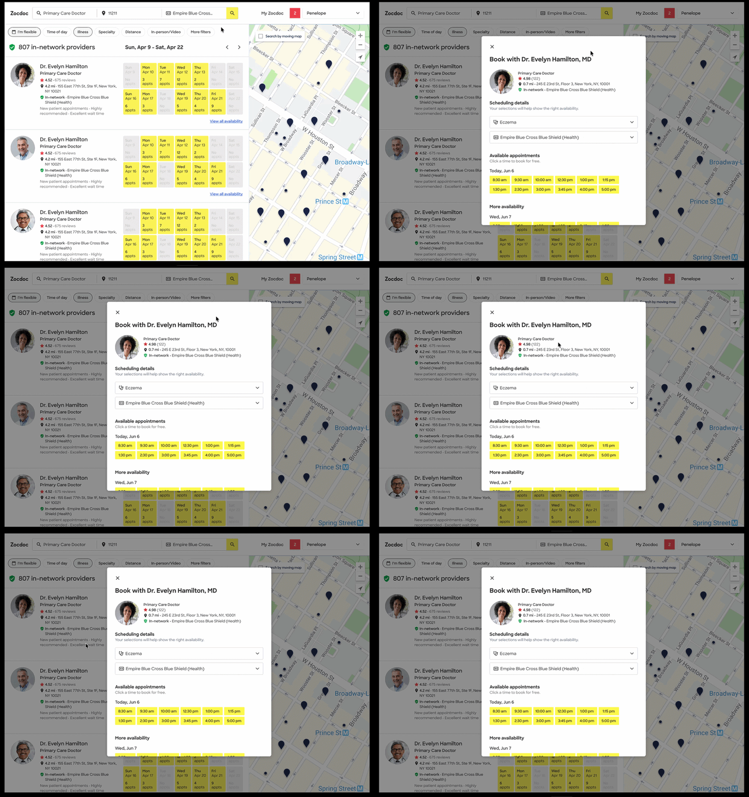
Search and availability already formed a two-step flow: patients compared providers in results, then opened the existing availability modal for more detailed appointment choices.
Design problem 1: Where is the complexity managed?
The availability modal remained the place for full appointment selection in every concept. What I wanted to understand was how much location and visit-type management should happen before patients got there.
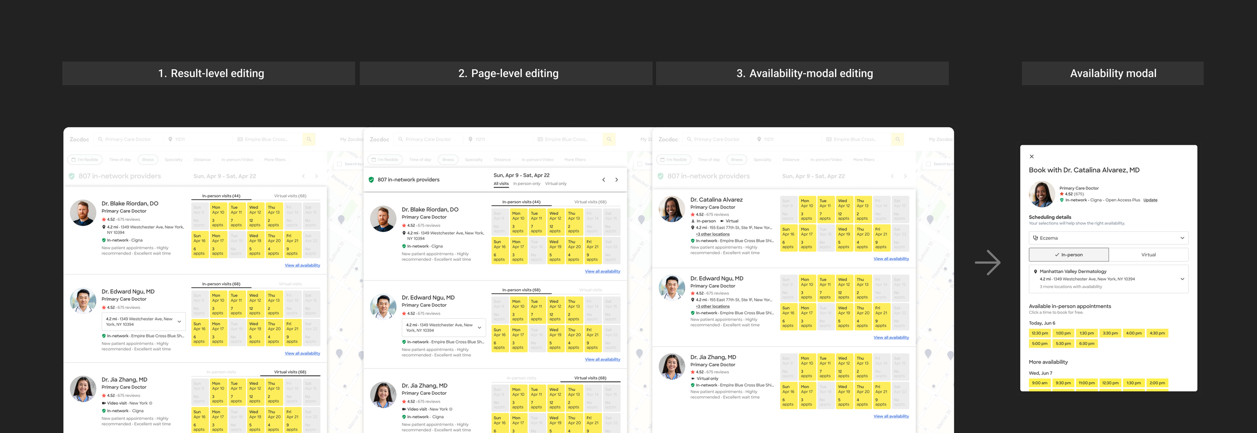
I explored around three levels of control before availability: within each result, at the Search-page level, or deferred entirely until patients went deeper.
I began to see that more control was not necessarily better control. Research showed that richer interactions could be understood, but they added density and asked patients to make detailed appointment decisions while they were still comparing providers.
That raised a broader question for the next round: should Search function primarily as a control surface, or as a comparison layer?
Design problem 2: How much control actually belongs in Search?
The first round suggested that detailed appointment editing belonged deeper in the availability experience, not directly in Search. That left a broader question: if Search wasn’t the editing surface, how much information and control should it still provide while patients compared providers?
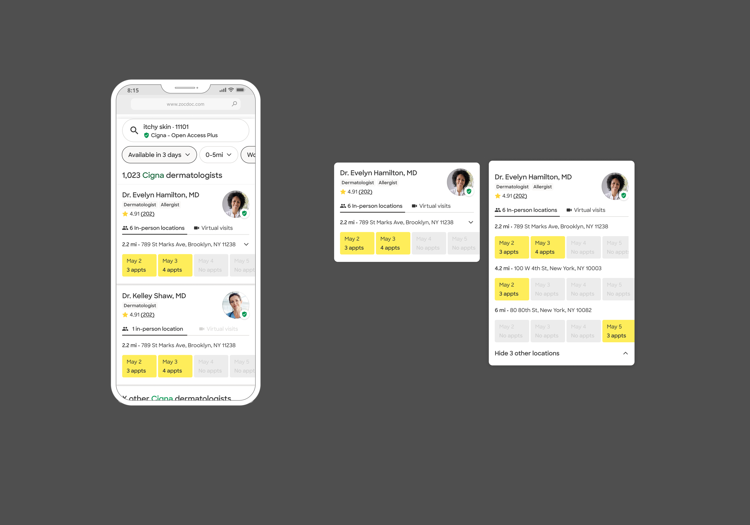
Search and availability already formed a two-step flow: patients compared providers in results, then opened the existing availability modal for more detailed appointment choices.
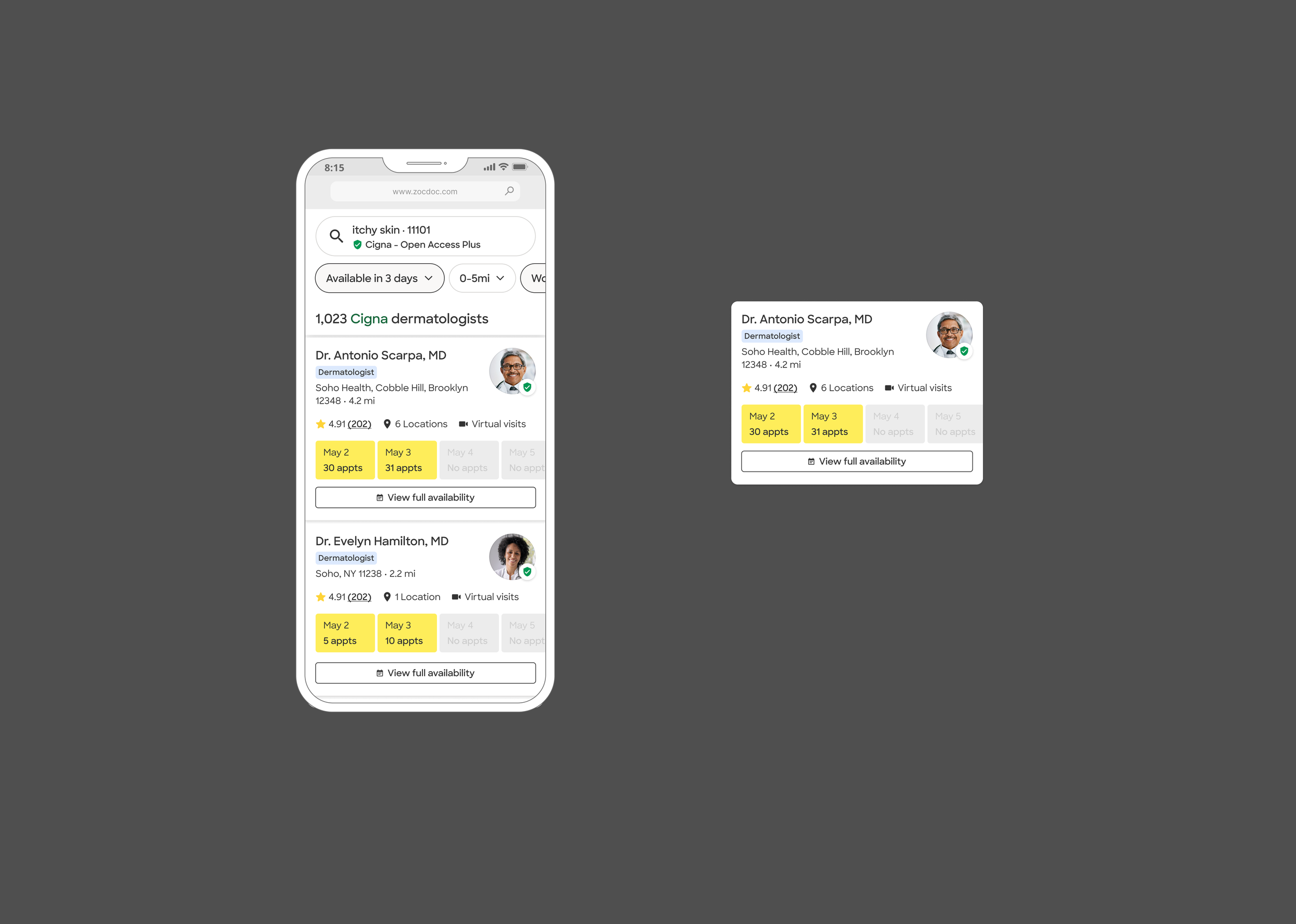
Search and availability already formed a two-step flow: patients compared providers in results, then opened the existing availability modal for more detailed appointment choices.
The lighter comparison model felt directionally stronger.
But simplifying too far could obscure availability patients still needed to make a choice.
Design problem 3: How much inventory should Search reveal?
Research showed that In-person vs. Video still needed to be clear, patients wanted access to full availability, and additional locations couldn’t simply disappear.
So I narrowed the question again: if Search was primarily for comparison, how much of a provider’s underlying inventory still needed to be visible there?

Search and availability already formed a two-step flow: patients compared providers in results, then opened the existing availability modal for more detailed appointment choices.
Search and availability already formed a two-step flow: patients compared providers in results, then opened the existing availability modal for more detailed appointment choices.
This round helped us pressure-test how visible additional locations needed to be, how much availability detail mattered during comparison, and where added control began to work against clarity.
The answer wasn’t to hide complexity, but to stage it: keep the inventory signals that mattered for comparison visible in Search, then expose the fuller set of choices once a patient opened availability.
What the sprint clarified
By the end of the sprint, we had a clearer distinction between what we could act on now and what still needed deeper investigation.
We synthesized that into a final prototype and leadership readout, connecting the near-term inventory opportunity to the broader Search questions we had uncovered.
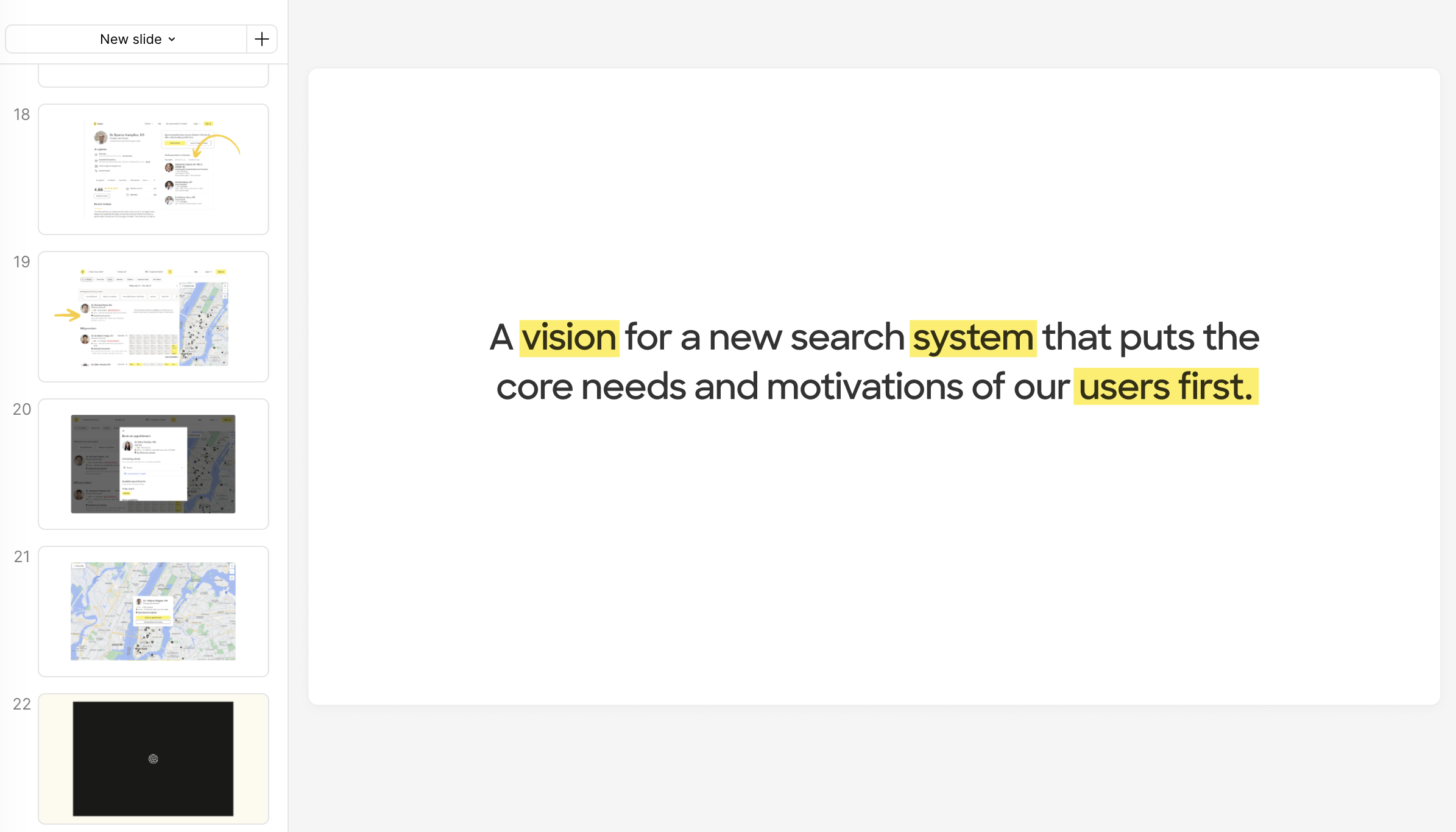
The readout brought the research, design directions, and unresolved questions together into a shared view of what we could pursue now and where the broader Inventory in Search work could go next.

The system still contained multiple provider-location records. The patient-facing experience presented them as one provider.
The underlying system was still provider-location based
Behind the experience, availability still belonged to separate provider-location records, with Video modeled as another location. Rolling inventory up changed what patients saw, not the underlying architecture. Every appointment still had to resolve to a specific location and visit type.
Organizing more inventory without making the card heavier
Rolling multiple locations, visit types, and availability into one result created a new hierarchy problem. I had to decide what patients needed to see while comparing providers, what could be summarized, and what could wait until they went deeper.
I refined the hierarchy across provider identity, insurance, location, visit type, and availability, making room for more inventory without letting it compete equally for attention.
Making the model hold up across real inventory
The ideal card was only one state. The system also had to work across different combinations of locations, visit types, availability, content lengths, and screen sizes without turning into a collection of one-off solutions.
I worked through the states and edge cases that would make the model durable, including location logic, modality combinations, availability behavior, long names, overflow, and responsive layouts, while preserving the same underlying hierarchy.
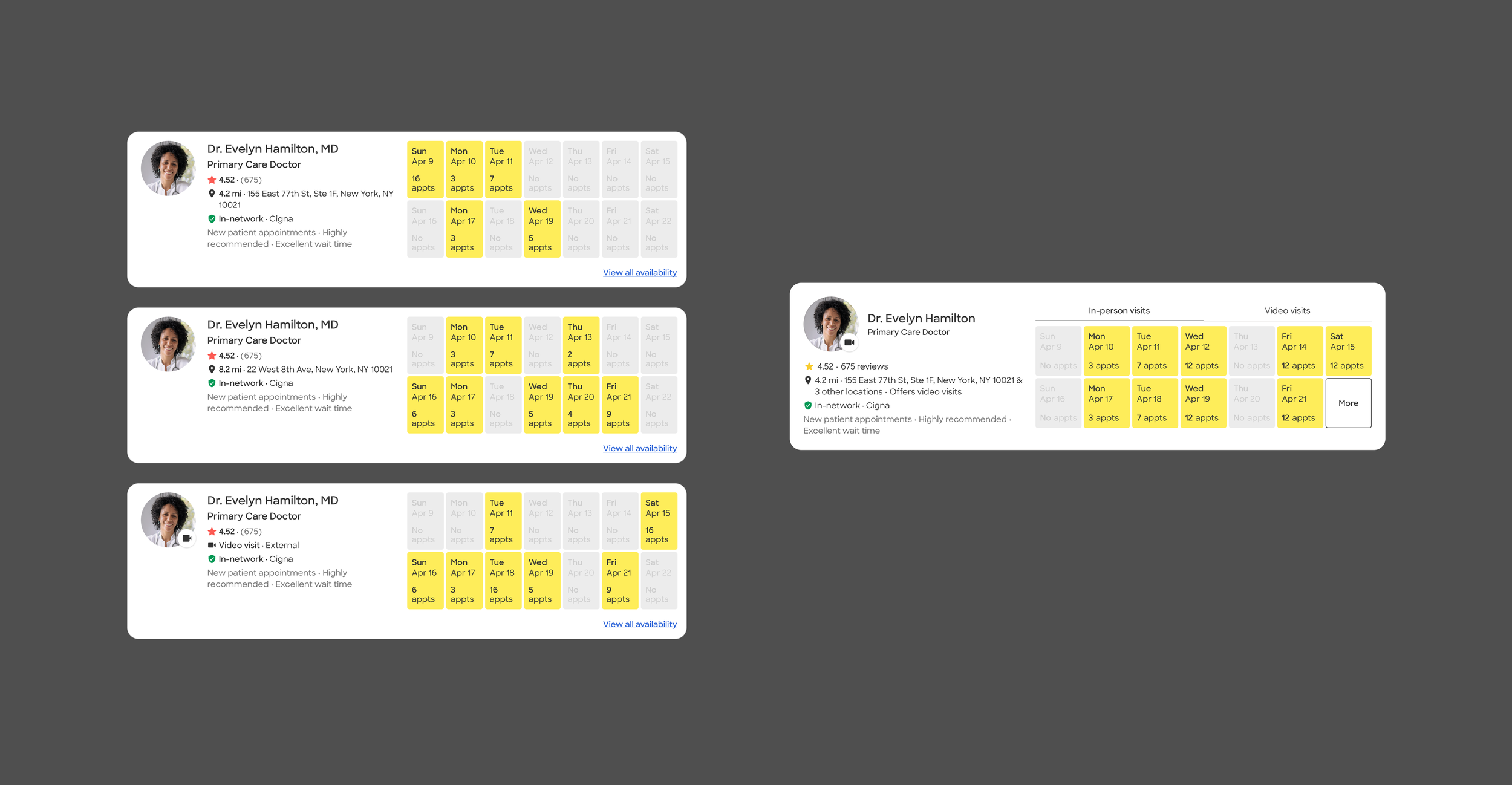
The final structure brought multiple locations, visit types, and availability into one provider result without giving every piece of inventory equal visual weight.
Carrying the model into availability
Search could summarize a provider’s options, but it could not expose every location, visit type, and appointment state at once. The fuller set of choices still needed a place to live once patients were ready to book.
I reused the existing availability experience rather than redesigning it from scratch, defining how the rolled-up result connected into it and how location, visit type, and availability context stayed coherent across the transition.
Carrying it through implementation
I maintained the RUA design source of truth and worked closely with Engineering as implementation surfaced new constraints and edge cases. I refined states and tradeoffs as they emerged, then carried the experience through web and native design QA, including adaptation for Android.
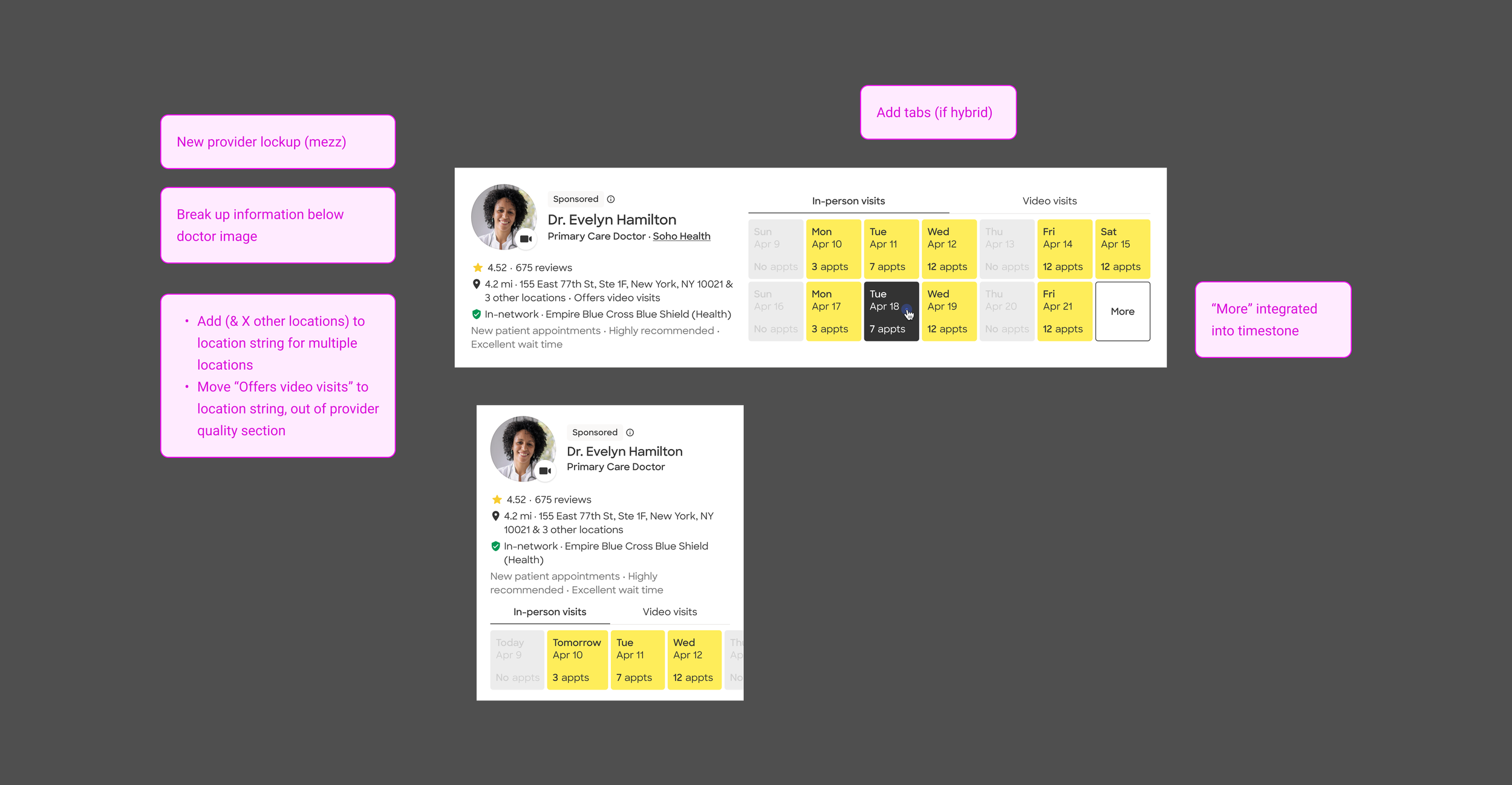
I iterated on how location, visit type, and availability shared limited card space, progressively separating what patients needed for comparison from detail that could wait.
Rolling up into a real system
The sprint had clarified much of the interaction model. Rolled-Up Availability was where I turned that direction into a production-ready MVP, defining the behavior, hierarchy, states, and edge cases needed to make it work within Zocdoc’s existing system.
Search handled comparison; availability handled the fuller set of location, visit-type, and appointment choices.
The same interaction model had to hold up across very different combinations of provider inventory without creating one-off solutions for each case.
The final system extended beyond the happy path, with reusable states, responsive behavior, and implementation details carried through build and QA.
The launch
What happened
The first A/B test was mixed: topline conversion was flat, while downstream appointment quality improved and a Sponsored regression emerged. A revised treatment later showed a statistically significant +1.3% lift in overall conversion, resolved the Sponsored conversion regression, and was recommended for launch.
I was on sabbatical while the follow-up treatment was prepared, so I view that result as an outcome of the broader RUA direction rather than an iteration I personally drove.
What this changed
Rolled-Up Availability was the part of the broader sprint vision we were able to carry into a real product experience. Other directions, including cross-listing, practice and facility concepts, and more future-state Search ideas, remained exploratory as priorities shifted.
The work moved from a broad question about how inventory should work across Search to a concrete model for how complex provider inventory could be made easier to compare without hiding the choices patients needed to book.