Reframing provider discovery across desktop and mobileMap
Project overview
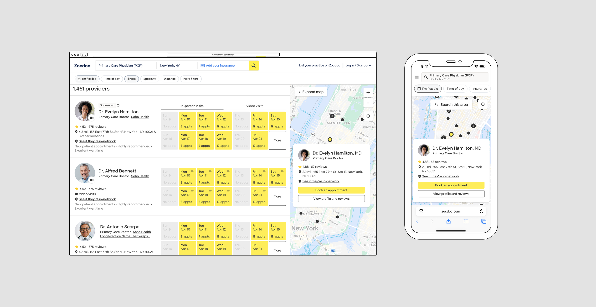
A previous Map experiment increased engagement but lowered booking conversion. I joined to simplify the experience and clarify the roles of Map, Profile, and Booking. From there, I expanded the work beyond the initial brief, auditing the broader Map experience and defining a phased direction for improvement.
Date
2024-2025
Role
Senior Product Designer
Team
PM, Engineering Manager, Design Manager, 2 Developers
Scope
Desktop / Mobile Web · Search / discovery
Outcome
Simplified and stabilized the immediate experience, then shipped a foundational Map improvement and defined a broader path forward.
Simplifying the immediate experience
The previous experiment had pushed substantially more booking functionality into Map. Engagement increased 20.3%, but overall booking conversion declined approximately 0.9%, while fewer patients continued from Map into the Provider Profile.
The team already had a working hypothesis: too much of the booking experience had been pushed into Map.
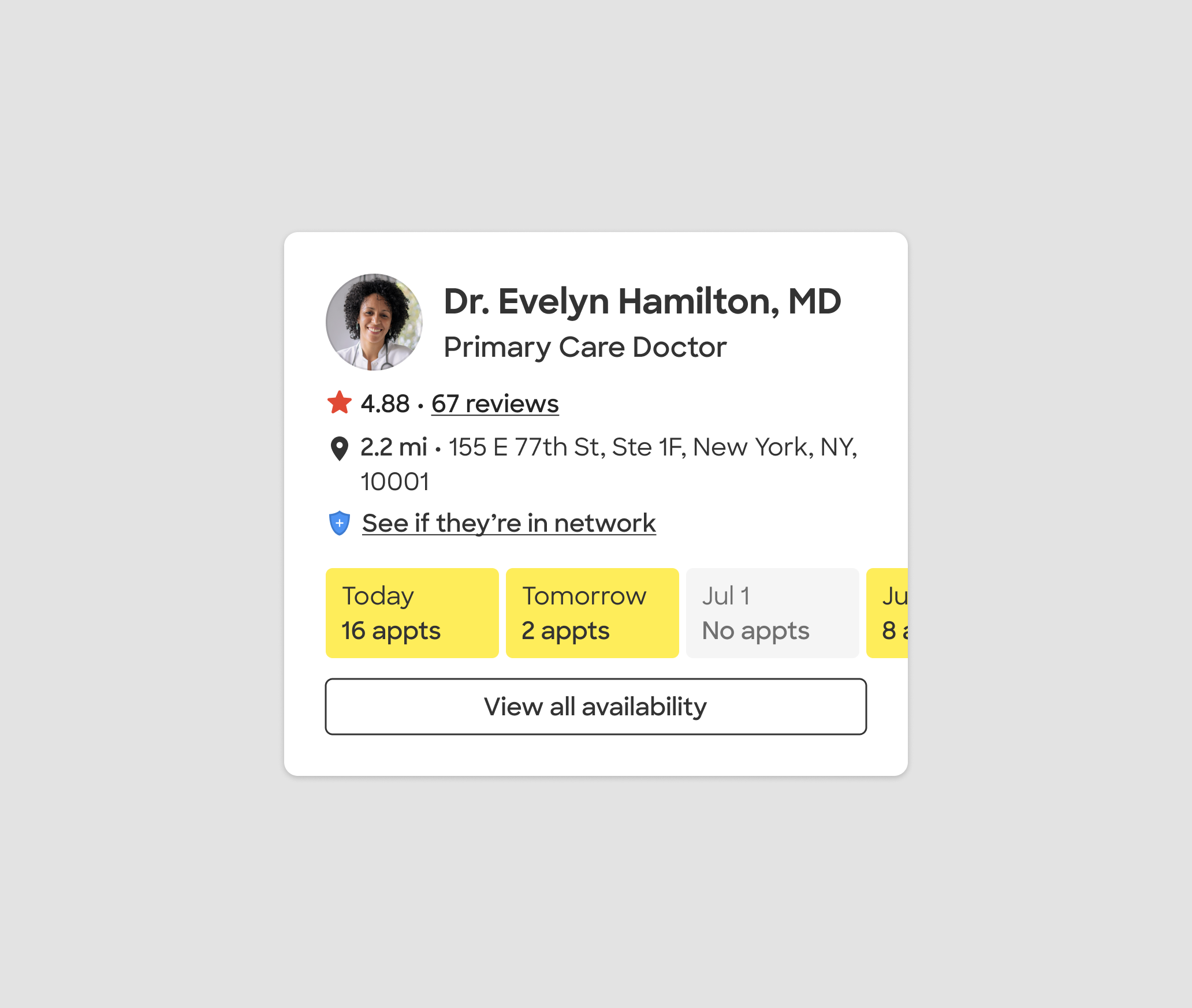
In the original map redesign, the provider card mirrored the list results to the left, displaying a row of available dates with the ability to view more availability
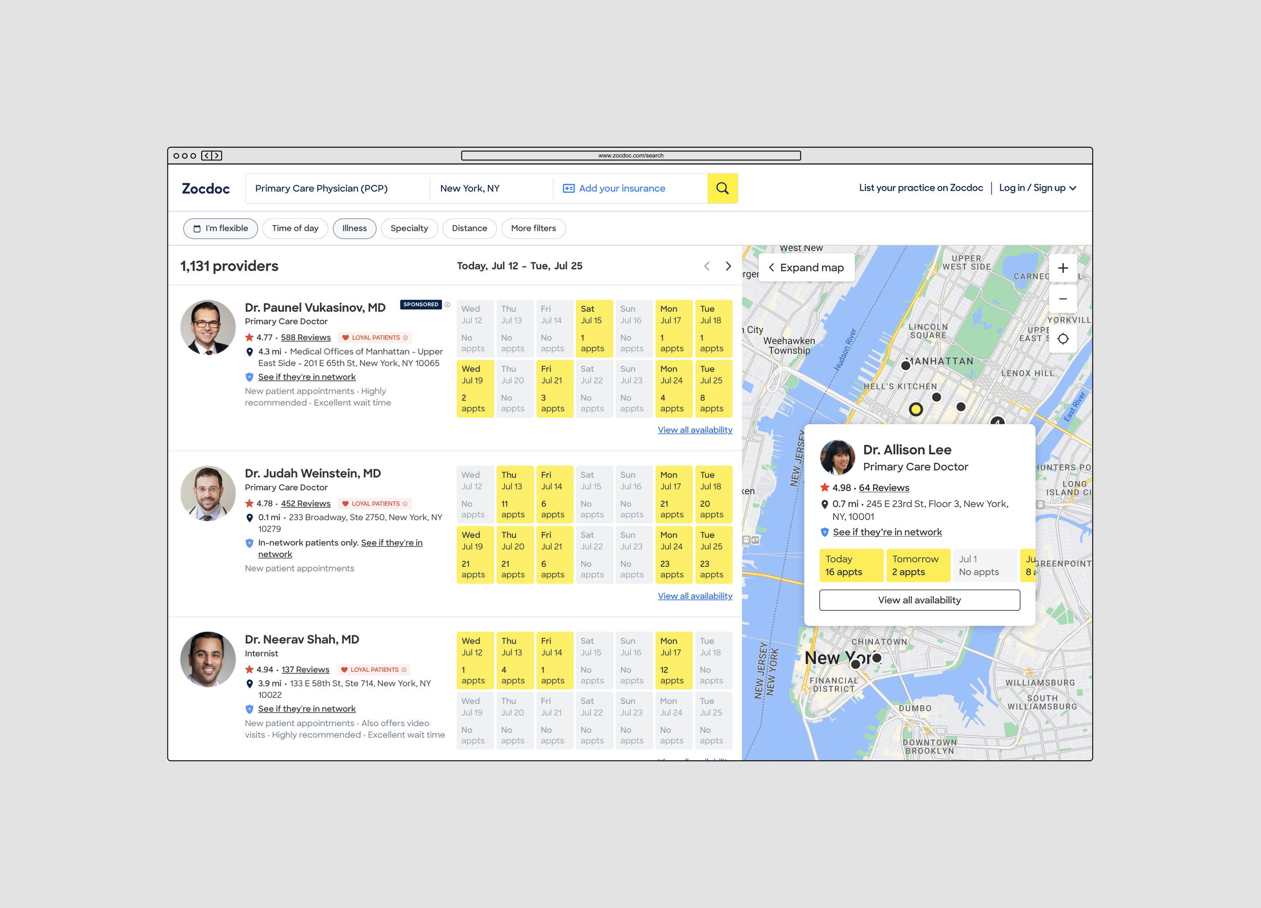
In the original map redesign, the provider card mirrored the list results to the left, displaying a row of available dates with the ability to view more availability
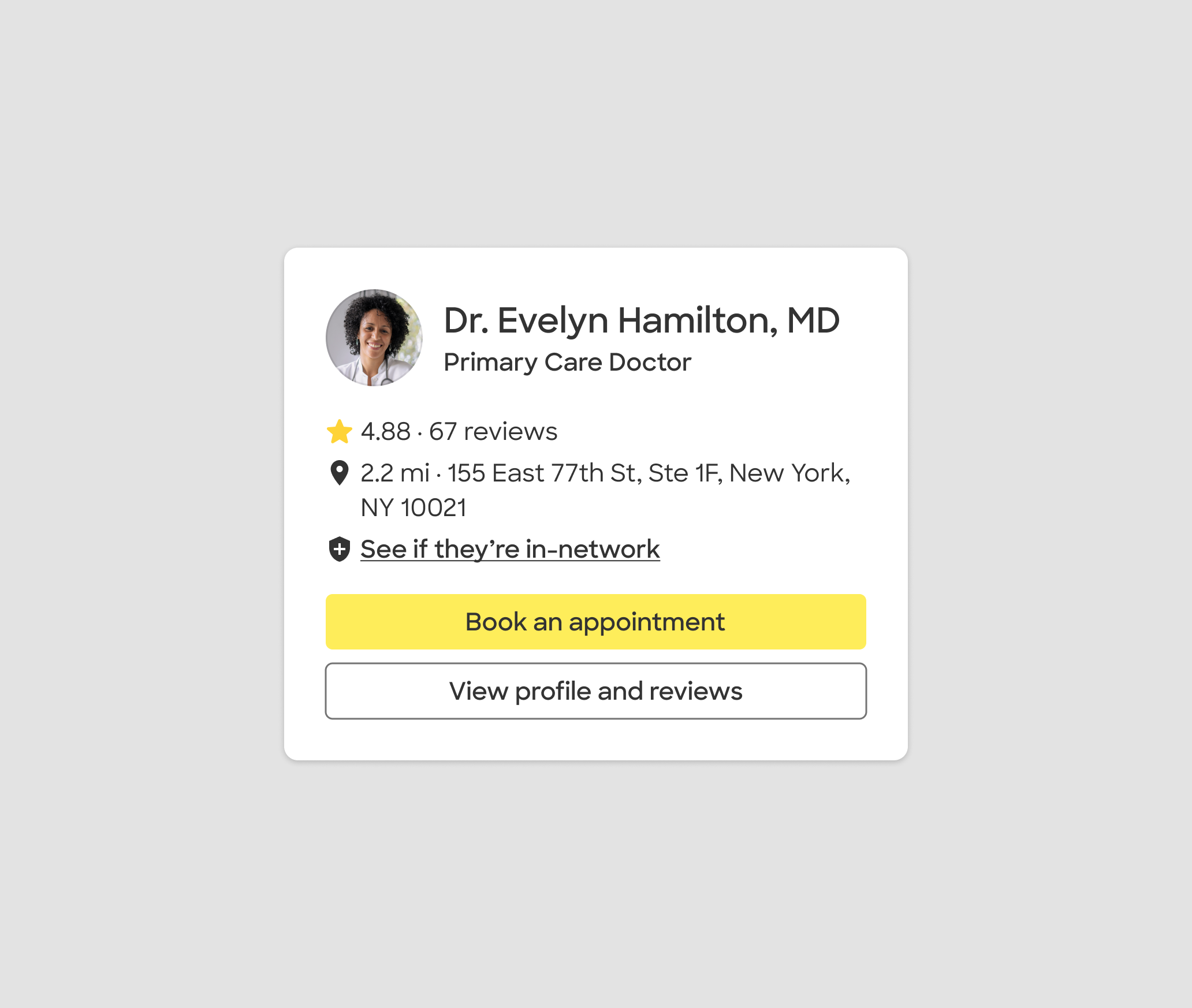
In the original map redesign, the provider card mirrored the list results to the left, displaying a row of available dates with the ability to view more availability
Adapting the model for mobile web
Because Mobile Web still lagged behind the desktop redesign, I adapted the same direction for a smaller viewport and tested a more prominent Map entry point.
The broader experience improvements persisted, but the new entry point did not increase Map usage and was reverted. The experiment clarified that improving Map itself and making it easier to discover were separate problems.
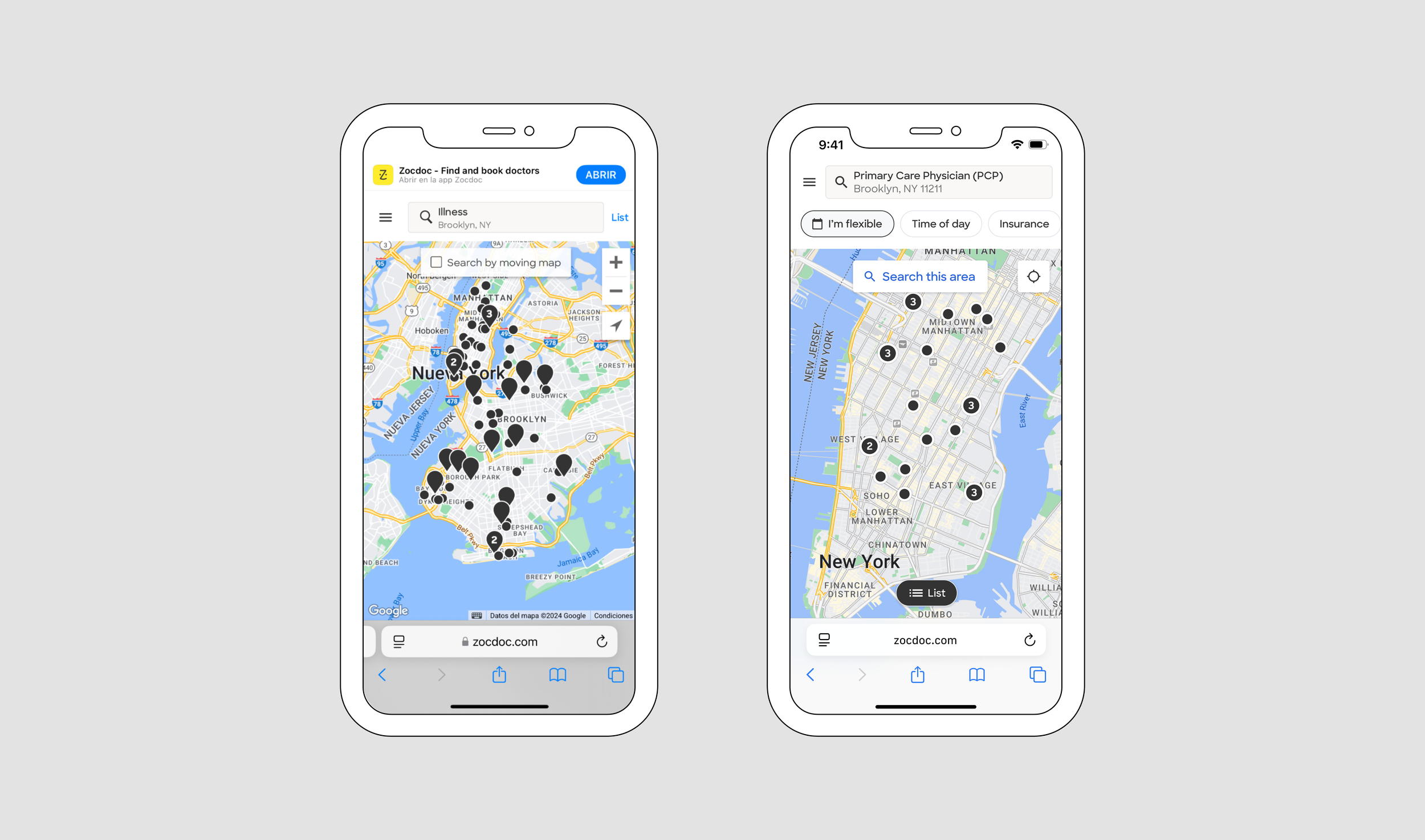
The redesign brought the desktop direction to mobile while reworking the experience for a smaller screen: clearer provider cards, stronger Map controls, more usable filtering and location behavior, and a more prominent entry point.
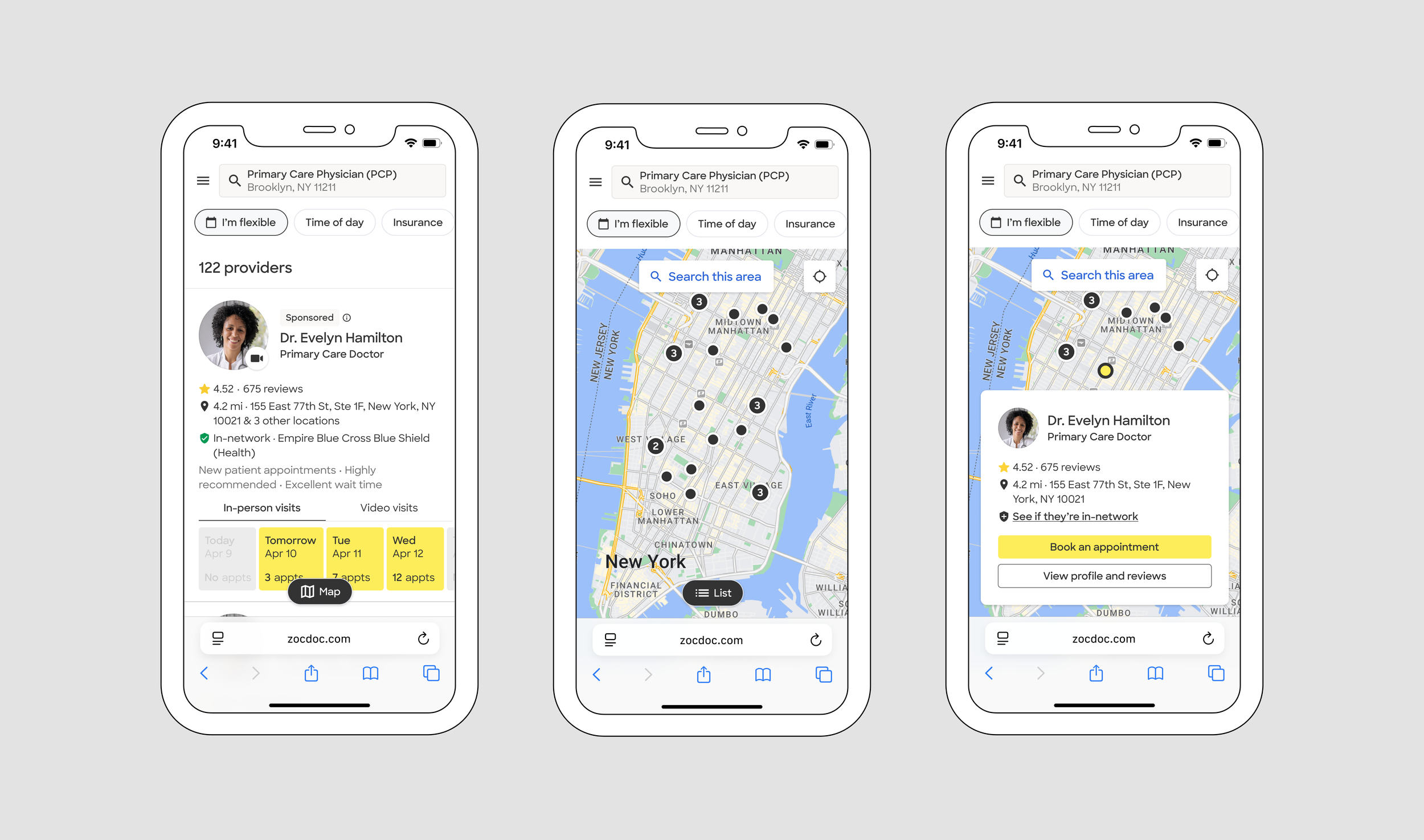
The full flow shows how patients moved between Search and Map, explored providers, refined results, and returned to the list—without trying to recreate the desktop interaction on a smaller screen.
Auditing the broader Map experience
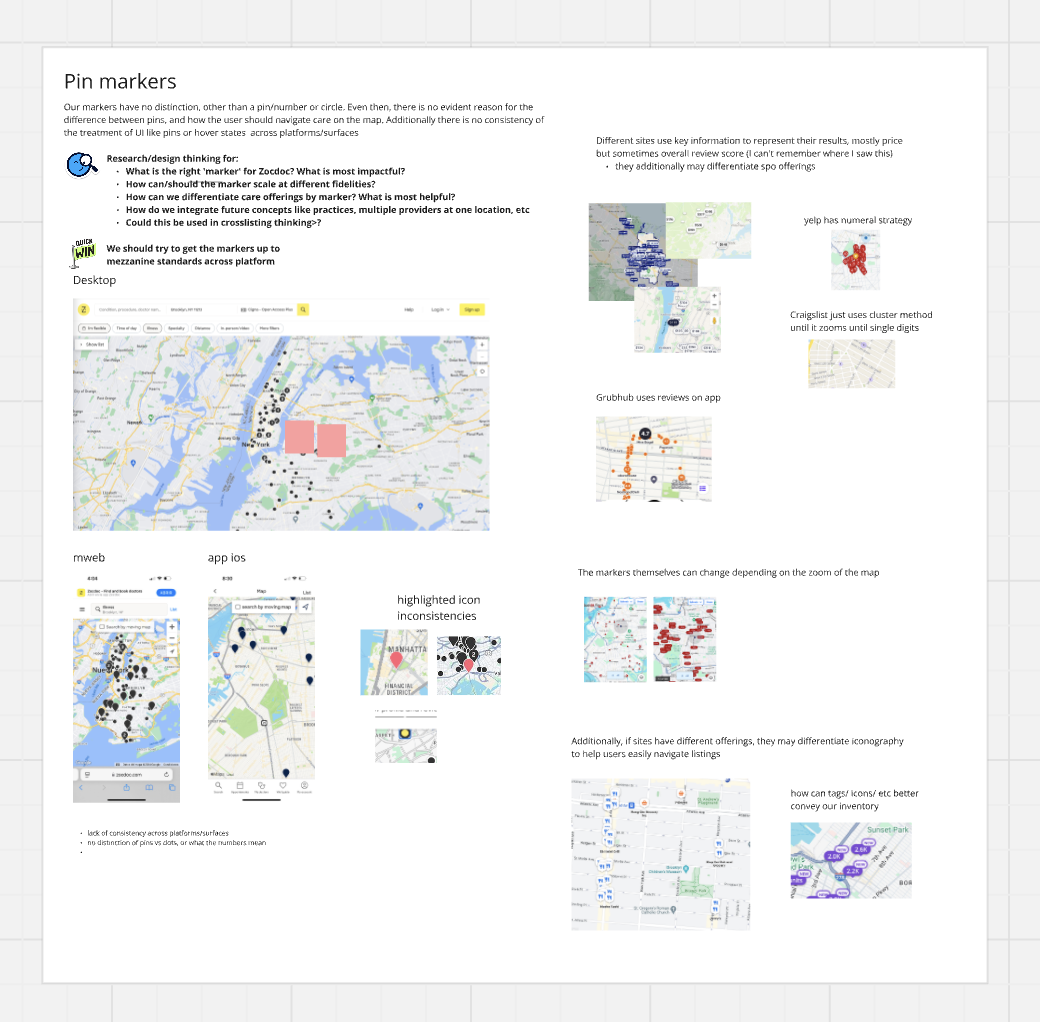
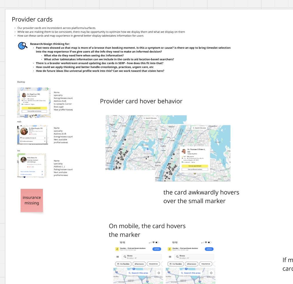
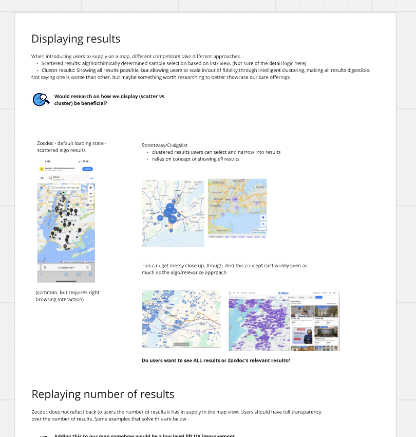
After the desktop and Mobile Web iterations came together, I stepped back and looked at Map across the full patient journey. I walked through what patients were trying to understand at each step, compared Zocdoc with how other products handled the same needs, and documented gaps across the experience.
NEW
NEW
NEW
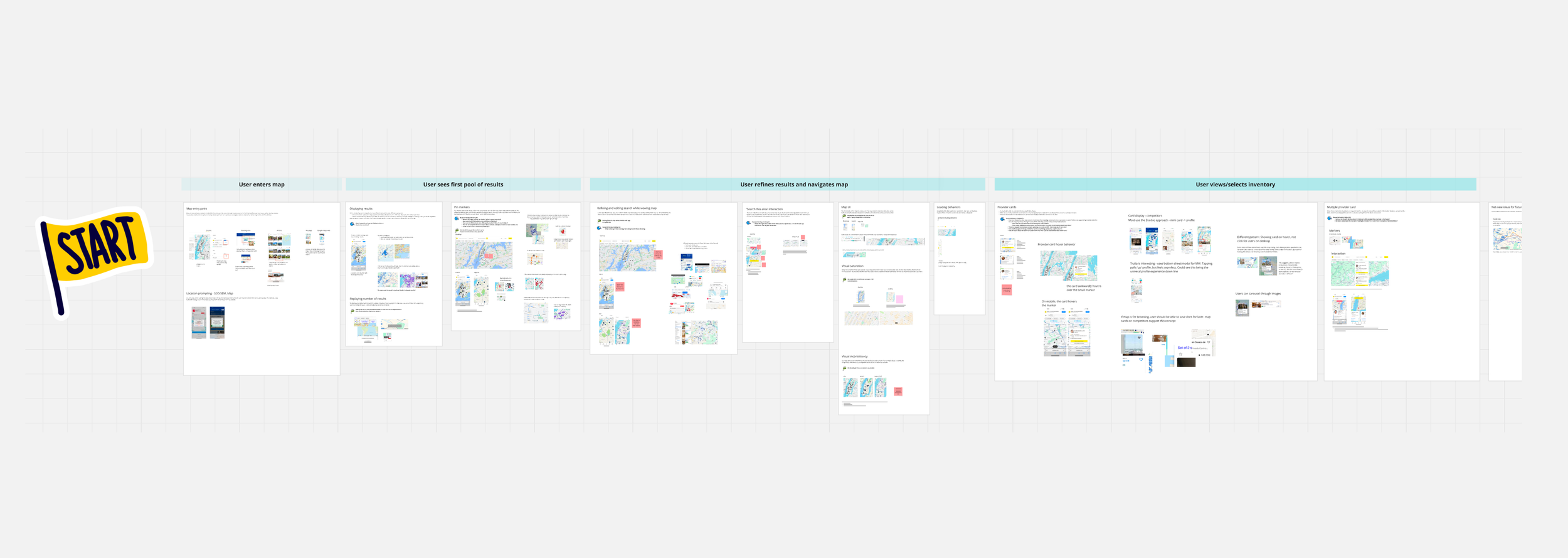
The full audit paired the patient journey with competitive examples and a review of the existing Zocdoc experience.
Turning the audit into actionable phases
The audit surfaced more opportunities than we could address at once. I grouped them into phases based on what was foundational, what depended on earlier changes, and what could realistically move forward first.
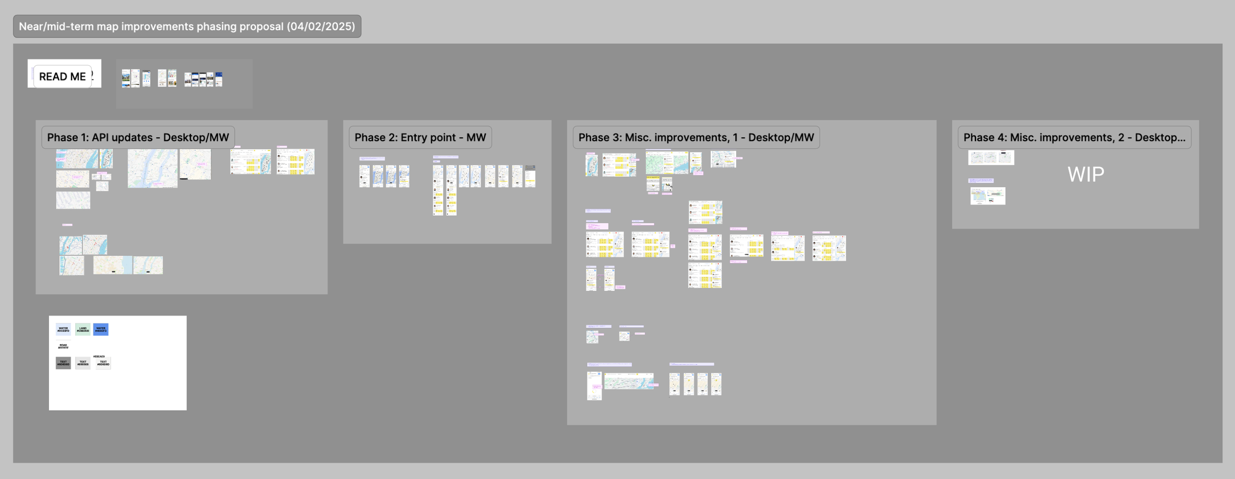
The roadmap separated foundational Map work from larger interaction and discoverability improvements.
Standardizing the Map foundation
The first phase focused on the map itself.
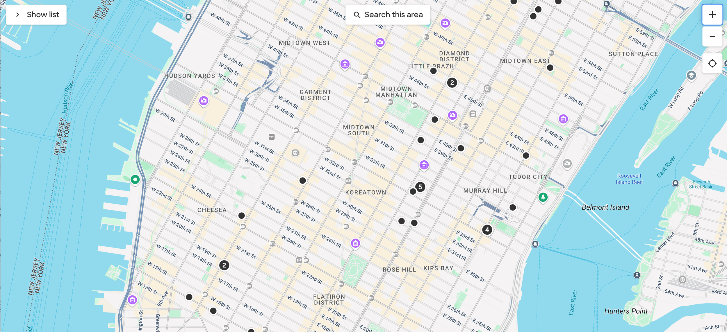
Our existing Google map was visually busy and highly saturated, making Zocdoc’s own pins harder to distinguish from the surrounding geography and from one another. Map treatments were also inconsistent across different parts of the product.
I explored the customization available through Google Maps and worked with Engineering on a more restrained underlying map treatment—reducing competing detail, clarifying pin hierarchy, and creating a more consistent foundation for Google-powered maps across Zocdoc.
Before standardization: High saturation, unneccessary detail, competing pin marks, and overall cognitive overload
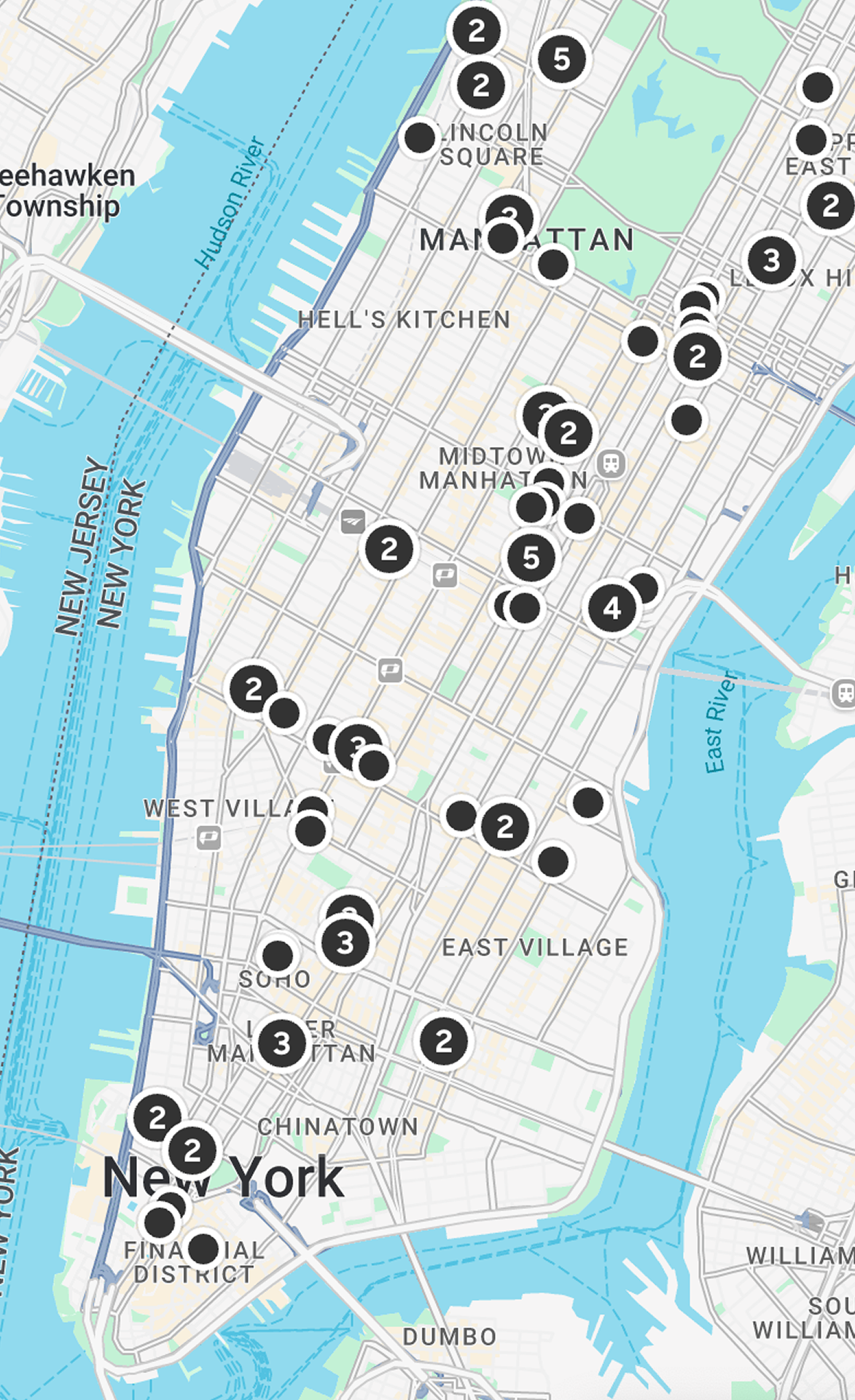
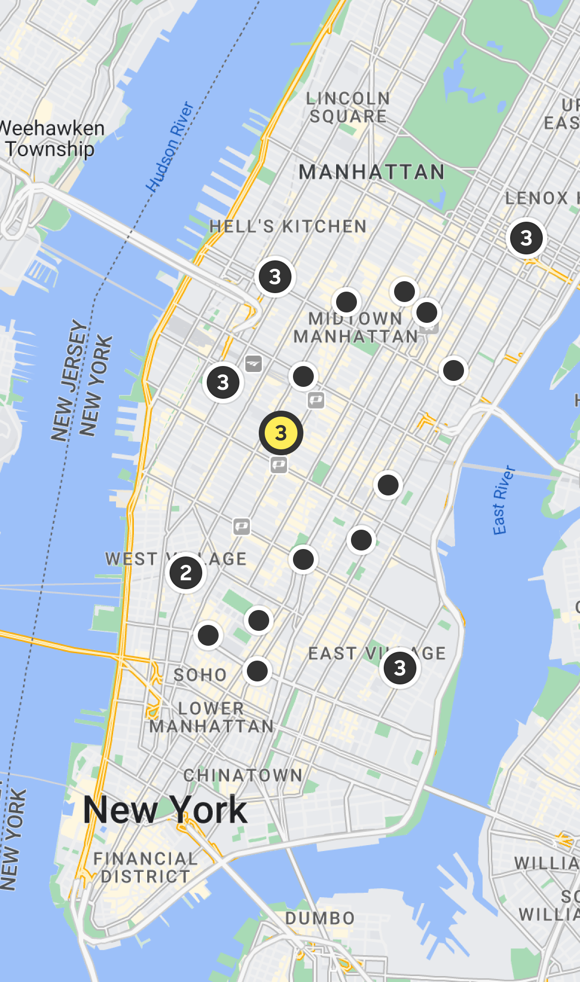
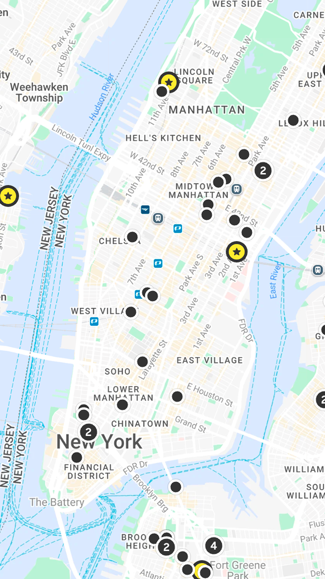
Before pulling in the a new API, our map presentation was inconsistent across pages (far left and center). Bringing everything under one roof (apart from Apple maps) made the experience consistent across surfaces as well as accomodate new types of SPO inventory (far right).
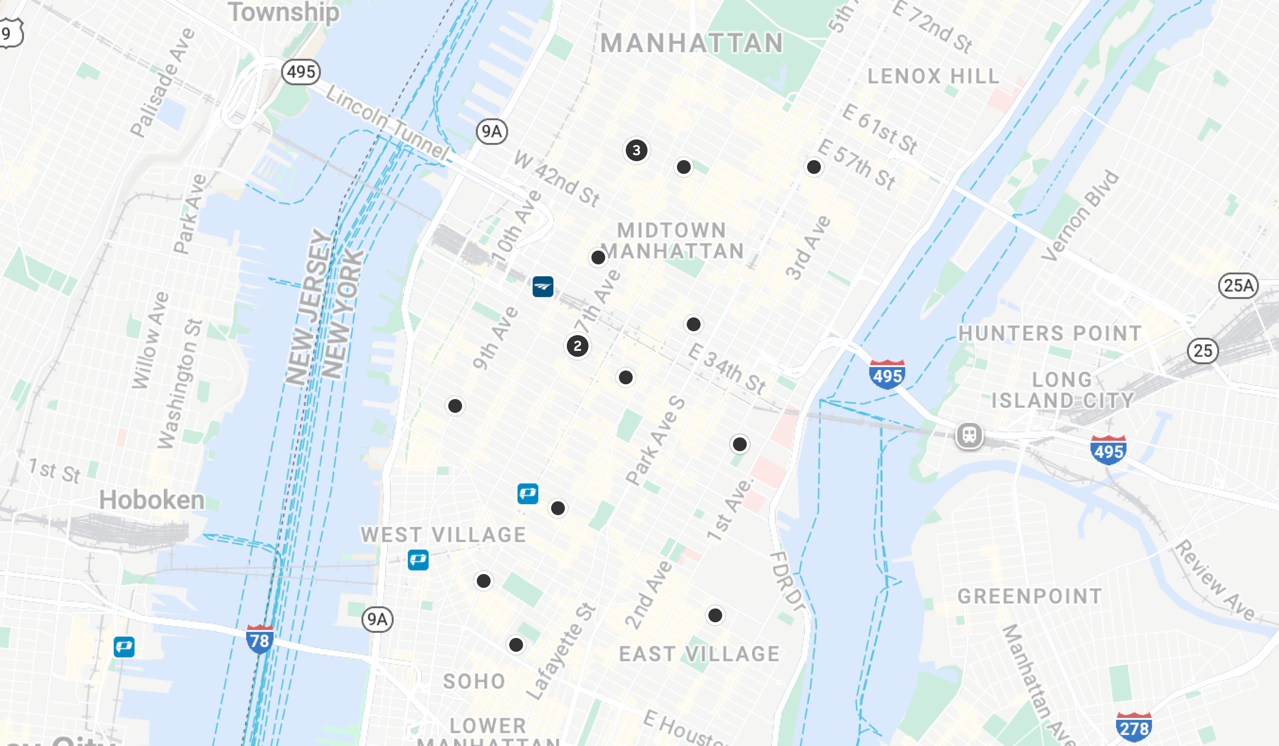
After standardization: Scaliing back unneccessary UI, both visually by fading the colors, matching more with Zocdoc’s mezzanine design system, and let the pins show better. Better handle how much information is shown at different fidelity of map zoom to not crowd with usless information. ALos
What moved forward
The foundational map work shipped. We had additional phases planned around discoverability, interaction improvements, and the broader Map experience, but Search priorities and team scope changed before that work moved forward.