Helping patients navigate thousands of insurance optionsInsurance picker V4
Project overview
Choosing insurance was a required part of booking—but patients had to navigate roughly 855 carriers and 18,000 plans, often without knowing exactly how their coverage was categorized.
After an earlier redesign failed to improve performance, I used what we learned to rethink the interaction: making search easier to find, preserving access to less-common plans, and creating a fallback for patients who simply couldn’t identify an exact match.
Role
Senior Product Designer
Team
Product Manager, Engineering Manager, Front-end/back-end developers, Data Analyst, Design Manager
Date
[Exact project timeframe]
Scope
Insurance selection · Search & autocomplete · Carrier and plan discovery
Outcome
+1.4% overall booking conversion · +3.2% for first-time patients
The challenge
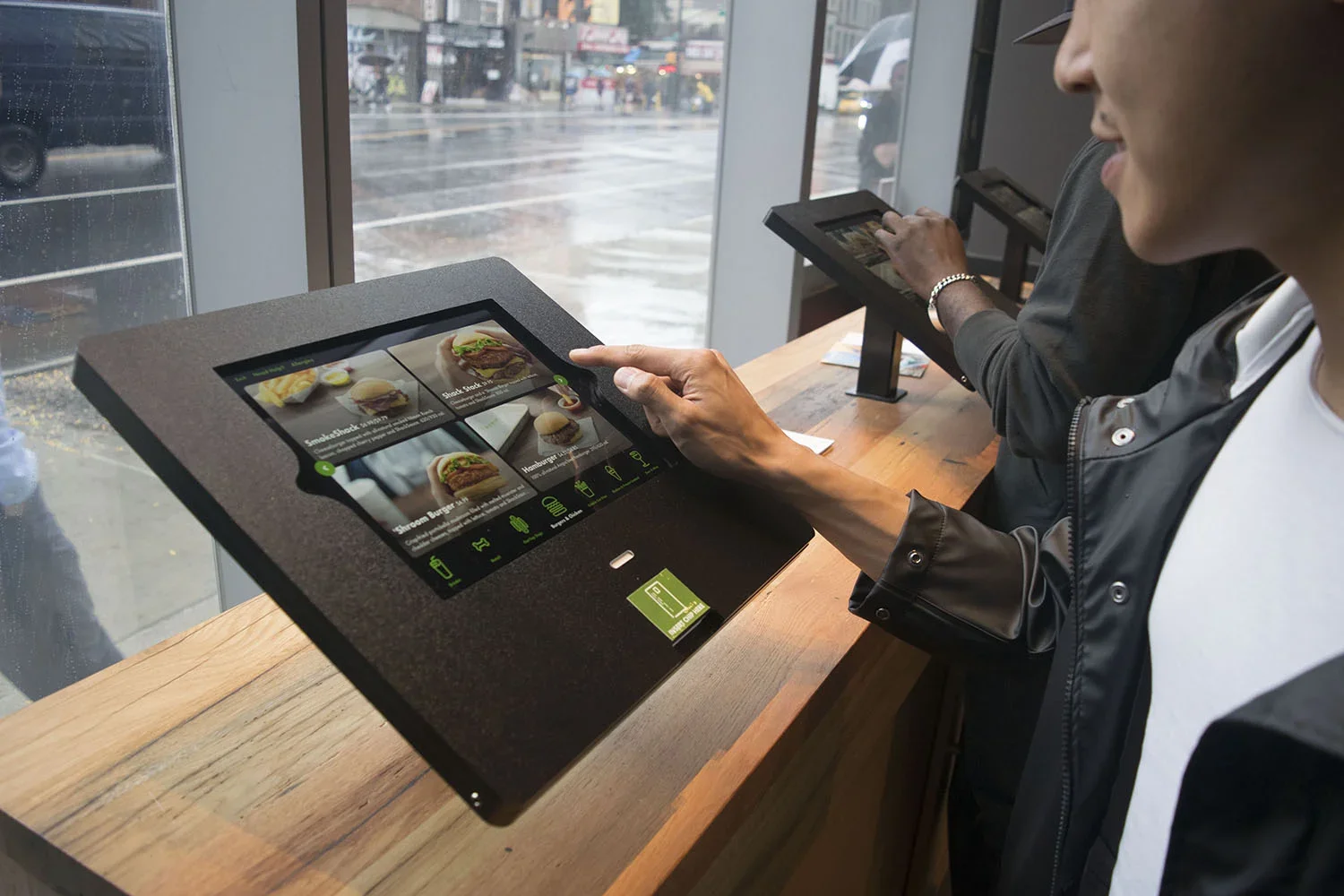
Shake Shack’s first kiosk had to do more than move the cashier flow onto a screen. It needed to make ordering faster and easier for a wide range of customers, handle a highly customizable menu, and still feel unmistakably like Shake Shack inside a busy restaurant.
The solution
A simple, highly visual ordering flow built around a small number of core screens, with large touch targets and customization revealed only when customers needed it. I also designed beyond the screen itself, considering kiosk placement, queue flow, photography, kitchen operations, hardware, and staff tools as part of the same experience.
Understanding a new way of ordering
Ordering from a phone or computer in your living room and ordering from a kiosk in a busy restaurant are very different experiences.
Through interviews, personas, and competitive audits, we looked at what customers expected from self-service ordering and studied experiences ranging from restaurant kiosks to ATMs and ticketing machines. We also considered physical factors such as kiosk size, line flow, and how the product would live inside the restaurant.
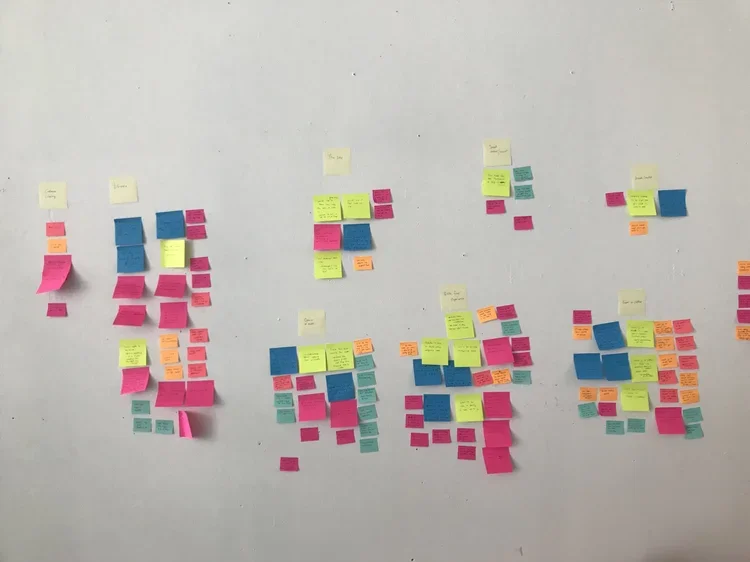
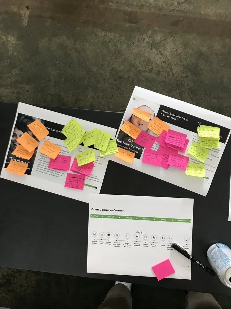
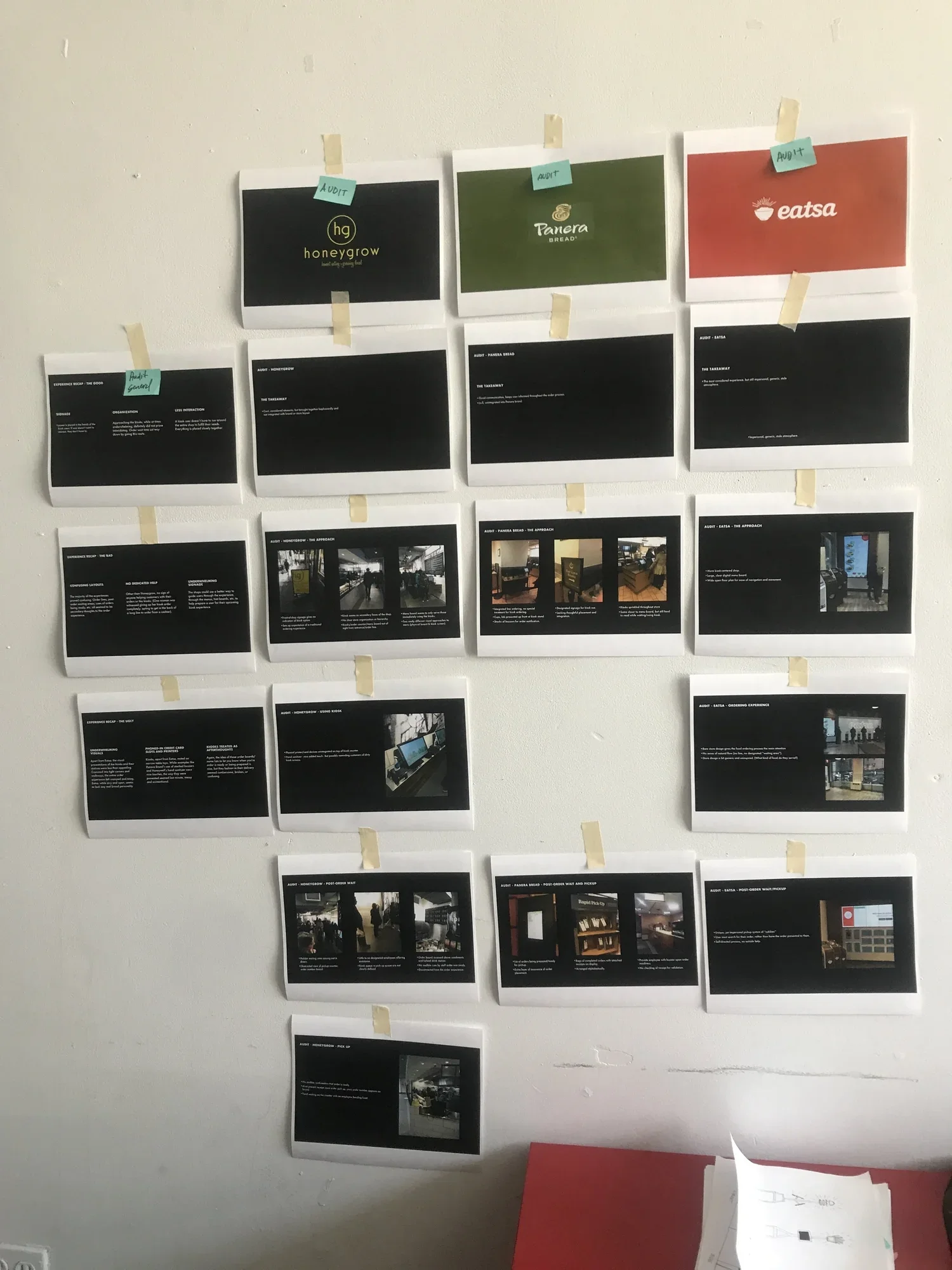
Working with our research team, we spoke with customers in-store and looked at kiosk experiences across different products. The research helped define the main user types and use cases I needed to design for.
Simplifying the system
I explored navigation, menu grids, touch targets, and screen progression with the goal of making the experience usable across a wide range of customers.
One recurring question was how much choice to expose. We had already learned from the mobile apps that making customization too prominent could encourage more complex orders and affect kitchen production. The kiosk needed to make those options available without suggesting that every customer needed to use them.
I also tested different menu densities before settling on larger, more tappable cards that reduced visual load and made the food itself more prominent.
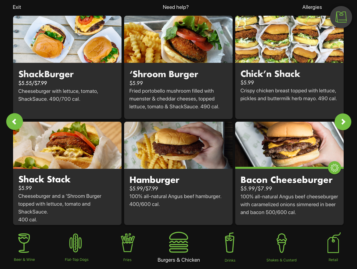
Product imagery, names, descriptions, prices, and calorie counts all had to fit within the digital menu. It quickly became clear how visually overwhelming that could get for someone trying to make a quick decision.
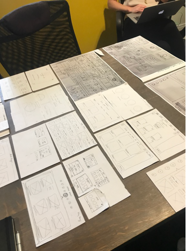
Working with our research team, we spoke with customers in-store and looked at kiosk experiences across different products. The research helped define the main user types and use cases I needed to design for.
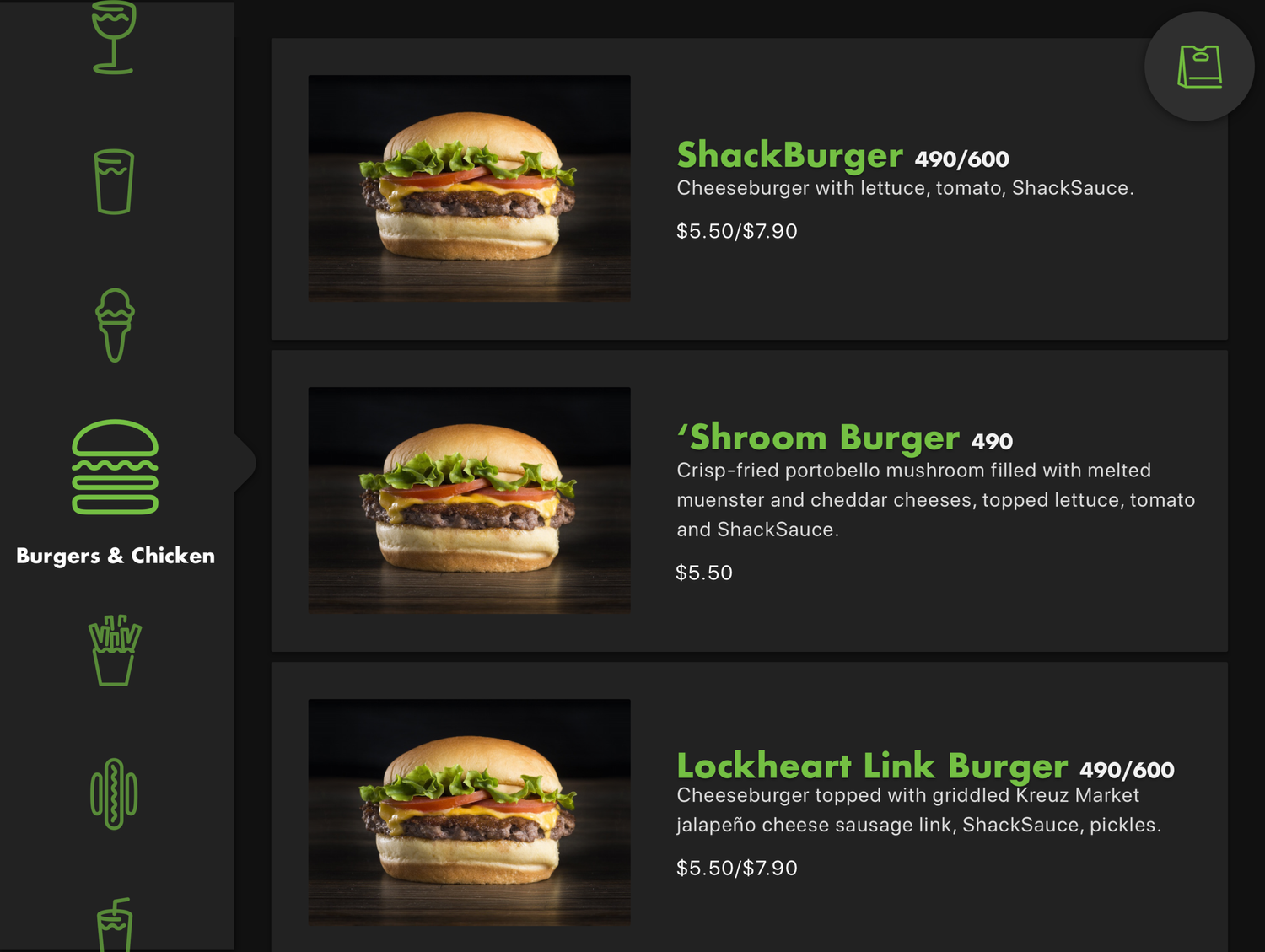
To reduce cognitive overload, I explored different interaction patterns that balanced how much information to reveal with keeping the menu easy to browse.
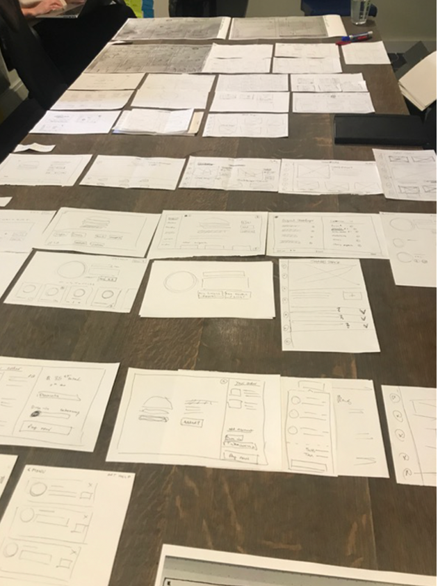
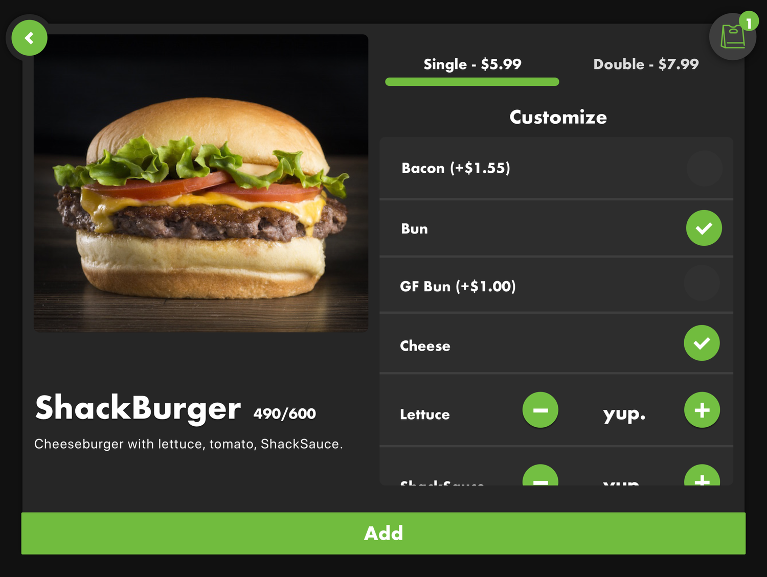
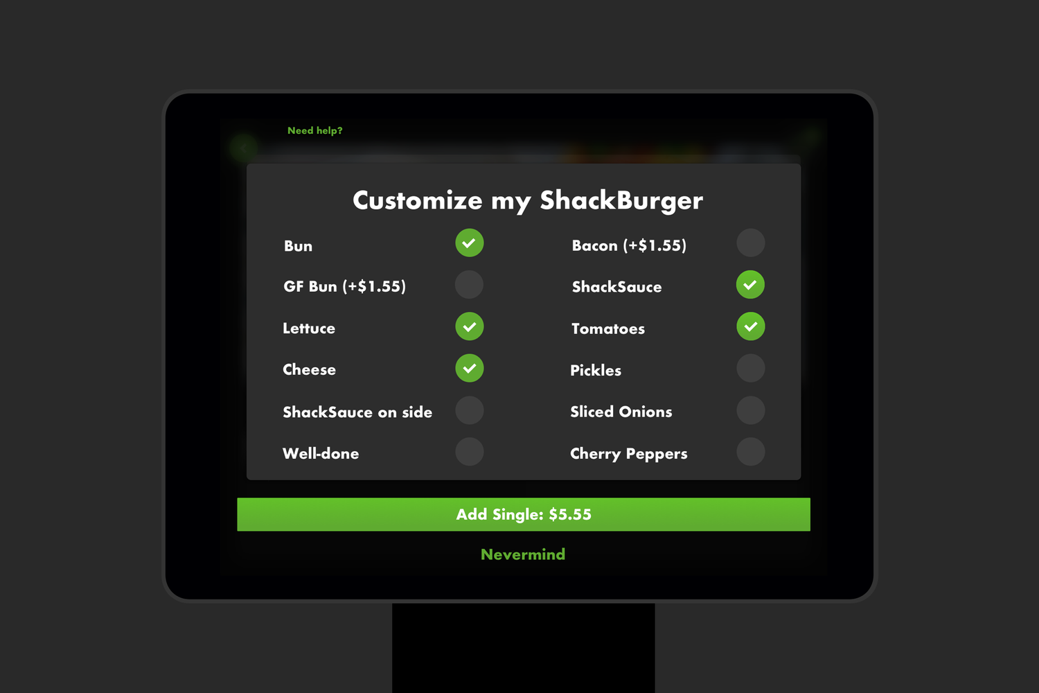
On the product detail pages, I explored how customization should work differently in-store than it did in a mobile ordering context.
The core experience
The final system reduced the ordering journey to four core screens, using large food imagery, clear touch targets, and a layered visual hierarchy built from blacks and greys pulled from Shake Shack’s digital style.
Customers could quickly select an item, choose high-level options, or open a dedicated customization view when needed. Real-time pricing made the consequences of additions clear, while familiar cart patterns carried over from the existing ordering products.
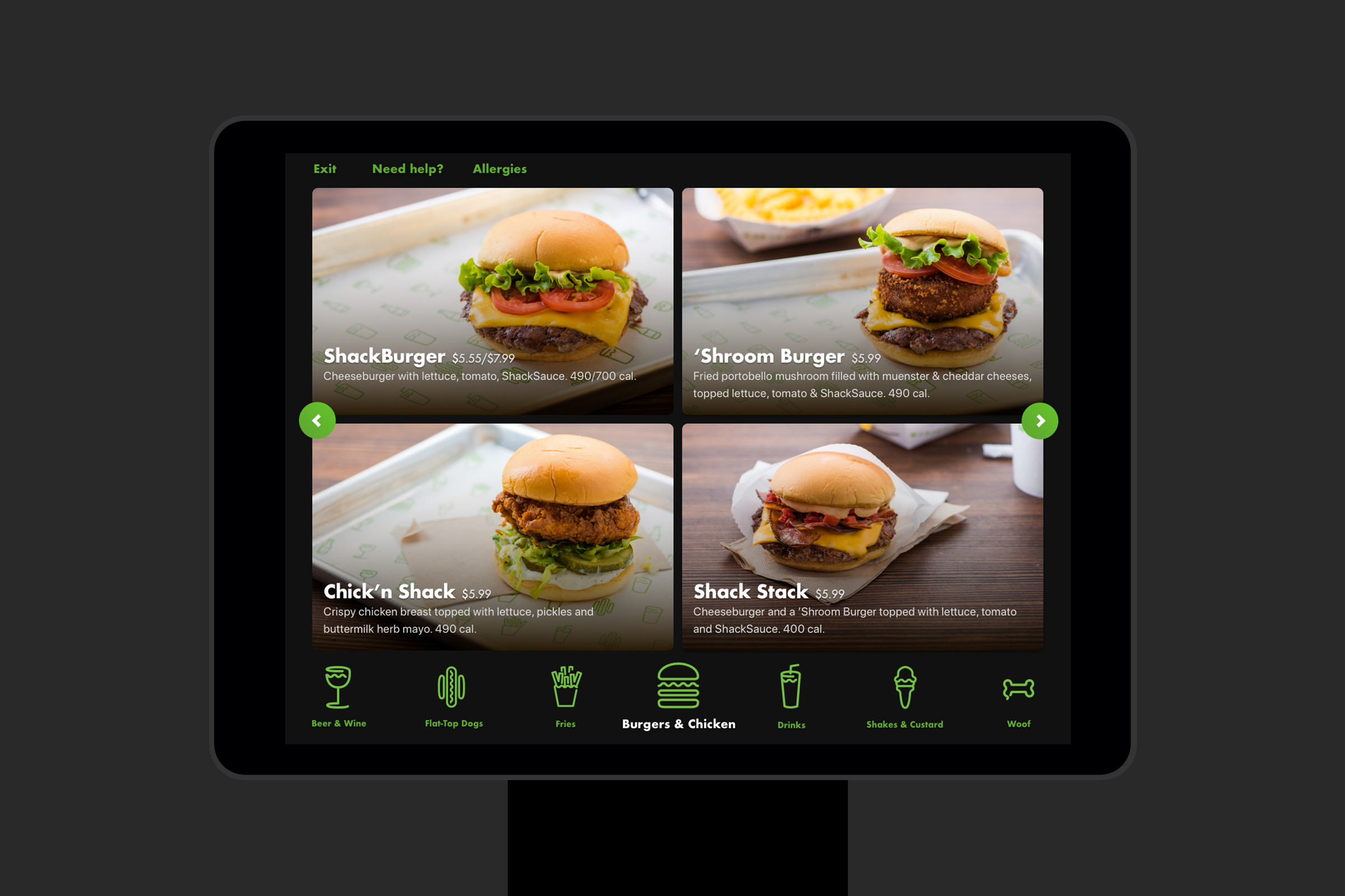
A 2×2 grid struck the right balance between density and scanability. Because menu categories varied in size, side-to-side browsing paired with a swipeable category menu made it easy to move through the full menu without feeling overwhelmed.
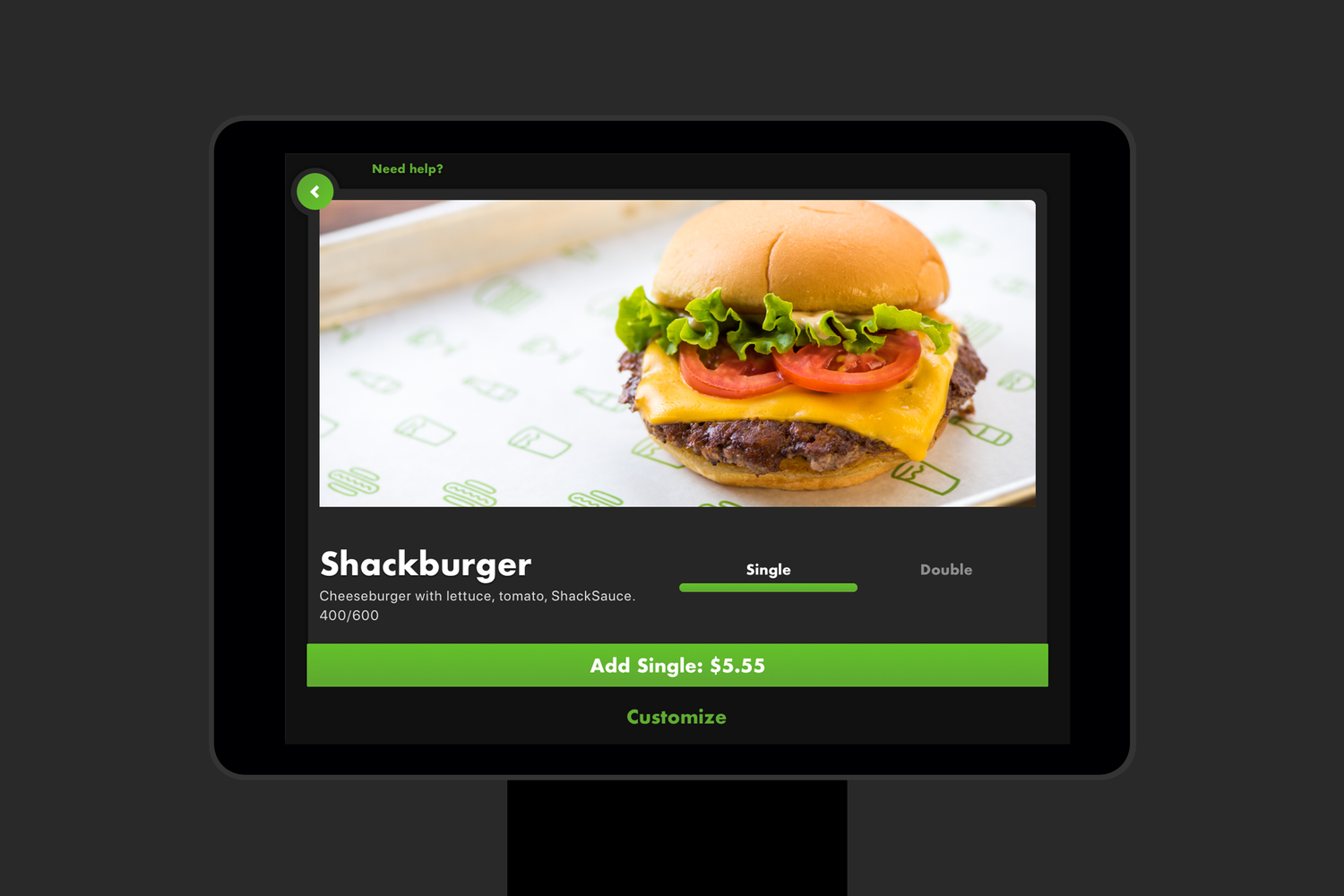
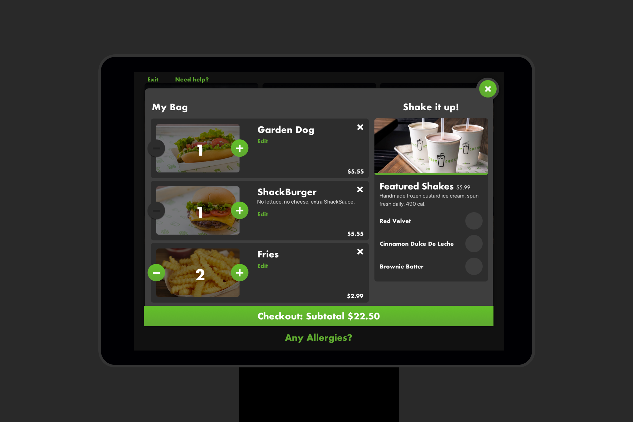

I defined the motion personality of the kiosk experience, using subtle stretching and movement to make interactions feel responsive and alive.

Friendly, playful, and unmistakably Shake Shack. Buttons gently expand and react as users move through the experience.
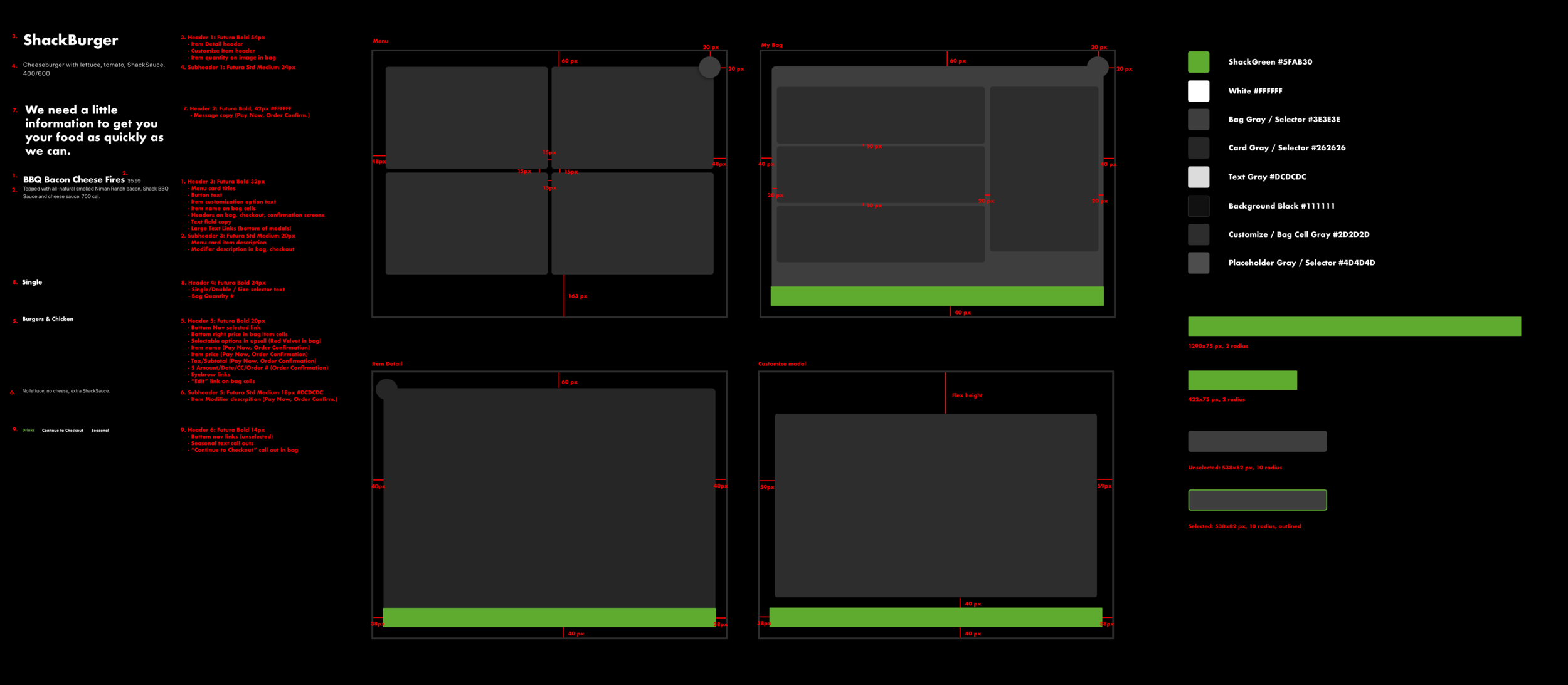
When it came to the design system itself, a core set of 4 screens make up the entirety of hte product. I defined typography, color, spacing, and other interaction behaviors.
Beyond the screen
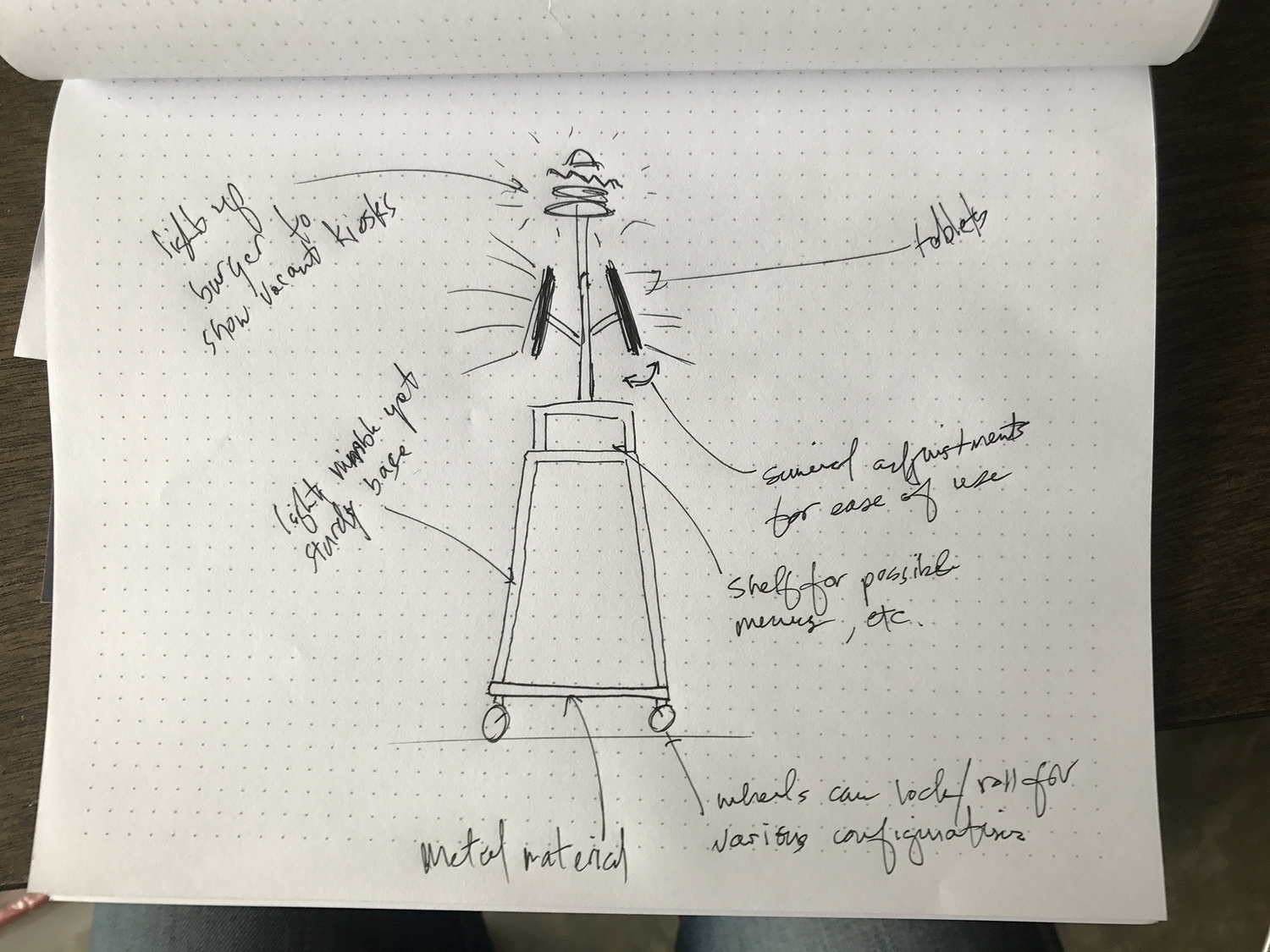
The project also extended into the physical environment. I explored kiosk casings, queue flow, digital menu boards, and how the hardware could feel integrated with Shake Shack’s Astor Place location rather than simply placed inside it.
I also helped support a new food-photography direction so the menu imagery would feel consistent and work effectively at kiosk scale.
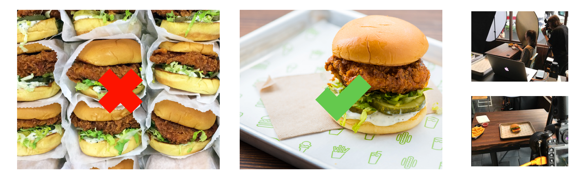
One of my favorite parts of the project was helping art direct the food photography. The original imagery did not always reflect what customers were actually ordering, so we shifted toward simple, elevated product shots that felt more true to Shake Shack and worked better within the kiosk interface.
Supporting the people behind the kiosk
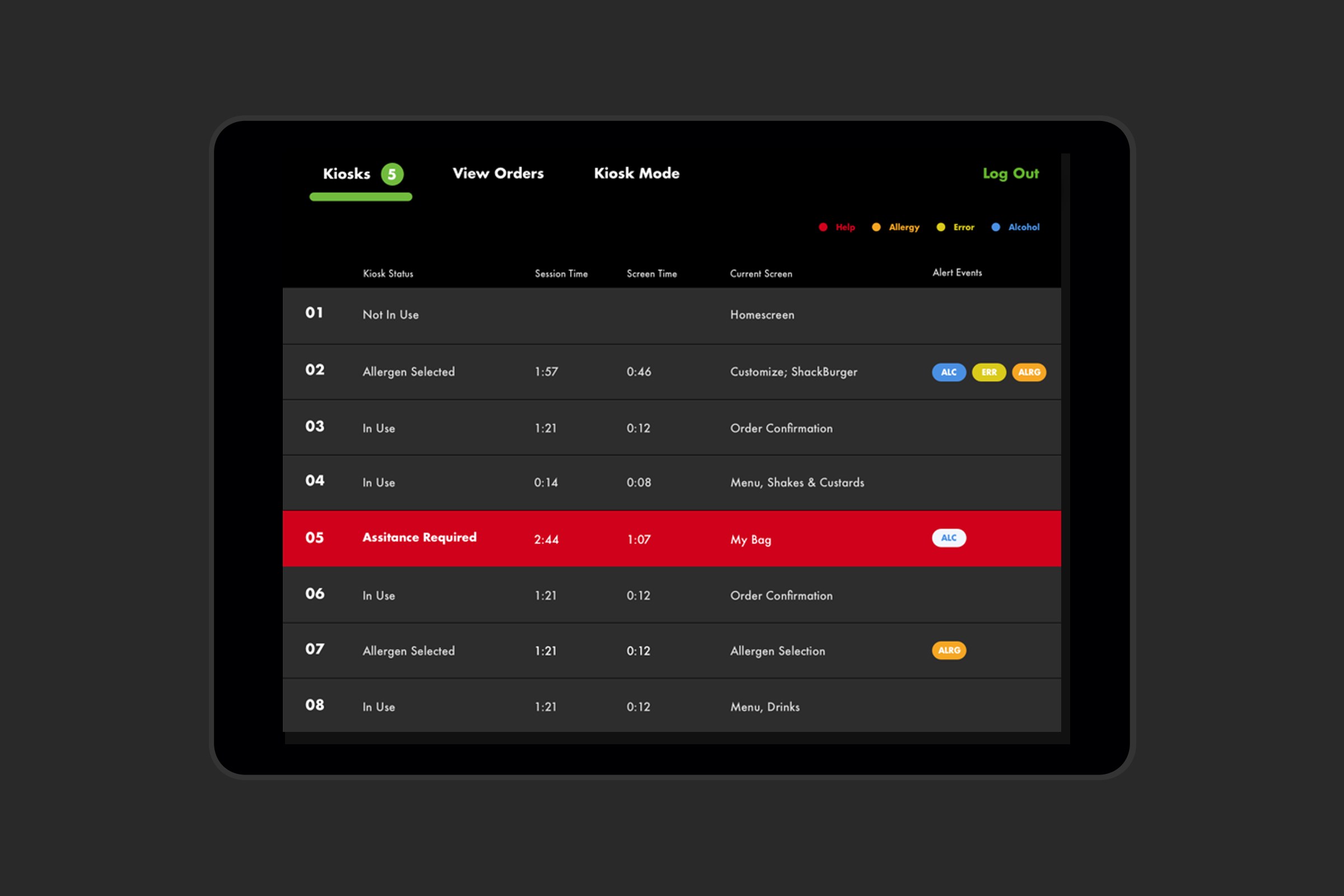
The customer experience was only one side of the system. I also worked on admin experiences for Shake Shack staff, including bug reporting and workflows such as verifying identification for alcohol purchases, while accounting for integrations with third-party systems including Square, Olo, and NCR.
Takeaway
The kiosk pushed me to think beyond the interface itself. The quality of the experience depended on the customer, the kitchen, restaurant staff, the physical environment, and the software all working together.
What started as an experiment became a much bigger part of the Shake Shack experience. Kiosks expanded to 16 locations by the end of 2018 and roughly 60 by the end of 2019.