
Shake Shack: Order Ahead
In 2016, Shake Shack's first order ahead iOS application launched with over 100k downloads in the first week of national release. A few months later, the Android application was released.

my role:
I served as UI designer for iOS & product designer for Android's app. I was tasked to guide Shake Shack's visual identity for their debut into the digital frontier, and ensure a seamless ordering experience. This then lead to iteration and development of the Android app for its 2017 launch.
the challenge:
Shake Shack has a good problem. The burger joint is so popular in so many of it's nationwide locations, wait lines are out the door... and around the block. Literally. The app's aim to cut lines, times and hungry bellies works in conjunction with third-party partners, packaged in a sleek, elevated ordering visual experience.
ready, set, sketch!
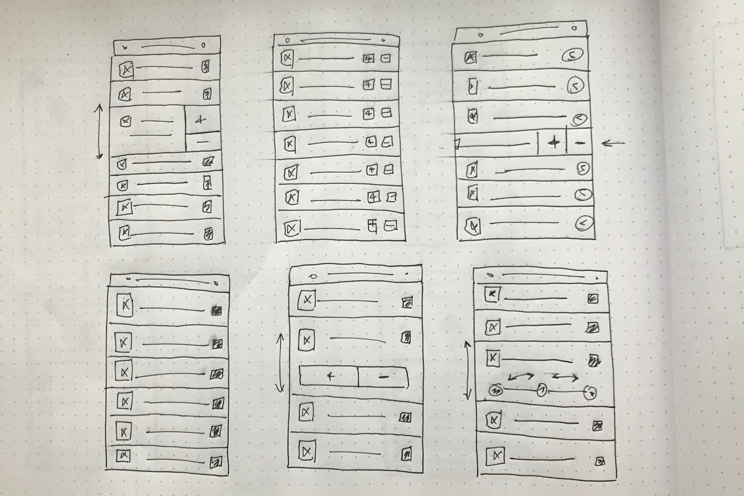

To ensure a high-quality ordering experience there were many things to consider. Finding a specific location and selecting a pick up time meant creating a stress-free decision process. Seamlessly entering into the menu, one only has a limited time frame to place an order. So as product designer, I needed to make sure to menus and customization options were clear, and the user was guided smoothly all the way through checkout.
Sketching and creating low-fi wireframes, I played with list and cell styles to meet the versatile needs of the user's journey.
harmony & richness
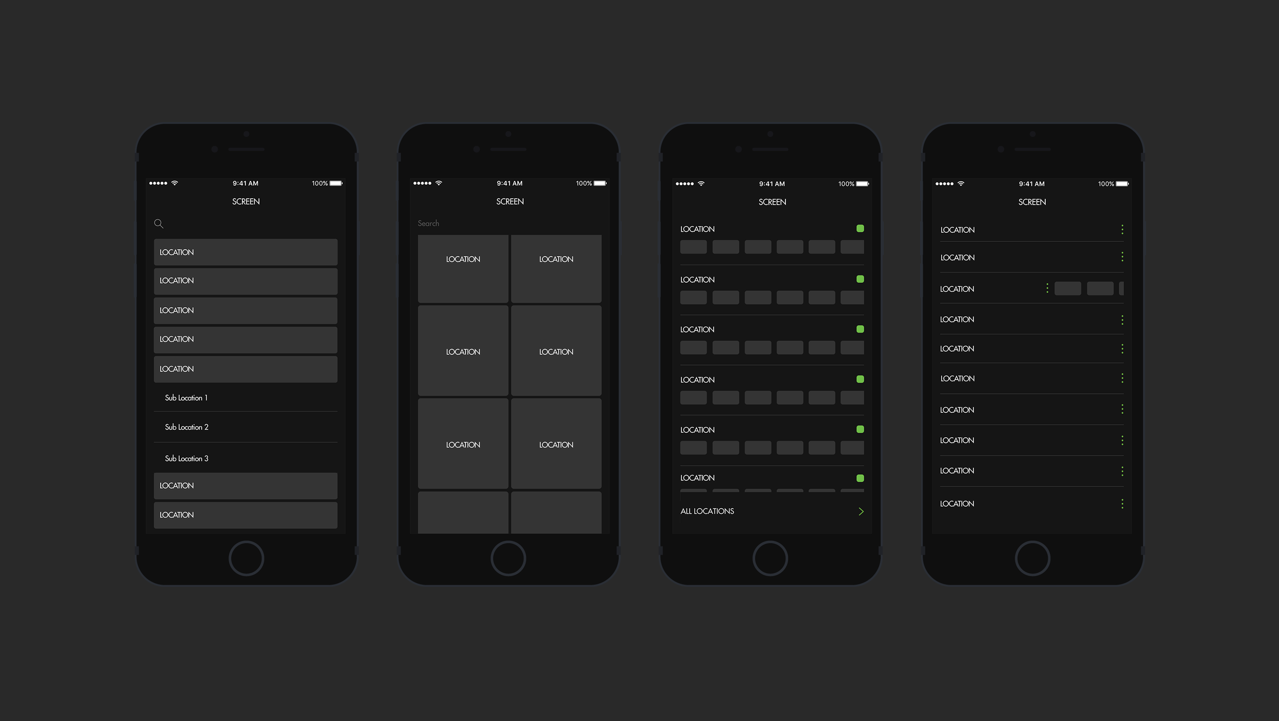
Revisiting Shake Shack’s identity for the native digital space was of key focus. A dark color palette was chosen to provide a richness and refinement to the order journey. Various shades of grey and black made up layers of the user interface, all working in harmony to create a nuanced feeling of plushness.
ui - iOS

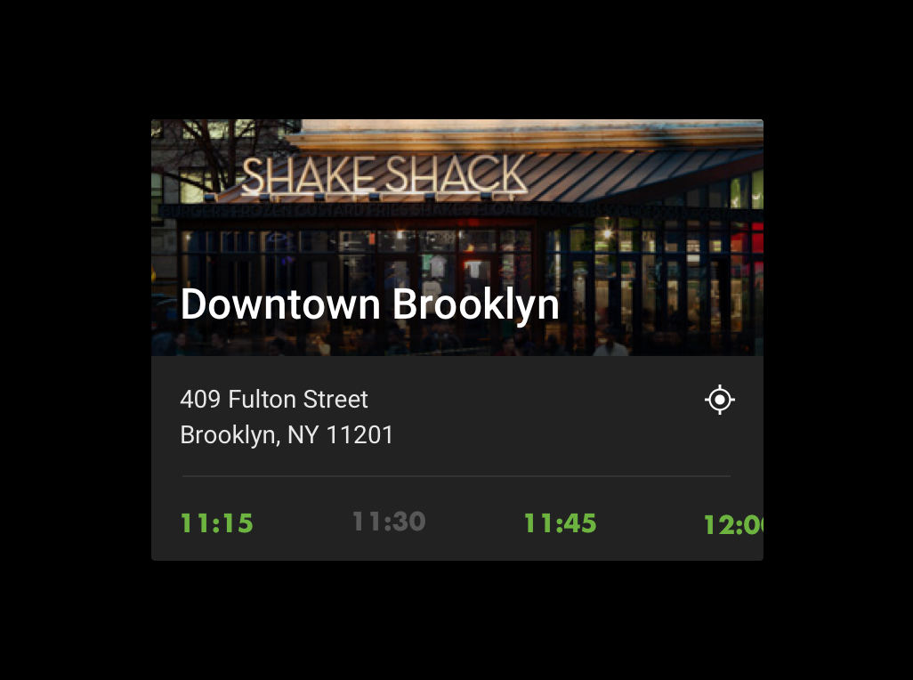
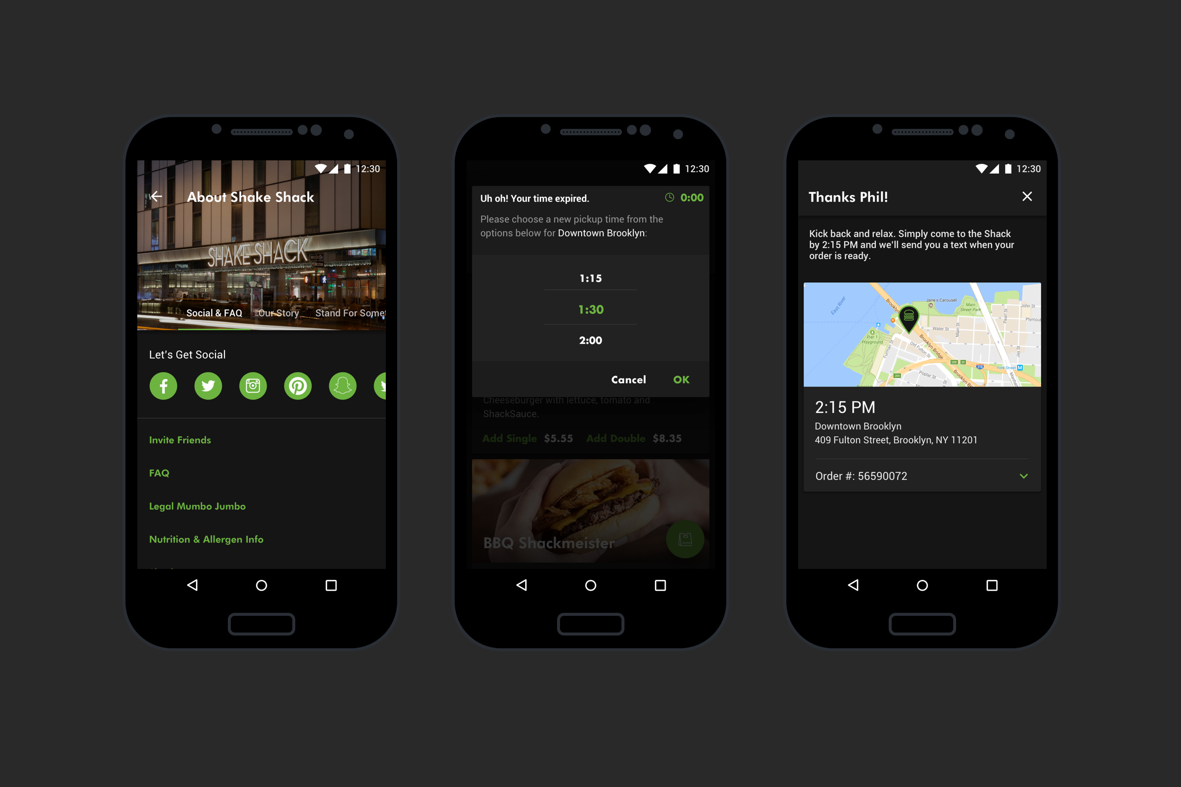
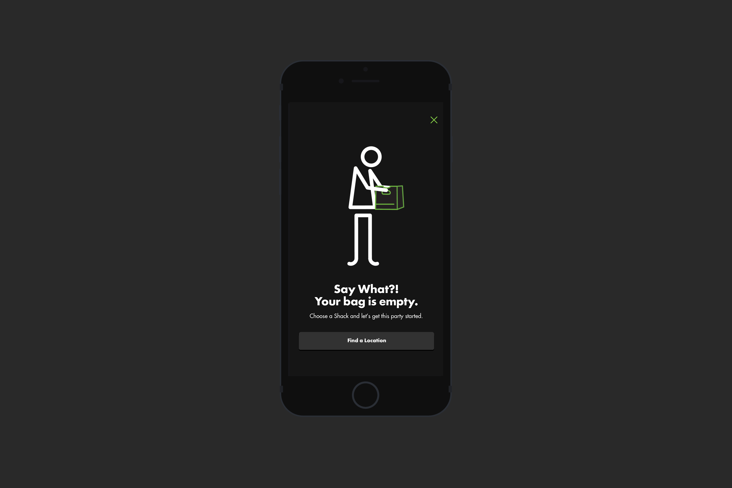
Celebrating the brand, I made use of the Shack's identity at key points in the flow. Their various location and exemplary menu icons provided me the opportunity to make decision pain-points a little more enjoyable. Large imagery and bright green buttons guide the user down the screen and through the product,. By entering a pick up location, you enter the beginning of your order. Tap "add" to quickly add or customize your menu item. Once finished, just tap the bag and check out. It's that easy.
android

A separate but similar project, Android provided us the ability to learn about the Shake Shack users, and how to improve on an even better experience. Tying in and studying Material Design’s principles, I blended even more sauce into the Shack App’s UX interactions and UI elements. I took advantage of the use of cards and slick interaction that resulted in a more clever, concise user experience. New features like Inbox and Account settings were also added.
lessons


We learned a lot as a result of the iOS launch. A project like this is never finished, it only evolves. Learning from users and kitchen staff, we wanted to improve on key functionalities of the app for the release of Android. Improvements implemented by our third party partners, as well as a better understanding of the Shake Shack app customer, lead us to refine the order flow. Light sketches and workshops lead to minimizing the amount of taps (ie work) someone should make to get their food ordered.

Adapting for Android gave us the perfect opportunity to reevaluate the hierarchy for features on the home screen. Not only were features reprioritized based on iOS insights, new ones, like inbox, added more useful functionality.
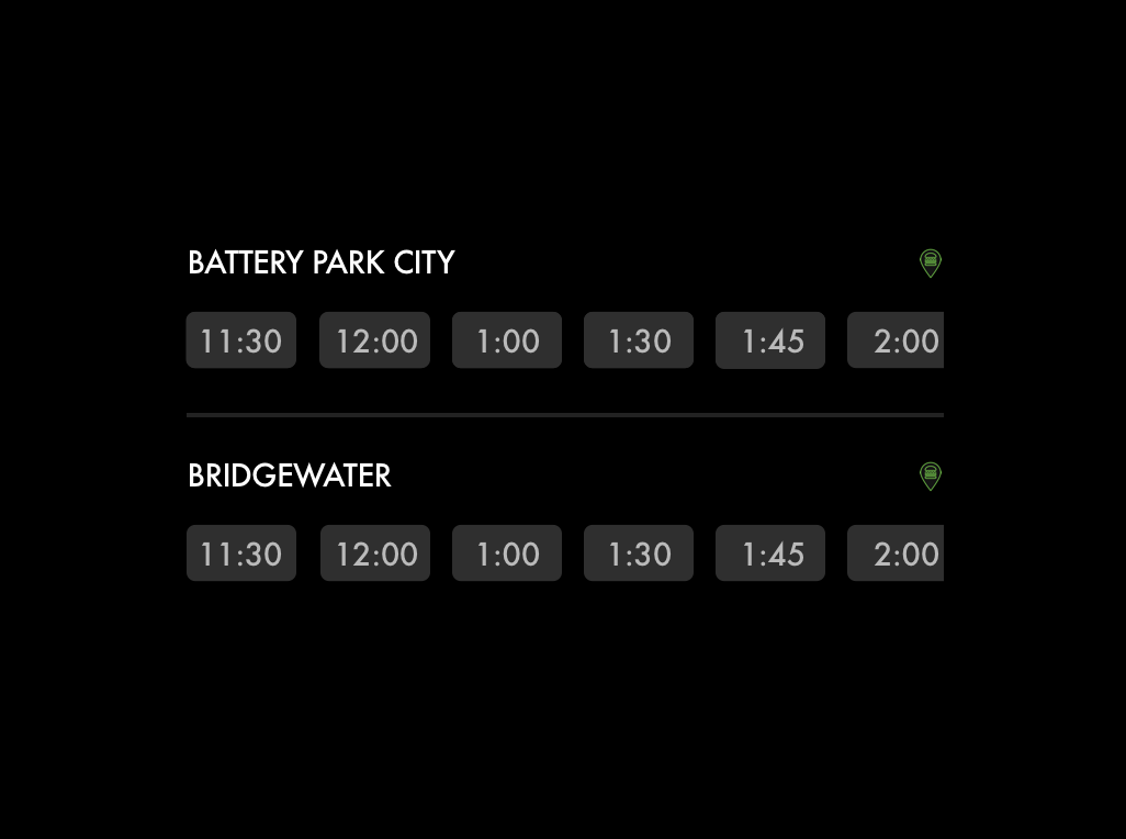
Before
The goal on launch was to showcase that the order ahead experience was available at every Shack location. The original list style for selecting locations hit that aim, and also showcased the number of options one has to place an order. However, we learned this list proved a bit overwhelming.

Before
Shake Shack repeatedly ranks as one of the best tasting burgers in fast casual, so why would anyone want to change an already amazing product? Turns out that no matter how good the burger, if customers are presented the opportunity to customize, they will. With too many people customizing their food in the original list format, kitchens were slowly getting backed up.
After
The solution was to implement card styles per location. Not only were we able to highlight each Shack more personably and expand touch points, the screen became more tailored and less overwhelming to the user. Tapping into the location card, you can learn more about the Shacks near you.

After
Iterating on these learnings, drop downs were implemented in order to hide the customize options so the user knew it was something they could do, not something they necessarily need to do.
same, but different.

Material-like card styles lent themselves well to the app's flow. Locking buttons and rearranging key functionalities, like +/- and the bag button opened up possibilities for a more robust product.
Small yet powerful adjustments like reorganizing the timer, About Us screen, and Order Confirmation screen added an extra bit of consideration for the user's ease.
In the end, it's all about the user's satisfaction. But a little distinction never hurt anyone. I'm proud to say the order-ahead app yielded an Appy Award for best in the Restaurants/Food/Beverage category of 2017, and two W3 Silver Awards.
