
Potbelly.com
The Potbelly.com redesign was a responsive web project to revamp the brand's online presence. The project included full ordering functionality, content creation, and a franchise site.

my role:
I served as the designer for the website redesign. Working with a small agile team, I worked on a visual UI update, as well as a cleaner, simpler website experience, particularly for their online ordering flow.
the challenge:
Create a newer, revamped visual presence for the website. Streamline the website's flow and navigation, while highlighting the brand's story and personality. Design for a responsive experience in desktop and mobile. Simplify the order flow to increase online orders and return rates.
out with the old


The brand’s unique personality is a voice that deserves to be heard and celebrated. A mission of mine was figuring how to tone down the visual noise of the old website, and create an intuitive, simplified web experience that reflects the modern day Potbelly.
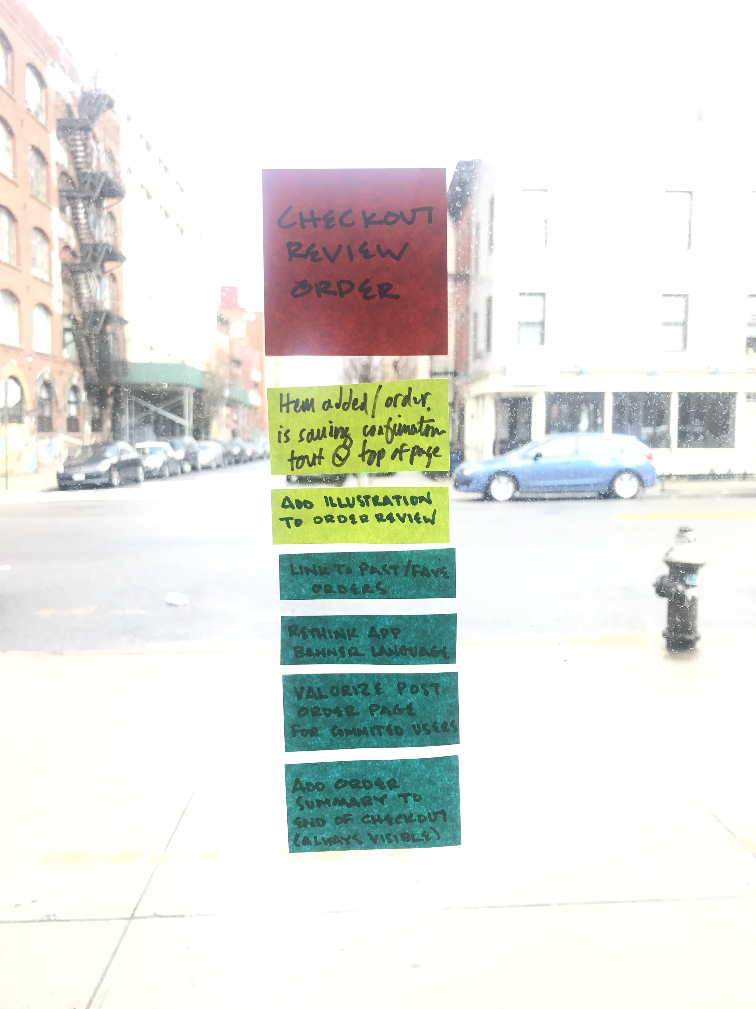
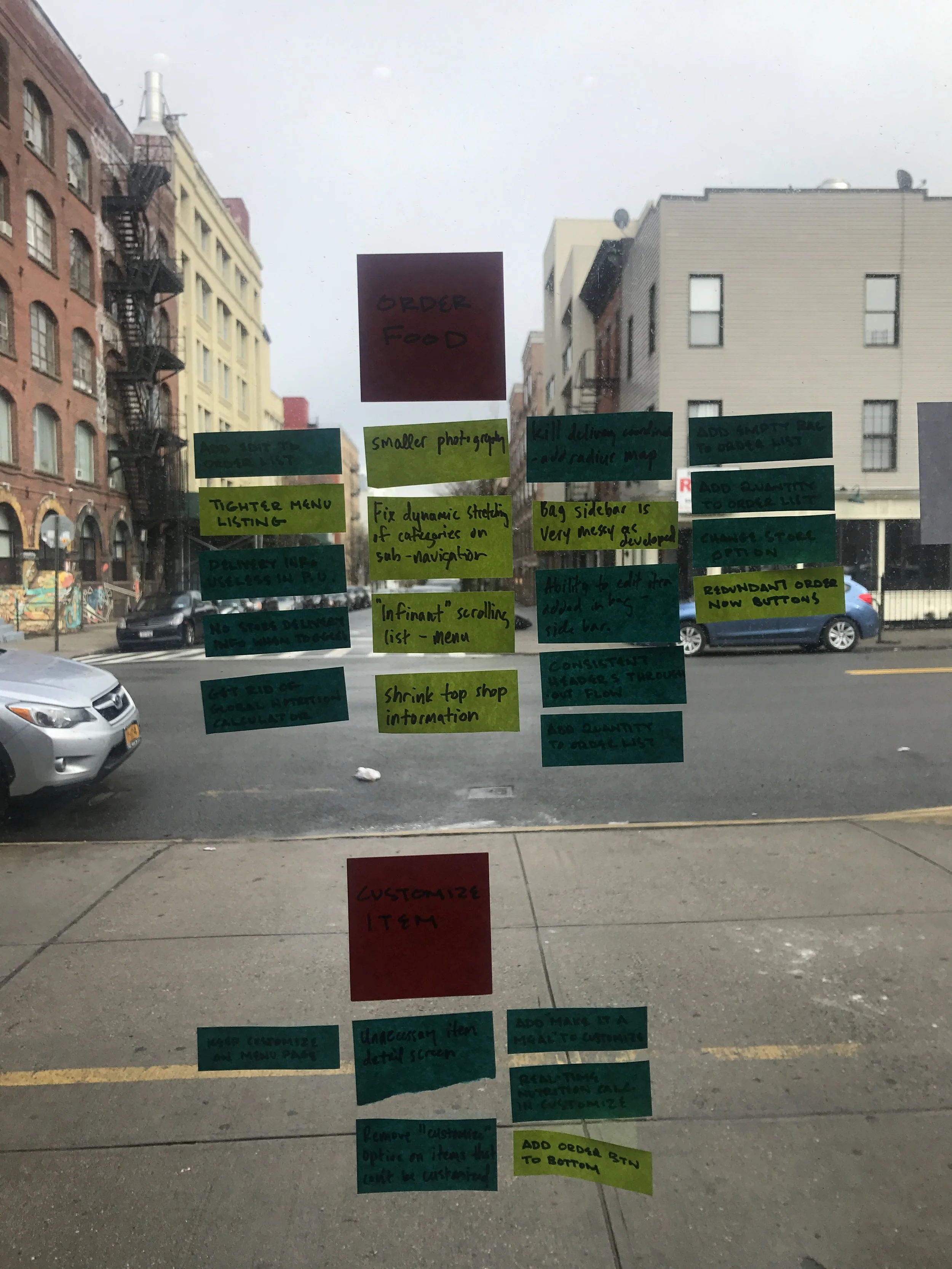
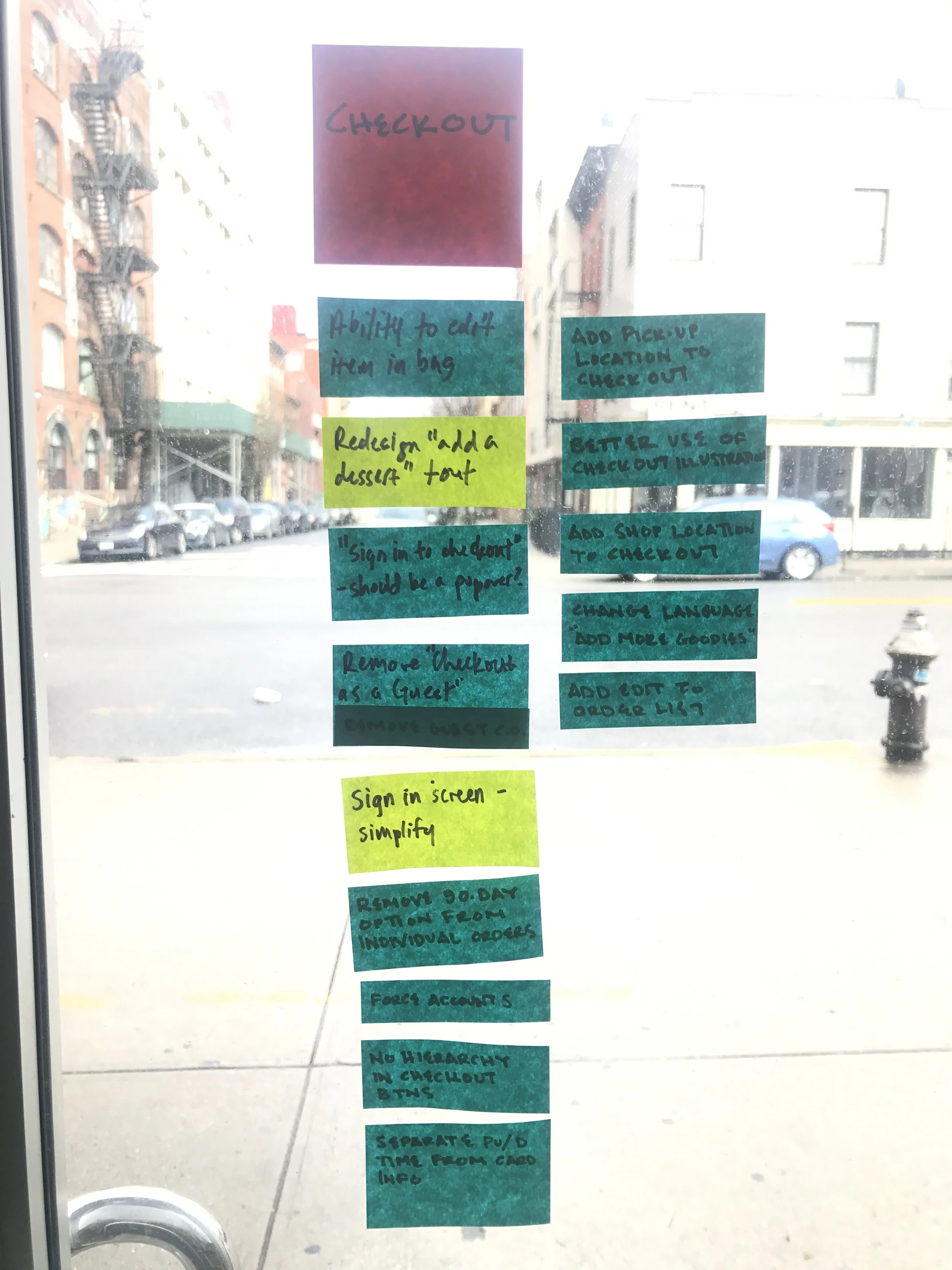
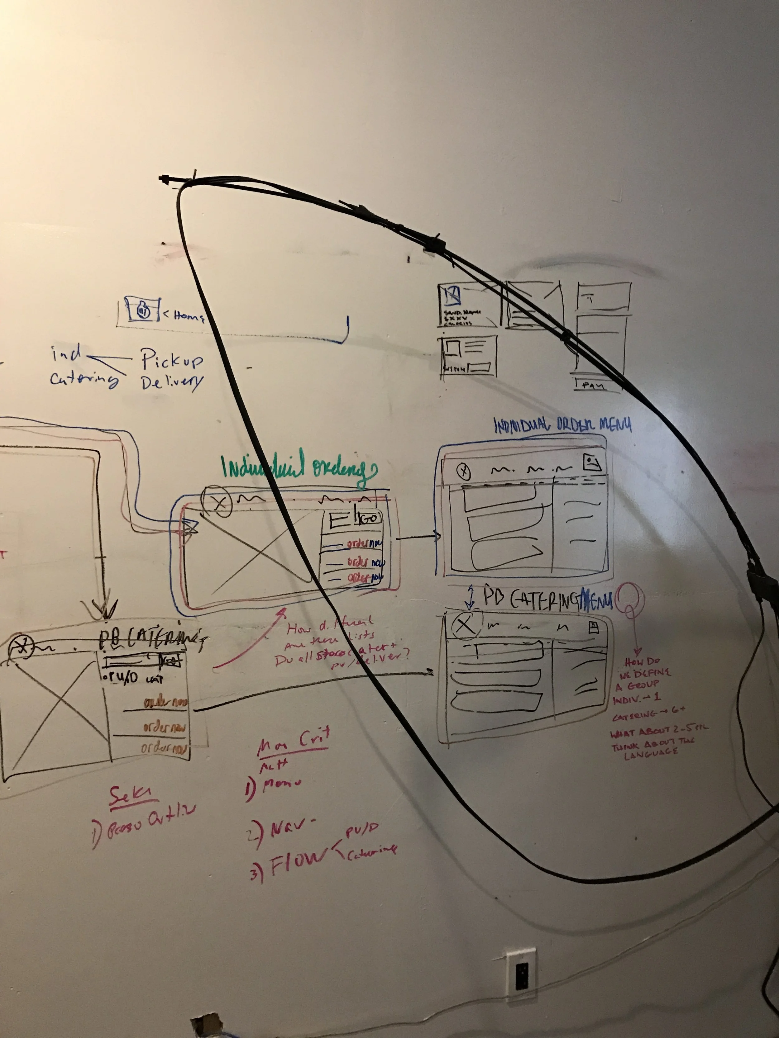
Iterations of user flows and site maps filled the white walls of the office. Untangling the threads, we ironed out our original project goal: get people ordering their sandwiches as fast and easily as possible. I conducted audits of various other online ordering experiences, from Seamless to J.Crew. After aligning on the site's idealized flow, the next step was building the skeletons of the new website.


original site map:
The site map, as it stood when we took on the project, was a little too complicated for what the client wanted from their ideal website experience. We took a look at what features the site should include, and how to condense all of Potbelly's rich material into a simplified modular system.

new site map:
To hit one of the clients main objectives - drive up online ordering - we immediately simplified and streamlined. Weekly workshopping led us to unravel what the client's main objectives were, and how to best tell their story and supplemental content so that it was easily accessible, yet not distracting from the primary ordering objective.
wireframes

Wireframes were created to get a better sense of the user’s journey, and how to tackle specific obstacles. Potbelly is unique in it’s ability to provide delivery and pick up services for most of it’s locations. However, variables such as order size, time, and type provided back-end challenges that drove much of the site’s structural decision making. Ordering for over 20 people would push one to the catering menu, for example. Inconsistent and varied operating and delivery hours made us take special look and care at the order flow, rather than just applying a blanket system.

For mobile, we ensured that the experience would not dissolve in quality, rather the opposite. More people than ever are using their smart devices as the primary gateway into the web. Collapsing lists, sticky buttons, linked directions and phone numbers, and clever implementations of breakpoints ensured that the ordering from a phone would be just as convenient - if not more so - than from your desk or home computer.
in with the new

Locations
Color theory, typography, illustration styles and various other design methods were considered when refining the visual presentation of the website. Potbelly has such great packaging and print collateral in their stores and advertising, and I wanted to intelligently move away from it’s old skewmorphic presence into a cleaner visual language. I wanted to bring out Potbelly's quirky and made-to-order values with typefaces like Karla and Amatic.

Menu
With so much information needed on every screen, I implemented card styles that gave every menu item it's own ecosystem. Leaving the right rail free for shop information, delivery and pickup times, the mini cart and checkout buttons, user's clearly know where they need to go to find the information they need.
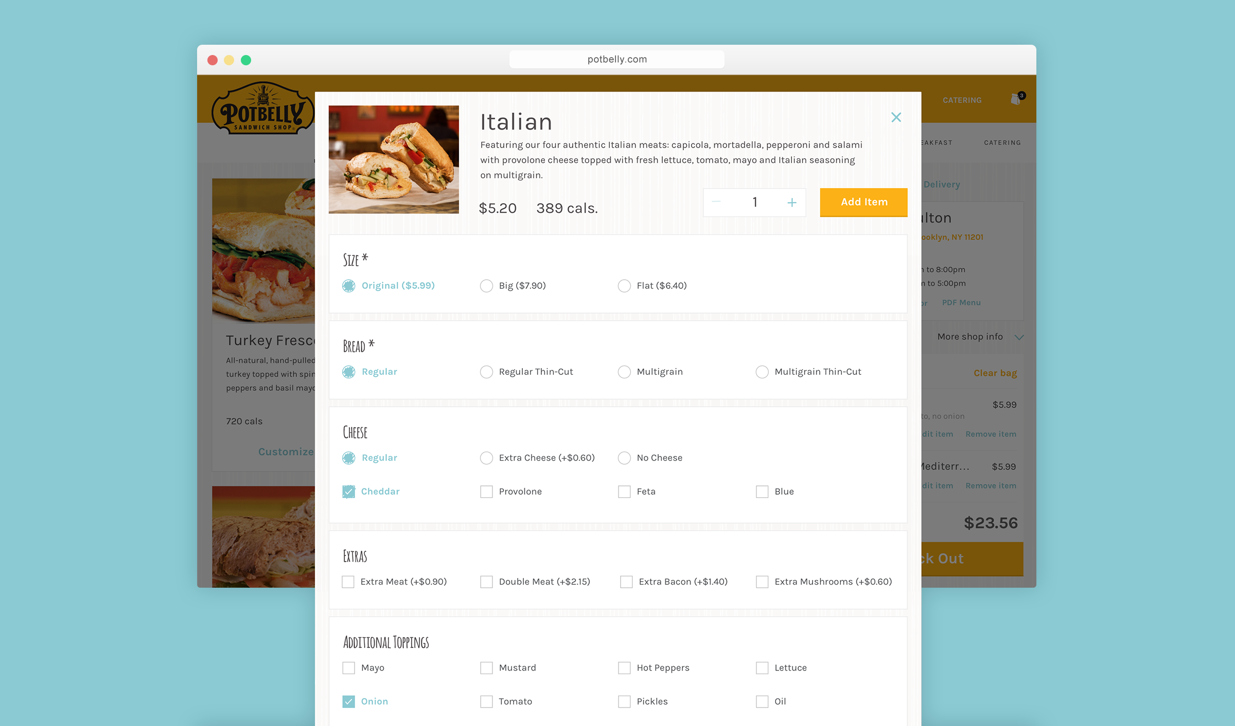
Item Detail / Customization
Potbelly is amazing in that it allows you to fully customize your sandwiches and other items. To make full use of this capability, users are brought into a item detail popover, where they can either quickly add the item as-is, or scroll down the page to make their selections. With different products having a multitude of customizable combinations, it was important to design for the least versatile menu items to most robust.

Mobile Screens
Keeping responsive to the front of our minds, I rapidly mocked screens in their mobile forms in conjunction with their desktop counterparts. From menu descriptions, to location cells, we wanted to ensure that scrolling was as minimal as possible, and that users were cleverly guided throughout their whole order.